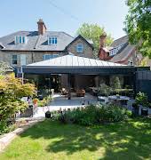
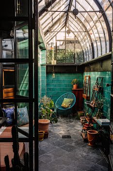
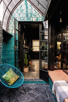
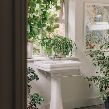
A small patio area was covered over to create a beautiful, useful space that increases the home's footprint, plus creates a lush, verdant mood.
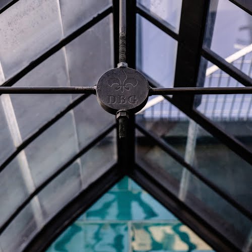
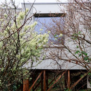
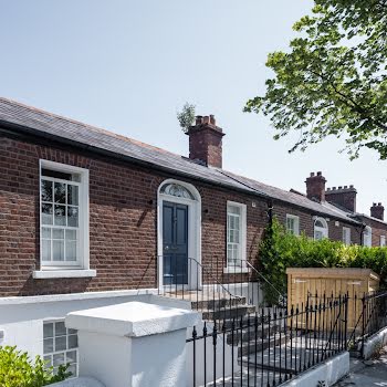
They say the kitchen is the heart of the home but Susan and Andy Bowe, the owners of a two-bed period home in Stoneybatter, Dublin 7, might disagree with that sentiment. Back in 2017, the couple added a striking greenhouse to the south facade of their home. The light-filled space functions as an extra room when they throw the doors open during the summer months. But it’s also the cornerstone of this slow and steady renovation project, and the inspiration behind many of the design choices they made along the way.
“The greenhouse was the starting point and it gave us the style for the house,” explains Andy, who is originally from Germany. “Without the greenhouse, you could do whatever you want in terms of design. But then we had to work around it, otherwise everything else would have looked off.”
Andy and Susan first met when she was looking for a contractor to build a roof over what was once an open patio area at the back of her house. The idea for the space developed over time, and so too did their relationship, which blossomed when they discovered shared interests in animals, art and design. They now share the small but perfectly formed home with rescue cats Aisling, Fluff and Mags. But it all started with the patio, which was originally meant to be covered with a uPVC roof.
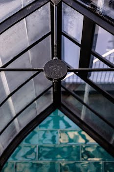
When the quote was more expensive than they anticipated, Andy suggested they might get better value for their money elsewhere. After some online research, he discovered Belgian company DBG Classics, which creates old-school, custom-made, wrought-iron greenhouses.
He sent his ideas across and, after some back and forth, they agreed on a unique design that combines a crisp angle on one side with an unexpected curve on the other. Andy built the structure, which arrived flat-packed – and it was a lot easier than he expected. “It installed perfectly,” he says, “like building Lego.”
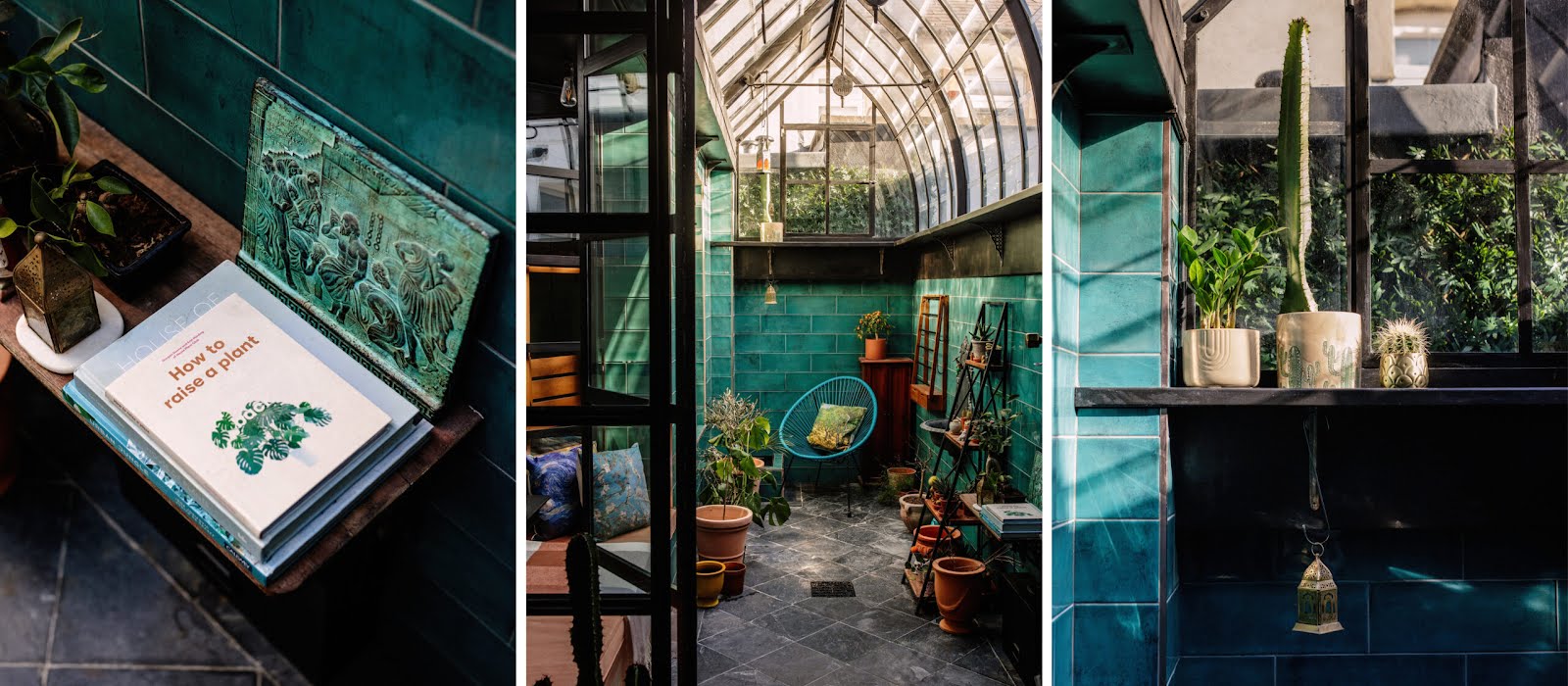
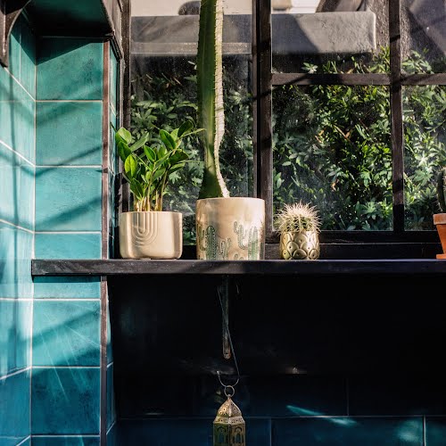
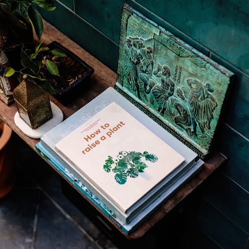
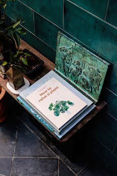
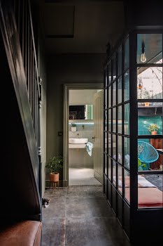
Choosing the colour scheme was a little more challenging. They eventually settled on verdant green wall tiles, which complement the terracotta-potted plants, and slate floor tiles, which add character and texture. Light pours from the greenhouse into the living room via a wrought iron and glass panel wall. It creates a seamless connection between the outdoor space and the rest of the house, says Andy, and it gave them the space to create a window-bench, with concealed storage units, which makes for the perfect reading nook.
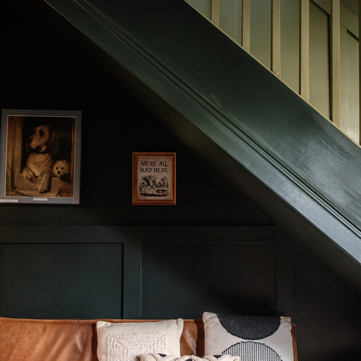
They moved on to the living room next, choosing a wall colour (Farrow & Ball’s Studio Green) that blends beautifully with the outdoor space. The fireplace was rebuilt from the ground up, and decorated with antiqued mirror tiles that “frame the whole room”. The colour scheme continues in the kitchen, where Andy raised the original units and added timber coving before painting them in the same Farrow & Ball shade. The tiled splash-back runs all the way to the ceiling. It’s a nod to the heritage of the home, which is almost 100 years old, explains Andy, who notes that kitchens in older homes were usually tiled to the ceiling “for ease of maintenance”.
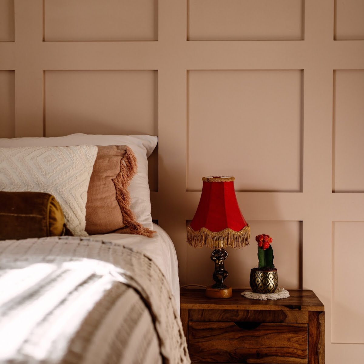
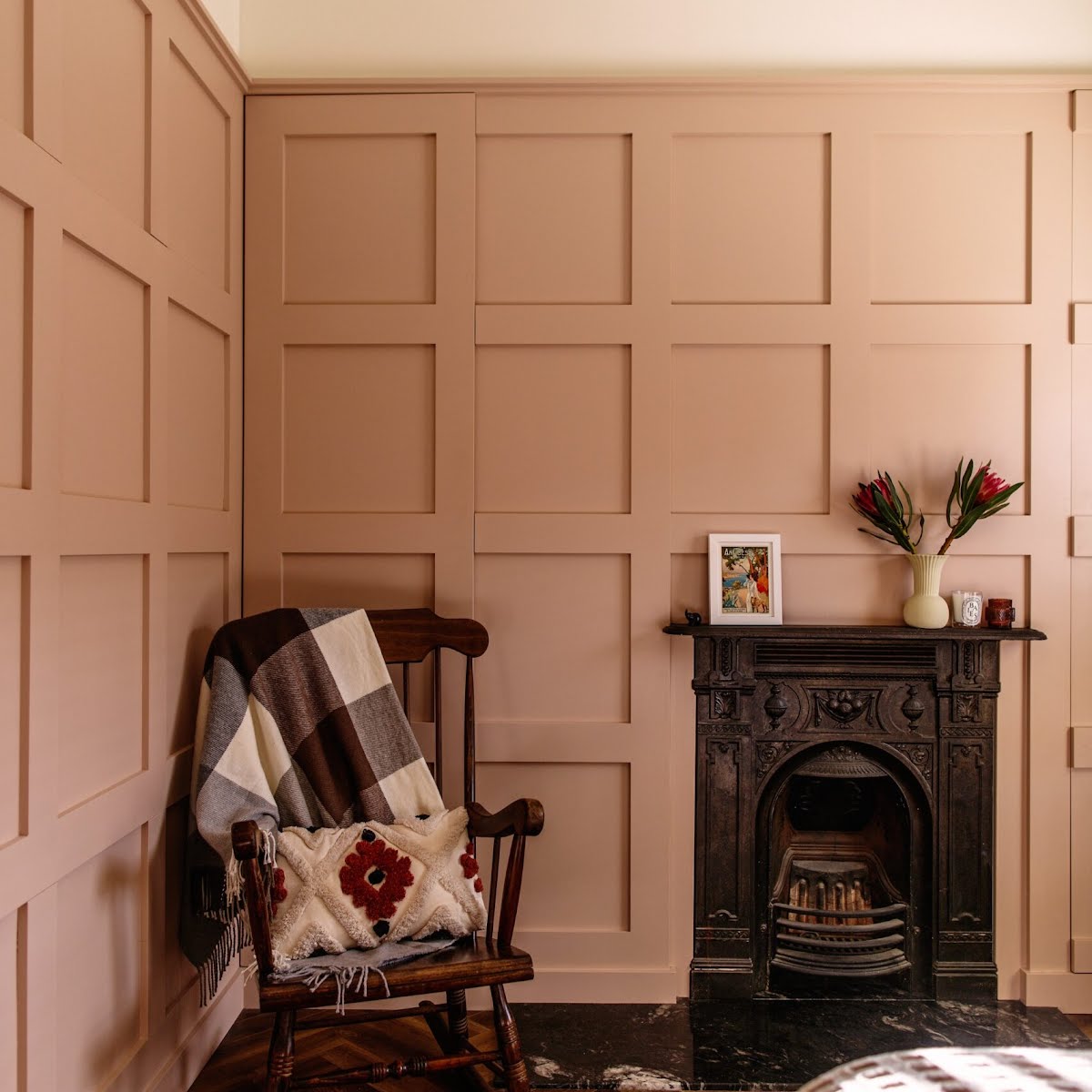
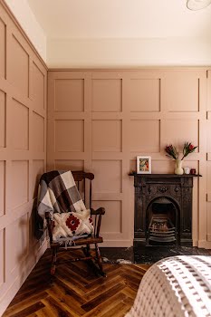
After working with a darker colour palette downstairs, the couple knew they wanted to incorporate lighter colours upstairs. Finding complementary hues was another challenge, says Andy, but after a lot of test swatches, they settled on Farrow & Ball Treron for the stairwell and Farrow & Ball Setting Plaster for the bedrooms.
The dusty pink colour makes the upstairs rooms feel bigger and brighter, while clever design ideas make the most of limited space. In the first bedroom, which they use as a multifunctional space, there’s now a door where once there was a window. It leads to a small 3x3m outdoor terrace on the existing flat roof by way of three steps that also serve as concealed storage compartments.
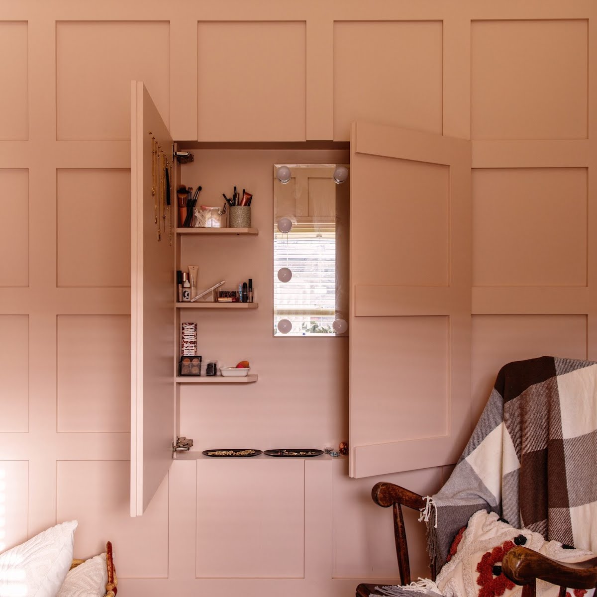
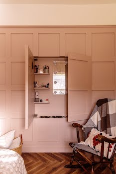
They didn’t plan on renovating the main bedroom but when a roof leak left hairline cracks across the walls, Andy suggested they panel the whole room. Small wardrobes were integrated into the alcoves on either side of the chimney stack, while another wall was hollowed out to create a narrow cabinet for jewellery and cosmetics. “It all disappears behind the panelling,” he explains.
The panelling project was a little trickier. “It literally took me a day to mark it out on the walls and understand how the windows and door fit,” he says. “You mark something, you look at it and then you change it again until you find the perfect fit. You need a bit of luck as well, in that the proportions of the room have to be suited.”
Some people use computer programmes to measure panelling, but Andy prefers to do it by hand. “You get a better feeling for the room doing it that way,” he says. And besides, having learned joinery while working in the metal industry in Germany in the nineties, he’s used to doing things manually.
“That was before we used computers, so you had to think in 3D.” It’s a skill that has stood to him. His problem-solving nous and “3D thinking” are visible in every part of this home, where form meets many different functions. Slow design principles shine through, too. The couple took their time with the project, avoiding trends and choosing materials that are made to last.
Andy is currently focused more on the trade side of his business, Harbowe Ltd. He recently started importing aluminium front doors from Germany and he’ll soon be importing timber doors, too. But he’s eager to sink his teeth into another renovation project soon. “People usually tell me what they want and I don’t bother them too much with my ideas,” he says. “But I would love to share some of my ideas and see where that might lead.”
Photography Al Higgins
Styling Lesiele Juliet
This feature originally appeared in the spring/summer 2023 issue of IMAGE Interiors. Have you thought about becoming a subscriber? Find out more, and sign up here.


