A narrow Victorian Dublin terrace has become a light-filled space connected to the outdoors
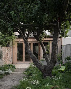
Drawing the main spaces closer to the long, bright back garden, incorporating a small internal courtyard and keeping the materials simple and natural are all key design elements.
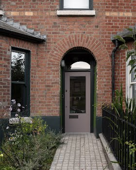
Part of a terrace of Victorian homes, this Dublin dwelling suffered from being narrow and dark, with living spaces that felt claustrophobic. Its owners got in touch with Scullion architects hoping to remedy the problem.
“As well as improved bedrooms, bathrooms, and working spaces in a narrow, dark house, the client was looking for a home filled with light, natural materials and a sense of connection with the rare asset that was the long and sunny city garden,” director Declan Scullion explains. “This project explores how to adapt narrow houses in a manner that contributes to a sense of spaciousness and well-being with spaces to socialise, work and play.”
Previously, the home consisted of an open plan living and dining room, a separate galley kitchen, downstairs bathroom, two bedrooms and a box bedroom, with no bathrooms upstairs.
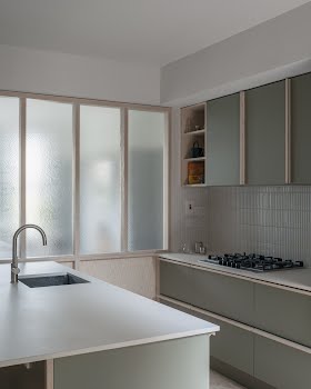
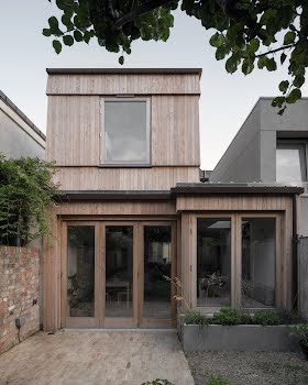
“The new house comprises an open plan kitchen, dining and seating area with separate living room and WC on the ground floor,” Declan says. “A second floor extension houses a new large third bedroom replacing the box room, upstairs family bathroom, and an en-suite added to the main bedroom in the original house. The house was also insulated and upgraded with new windows, doors, rewired and re-plumbed.”
The restricted site dictated how the house could be adapted and reconfigured. “The narrow site demanded that functions (kitchen, courtyard, stairs, stove, study) align with the outer edge of the house plan,” Declan explains.
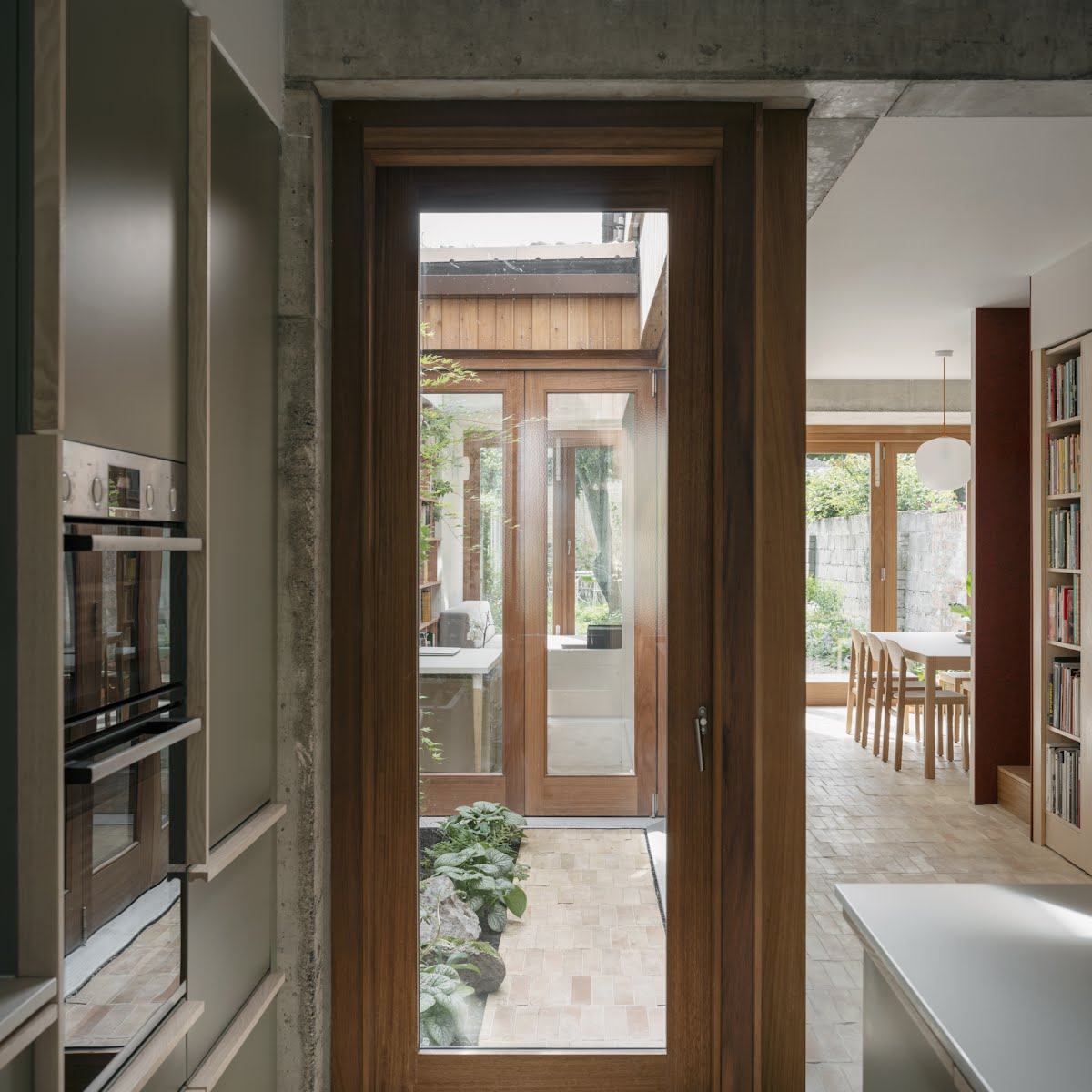
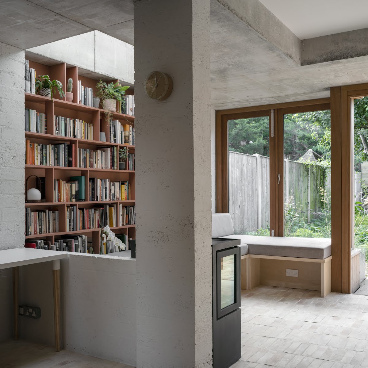
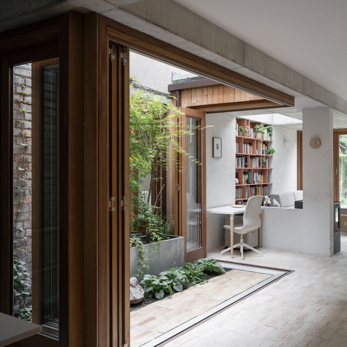
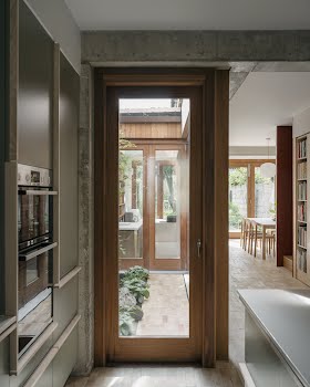
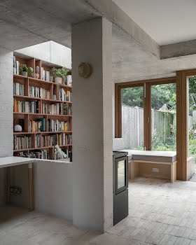
“The new kitchen, dining, home-working and seating areas at ground floor offer overlapping social functions that bleed between each other. These functions also overlap with outdoor spaces, like the courtyard. This layout lends itself to a more social environment for family life which the original house layout, with its cellular rooms housing separate functions, could not provide.”
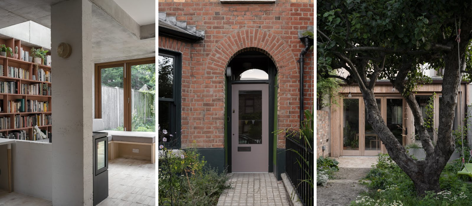
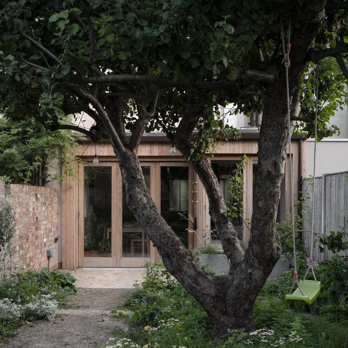
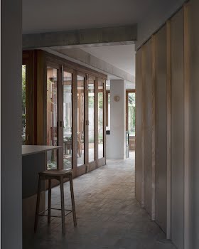
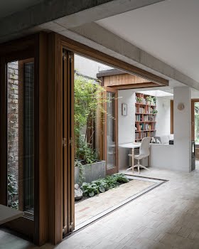
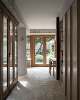
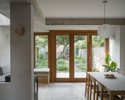
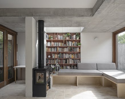
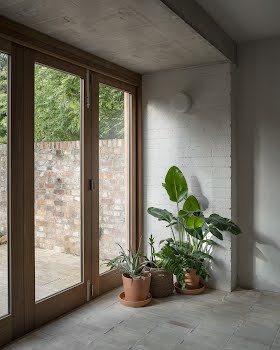
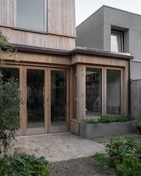
In order to unite spaces old and new, indoor and outdoor, a carefully chosen palette has been used throughout the home. “Handmade terracotta floor tiles unite internal and external space like a carpet through the plot. The house transforms in summer, when hardwood doors open fully to the courtyard and fold back to the rear allowing the concrete structure to stand free, pavilion-like, between party-walls and bridging from house to garden.”
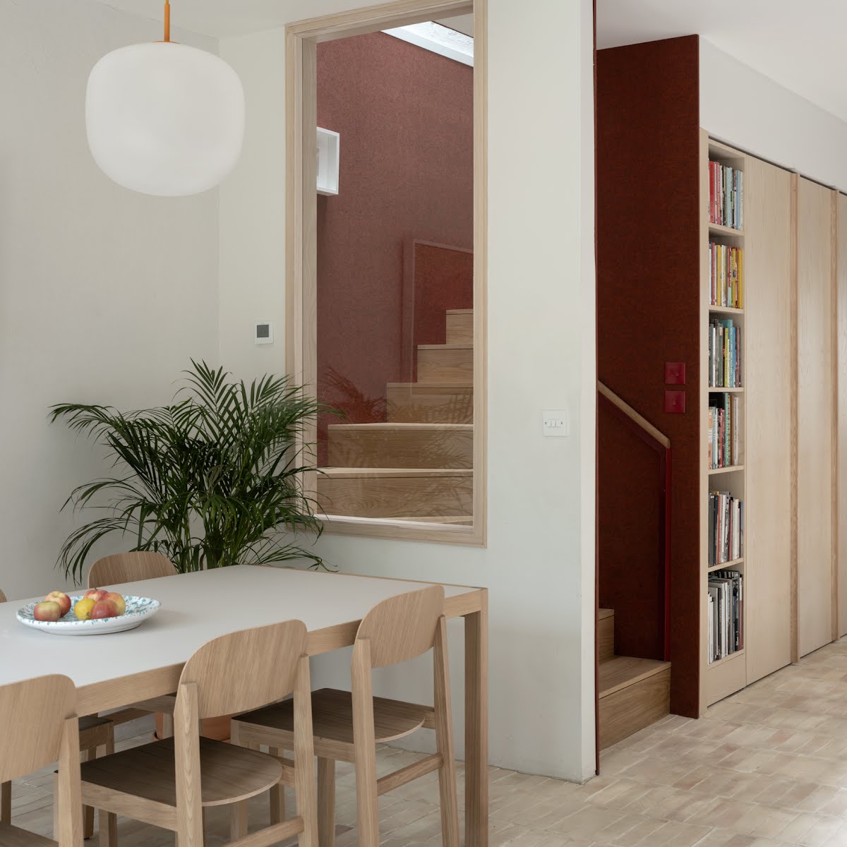
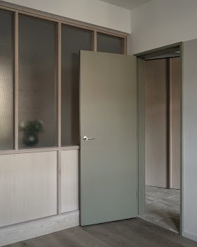
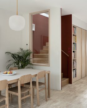
Other prominent natural materials include ash wood frames, and red felt wall panelling, while a selection of complementary paint colours were selected that harmonised with these key materials and each other.
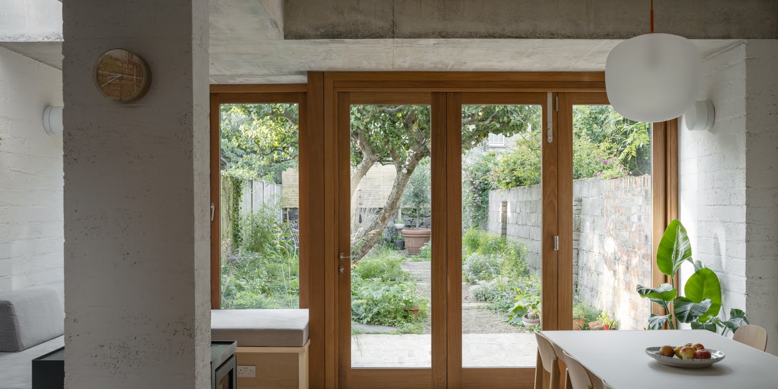
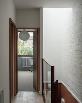
Much of the design was about ensuring natural light could flow in the home, such as the bi-fold doors at the back, the small courtyard between the kitchen and living and dining space, the roof light on the stairwell and a mirrored roof light set into the grass roof on the back extension. “The light then in turn brings added warmth to the natural materials of wood and terracotta used in the interior spaces, leading to a very tranquil environment in which to spend time,” Declan says.
Looking at the finished space, it’s hard to imagine it ever felt dark and compact. Now, the space is utterly serene and connected to nature, yet functions perfectly.
Photography Johan Dehlin


