By Kate O'Dowd
30th Nov 2015
30th Nov 2015
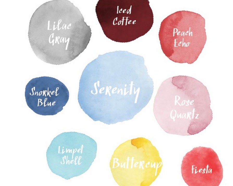
We shared Pantone’s top shades for Spring 2016, in our current issue of IMAGE BRIDES?- here are three of our faves and how to use them to create?your wedding palette…
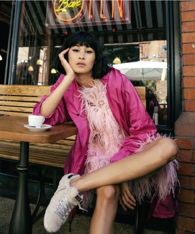
ROSE QUARTZ?A pink wedding theme can seem like’dangerous territory for anyone eager to avoid classic bridal cuteness, but used cleverly, it can create an event that’s as modern as it is softly complimentary. Rose quartz is a cool sherbet shade and should be kept as such; not dollied up with the addition of peachier tones or made to feel overly pretty through an abundance of fussy texture. Keep lines clean and colour range minimal – either all one shade, or juxtaposed with white or a’seafoam blue.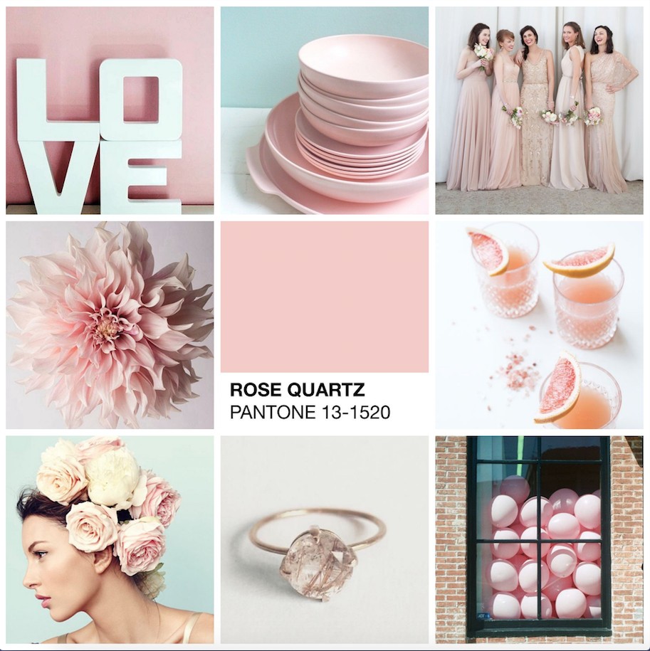
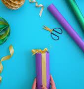
BUTTERCUP If ever there was a shade that screams rejoice, it’s this one. For a bright, summer celebration, or that extra push winter needs to be getting on its way, Buttercup is yellow at its best. Much like Rose Quartz, the modern way to use Buttercup is to allow it to pop all by itself, in minimalist blocks of colour, rather than, say girly floral prints – it looks gorgeous against a pale grey accent. Use it to light up focal points, but don’t have a?Buttercup?explosion?- cake topper, rather than cake; table accessories, rather than tablecloths… get the idea?
LILAC GREY This’shade is sophisticated, ethereal… and just so romantic. It’s grey without being quite so aloof; lavender without being, well, lavender; it looks gorgeous with copper and rose gold and it encapsulates chilled-out bohemian, to a tee. Soft, billowy texture is what gives?Lilac Grey its moment – think ruffled tulle, fluffy feathers and delicate petals.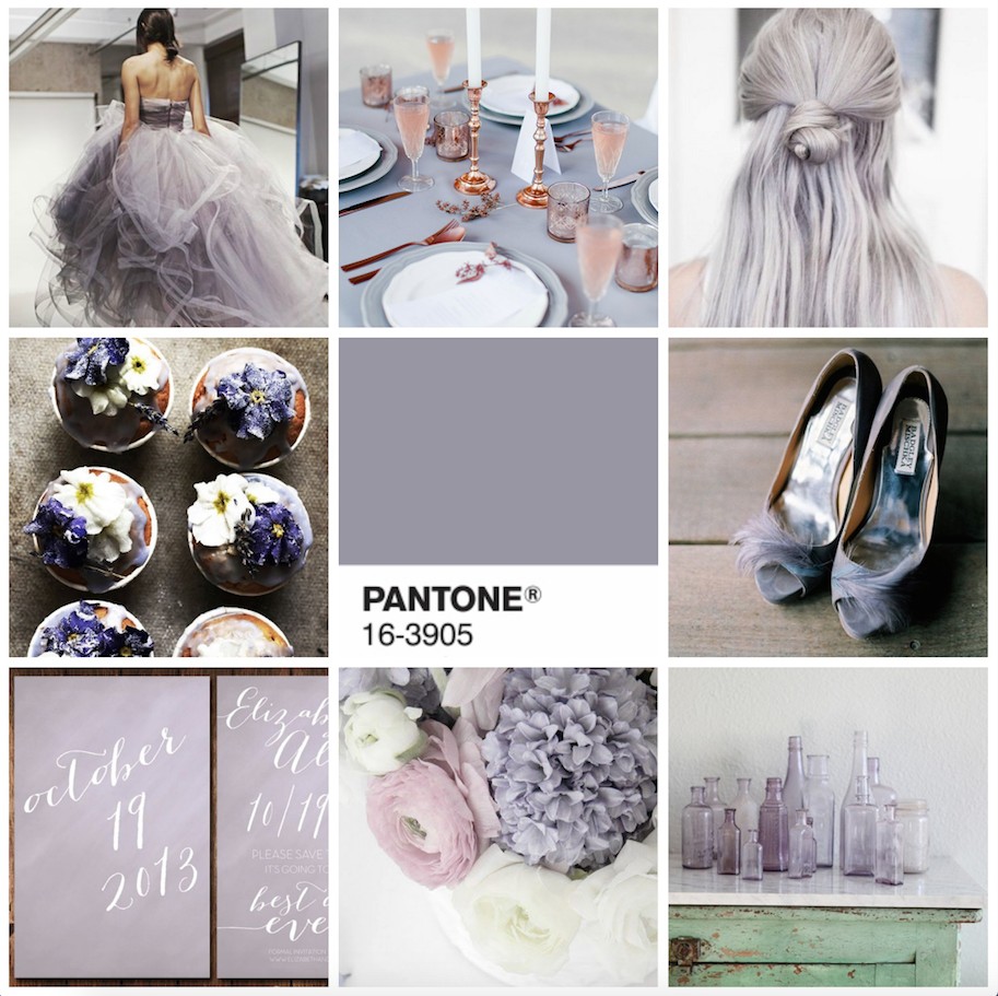
For more tips on how to make your wedding totally stylin’ in 2016, pick up our new issue, on shelves now (we’re thinking that fab hydrangea backdrop on our cover is Serenity, which of course is on Pantone’s cool list, too)

