By IMAGE Interiors & Living
21st Apr 2019
21st Apr 2019
Tasked with livening up a spacious South Circular Road property in Dublin, Róisín Lafferty of Kingston Lafferty Design immediately knew what element would prove crucial: personality.
Having worked with the homeowners on their previous home in Smithfield – a small terraced home near the Jameson Distillery –Róisín was keen to ensure their personalities were very much present in their new Victorian renovation too.

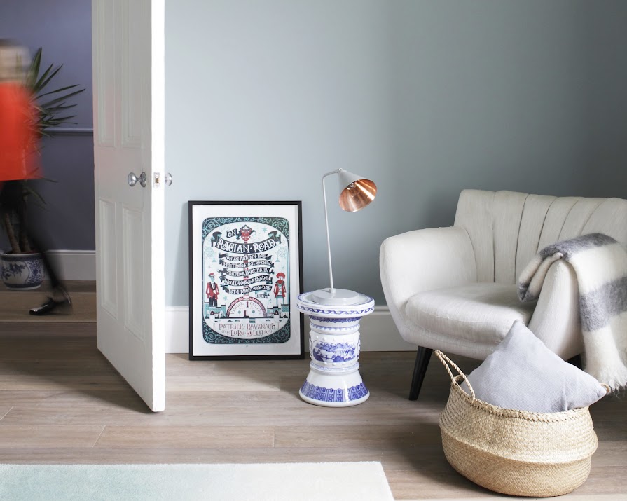
Lola Donoghue’s Love painting overlooks the West Elm Origami Coffee Table.
The Tilt floor lamp is from Blue Suntree.
“The building was well laid out with lots of natural light, but it lacked character and colour,” Róisín says. “As the kitchen and living rooms tend to be the most used spaces in a house, it was important that the design here was both functional and fun.”
The overall aesthetic goal was to create a feeling of calm sophistication in a space that didn’t take itself too seriously.

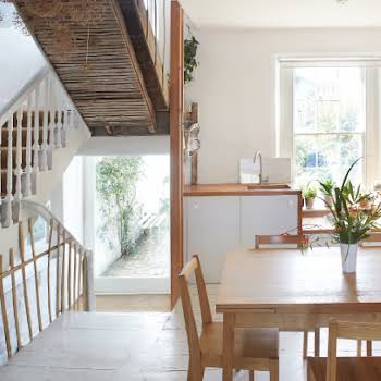
Original stained glass on the second-floor landing is framed with a mid-grey, blue tone wall colour from Dulux
“We kept things light and airy. This is a small, young family with a playful air, so we wanted those hints of fun to frame their new life here. While the new home had a great space and lots of natural light, it was lacking colour and depth.”
Blue and teal tones were selected to contrast against the subtle wall colour, but also to complement the overall palette of existing items. An eclectic mix of dining chairs adds character and interest to the intimate dining space, which is partitioned with a Persian runner rug.

Lola Donoghue paintings bookend the dining table and provide splashes of colour
At the family’s previous residence, space was at a premium, so, there were a lot of custom pieces created to maximise the sense of light and make it bigger. Many of these elements have been brought to their new home, including a bespoke table and light fittings, creating a very expanded sense of space and lightness.

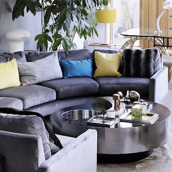
Navy leather French Connection Zinc cuddler from DFS with cushions from Article. The side table is CA Design
Inside, lining the living room is seamless joinery, which is fully adaptable to changing requirements over time. “Storage is always important in a home, it can be a key function for many clients and is important to consider from the beginning of a project,” Róisín advises.”The client was keen to have a space where they could work from home if needed but didn’t want it to be a big feature.”
And so, a closet office that could be tidied away was the perfect solution. Once the doors are closed, the calmness of the living room is maintained.

The cow painting is an original art commission by Debbie Chapman
Where the kitchen was concerned, Róisín and her team were working with an existing set-up but found room to manoeuvre. “We added in some new elements. A new extractor was put in and we designed a unit to house this.
The industrial-style cages were designed to contrast against the streamlined kitchen units, as was the distressed dresser. Paint colours, artwork and tiling were all selected to complement this contrasting style.”

“The Eat Well, Travel Often” print is from KLD Custom Creations, while the
lighting fixture is a Molecular pendant from Rockett St George
In this space, Róisín and her team have played with the scale and quantity of lights. Lighting fixtures are a focus throughout. “By varying the levels at which the lights are hung and lowering the level of light over specific pieces of furniture, you can create a strong focal point within a room. This is what we were aiming for over the distressed dresser and also with the cluster over the coffee table.”
Large-scale dining is continued outside. “It was important with the glazing to the rear of the property to have a link between the interior and exterior spaces. This table has a geometric-painted birch ply top with a colour pop injected through the bright yellow builder’s trestle legs.”

A custom-made KLD table is surrounded by Tolix chairs from Industry, cushions from DFS and Ikea. On the table, bowls are from Dunnes Stores, while the cutting board and salad spoons are from Article
For those planning an extension, Róisín shares some advice. “We always believe in a holistic approach to design and planning from the beginning is key. All elements, from storage and built-in joinery to loose furniture items and colours, should be considered, along with the layout of the space. This will lead to a better overall result for any project.”
PHOTOGRAPHY Ruth Maria Murphy WORDS Dave Hanratty

