By Megan Burns
22nd Sep 2018
22nd Sep 2018
There’s not many paint companies where we know individual shades by name. ‘Elephant’s breath?’ you might enquire when visiting a friend’s new kitchen, or note that you want a Downpipe kind of shade for your sofa. Expect some new adjectives to enter your colour vocabulary, because Farrow & Ball is adding nine new paint shades to its colour card, replacing nine existing ones to ensure their range remains selective and curated. There haven’t been any new shades for two years, so we were suitably excited when we heard the news, and even more so when we finally got to see them. Let us introduce you to the new additions, launching September 20.

Bancha No.298
A mid-century modern green, this is a darker shade of the archive colour, Olive. Inspired by Japanese tea leaves, it’s a strong colour, yet creates a serene mood. It combines well with creams, pinks and browns.

De Nimes No.299
Named after the cloth of everyday workwear made in the French city of Nîmes (from which denim originated), this blue is grounding and calm.

Jitney No.293
This sandy neutral takes its name from the bus that takes New Yorkers out to the beaches of the Hamptons, and creates a suitably relaxed mood.

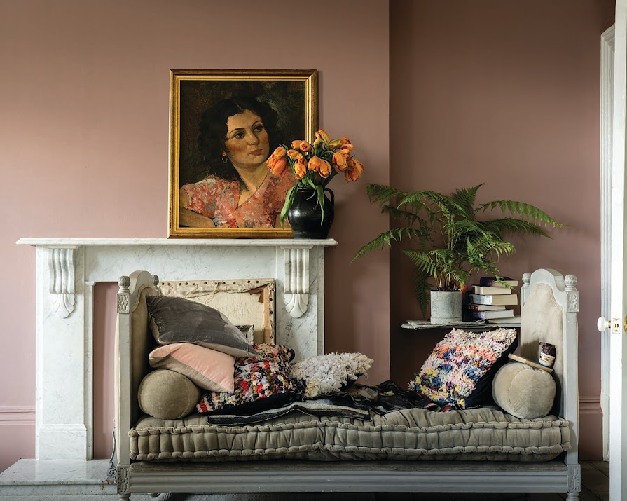
Sulking Room Pink No.295
This muted rose has a powdery quality that makes it easy to pair with complementary tones. Its wonderful name comes from its link to French boudoirs, originally named after the French ‘bouder’ – to sulk.

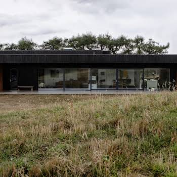
Paean Black No.294
A red based black, this colour is inspired by old leather hymnals. It’s a perfect accent to shades of both red and black, and looks at home in both period homes or contemporary properties.

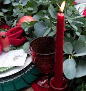
Preference Red No.297
The deepest, richest red on the Farrow & Ball colour chart, pair it with Paean Black or Sulking Room for a dramatic impact.

School House White No.291
This soft off-white is warmer than many contemporary neutrals, and is designed to look like the colour of white when in deep shade.

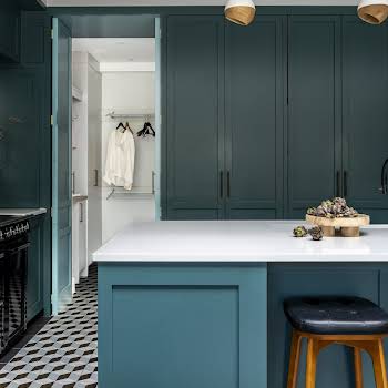
Treron No.292
A dark grey green, this shade is a variation of the classic Farrow & Ball Pigeon, and so it is named after a green variety of the same species. It’s beautiful paired with French Grey and traditional neutrals, as well as natural wood.

Rangwali No.296
A vibrant pink, this shade takes inspiration from the powder that is used at the Indian Holi festival of colours. Perfect for adding a sense of playfulness to a room, with a depth that comes from the inclusion of black pigment.
Featured image: Sulking Room Pink No.295


