My Favourite Room: ‘I spent longer designing the ensuite than any room in the house’
By Grace McGettigan
12th Mar 2020
12th Mar 2020
We asked interior architect Ruth McGahey (from the beautifully curated Instagram @house_of_goose_studio) to talk us through her favourite room in her house
Ruth McGahey wears many hats; not only is she a mother-of-three, but she also works as an interior architect, interior designer and stylist (all the while running a personal blog).
Since moving back home to Ireland from London, Ruth and her family have moved into a beautiful country home (which came with two donkeys in-tow). The original house interiors were ripped out and redesigned, with one particular room standing out above the rest.
Here Ruth shares her favourite room at home, including why she designed it this way and why she loves it so much.
My master ensuite
“My favourite room in the house is our master ensuite bathroom,” Ruth says, “mainly because of the incredible light that it gets, but also because I spent so long designing it more than any other room in the house (apologies to Renov, our very patient building contractors).
“It’s also a very luxurious space, and I mean that literally because of the amount of space we have in here.
“When we bought the house in 2015, the master ensuite had one pedestal sink, a bath, a large shower and loo (obvs!). It was huge, but lacking in any luxury other than its size.

“When I set about redesigning this room, I wanted to take advantage of its size and light – but mainly, I wanted to design a bathroom that felt like a beautiful, cosy room with bathing facilities in it, as opposed to a clinical bathroom setting.
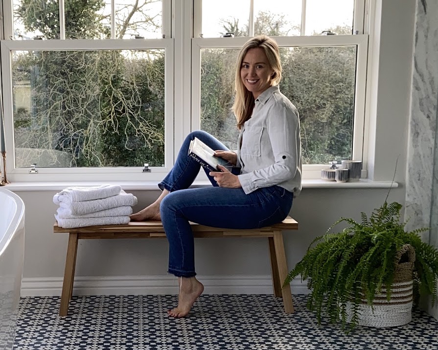
“I adore the encaustic cement tiles on the floor which I sourced from Best Tile. I feel they create a great base for the overall look of the room. I just love the pattern and their colour, and they really formed the base of the design,” Ruth explains.

“The arabesque wall tiles in the shower (from Tile Style) complement the Moroccan-style floor tiles, but I felt that they were still simple and elegant, and didn’t take from the pattern of the floor. I really wanted to avoid using any tile trims in this bathroom,” she adds, “so the Carrara marble panels, from Miller Brothers Stone, conceal the edges of the wall tiles while adding another texture to the scheme.
“By moving the shower heads to the back wall, we now have a view out when we shower, rather than just looking into the corner.
“The bath is one of the only items we retained in the house when we renovated (we did change the brassware though and they are from Samual Heath, which we sourced through Ideal Bathrooms).
What’s more, Ruth says, “The Jim Lawrence pendants over the bath and the wall lights over the vanity give off a lovely soft glow at night, taking the room from just another bathroom to a very relaxing room you want to spend time in.”

As for the vanity unit, Ruth says, “I really struggled to find [one] that worked in this room, so I designed this one and had it made by a joiner. It’s painted in Hicks Blue by the Little Green Paint Company and the pull handles I found in Armac Martin. The vanity mirrors are again from Jim Lawrence.

“The lovely timber bench that I’m awkwardly perched on is from Ikea,” Ruth says. “I just walked passed it one day and thought the raw timber look would work well under the window. It also works well as a place to store clean towels (and children who aren’t big on giving their parents privacy!)

“My advice for people who are designing their bathroom would be: don’t be afraid to use colour or pattern in tiles. Often people think if you move from the square or rectangular plain tiles that they’ll date too quickly. The thing is, everything dates at some point, especially when you play it too safe. So just add the tiles you love and pair them with a simpler tile so as not to overpower the space. And remember, if you love them, what does it matter?
See more of Ruth’s interior design expertise on Instagram at @house_of_goose_studio, or by visiting her blog at houseofgoosestudio.ie.
Photos: Ruth McGahey
Read more: My Favourite Room: ‘It’s a bit of anything and everything – but it works for us’
Read more: My Favourite Room: ‘It took me 3 years to find this painting’
Read more: Niamh O’Sullivan shares a glimpse inside her home office in Co Kildare


