By Megan Burns
26th Dec 2019
26th Dec 2019
Here at IMAGE, we’re lucky enough to get to chat with interiors designers and experts on the regular, picking up some great tips along the way. However, it’s easy to forget these words of wisdom, so we’ve collected some of the best interiors advice we’ve been given this year.
Key pieces
If your budget is really tight, make sure your floors are right. “They’re not something you’re going to be able to change again. Other key pieces are your sofa, bed, table and chairs and lighting. Getting the lighting is right is essential. If you’ve got all these lovely pieces of furniture and just a bare bulb hanging in the room it can make the overall effect quite cold. Paint is always your friend – easy to change, and not a huge commitment.” Aoife Rhattigan, Restless Design.
Wallpaper
When choosing a wallpaper, always consider the style of your room. “It’s important to understand the different atmosphere your room can convey depending on the wallpaper. If you prefer to go casual then floral designs are a must, they give the room an organic ambience and a relaxed feel. For a contemporary feel then consider bold geometrics, and high gloss or metallic accents can create a dramatic feel. Or, if you are heading down the traditional route, be sure to stick to intricate detailing and stripes, which looks chic alongside traditional furnishings. Always remember to be consistent and choose a pattern that works best with your bricks and mortar.” Vanessa Arbuthnott Fabric and print designer.

Kitchen planning
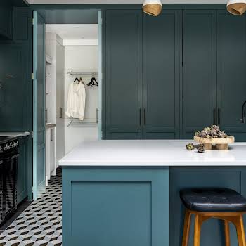
When planning a kitchen, you’ll come across lots of new trends. “Be careful about introducing too many bang-up-to-date looks in a big way, as you could quickly tire of them. A better idea is to select a plain design, then accessorise with the latest metal lighting and on-trend handles, say, as these are cost-effective and relatively easy to change.” Denise O’Connor, Interior Designer at Optimise Design.
Entrance area
If you have kids, the entrance area in any house often becomes a dumping ground for coats, dirty boots and outdoor gear. “This is where more clever storage can make a world of difference. Hang hooks for coats to save space and keep them off the floor. For younger kids, keep hooks at reachable heights. Anthropologie and Rockett St George stock lots of cute versions with initials and animal heads. For shoe storage, Ikea has plenty of practical options or look on Etsy for more creative solutions.” Sara Thompson of Thompson Clarke Interiors
Memories
Tap into your own memories. “Too often people feel they are going to be judged if they pick the wrong colour. Creating a home is not just about picking paint colours. When people say that what they want is a lilac colour in the bedroom, it’s usually not just a colour for them. There is a very specific association with it; they have seen something, or they have been somewhere. What I love is when that story is much more complicated than just, ‘Oh well, I saw something in a magazine’. What I love, is when they say ‘Well I was on holiday in here and I saw a lavender field’ or ‘I remember my granny’s eyes were this colour’. These things are so much more about the romanticism and the storytelling of who they are. This is the starting points for the way they decorate, and that’s what a home should be.” Laurence Llewelyn-Bowen

Photograph
If you’re unsure about a space, take a photograph. “It might sound funny, but if something is bothering me, I’ll look at it through a photograph and find that I can read it much more objectively and find a good balance.” Helen Cody, designer
Children’s bedrooms
For children’s bedrooms, it’s important to remember that the space should be flexible enough grow with them. “Consider a minimalist aesthetic, and add personality with small accessories. That way, you can swap things in and out as your children mature.” Aoife Porter
Lighting is key
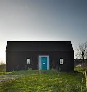
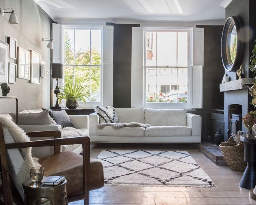
For dark walls, lighting is key. This is true for any space, but even more important when introducing dark colours to your walls. The first thing Jane Rockett, co-founder of Rockett St George did when she bought her cottage was maximise the natural light by stripping out the partition walls on the ground floor and open up the top floor to the rafters. She also added a glass extension to the dining room, allowing daylight to stream through the space. This means that while the black walls create drama, the room does not feel dark.

Rethink tradition
Rethink traditional advice. “You may have heard of the kitchen ‘work triangle’. This is a traditional ergonomic concept that connects three key working areas in the kitchen – the sink, the fridge and the cooker, the idea being that they form a triangle for ease of access. I find it more useful to make a triangle of the food preparation area and the sink and cooker. This works well if you have a stand-alone island unit or a peninsula (a unit that is attached to the wall), especially if it means you can chat to people opposite you while you work. Have a think about how you move around your current kitchen, what works for you and what doesn’t.” Fiona McPhillips, author
Bigger is not always better
Bigger is not always better. “If you’re renovating, before deciding to open up all the rooms at garden level or to extend into the garden, consider your options. Sometimes, small alterations to improve the daylight and sunlight can make for a more practical and low-key solution.” Jillian Bolger
Featured image: Rockett St George
Read more: Take a peek inside the 12 best houses built across the world this year
Read more: The gifts to get a first-time homeowner (that they’ll actually love)
Read more: Planning a dinner party? Tips for hosting on a budget


