By Megan Burns
17th Jul 2020
17th Jul 2020
The Mont on Merrion Square has been given a whole new look by Dublin-based interior architecture firm 21Spaces, and there’s loads of great ideas to take inspiration from.
The Mont hotel, formerly known as The Mont Clare Hotel on Merrion Square has been beautifully redesigned by 21Spaces. This gorgeous space would not only be a great place to stay, but there’s also so much design inspiration to be found in its rooms. Here are just some of the ideas we’re keeping in mind for our next interiors project.
Bring the outside in

With Merrion Square right on the doorstep of the hotel, 21Spaces decided to extend its influence into the entrance, prolonging that sense of greenery and nature just that little bit further.
The entrance and reception of the hotel combine materials that echo the square, such as concrete and wood, as well as generous planting, so rather than abrupt contrast between indoor and outdoor, the two spaces flow easily.
Old and new can sit side by side

21Spaces wanted to incorporate the history of the Georgian building into their design, and they have done so seamlessly. Details like the sash windows in this bedroom are unmistakably Georgian in style, yet the grey shade of the shutters helps them to fit in with the contemporary design of the rest of the room.
Similarly, the picture rail is a nice nod to the building’s history, but hanging modern abstract prints from it brings it right up to date. Painting it in a contrasting colour to the walls also makes it feel like a design statement rather than an antiquated feature.
Combining textures is a subtle way to make a statement

Lots of bold colour might not feel right in your home, but this reception space shows that combining contrasting textures can be just as interesting.
The juxtaposition of the smooth, shiny metallic units with the speckled terrazzo counter and the rough exposed brick creates a feeling of depth and tactility. Although you may choose different surfaces, this is something that’s easy to recreate in your own home.
Murals aren’t just for exterior walls

We often admire large-scale paintings outdoors, but who’s to say that’s the only place they can be?
This mural by artist Margarida Fleming adds life and colour, and has more impact from afar than any smaller, framed artwork could. People have been getting creative with their walls in lockdown, and this shows that there’s no reason why a wall can’t be turned into art.
Go bold with tiles

These gorgeous subway tiles in both orange and dark red show the impact even a small tiled area can have in an otherwise neutral space.
We love the slightly irregular colour of the chosen tiles: along with their high-shine surface they prevent the walls from looking flat. This is also a great example of how the same tile shape can be laid in multiple patterns, to give a different feel.
Great craft is timeless

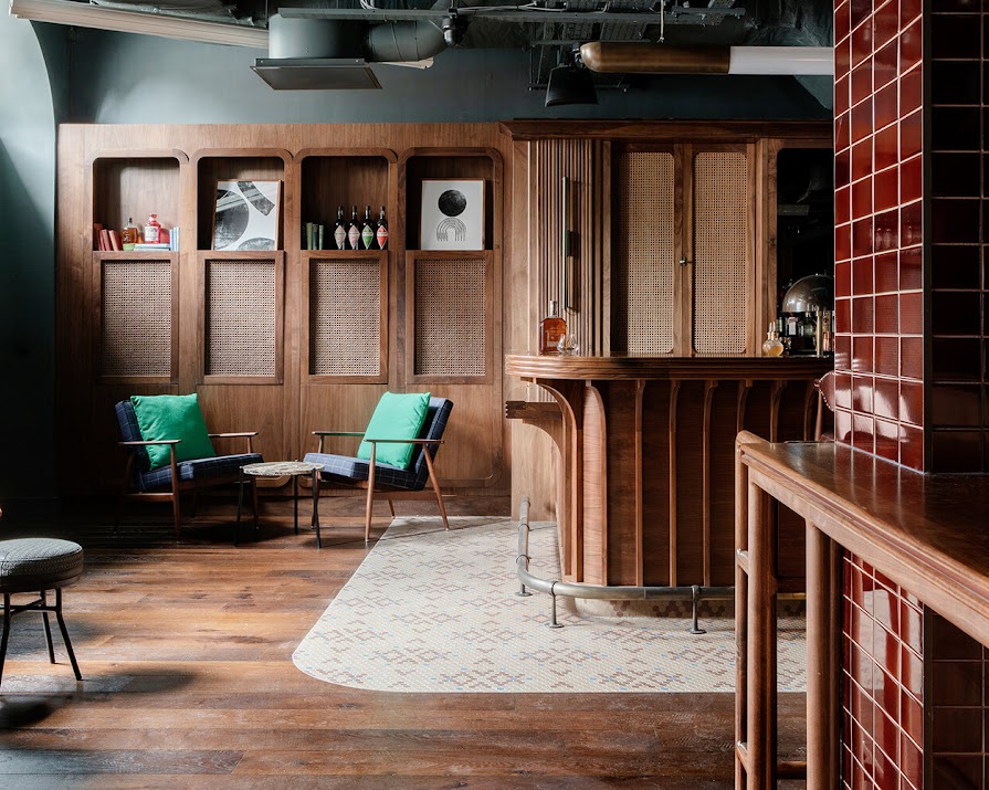
Throughout the hotel, 21Spaces designed bespoke joinery and furniture tailored exactly to the space, and this attention to detail means that these pieces will sit perfectly in their surroundings for years to come, no matter what trends come and go.
This gorgeous bar and panelling with its soft curves and textured rattan details show the result of such careful design. Donegal-based Mourne Textiles also supplied some of the fabrics for the space, adding a touch of Irish heritage.
Photos: Ruth Maria Murphy
Read more: Father’s Day gift ideas for design-minded dads
Read more: 3 new Irish interiors shops to check out now that lockdown is over
Read more: How to repot your house plants, and the signs that you need to


