By Lauren Heskin
21st Sep 2020
21st Sep 2020
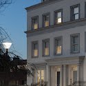
There are major pared-back Parisian vibes from this four-story Dublin home that’s been entirely redesigned by Philippa Buckley’s Studio 44.
Tasked with completely redesigning this four-story house, interior architecture and design firm Studio 44 set about curating a luxurious, laid-back design aesthetic that flows seamlessly room to room, creating a calm yet unified family home.

Philippa Buckley and her team worked on everything from floorplans to the restoration of the kitchen, bathrooms and fireplaces as well as furnishing every room. The pièce de résistance is the palatial top-floor master suite, where soaring floor-to-ceiling windows flood the large bedroom, sitting area, bespoke dressing room and ensuite with light.
Here, Philippa talks us through the project, from the initial design stages to the final result.
On creating continuity…
The brief was to design the house with a classic contemporary look that would evoke a unique sense of style and pared-back luxury. The client also wanted a design that maximised the spaces with a seamless connection from one floor to another in terms of function and design aesthetic.

To create that fluid feel, we began with a very detailed 2D floor plan, giving a holistic view as to how the spaces would work in terms of form and function. Along with that, we curated a collection of mood and lifestyle images so the client would have a clear vision of the overall feel and well as smaller details.
On incorporating technology…
Working on a project with such an abundance of natural light thanks to the large windows is always a welcome treat. However, we also had to be conscious that furniture and fabrics might fade over time thanks to the strong UV light. We put a lot of thought into the appropriate window treatments very early in the project, opting for automated blinds throughout the whole house to both protect against UV and facilitate privacy. We also used roman blinds and curtains to layer up colours and textures.

While the house was still in the renovation stage, we changed the electrics to incorporate REKO lighting, allowing us to centralise control of lights, TVs, security and window blinds on to one remote device.
On the colour palette…
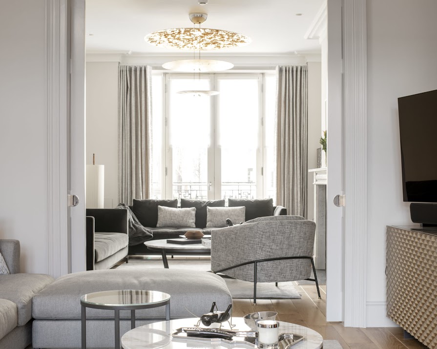
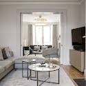
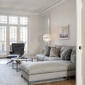
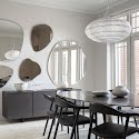
In keeping with the client’s brief, we sought to incorporate a neutral background in terms of the paint palette with carefully considered furniture and lighting pieces to provide a timeless environment for the family. The muted tones increase the feeling of spaciousness and light throughout, complemented by materials of brass, marble, wood and fabrics, which add texture.

Each room had its own furniture and fabrics chosen to enhance the space but also ensure that they flowed from one to another to create a uniform aesthetic. The final piece of the jigsaw was the artwork, which was chosen to not only add colour but also to enhance each zone.

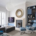
The only place we deviated slightly was in the TV room, where the children and their friends hang out. I wanted to create a more youthful and fun aspect here and Farrow & Ball’s Stiffkey Blue provided the right injection of colour, sitting perfectly beside the soft leather of the Marelli chair and footstool. We then incorporated the colour into our art selection for some additional hits of colour.
On the importance of lighting…
For me, lighting is one of the most important elements in interior design. It not only affects the perceived size of a room but also changes the ambience, mood and how you use the space.
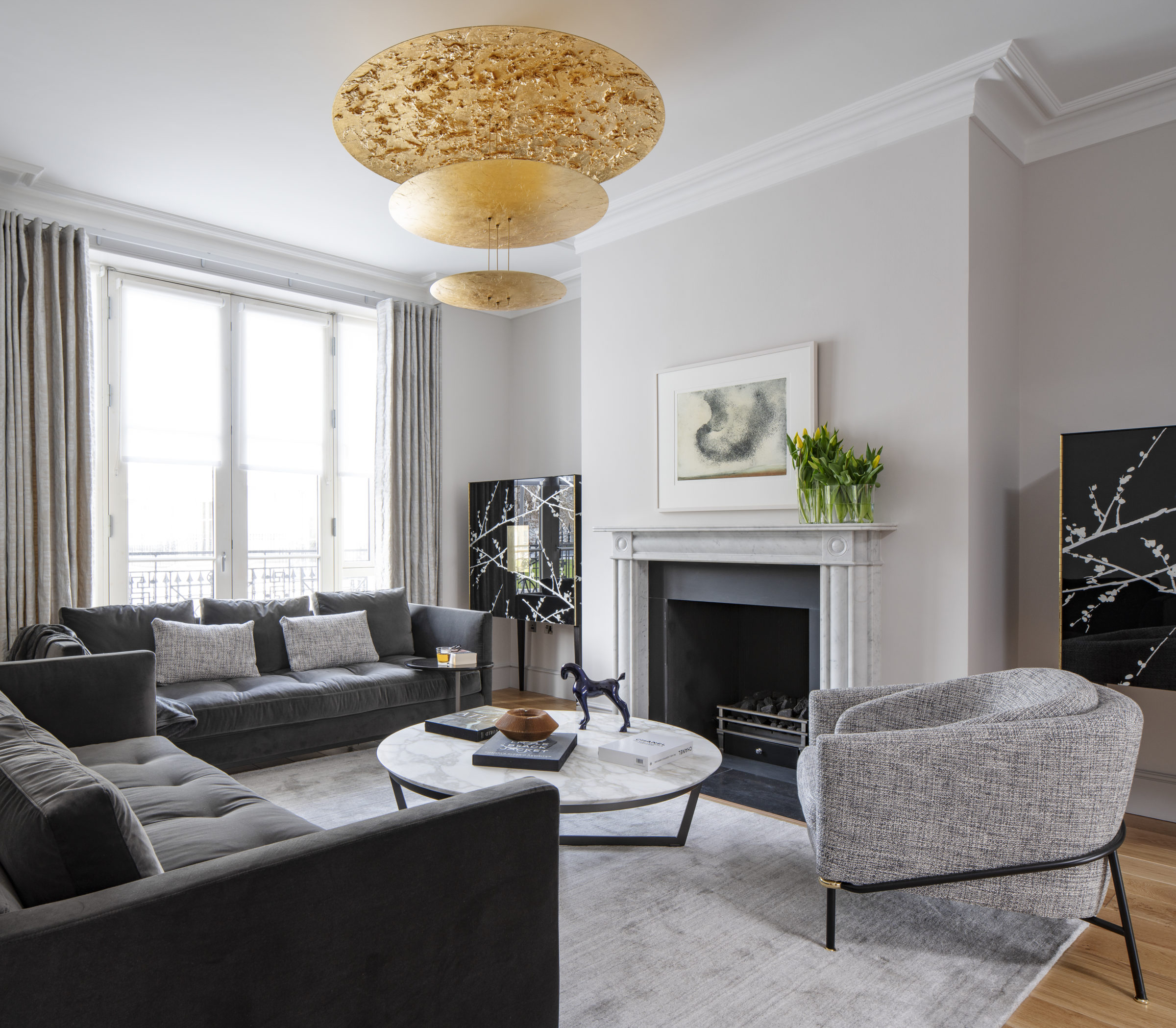
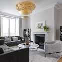
Layering up light from various sources is key. In this project, everything from central ceiling fittings and recess spotlights to floor and table lamps were chosen for both their light output and design aesthetic. The Gold Leaf light from Catellini & Smith in the main living room was chosen for its beauty and it’s a great talking piece. It’s also dimmable and having a centralised lighting system gives you control over each light fitting so you can curate the perfect ambience.

For the master bedroom, illuminating the bookshelves with LED strips means that this soft light can be on in the background when the rest of the lights are either off or dimmed depending on how the space is being used.
On her favourite space in the house…
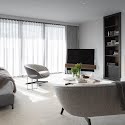
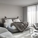
My favourite element in the house is the master suite on the top floor. The brief was to design this like a boutique hotel suite with a bespoke dressing room and ensuite and I felt it was important to select well-thought-out furniture pieces that would reflect pared-back luxury. We used shape, size and texture to create a calm sleeping zone and a separate seating area where the client can work or watch TV.

All the furniture is from one Italian designer so we could coordinate the aesthetic and I designed the bespoke joinery either side of the chimney breast, which complements the wood finish of the side table.
It’s really not hard to fall in love with this light-filled room. It evokes a deep sense of quiet, calm luxury as soon as you enter, with beautiful furniture pieces and fabrics chosen for warmth and texture.
All imagery by Donal Murphy
Read more: A fitted kitchen isn’t your only option: Here’s why freestanding units are a good idea
Read more: This beautifully restored Victorian home in Monkstown is on the market for €2.695 million
Read more: My Favourite Room: ‘It took me 3 years to find this painting’

