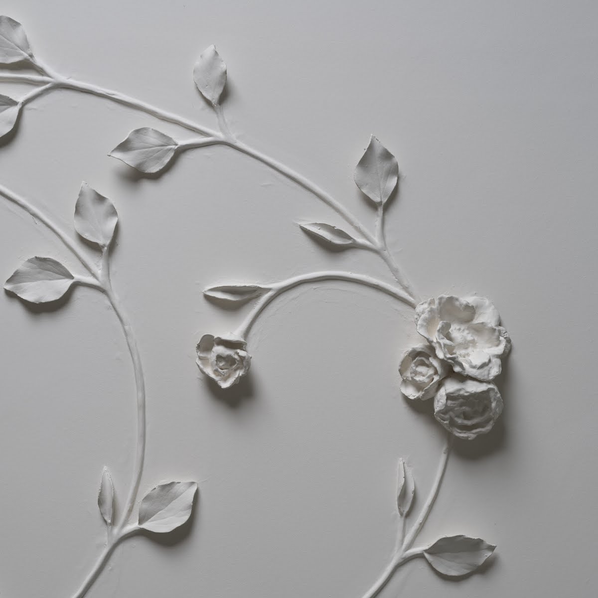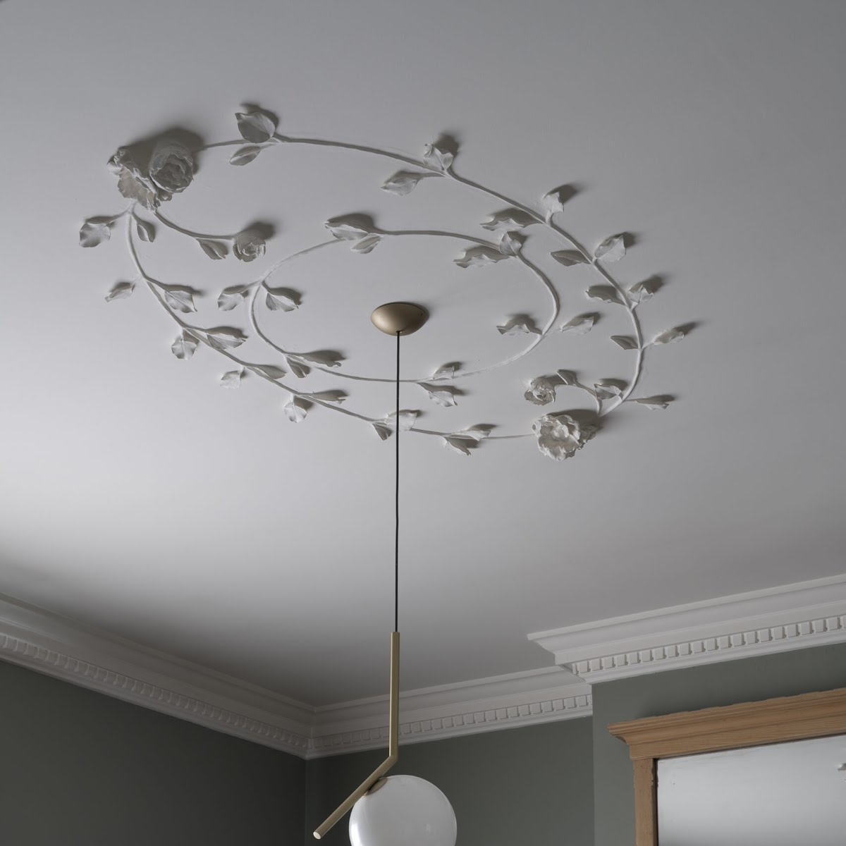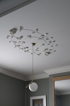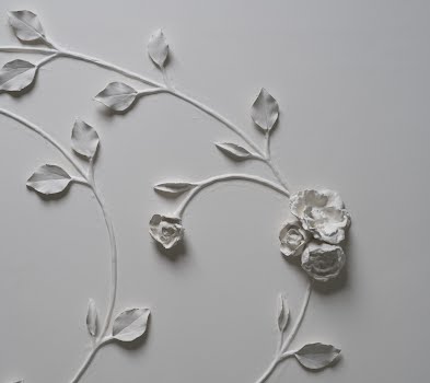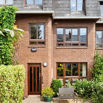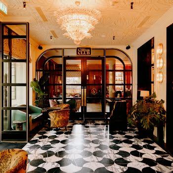
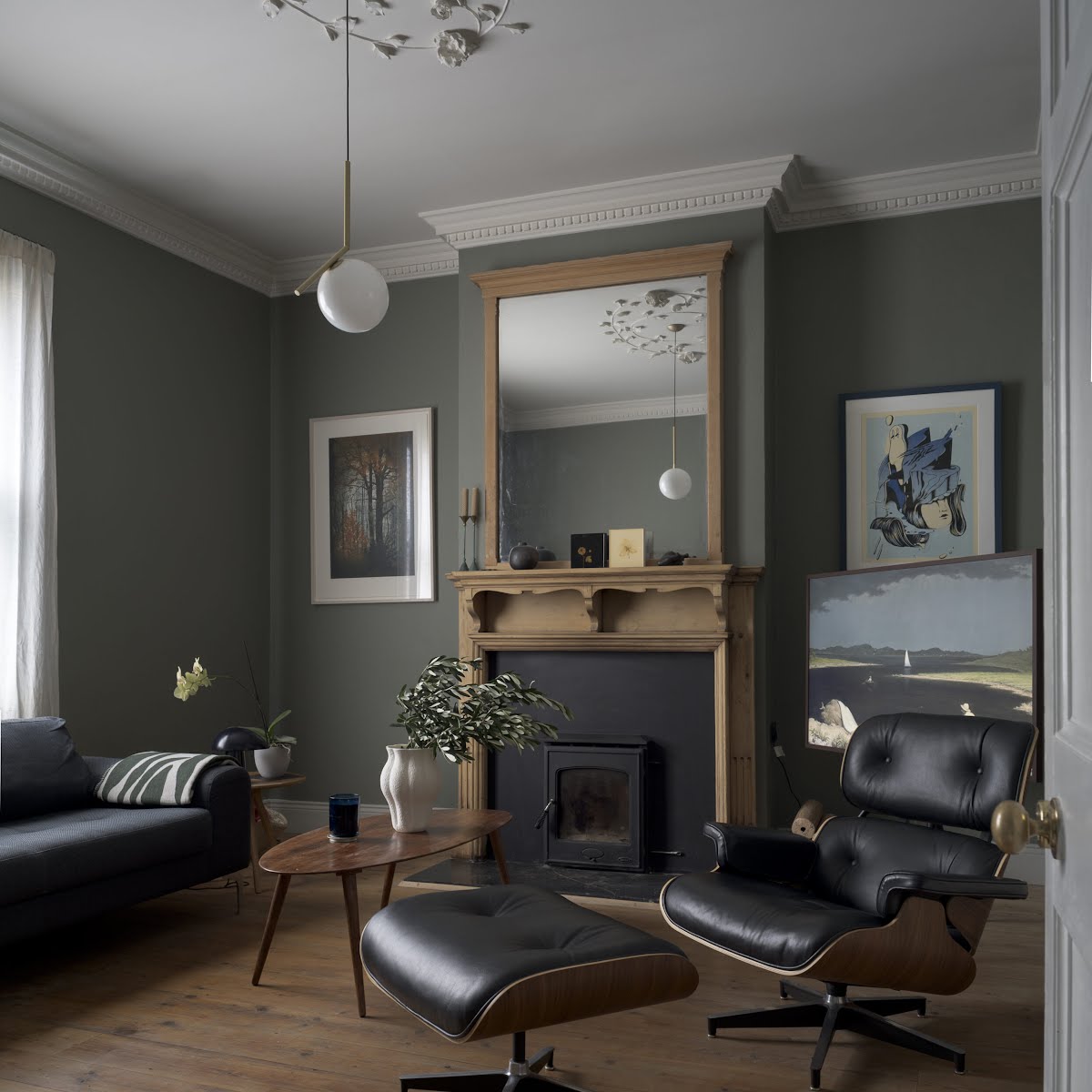
A beautiful plaster ceiling rose is a highlight of this restored Victorian cottage in Dublin
Its owners have restored original details, as well as adding new ones that feel true to the character of this home, whilst also bringing it up to date.
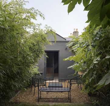
A charming 1870s cottage, this Victorian Dublin home was in poor condition when its owners Laura and Kevin bought it. “Before we began, the house felt trapped in time – a series of small, dark rooms and a cramped kitchen that barely had space,” they explain. “Outdated wiring and plumbing added to the list of woes, and the lack of proper insulation meant the house was cold, draughty and difficult to heat. Essentially, it was a beautiful old house struggling to meet the demands of modern living.”
Its issues were manifold, including damp, a layout that felt disconnected, poor insulation, and original features being covered up. “We were determined to bring back some of that Victorian charm.”
The couple explain that “the cottage needed an extensive overhaul to address these underlying issues and create a comfortable and functional home for the 21st century, while respecting the special interest and character of the original house.”
Because of the extent of the issues, the home required a significant renovation. To address the damp, modern dry-lining walls were removed, along with layers of non-breathable plaster. Exposing the original brickwork allowed the walls to breathe, whilst also allowing them to identify additional areas of decay and deterioration.
Some bricks were cut out and replaced to ensure the safeguarding of the masonry walls. The brick walls were then covered using a traditional insulated lime plaster. The plumbing and electrics were upgraded, insulation was added.
“We wanted to introduce a consistent and coherent design intent that respects the character and proportions of the original house, while highlighting embracing the modern interventions which supplement the original house,” the couple explain.
Their approach to the design was simple but considered. “We believe that a home should be both beautiful and functional, a place where every element has a purpose and every corner holds a surprise. We aimed to maximise every inch of space, incorporating clever storage solutions and unexpected design elements.
“Perhaps our favourite aspect of the design is how we seamlessly integrated old and new elements, utilising a reduced material palette that aims to tie together the disparate spaces of the house.”
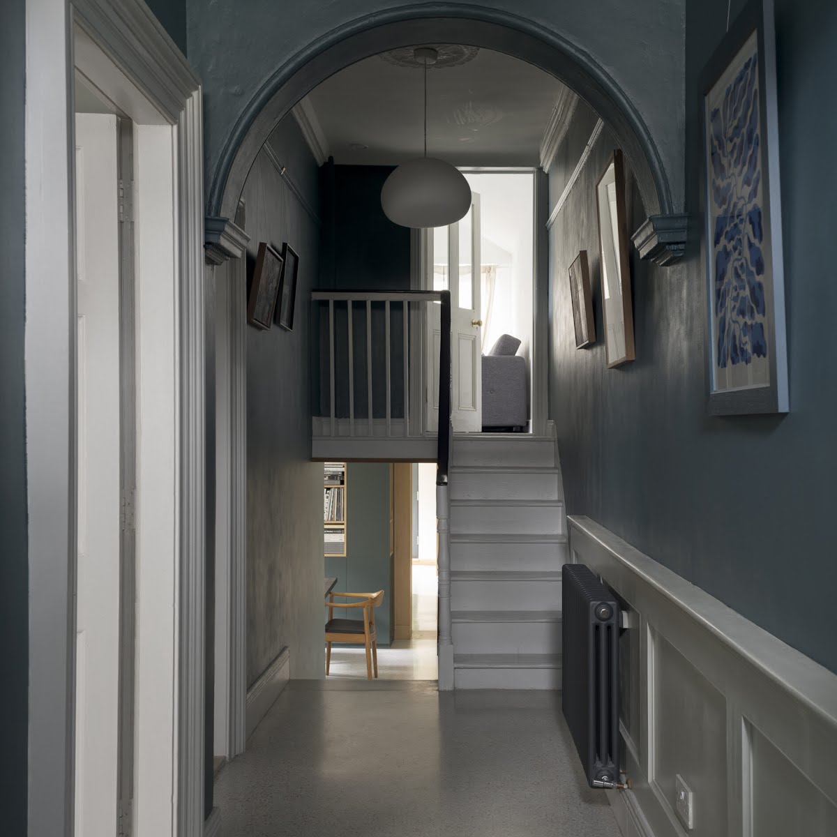
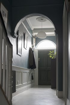
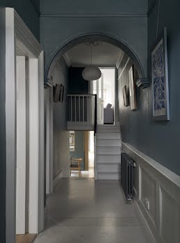
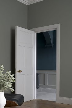
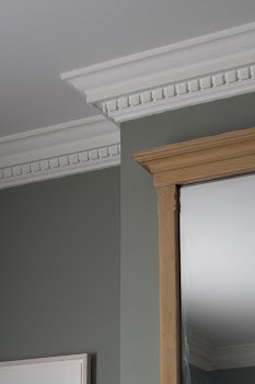
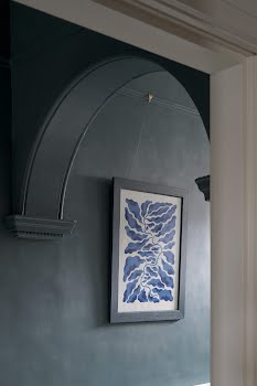
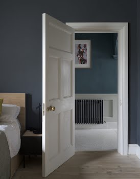
Much effort was made to restore the original character of the house. Antique doors and pitch pine flooring were restored, and they reinstated decorative cornicing, while the more modern parts of the house were given bespoke built-in storage and decorative wall panelling, creating a space that feels both true to its history and yet perfect for modern living.
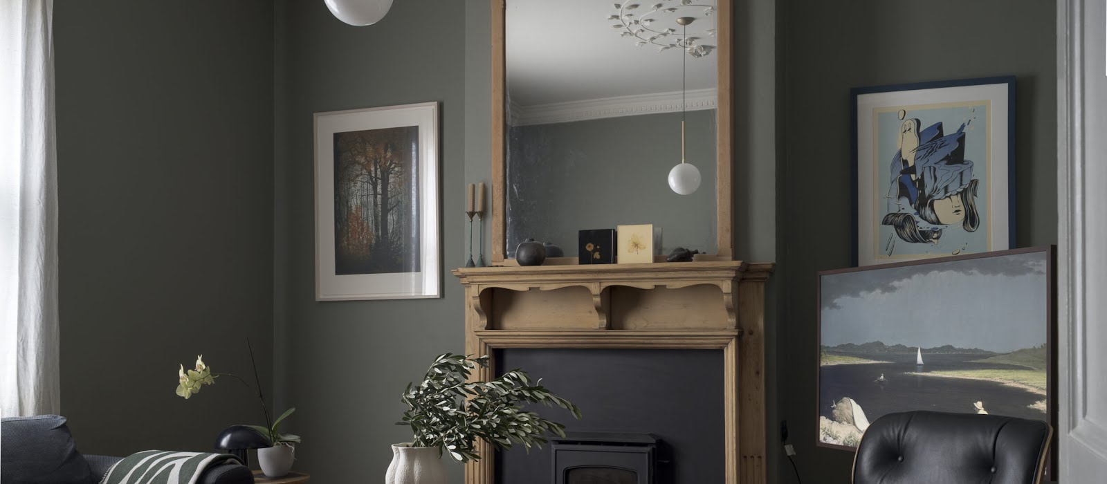
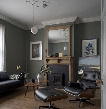
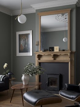
A perfect example of this is the drawing room, where the existing tongue and groove floorboards were replaced with a solid salvaged pitch pine flooring.
The original carved wooden fireplace was given a new inset stove, and the couple chose to add a hand-modelled plasterwork ceiling rose, a unique creation by craftsman Paul Griffin of Griffin Plastering. “Paul also added decorative cornice throughout the room, the proportions of which were the subject of much debate to ensure the eligibility of the ceiling rose was not diminished or overwhelmed,” the couple explain. The walls are finished in Sage Green by Little Greene.
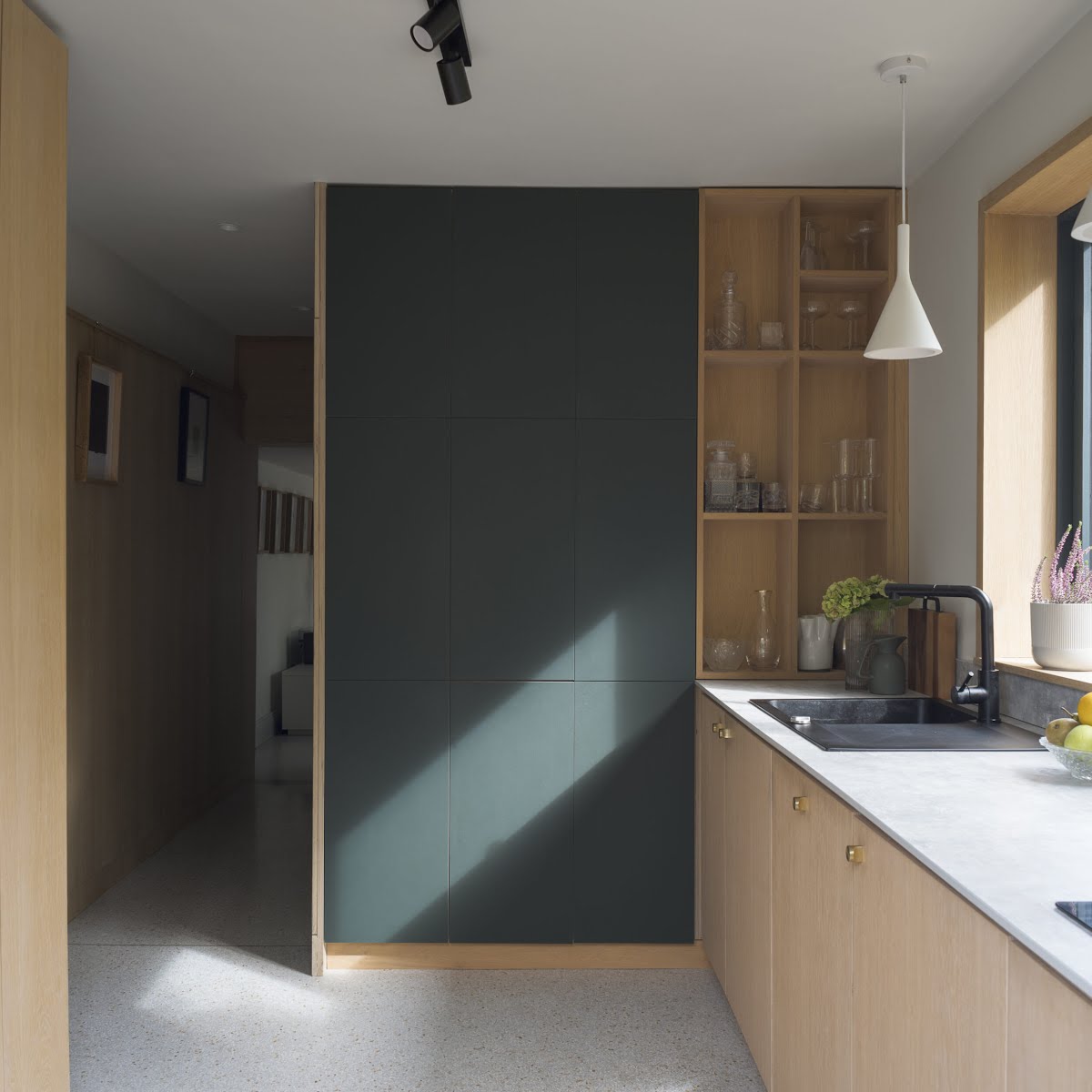
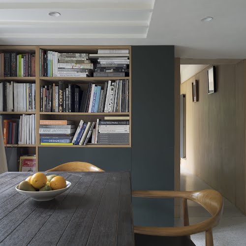
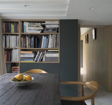
In the dining room, storage is used to great effect. “Tthe dining room cabinets and bookshelves were custom built and clad in dark-green furniture grade linoleum,” Kevin and Laura explain. “This custom-made storage system offers a myriad of cupboards and bookshelves, catering to every need and keeping the space clutter-free. Practicality meets elegance in this seamless blend of form and function.”
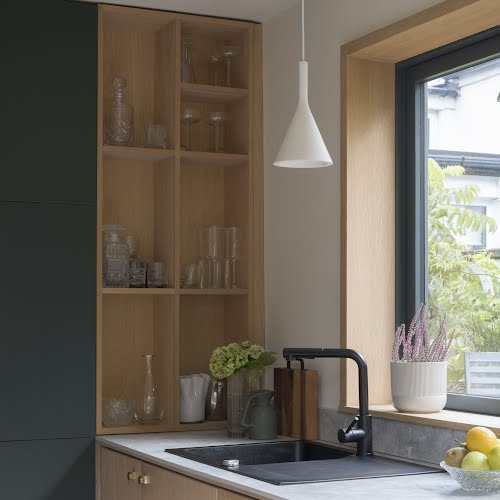
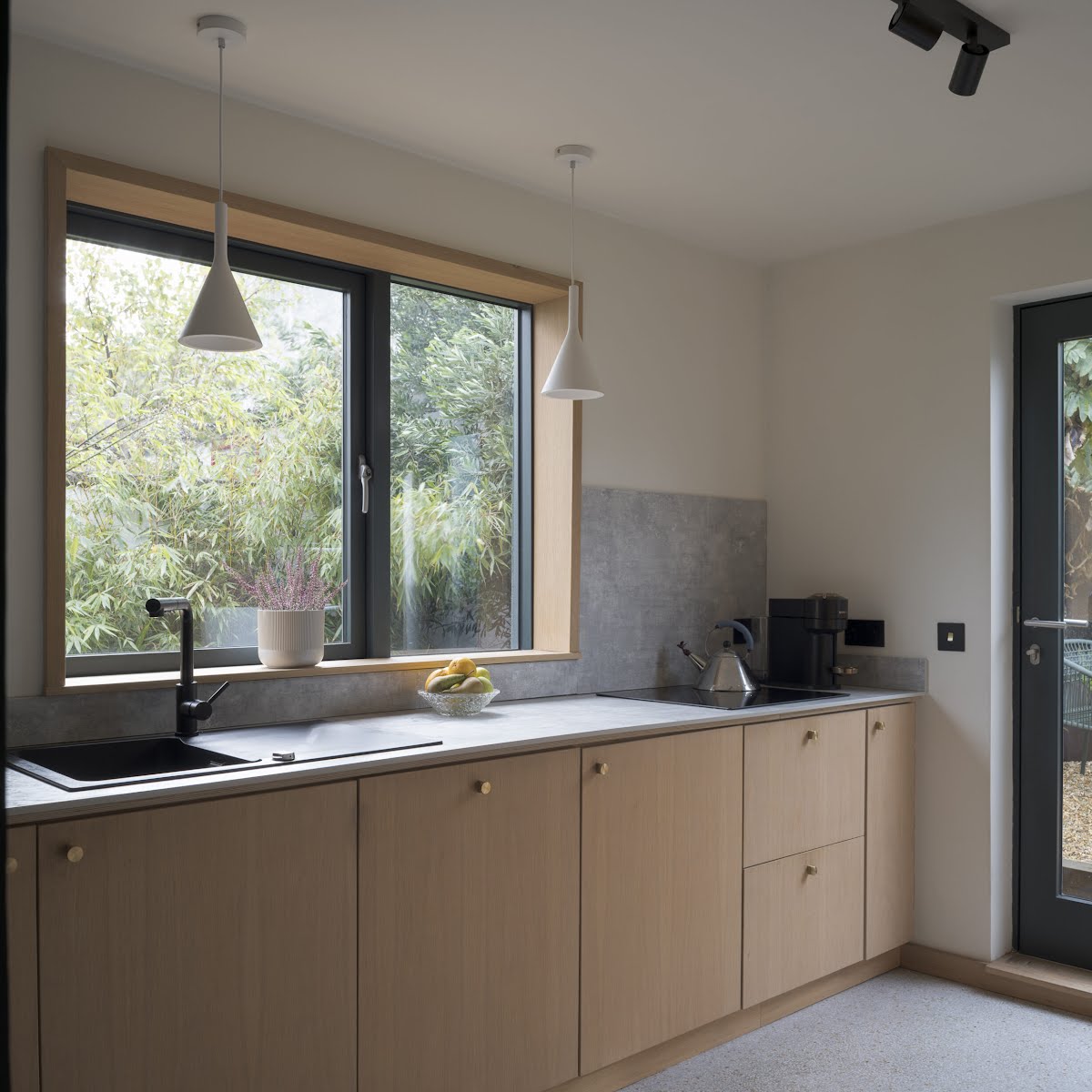
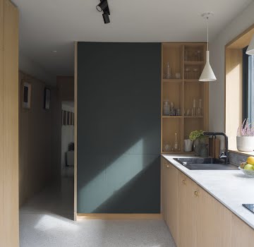
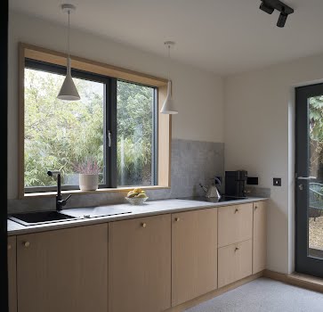
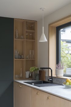
This is continued in the kitchen, a sleek yet practical space. “Our kitchen is a testament to our commitment to thoughtful design. By carefully considering every detail, from the oak-lined window surrounds to the integrated appliances, we have created a space, which we feel is both visually stunning and highly functional. It’s a place where we love to cook, gather, and create memories.”
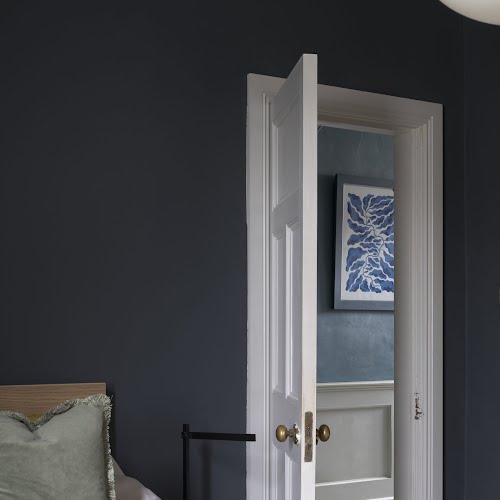
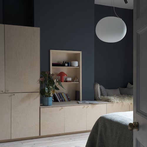
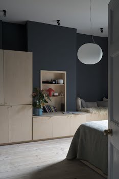
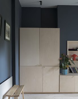
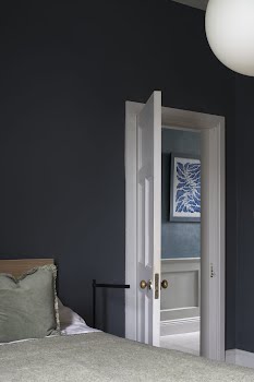
In the main bedroom, the couple “wanted the space to exude tranquillity and sophistication, so we have painted walls in a deep navy hue called Ben Bulben by Colortrend, establishing a calming ambiance, providing the perfect backdrop for restful nights. The rich colour is beautifully offset by the cool and rustic charm of pale reclaimed solid Douglas fir floors.”
They designed bespoke birch-plywood cabinetry to create storage without disrupting the calm mood of the room.
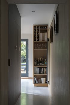
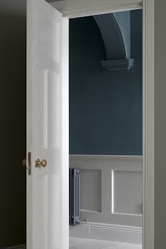
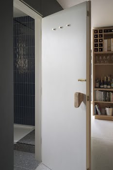
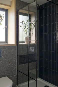
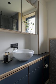
In the wall of storage in the dining room is a hidden door that leads to the bathroom. “We chose cool grey tones of the floor tiling and deep blue metro tiles in the bathroom to create a calming atmosphere, a perfect retreat from the hustle and bustle of daily life. The Crittal-style shower doors add built-in cabinets, contrasting beautifully with the softer elements of the design.”
It’s a home that proves the power of respecting the history of a home, combined with considered design.
Photography: Donal Murphy

