An Irish colour expert recommends three schemes for your most used rooms
By Megan Burns
12th Feb 2024
12th Feb 2024
Want to refresh a room but don’t know where to start? We asked a colour expert for some ideas that will suit our tricky Irish light and look great this season and beyond.
Adding a new coat of paint is often recommended as an easy way to change up a room, but what’s not so easy is choosing what colour to go for.
Presented with endless choices on colour cards, how do you know what will actually suit your home, or what’s better off left in the catalogue? We’ve turned to Dervla Farrell, colour expert at Colourtrend for some advice.
First of all, she has some general tips when it comes to choosing colour. “Due to Irish light being a little duller and blue toned, a lot of people lean towards bright shades in an attempt to fight the darkness,” she says.
However, there’s no need to stick to bright whites and creams. “One of my biggest pieces of advice for Irish home owners is don’t be afraid of colour, this can often be a more effective way to bring life to your home then just leaning towards the safe, lighter, neutrals.”

If you’re nervous about incorporating strong colour, you don’t have to put it on the wall, either. “One of my personal favourite ways to bring in more colour, instead of feature walls, is to incorporate some feature woodwork,” Dervla recommends.
“Consider painting skirting, doors and architraves the same colour as your wall shade or going darker. Transform an old coffee table or dresser with a moody teal or brown toned plum.” She also suggests painting your ceiling the same shade as the walls to create cosiness, or a contrasting shade to add more colour.
If you’re still unsure about where to start, Dervla has put together three colour palettes for the kitchen, living room, and home office. Use them as a starting point to create your own schemes, go lighter or darker, or tweak them to work with your home.
Kitchen
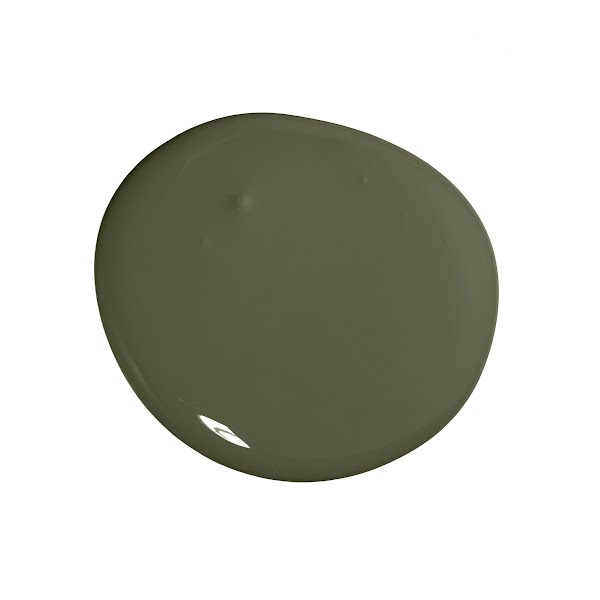
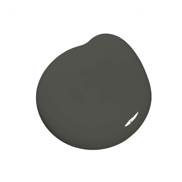
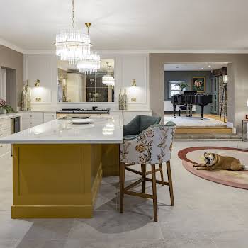
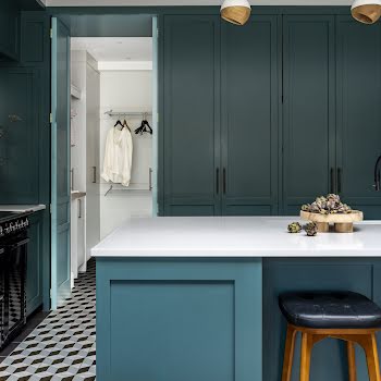
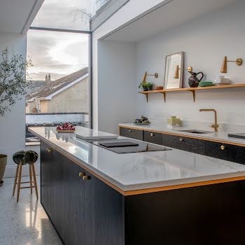
At the moment we are seeing green trending for kitchens and kitchen cabinets. Green is a beautiful addition to the home creating a calm and inviting atmosphere. I’d recommend moving away from the grey greens that we’ve been seeing and move towards earthier greens like our shade Sweet Caper or for a more unique, dramatic option, our almost black bottle green Four Arches.
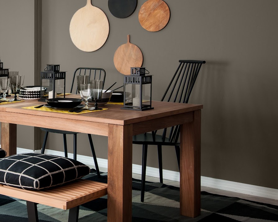
As a wall shade, I would recommend Esker Ridge, Esker Ridge is a mushroom tone that will complement your cabinets and ground the space.
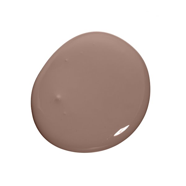
I’ve added the additional shade Chestnut Pink. Adding a feature colour into a scheme, perhaps by upcycling a dresser or bookcase, is a great way to add more colour and make a statement, while also breathing new life into a piece of furniture. Chestnut Pink is a brown toned blush shade that will add a subtle warmth to the space.
Living room
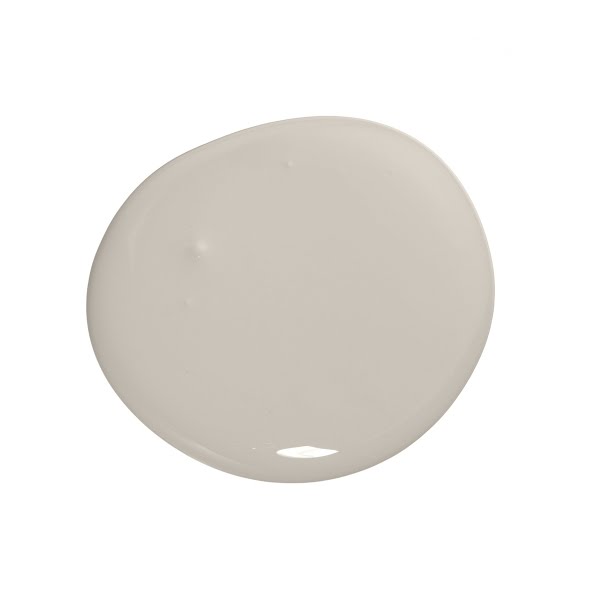
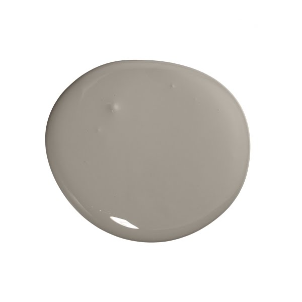
For the living room we have seen a shift from the deep navy blues to greens and greiges. For the neutral lover, I would recommend Old Bone. Old Bone is a stoney taupe with a grey undertone. It makes a subtle statement in your living room and is the perfect compromise as a neutral moody shade.
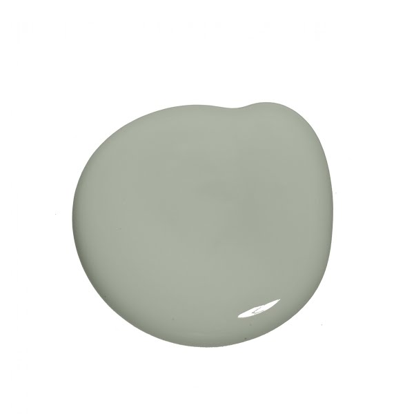
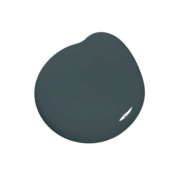
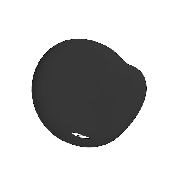
I have also included Bunratty, This blue green is perfect to keep things light while still having fun with colour. With either of these shades, I would recommend darker moodier colours as complementary tones, try Profound, a deep mature teal or Dressage, an off black.
Home office
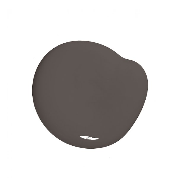
With the new-found importance of having the perfect zoom background, I’ve found home offices are a space to have fun with. For those looking for a unique and sophisticated home office shade, look no further than Pine Marten.
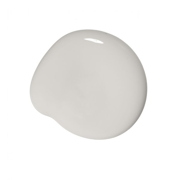
This shade is a rich and opulent deep warm brown. Paired with complementary tones like our warm light grey, Subtle, both shades will help to transform your work from home experience.
This article was originally published in February 2022


