A crumbling Rathmines house has been turned into a combined family home and workspace
By IMAGE Interiors & Living
24th Mar 2024
24th Mar 2024
Its architect owners have transformed the terraced Dublin home.
“We found ourselves perched on the middle floor between a swamp and a jungle,” grimaces architect and homeowner Douglas Carson. “The top floor had been invaded by a rampant clematis that had broken into the top windows, while the basement was awash, following a flood.”
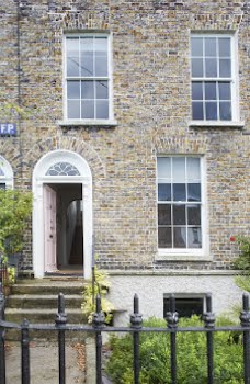
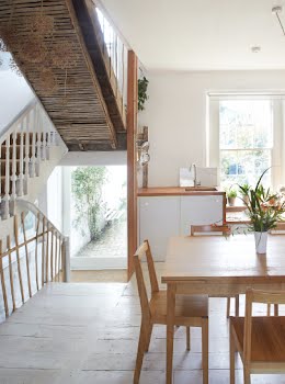
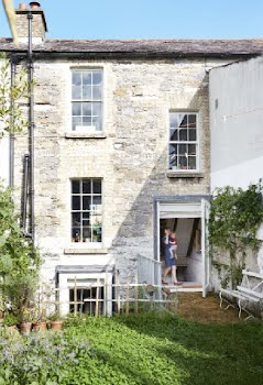
Such was the Jumanji-esque scene one week after Douglas and his wife, fellow architect Rosaleen Crushell, bought this 1840s three-storey Rathmines home in 2012. Now, from the kitchen window overlooking the garden and cricket ground beyond, thoughts of swamp living seem far away.

“We came back to Dublin after six years in London, we were renting but looking for a home: our budget wasn’t large, so we knew we would probably buy an older house to renovate, which suited us too as we wanted something we could do up to our own taste,” explains Rosaleen.
Handily, their vast experience from running their own architectural firm Carson & Crushell, Douglas’ tutoring in the UCD School of Architecture and Rosaleen’s master’s degree in architectural conservation, meant that taking on the renovation of a rather ungainly derelict house in poor repair, with a budget close to zero, didn’t faze them.

“Having been unmaintained for many years, it was in poor shape, although not as bad as it might have been, as heating from the houses on either side had at least kept the fabric of the building reasonably dry,” says Douglas.
But their glass-half-full attitude took a hit when severe rain flooded the basement by half a metre shortly after they got the keys. Costly rent prices meant that the couple had to move in as quickly as possible, so they added basic electrics, a water heater and a WC, put everything they had in storage, and camped out on that middle floor for eight months until their planning permission finally came through.

It at least gave them time to establish a vision for the house and key to the couple’s renovation plans was to make the basement accessible, both in the front and also into the large rear garden.
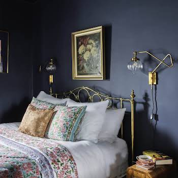
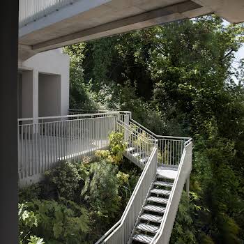
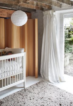
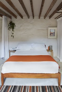
“In order to bring in plenty of daylight we decided to excavate and create courtyards, which could be filled with greenery and also function as accessible outside rooms,” says Douglas. The nursery opens onto the rear courtyard with steps leading to the garden, while the master bedroom and bathroom are to the front, bright but secluded by being down a half-storey from street level.

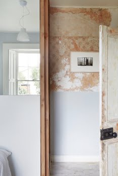
To create the log-cabin-like en suite master bathroom, they needed to build a load-bearing wall in timber and rather than plaster over it, they used it as inspiration. “We didn’t want smooth, modern plaster so instead we used dry, breathing, horizontally stacked timber that visually resembles brick and the rough, textured walls of the stone exterior,” explains Douglas.
It was built without a single nail or screw and the bath slots neatly into a space under the stone front steps. The window too was carefully considered, as light is precious in these basement rooms, and so it is shared with the bedroom by an ingenious shutter that lets light into both rooms.

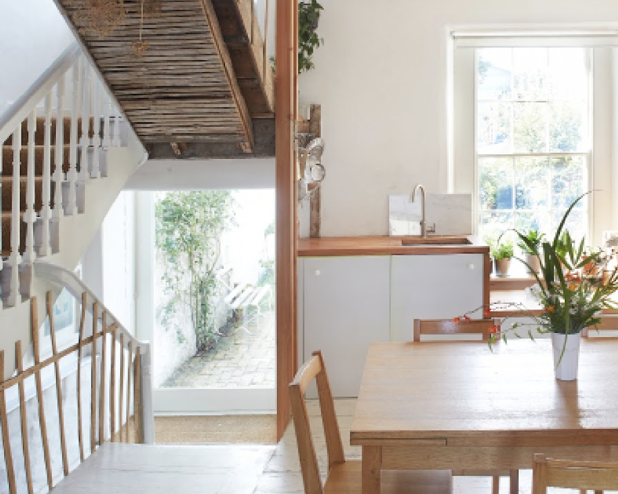
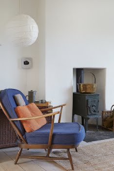
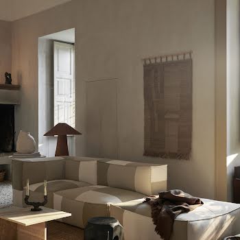
This sense of playing with the building’s original structure and materials was also carried up to the entrance level living spaces, in their thoughtful reconfiguration of the kitchen/dining room and sitting room.
“We wanted to live comfortably without compromising the best qualities of the existing structure, so it was more about removal than adding any new building, a few things taken out, a few things opened up. People often think they need an extension when they really just need to re-organise the space they already have.”
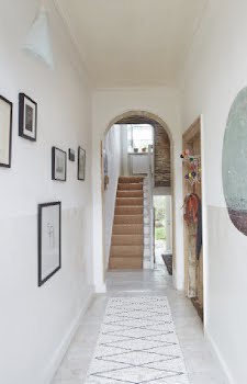
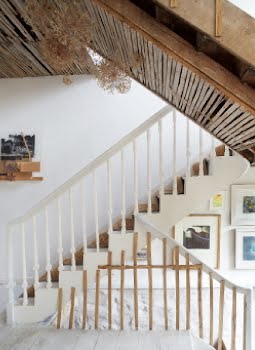
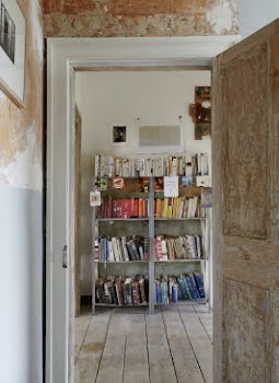
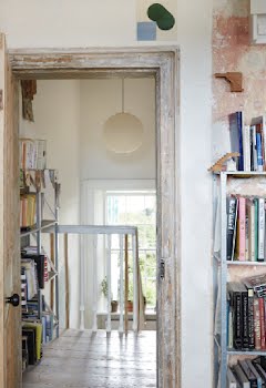
Around the staircase, areas of old, weakened plaster either fell or had to be removed and rather than plaster back over it, the couple decided to leave it exposed, partially because of the tactile, rustic texture and partly because of the tale it told of the history and structure of the house: Douglas uses the stairs to demonstrate to his architectural students how stairs were built in bygone times.

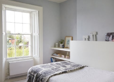
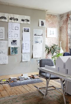
The top floor’s piano nobile is the largest and airiest and surprisingly, they opted to make this their office, with a small guest bedroom in the back. “Well, the office is where we spend most of our waking hours so we chose the room with the best light,” says Douglas. “And actually, it’s one of our favourite places to be in the house.”
This simple family home belies the architectural thought and integrity that the duo brought to it. Like all good design, it hides its complexities and difficult rebirth well, not a carnivorous vine or bulldozing rhinoceros in sight.
Photography and words: Barbara Egan
Styling: Oana Baciu
This article originally appeared in the May/June 2018 issue of IMAGE Interiors & Living.

