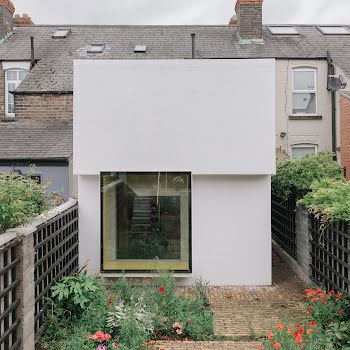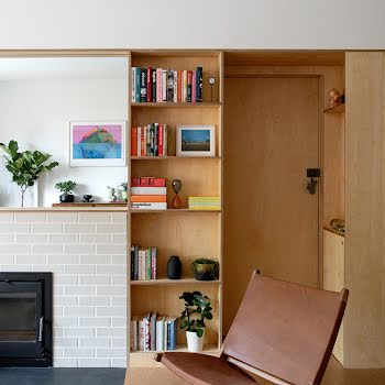
A modest extension has created a feeling of light and spaciousness in this Balbriggan semi-d
The addition is less than the size of a single parking space, yet has transformed the home by maximising light and improving its functionality.
A typical semi-detached house in a 1970s housing estate, this Balbriggan home had a layout that is found across Ireland, with a separate kitchen, dining, living room on the ground floor and two decent-sized bedrooms, a box bedroom and bathroom on the first floor. A northeast orientation at the rear meant that it felt dark there in the evenings.
Ciarán Molumby and Laura Carroll of Islander Architects explained that the owner of this home wanted to update it, and make the most of the space available, without needing to apply for planning permission, so any addition needed to be minimal.
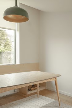
They also wanted to add a utility room and bathroom downstairs, as well as providing a space to work from home.
“Modifying or extending any existing semi-detached house requires an architect to carefully reimagine this familiar domestic layout”, Laura and Ciarán explain.

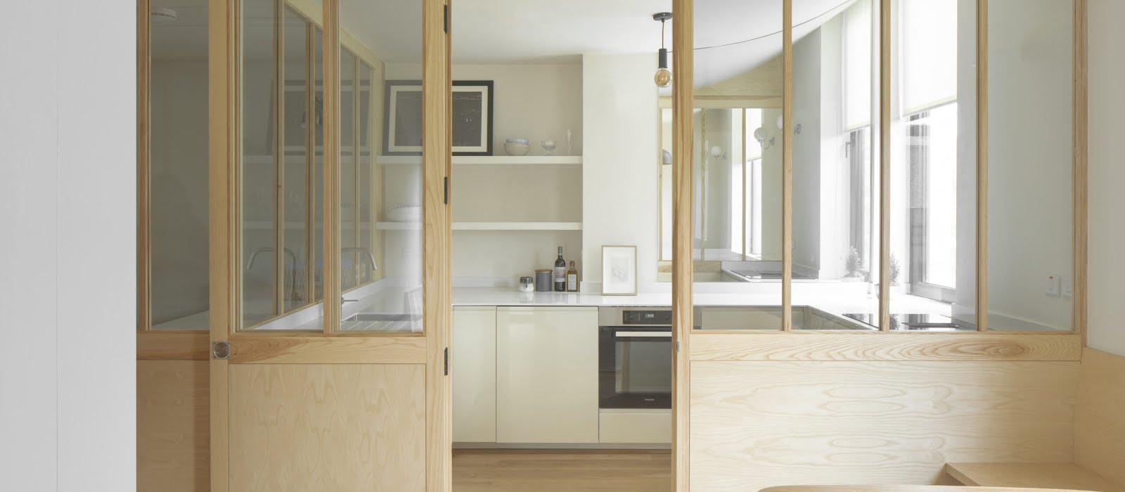
“In our initial discussions with the client, it was clear to us that the new utility room needed enough space to hang clothes to dry and iron clothes comfortably. As strange as this may sound, the utility room became the driving force for the whole design. We designed the utility room to be centrally located with generous views of the kitchen, dining room and rear garden beyond to make the ritual of doing laundry a more enjoyable and calming space for our client.”
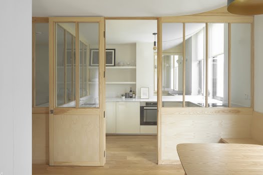
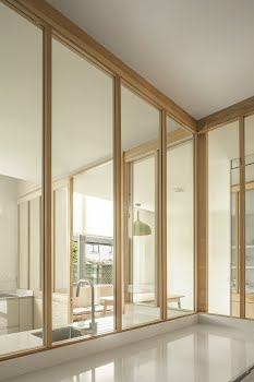
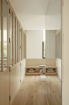
The design involved adding glazed timber screens between these spaces to physically separate them, but connect them visually, while allowing light to flow between them.
It also means, Ciarán and Laura point out, that “the mess of the kitchen can be closed off easily to allow the client to relax or entertain in the dining area”.

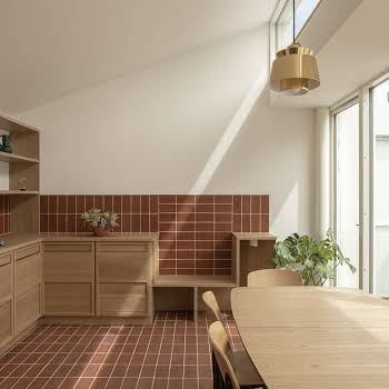
The addition required to the house to create this new layout was surprisingly small. “We essentially added the utility and bathroom to the centre of the ground floor plan and pushed the kitchen and dining area out into the garden by only 1.5m to give an additional 9 square metres in floor area. To give you an idea of the size, it’s smaller than a single parking spot.”
Although small in size, the duo still took the opportunity with the extension to create interesting features that add personality to the home.
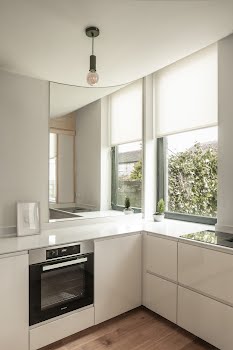
“We saw an opportunity to design a subtly curved ceiling rising high from the old house for this sliver of an extension, maximising the shallow depth and allowing the softer daylight from the northern orientation to penetrate deeper into the house,” the architects explain.
While many rear extensions incorporate large doors to the garden, an alternative approach was taken here.
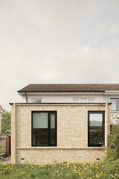
“Our client wanted to be able to focus on her work comfortably,” Laura and Ciarán say. “In this instance, we opted to shift the perspective providing discreet side access to the rear garden, and design two separate windows at eye level to direct the gaze toward the mature trees swaying beyond the interior realm.”

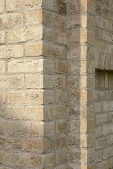
When it came to choosing materials for the project, the owner was keen to incorporate brick, which reflects the homes around it, and the home’s location close to a former brick factory.
“The bricks’ relatively small size allowed us to play with patterns in the coursing for the facade, adding tonal variety, altering perceptions of proportion and forming weathering features such as a continuous brick cill,” explain Ciarán and Laura.
“The builders were wonderful at translating our ideas from paper to the ground. In particular, the brick layers really enabled us to make this design a reality with their knowledge and passion for the task at hand.”

The result of this transformation is illustrated by an anecdote the owner shared after the project was completed.
“Our client told us a story shortly after the project was completed where one of the tradespeople was coincidentally sent to work on two houses in the same estate. At first, he visited our client to carry out his work, said nothing and left to complete the work on the neighbour’s house nearby. He came back at the end of the day to tell her he had realised the difference between the two houses and wanted to say how impressed he was with the new layout.
“Perhaps this story goes some way to explaining that these subtle design interventions can seem so obvious at first glance but they go a long way to unlocking the latent potential within such a familiar house type.”
Photography: Peter Molloy
Main Contractor: Kiwi Construction
Ash Timber Screens: Michael Black’s Joinery
Brick: Outhaus
Windows & Doors: The Folding Door Company
Kitchen & utility cabinetry: Ikea
Countertops: Granite & Marble Crafts
Tiles: Fieaga Living
Timber flooring: Scott’s Flooring
This article was originally published in November 2023.


