This film director’s Dublin apartment has gone from bland to bursting with California cool
Interior architect Clíona Dempsey thought carefully about the needs and taste of its film director owner when putting together her design, which shows how much can be done with a limited space.
When starting work with a client, an architect will usually try to get a sense of their personal style. Pictures saved from magazines or social media can give a good idea of what they like. When your client is a film director, however, you can go a little further.
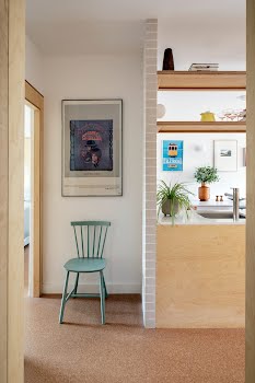
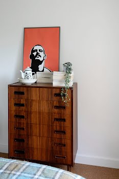
Interior architect Clíona Dempsey was chatting with John Butler early on in the process of renovating his apartment, when she says her attention was caught by a beautiful photograph on his wall. “He explained it was a still from his film Papi Chulo,” Clíona says. “He said, ‘If you want to know about my design aesthetic, that film is like a celluloid storyboard of it.’”
So Clíona sat down to watch the movie, set in Los Angeles, the embodiment of John’s taste: “That was a moment where I thought, ‘I get this guy, and I love his style.’ That was a real springboard for me.”
The task at hand was to transform a 1970s apartment near Dun Laoghaire into a more functional, stylish space. Although featureless and drab, it had great potential, thanks to a bright aspect and beautiful treetop views.
Both were certain that it could be something special. “I started working on the design before the sale had even gone through,” Clíona laughs. “We were measuring up around the previous tenants.”
John had few specific requirements of the design, simply that it shouldn’t feel cold, and should function smoothly.
“I wanted something minimal yet warm, something that would feel both earthy and clean, and reflective of the seaside location,” he says. “A designer shack in 1980s Venice Beach, two floors up!”
The result is a cohesive, considered home that flows seamlessly, while nods to John’s LA style and the building’s seventies provenance set the tone.
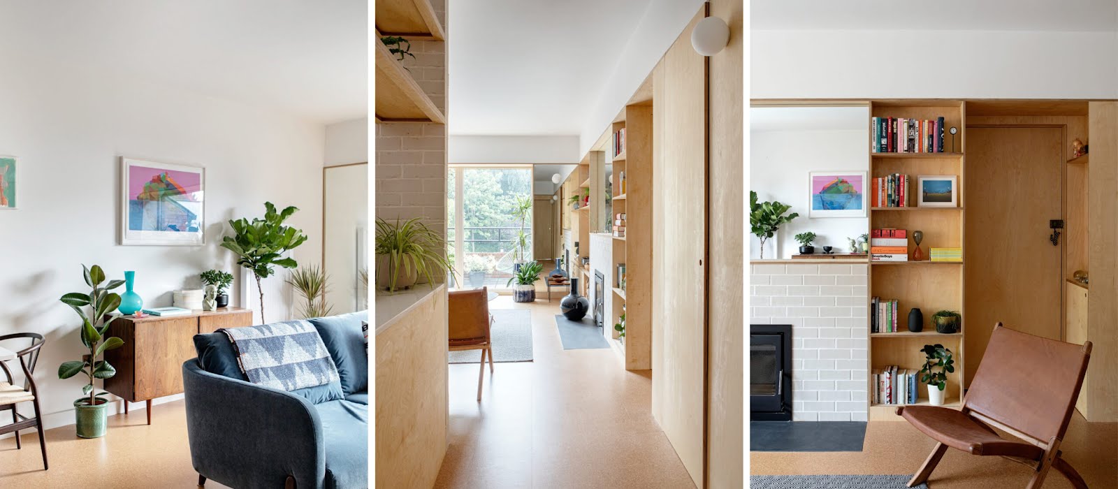
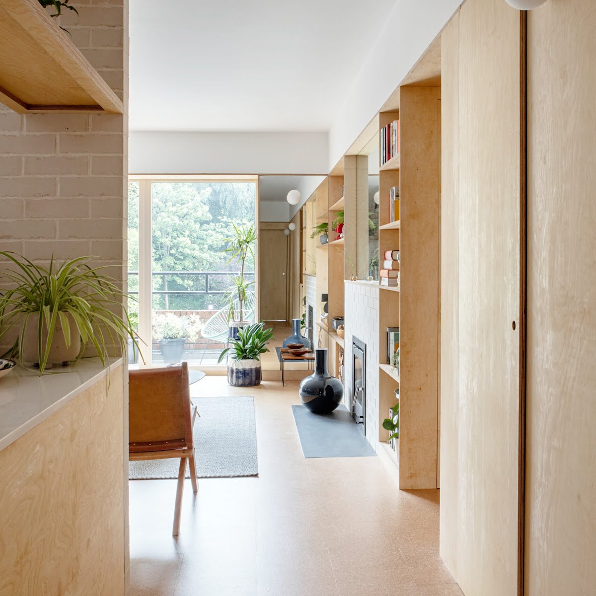
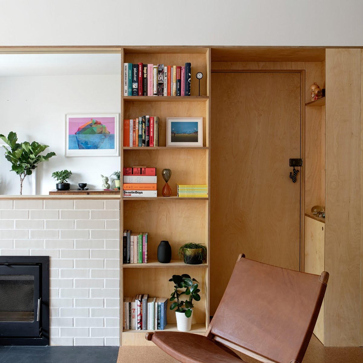
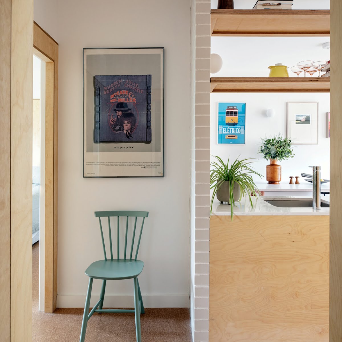
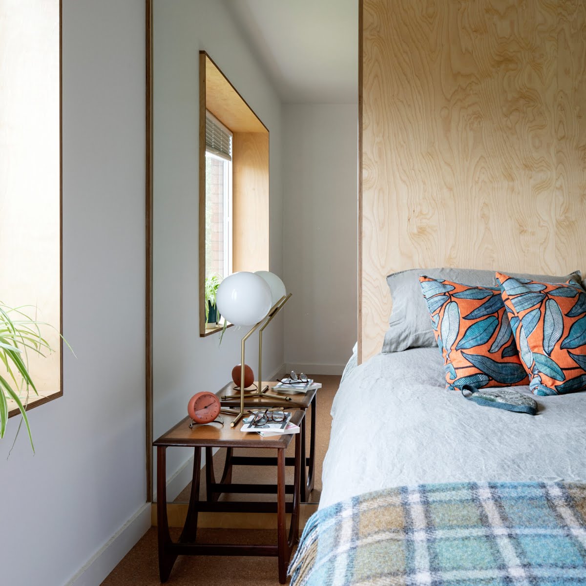
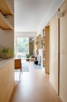
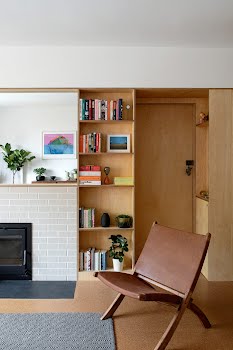
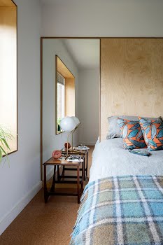
A wall of fitted birch plywood provides a clean line through the main living space. It appears to snake through the apartment like one continuous piece of furniture, as the material is used for other details like doors, panels and windowsills. The existing wall undulated because of details like the chimney breast and alcoves, so Clíona brought the whole thing out to one point to create what she calls a “working wall”.
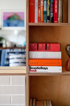
It incorporates features such as the built-in stove and log storage, open shelving, and seamless mirrors, balanced with concealed storage space for things like coats and laundry.
What Clíona also loves about this is that it creates a line akin to a picture rail, adding to the sense of height. “I wanted to follow that the whole way around the apartment. It’s the same height as the doors and windows, and it wraps around into the other rooms.”
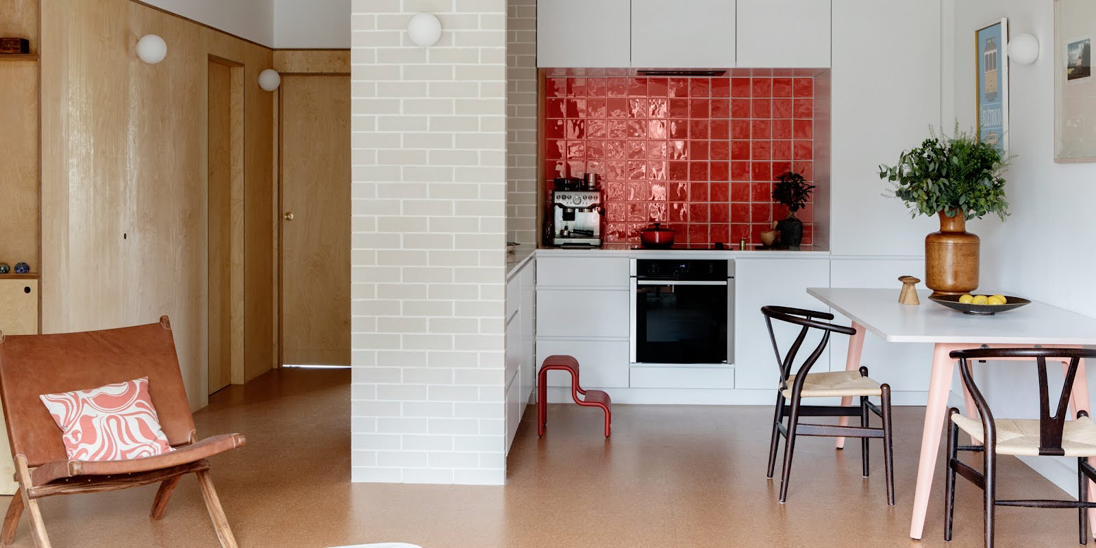
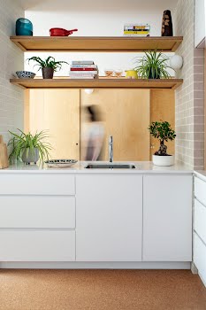
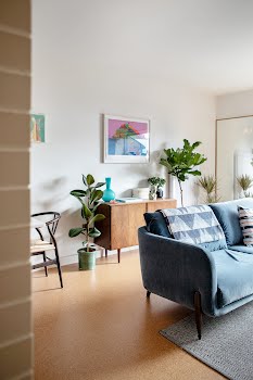
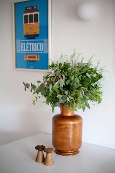
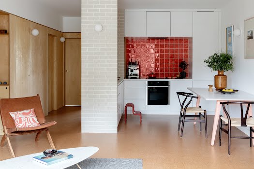
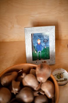
The plywood was also used to create deep windowsills for displaying favourite objects. Texture too comes from the pale brick details in the kitchen and living space, to reflect John’s Californian tastes, as well as the cork floor that runs through all the rooms.
“John initially wanted a timber floor,” Clíona explains, “but I’ve always loved cork, and because it’s an apartment, there’s sound attenuation to consider. Cork gives you that lovely same warm underfoot feeling and is very practical.”
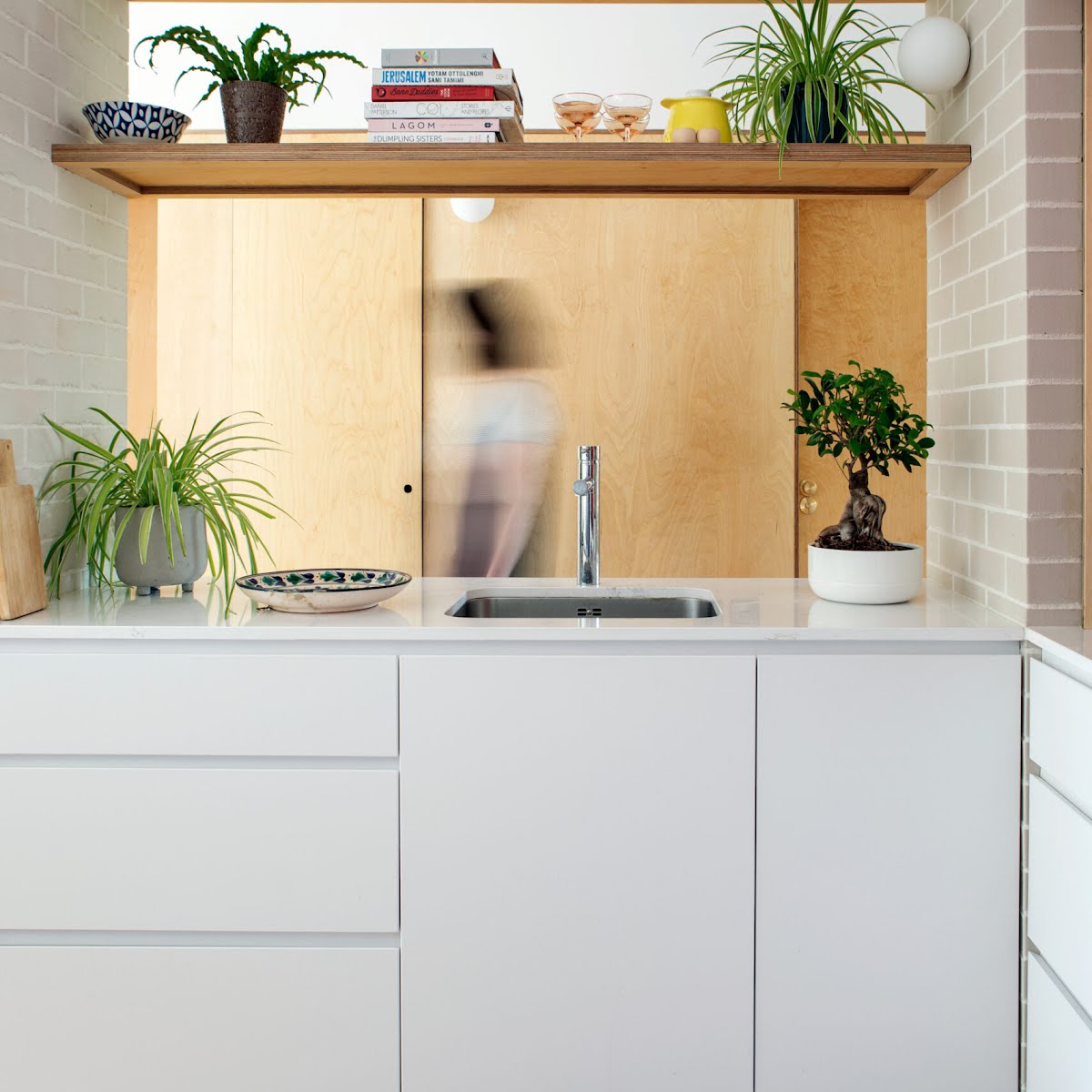
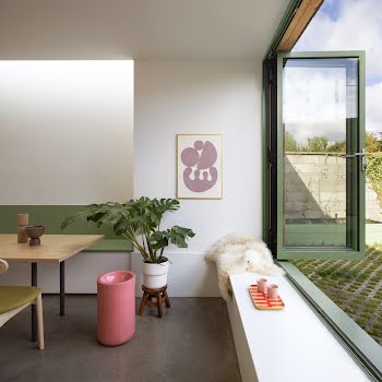
A plaster wall between the corridor and kitchen was replaced with two brick walls with a worktop and open shelves between them, defining the kitchen zone without making it feel closed off. These simple materials were partly chosen as the budget for the project was modest, Clíona explains, but it was important to both her and John not to skimp on the details.
“For the lights, we chose classic globe shapes in a seventies style. The size of the space means we didn’t need lots of them, so they’re very nice quality.” The same approach was taken with the brass Buster + Punch door handles. “You really do see the details in a smaller space,” Clíona says, “especially with a pared-back style. It just made sense to get nice fixtures, and John and I really did see eye-to-eye on things like that.”
It’s an attitude that reflects their shared enthusiasm for this space. While some may consider apartments transitory, there’s no reason they should be. As John points out: “It’s a small apartment and my favourite thing about it is that, to me, it represents a way of life. Houses are heteronormative. I don’t have a family, so who needs lots of empty rooms to walk into?


