An architect couple’s savvy design eye turned this run-down Edwardian redbrick into a spacious family home
The Dublin 4 home was transformed in just nine months by an architect couple, and now works perfectly for their family.
From its deceptively formal redbrick façade, only the lime yellow front door gives a flavour of what lies beyond this recently renovated house. Bought by Catriona Duggan and Achim Gottstein of Gottstein Architects, they gave themselves just nine months to design, renovate and move into their period home with their two girls, Lottie and Lucia, putting an emphasis on air quality and sustainability throughout the build.
“The back of the house was actually sinking,” says Catriona simply, clearly unphased by the stumbling block. But then, it’s all in a day’s work for these two architects who have seen their fair share of structural problems, including their previous home, which was also subject to subsidence.
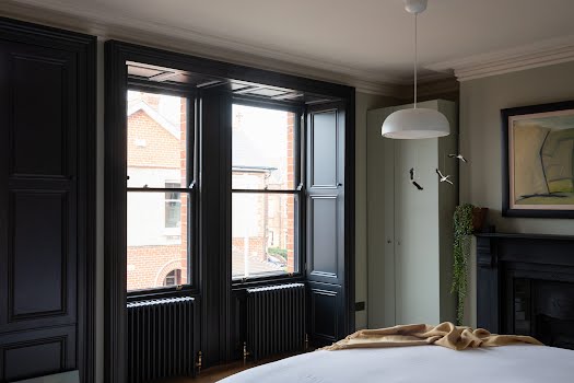
“I think that put a lot of buyers off but we knew how to deal with it.” Inside was no better: a traditional three-bedroom house virtually unchanged by its previous owners with no central heating. The aim was to maintain as much of the original features of the Edwardian property and make it less imposing, opening up dark spaces and creating a city garden with a spacious kitchen alongside the period living spaces.

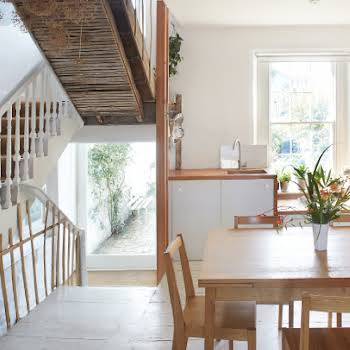
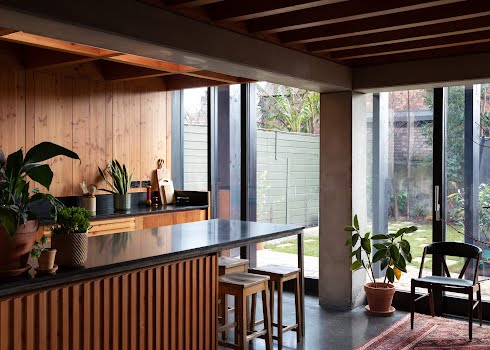
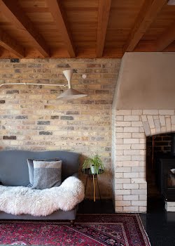
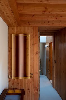
“As a practice, we’re intent on sustainability,” explains Achim. “We’re interested in how a building is assembled, how it evolves and how it’s adapted, allowing any new contemporary elements or repairs to be seen.” This is evident in the Douglas fir structural timber that marks their additions, sleeving into the historic brick bones of the old building and bringing a freshness and honesty to the property. Even the repairs to the ornate plasterwork have been left exposed.
“The beauty is seeing how the different materials [brick, timber and plaster] are read; there’s a truthful expression to it all,” notes Catriona, who admits that while the time-sensitive deadline was challenging, she is most proud of creating a home for her family that reflects their ethos.
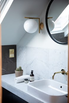
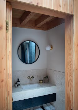
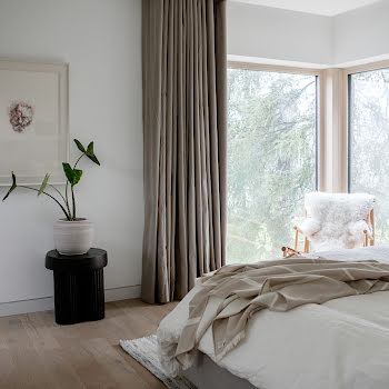
The entire house was stripped back and refigured with sustainable intentions. A second-floor triple bedroom and ensuite was created by dropping the ceiling height of the middle floor from about ten feet to nine and moving the stairs. They used Edward Bulmer natural paints throughout, allowing them to sleep in the house as it was being painted.
Eco-friendly waxes were used on all the wood and the timber ceiling joists are thick enough to retain structural integrity during a fire, avoiding the need to coat them in a toxic flammable paint. Where possible, existing materials were reused, such as the outdoor patio floor, which is made up of Dolphin’s Barn bricks from the old kitchen wall and in the garden, where granite windowsills are used to line flowerbeds.
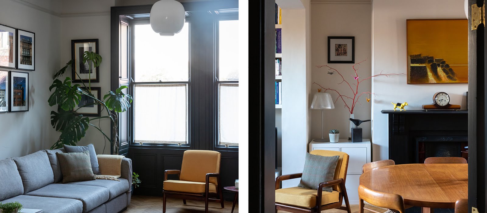
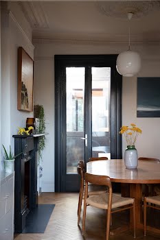
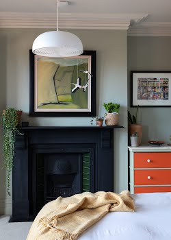
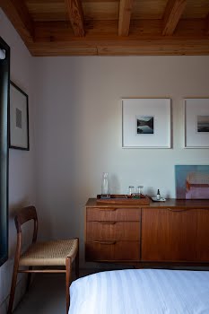
The couple also wanted to work with the furniture they had from their first home and decided not to buy anything new. “Sometimes, I wonder if a cabinet or table looked better in the old house,” laughs Achim. “It’s a case of getting things to fit somewhere they don’t belong. But overall, everything seems to work.” For example, a beautiful mid-century sideboard that sat downstairs in their previous home now takes pride of place in the spare bedroom, acting as a chest of drawers.
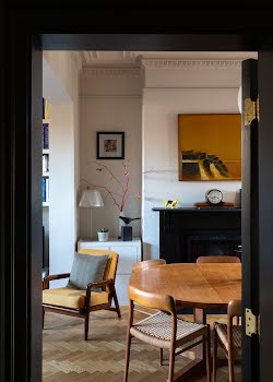
The vintage dining room table, in particular, is a much-loved item that has moved with them. “When you’ve had years of dinner parties, friends, laughter and tears around a table, it becomes a part of who you are; there’s something lovely about sitting down with furniture you’ve had all your life,” notes Catriona. Ironically, the table wasn’t something they intentionally purchased, it arrived unexpectedly with the ten Moller dining room chairs they bought on eBay.

The other surprise was the upstairs utility room, which was “found” half way through the renovation. Remapping the floor plan to create a third floor was a prerequisite of the design but it wasn’t until they reconfigured the stairwell that they realised they had more headspace in the return than expected.
It’s a stark contrast to the typical utility room, housed in dark basements or adjacent to the kitchen. Bathed in sunshine thanks to an enormous roof light, the airy utility appointed with birch ply cabinets that screen off the boiler. The room is so warm that the tumble drier has never been connected and its location near the bedrooms means washing isn’t loitering around the ground floor before eventually making their way back upstairs.
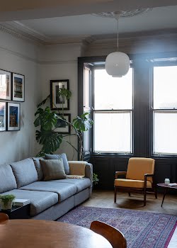
The couple’s nuanced approach to building each room with considered choices has created a lighter, natural flow to the house with fresh colour palettes, natural materials and timeless furnishings weaved throughout. As the home base for this young family, the house required materials that could withstand some wear and tear.
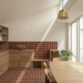
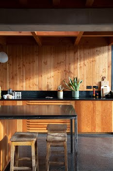
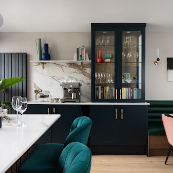
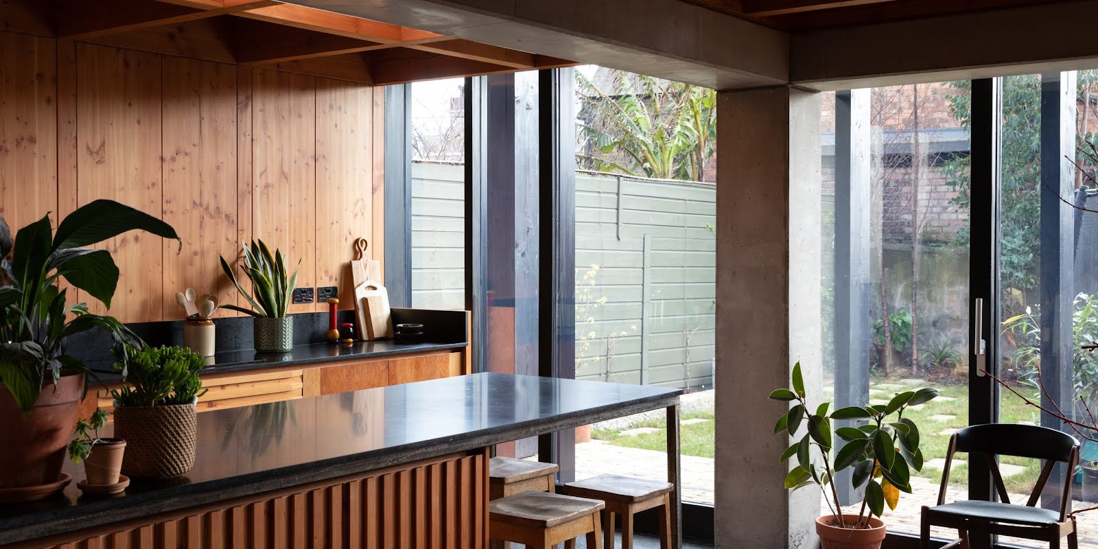
The kitchen in particular is designed as a space for everyone’s needs, with a polished concrete floor, dark granite worktop and wooden cabinets built by Omega Fitted Furniture. “I didn’t want it to feel like a conventional kitchen,” explains Catriona, “but more like a piece of furniture with appliances concealed in a low-level dresser and a table area within a very modest extension.” The 11-square-metre kitchen extension retains much of the garden, something missing from their former home, and the slatted canopy of Douglas fir along the patio acts as an interface between indoors and out.

“What’s often forgotten in design is the fact that people will be using the spaces,” says Achim. “Whether it’s the tactility of things or the air quality in a room, it should be about making buildings that can stand the test of time, that are easier to use and more pleasant as a consequence.” Functional and sustainable in practice, while still remaining beautiful to look at, these architects have created a space that works for their family, designed with the future in focus.
Photography Doreen Kilfeather
Styling Ciara O’Donovan
This feature was originally published in the March/April 2020 of IMAGE Interiors & Living


