This Clontarf home was reconfigured to streamline the layout and maximise its views
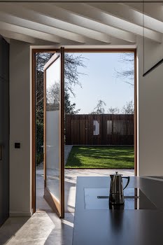
Architectural Farm worked to remove awkward additions to the home, and connect the space to the outdoors.
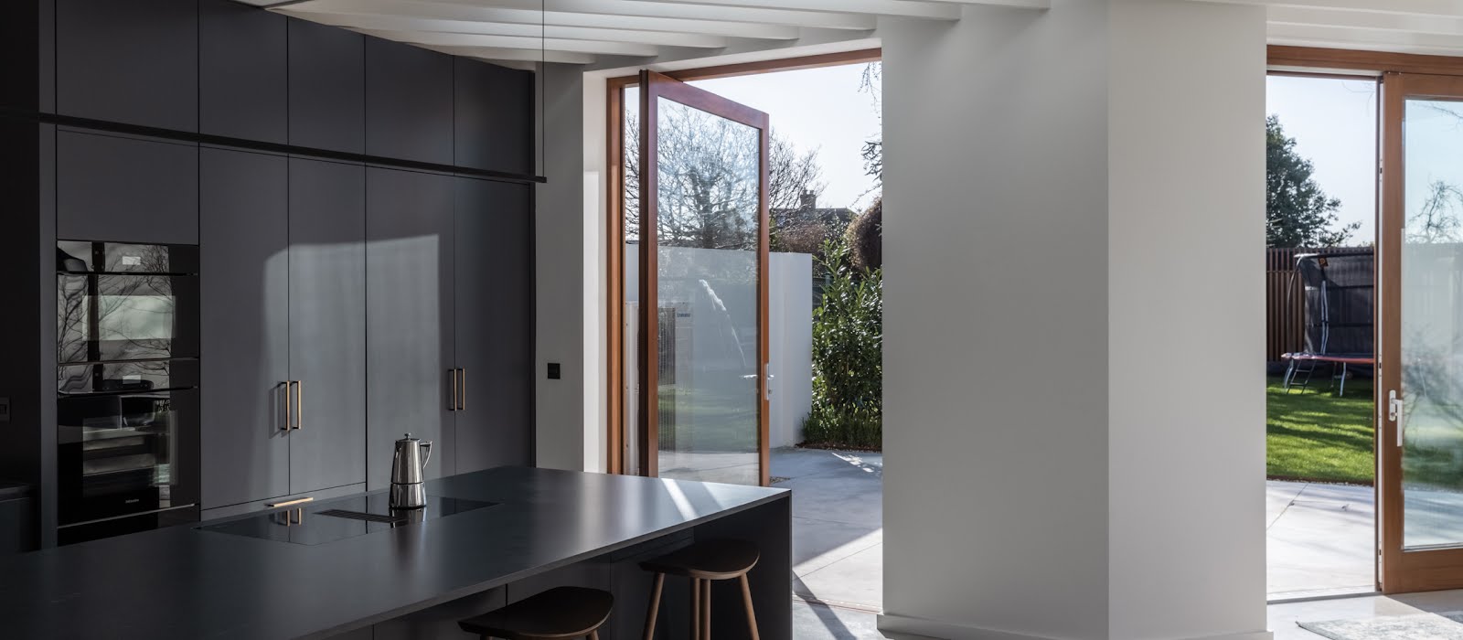
The owners of this Clontarf home approached Architectural Farm to remedy its awkward layout. When they bought it, it had some poorly considered additions and alterations that resulted in a large house but with odd shapes and underused spaces, with little connection to the garden.
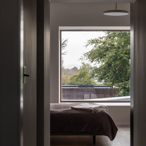
The south-facing rear living spaces also had issues with overheating, Shane Cotter, director at Architectural Farm explains. “The views of the Dublin mountains from the first-floor bedrooms were also obscured,” he says.
“They had lived in the house for a few years before looking to tailor the house to their own needs. They wanted a home that functioned well for them but also that reflected their own tastes, with spaces that were simple and calm but also warm.”
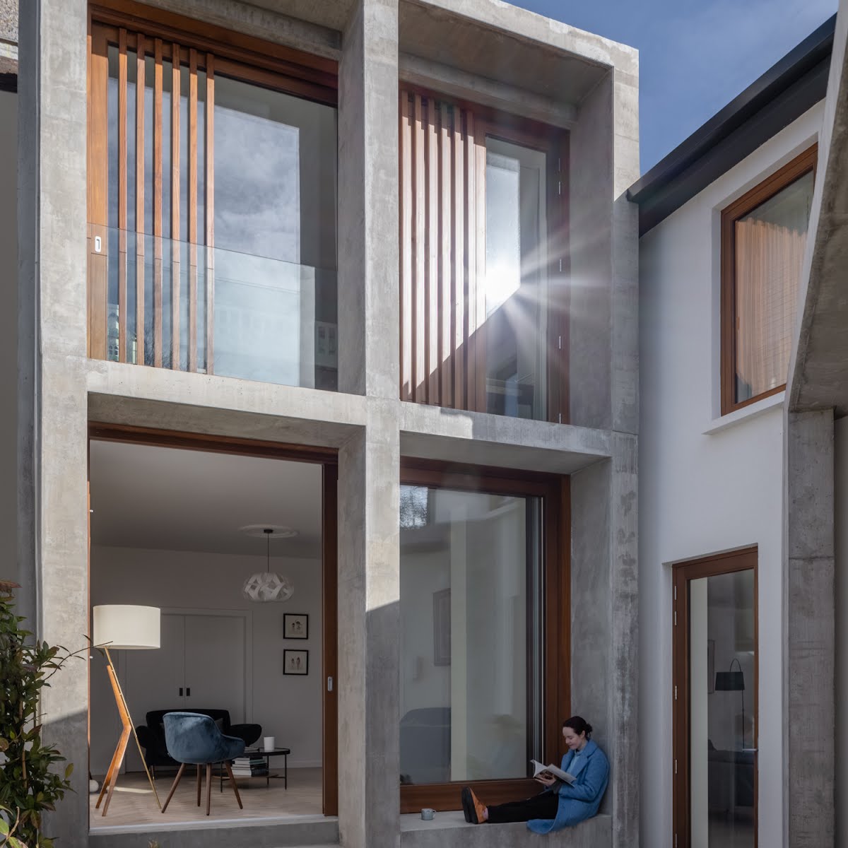
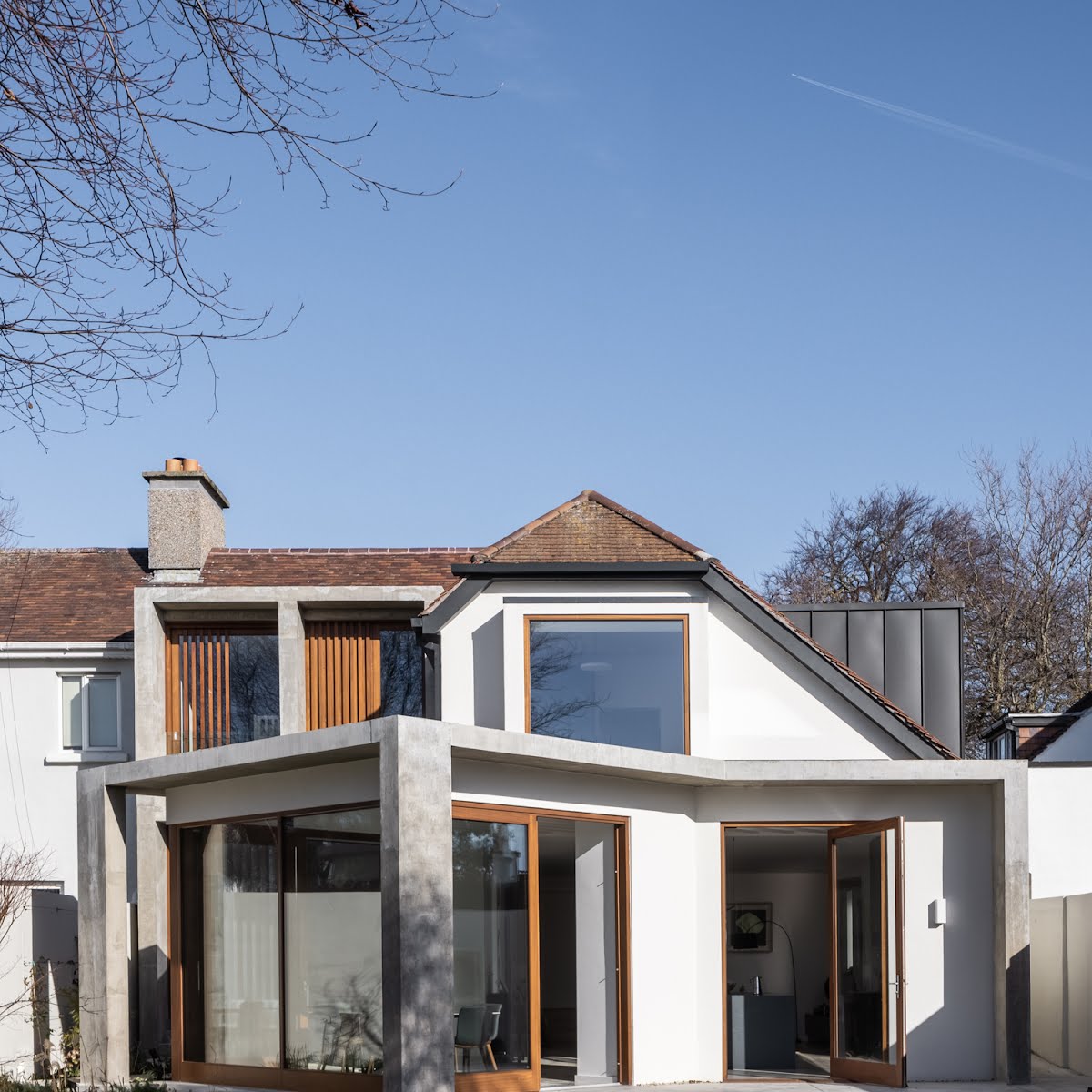
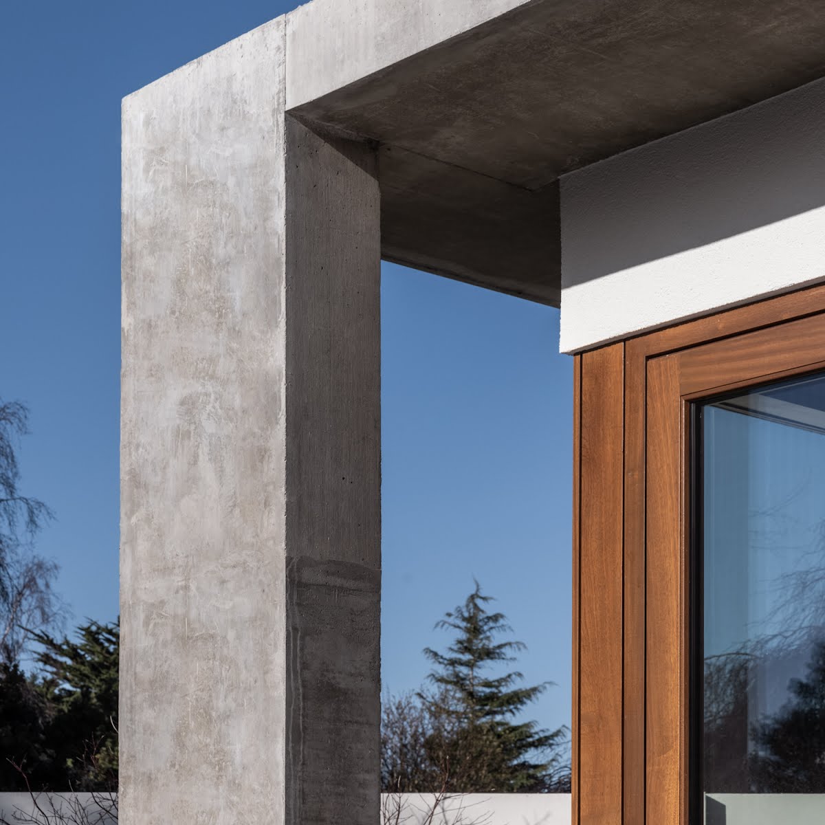
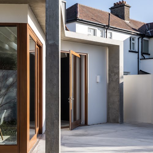
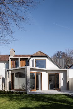
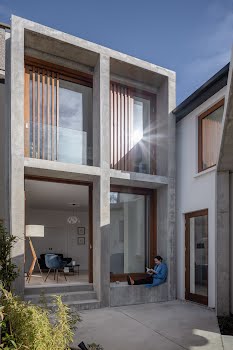
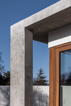
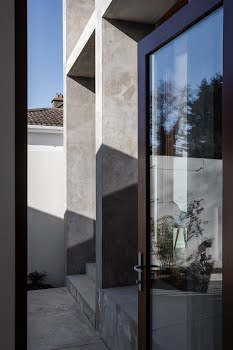
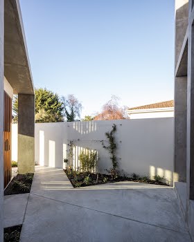
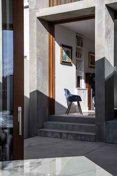
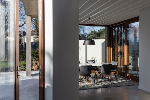
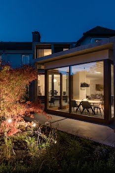
Their design sought to remedy these issues with minimal alteration to the existing house. The result was the introduction of a deep cast in-situ concrete frame.
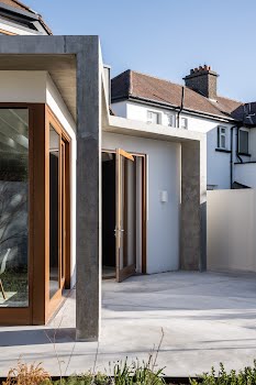
“The new frame wraps around both the existing ground floor extension and a new ten square metre two-storey tower,” Shane explains.
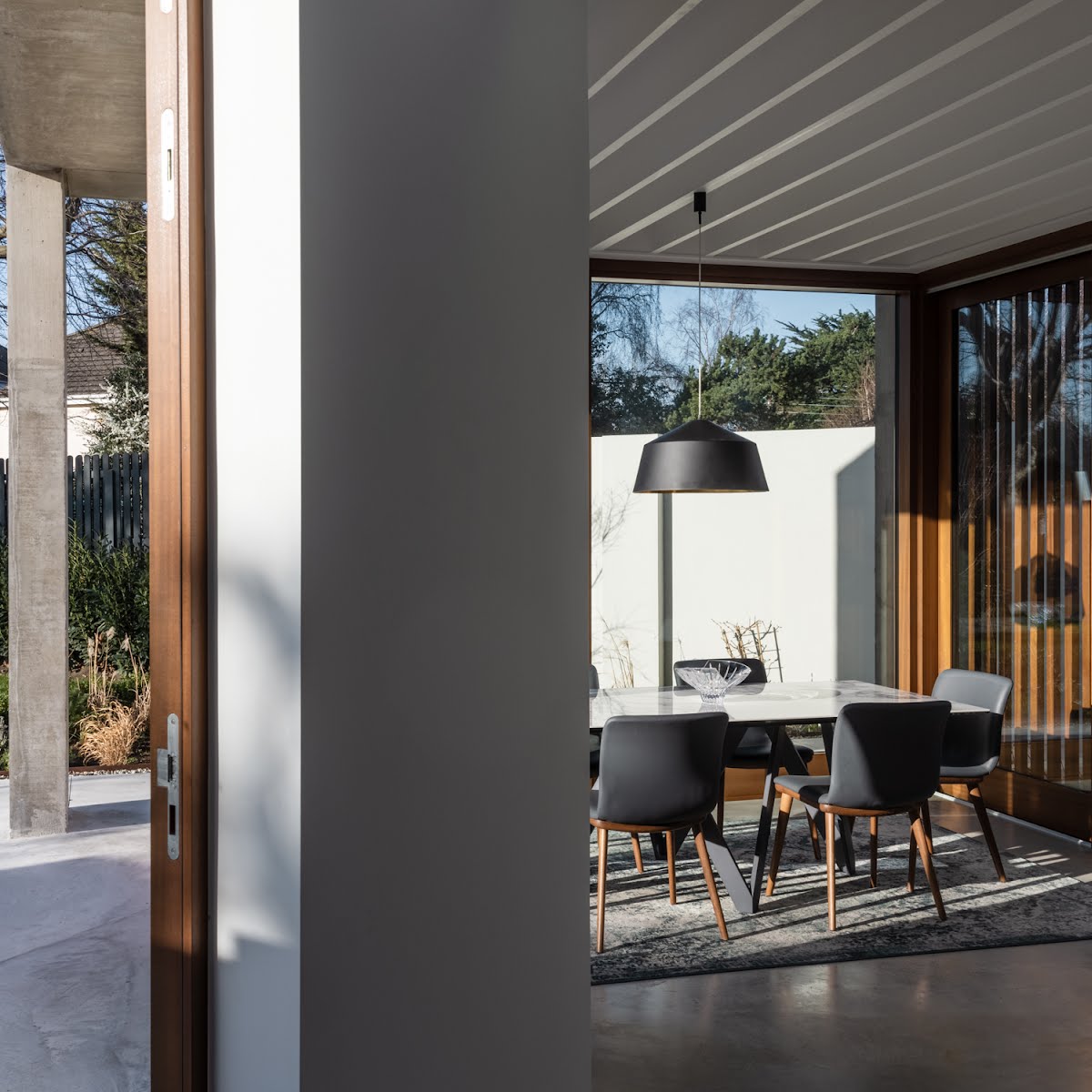
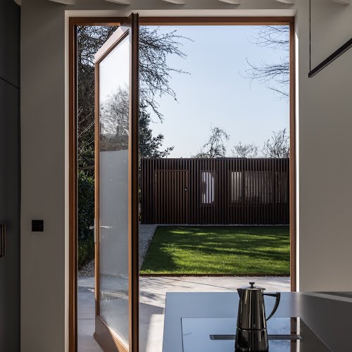
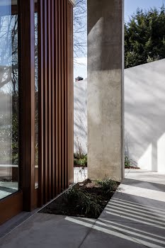
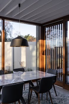
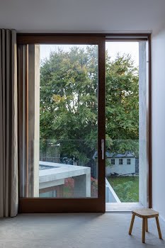
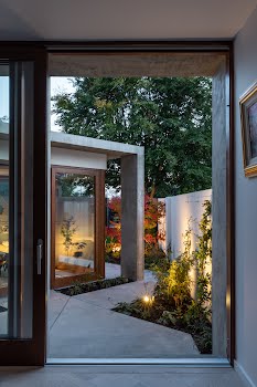
“The depth of the new structure gives a sense of protection and permanence while also preventing the living spaces from overheating in the summer. The new structure is complemented using timber panelling and windows and by the new landscaping meandering through the columns from courtyard to patio.”
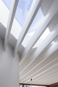
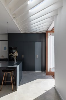
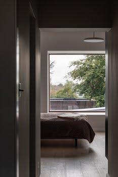
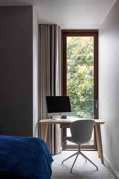
A pitched roof was removed from the existing extension to allow more light into an existing courtyard, and to create space for a large picture window in the first floor main bedroom, maximising views of the Dublin mountains.
The renovation provided an opportunity to insulate the walls and floors, improve the thermal performance of the glazing and install a renewable heating system.
Shane explains that while there was some potentially challenging elements to the project around the required quality of the concrete or the joinery, “we were fortunate to work with a WCB Construction, and subcontractors who were as keen to get these right as much as our clients or we where so our lives where made easier.”
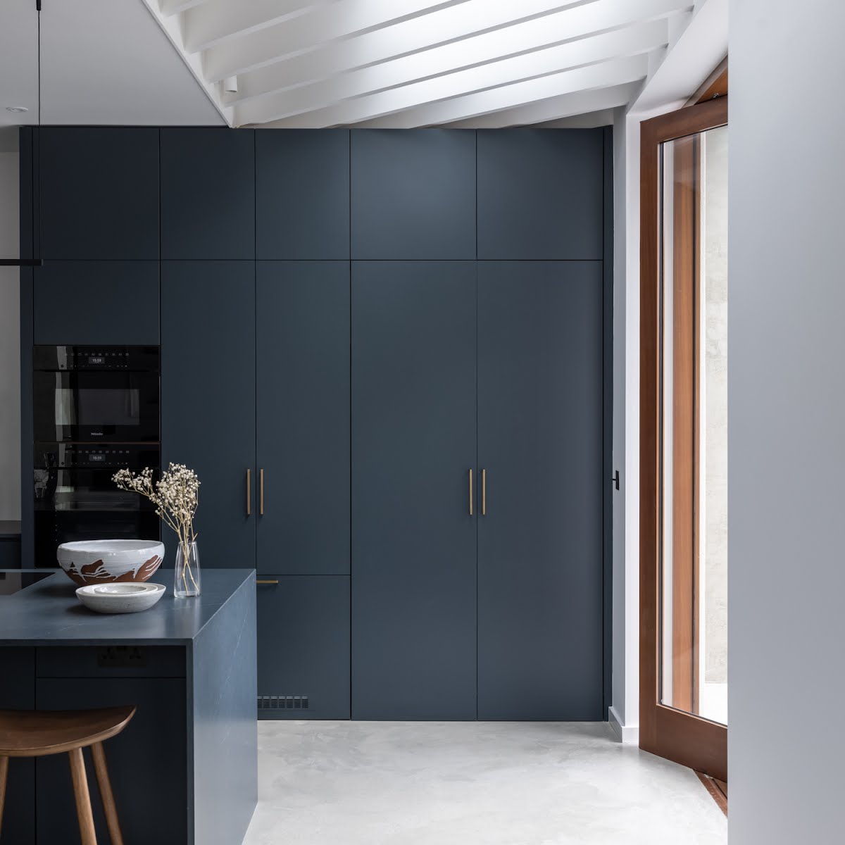
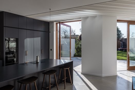
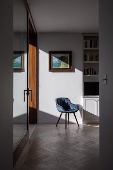
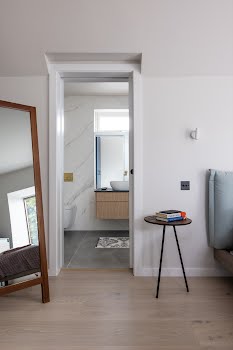
To help the old and new spaces feel harmonious, they stripped back the palette of material and colours to one which was complementary to the original early twentieth century house.
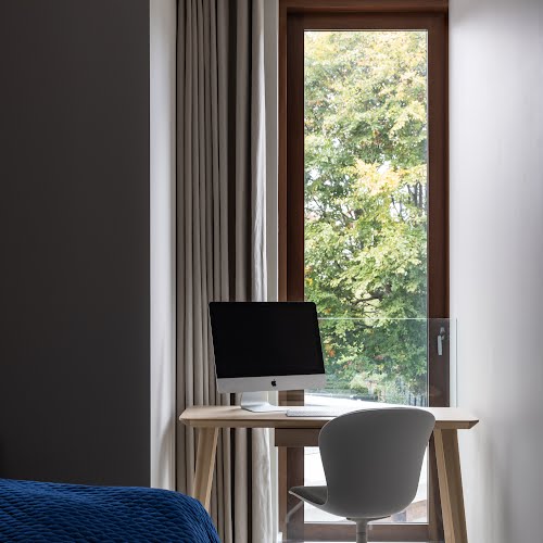
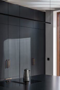
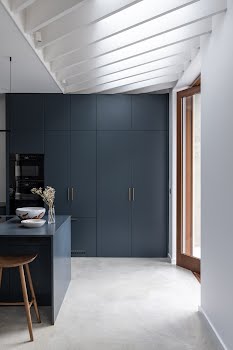
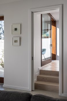
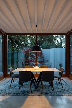
Concrete and timber are the main materials throughout the home. A timber floor runs throughout the existing house, while a new concrete floor flows out into the garden, connecting with the new columns and frame. “The colours and tones of walls and floors are deliberately light and muted to allow the rich texture of the large timber windows and panelling to sing,” Shane says.
“We love the textures, the light, how calm the space feels, and how the relationship with the internal spaces and landscaping has evolved,” Shane says. “That happy relationship of architecture, home and garden came out of a great collaboration with our client, garden designer, Sarah Jordan, and contractor, WCB Construction.”
Photography: Ste Murray

