By Laura Iunghuhn
23rd Mar 2021
23rd Mar 2021
Cooped up and considering finally tackling the much-need paint job in the spare bedroom? Or want to give your living room a bit of a lift? Choosing the right colour scheme for your home is simple with these simple rules.
Some of us are happy to lash a few coats of paint on and hope that it’ll work effortlessly with the rest of the room’s palette. Others need a little more reassurance. It can be difficult to imagine just how a colour palette will come together in a space, between fabrics, paint, furniture and accessories.
However, there are some failsafe ways to ensure you get off on the right foot. So if you need a helping hand choosing colours for your next big project, here are the rules to follow and the things to know for choosing a compatible palette.
Types of Colours
When looking at colour, there are really only three types:
- Primary colours: red, blue, yellow
- Secondary colours: orange, purple, green (made from mixing primary colours)
- Tertiary colours: the six shades made from mixing primary & secondary colours – these are all the colours that fall between the primary and secondary colours on the wheel.

Once we have these 12 colours, variations can be created by lightening or darkening each base. These variations have their own names:
- Tint: lightening a colour by adding white
- Shade: darkening a colour by adding black
- Tone: slightly darkening a colour by adding grey
Choosing Colour Combinations
Now that you have a better understanding of colours, it’s time to pair them. This is a daunting task, so we’ll start with a simple question: How many colours do you want to decorate with? Fewer colours will make the task less overwhelming and cater wonderfully to a minimalist decorating style. A greater number of colours requires thoughtful planning but they can accommodate more of those bits and bobs you’ve accumulated over the years.
One-colour schemes
A tonal colour scheme uses one colour in varying tones. This scheme can be as simple as selecting two or three shades from a single colour swatch. This bedroom below plays with a monochrome palette, varying shades of charcoal grey to off-white.

Bedroom in Remo Masala’s Berlin apartment. Photographed by Greg Cox. Arctic Blonde, from €1.70, Colourtrend. Mid Lead Colour, from €21.50, Little Greene.
Two-colour schemes
If you want to opt for two colours, there are two options to choose from. The first is a harmonious palette by selecting colours next to, or near each other, on the wheel. The green and yellow of this Donegal living room are merged beautifully in the Superfolk print hung on the wall and the two colours really zing off on another, while a neutral white keeps them feeling earthy.

Living space in Niall Campbell and Catherine Burke’s Donegal home. Photographed by Al Higgins. Dancing Light yellow, from €32, Curator. Subtle grey, from €1.70, Colourtrend. Jewel Beetle green, from €21.50, Little Greene.
Or, you can opt for a complementary colour scheme, which is colours that sit opposite each other on the colour wheel. These are the classic pairings of red and green or yellow and purple; there’s a reason why so many of us are drawn to millennial pink and mint green pairings at the moment.

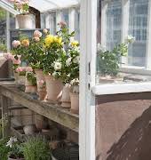
Rear garden room extension in a North Dublin home designed by David Leech Architects. Photographed by Joseph Carr. Loft White, from €21.50, Little Greene. Jade Cluster 3, Dulux. Day at the Races pink, from €25, Curator.
If only two colours get to be overwhelming, combine them with a neutral (white, grey, or black) to break up the space.
Three-colour schemes
A split-complementary colour scheme requires a dominant base colour with two other colours as accents. Choose a base colour and two shades on either side of the colour opposite on the wheel. Here, the subtle introduction of a deep red adds a richness to the overall palette and prevents it looking too samey.

Guest bedroom in Jane Rockett’s Sussex home. Photographed by Bénédicte Drummond. Kimono red, from €1.70, Colourtrend. Gorse Bush yellow, from €1.70, Colourtrend. Midnight Lagoon blue, Dulux.
An analogous colour scheme utilises three colours in a row on the wheel, two of which are primary and the third secondary. Below, the rug is used to pull together the tan leather of the sofa and the natural timber of the kitchen units, while bringing out the texture in the concrete walls.

Living space in Cléa van der Grijn’s Sligo home. Photographed by Brent Darby. Chestnut Grain red, from €32, Curator. Babouche yellow, Farrow & Ball. Middle Buff orange, from €21.50, Little Greene.
A triadic colour scheme uses three colours with equal space between them on the colour wheel. Most commonly, this scheme utilises all three primary colours or all three secondary colours. Below, it’s yellow and red, with a hint of complementary olive green introduced via the chair. Which brings us nicely to four-colour schemes.

Living space in Wendy and James Aldridge’s East London townhouse. Photograph by David Cleveland. Rich Havana 6 yellow, Dulux. Gatekeeper’s Lodge blue, from €32, Curator. Sweet Caper green, from €1.70, Colourtrend. Rectory Red, Farrow & Ball.
A good rule of thumb when pairing three colours is to use them in a 60-30-10 proportion. Think about this as having a dominant colour, a colour to support the dominant, and the third to use as an accent.
Four-colour schemes
A tetradic colour scheme combines two pairs of complementary colours. Here a yellow and green are paired with a pink and purple.

Sitting room in Orna Holland and Clifton Foyle’s Dublin home. Photographed by Doreen Kilfeather. Heather Bloom 5 pink, Dulux. High Stool bronze, from €25, Curator. Larkspur blue, from €1.70, Colourtrend. Turquoise Blue, from €21.50, Little Greene.
A square colour scheme uses one primary, one secondary, and two tertiary colours. With this scheme, two shades should be more neutral while the other two are bold. In colour combinations like this, only one colour should dominate while the others act as accents.

Living space in Suzanne Martin and Alex Milton’s basement apartment in Dublin. Shot by Shantanu Starick. Drifting Cloud grey, Dulux. Carys yellow, from €21.50, Little Greene. Hay dusty yellow, Farrow & Ball. Garden green, from €21.50, Little Greene. Bramble dark grey, from €25, Colourtrend.
It’s a lot, we know. So, take a moment to breathe. Working with a colour wheel is a great basis for selecting colours, but you don’t have to stick to it rigorously. Use it to choose colours at the beginning and then start playing with shades and tints and introduce accent tones. It’s all about introducing your personality to a space, but it’s also reassuring to have a place to start.
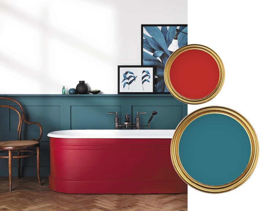
Featured image: Bute cast-iron bathtub, Versatile. Pacific Pool blue, Dulux. Atomic Red, from €21.50, Little Greene.


