Cut the clutter with these clever hidden storage ideas for your home
By Megan Burns
09th Jan 2021
09th Jan 2021
Storage is key to creating a relaxing living space, so choose designs that fit seamlessly into your home.
After the chaotic festive season has passed, it’s often a chance to de-clutter and bring a little calm into our lives. If you’re planning to organise your home, make it a resolution that will last long past February by using streamlined storage to create a clean, open feel. From small additions to larger revamps, there’s plenty of ways to make the most of your space.
Hot seat
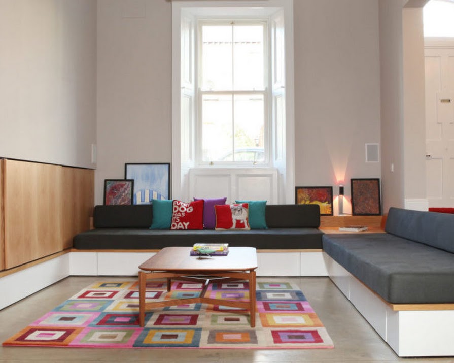
The small footprint of this property meant that imaginative storage solutions were required to create the serene, minimalist look that was desired. Four drawers are built in to the sunken seating, and a large wall unit with sliding doors resembles timber panelling when closed, while concealing ample shelving.
Ciaran McCoy, partner at ODKM Architects explains. “In larger houses we can be lazy when designing storage because space is more available. I would encourage people to re-think empty voids and spaces, such as under seating and stairs, behind walls, in the attic and in those nooks and crannies that go left under-utilised.” He also advises that storage should be integrated into the overall aesthetic of a home and planned from the outset, rather than just included as an afterthought.
“It is always easiest to incorporate storage in the early stages of planning a room, especially if you want to go for built-in or concealed styles, so keep it in mind from the beginning of a project.”

Double duty
Smart storage doesn’t have to be built-in, as the Monolit side table from Universo Positivo shows. Carol-Anne Leyden of CA Design loves its ingenious lift-off cover. “It’s probably one of the most versatile items we stock. They can be used in a living area for newspapers and books, in a bathroom for towels — I even have a pair that I use as bedside lockers, and they really give a room a clean, minimal look.”

Clever corner
Even small spaces can be made to multitask, such as this corner storage and study area. Jane Higgins, of Jane Higgins Home Design, points out that sticking to neutral shades isn’t the only option for making storage work with the rest of your room. “We introduced a splash of colour for relief in Farrow & Ball’s ‘Rectory Red’ and an integrated LED strip light to highlight the corner and add interesting ambient lighting.”

Going up
Taking inspiration from New York homes where ceiling heights are generous but space is at a premium, Patrick McKenna of Wabi Sabi designed this galley kitchen to make the most of the vertical room available. The higher units can be used for items needed less frequently, while the lower ones accommodate everyday essentials.
To prevent the kitchen from dominating the general living space, this pared-back design incorporates only its crucial storage needs, allowing other areas such as the hallway to house more general items. This streamlined brief gave McKenna the freedom to focus on the fresh, contemporary design of this kitchen. While the understated style of the space contrasts with the building’s historic features, they find a common ground through the soft neutrals which are continued from the unit doors to the walls and complemented by the wood floor and limed oak bar counter.

Floor-to-ceiling
Devoting an entire wall to storage ensures you have no wasted space, and can even create a focal point in a room. This unit combines open shelving for displaying personal objects with concealed drawers and push-latch cupboards below. As David Farrell of Michael Farrell Bespoke Furniture Design explains, “This design also cleverly has a pocket door which slides behind the bookshelves and finishes flush when open, combined with a mix of painted white and solid oak finishes. This keeps the room feeling spacious and open.
“To avoid storage becoming imposing, choose clean styles that complement the rest of your room. Details like handle-free doors and flush finishes will help it feel minimalist and unobtrusive, while still adding practical space.”

Minimal mood
Don’t underestimate the power of one hardworking storage unit to save space. The end cabinet in this kitchen houses the larder, integrated fridge-freezer, and oven, as well as additional shelving for tableware. Having the main features of the kitchen all in one area also makes for a more streamlined cooking experience, rather than having to constantly move between different parts of the room.
The oak-veneer units were hand-painted in Farrow & Ball’s Downpipe to give a soft, calm feel, and glass-panelled doors reflect light into the rest of the space. To make the most of a unit like this, Lisa Johnston of Cillían Johnston Cabinet Makers advises that shelving, whether exposed or inside a cabinet, should always be kept shallow to avoid creating “dead” space that is too far back and difficult to reach. When dealing with deeper spaces, she recommends drawers, as they are easy to see into and keep organised.
Read more: 3 renovated cottages in Galway, Roscommon and Clare for under €200,000
Read more: Inside this gorgeous Killiney home with sea views on the market for €2.45 million
Read more: Our favourite home office buys from the online sales (for under €50)


