Inside a Victorian home in Bray, reworked to create a contemporary family space
By IMAGE Interiors & Living
06th Jun 2022
06th Jun 2022
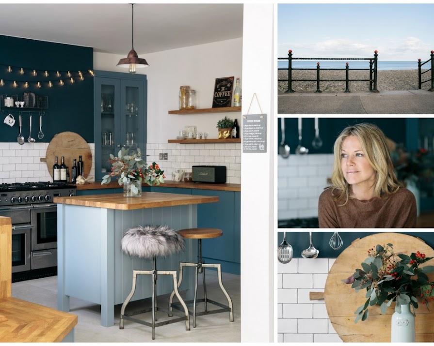
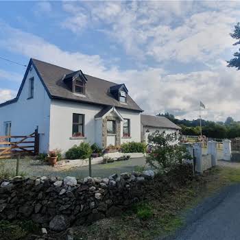
At a seaside Bray home, a collaboration of light, space and teamwork has created a cleverly-configured family home.
“Being a Libra I thrive on balance and harmony – and having space and order in my home positively influences the way I feel day to day. Now that we have a house with flow and continuity, I can finally relax and enjoy living here,” says Ayshea Ryan, delighted at the completion of the Bray seaside villa she shares with husband Ciaran and their two boys, Dylan and Flynn.

“We wanted this to be our last move – our home for life,” explains Ayshea. “Although I’m fastidious about ensuring my home is free of clutter and that each room offers space to breathe (Ayshea runs decluttering service A Place for Space), I didn’t want to act in haste with this house. So we muddled along for two years before we felt ready to make changes.”
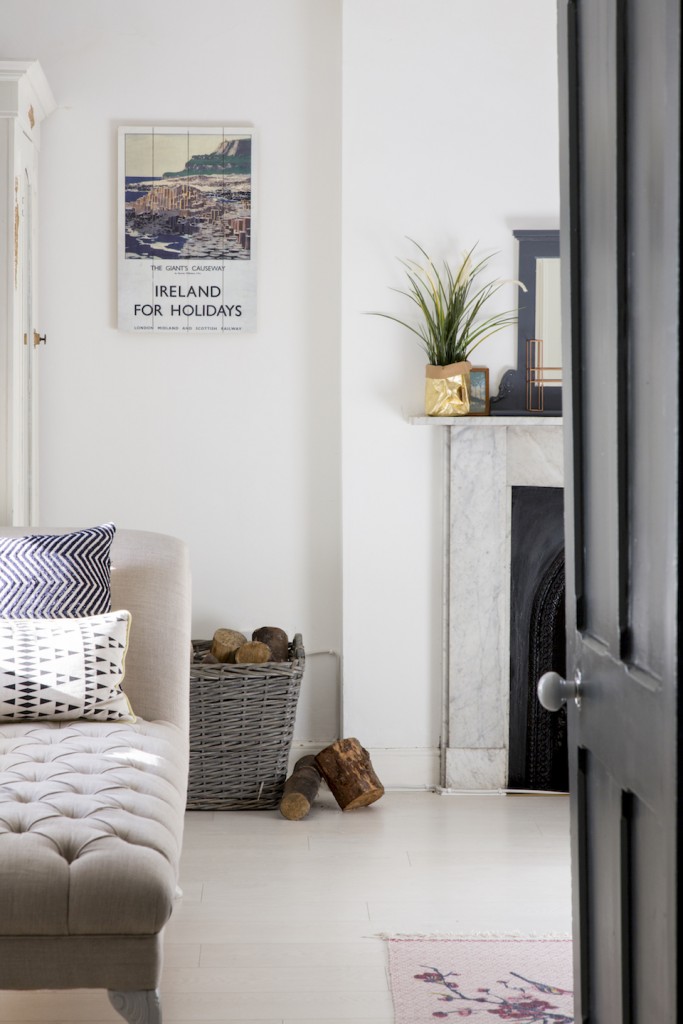
They were introduced to Tonya Douglas of Little Design House by Ayshea’s sister. Although now back in Ireland, at the time Tonya was running her interior design business in the UK. “I met with Ayshea and Ciaran and felt we could make the distance and budget work if I acted as a consultant instead of full-time interior designer,” Tonya explains. Ayshea says it was a perfect arrangement.
“I was able to go out and source things and then Tonya would help me focus back to the mood-board we created. She was a great sounding-board and brought the vision, consistency and experience we needed. I was hesitant initially about using an interior designer as I was worried about budgets and felt I should do everything myself,” Ayshea says. “Now when I look back, I realise that Tonya’s expertise ensured we got the house we wanted and actually saved us money in the long-run.”

With time already invested in living in the house, the couple was sure of a few fundamentals from the outset of the project. Two aspects in particular needed addressing: firstly, the old-fashioned room layout of a kitchen on the ground floor with a dining room on the first floor didn’t reflect contemporary family life.
Secondly, they needed to find ways to introduce more light. “Our life at home was always compromised by the poor layout of the ground floor,” Ayshea explains. “The kitchen was really gloomy, but we had to eat there as the dining room was too far away to be practical. This left us with a whole room out of use.” In the original layout, the kitchen was one of a trio of rooms on the ground floor, together with a family room and a guest bedroom. Each was accessed via a small, dark lobby space. “The guest bedroom didn’t even have a window,” says Ayshea.

Structural changes were obviously needed to remedy the situation and so an architect was brought on-board. Another personal recommendation resulted in Ayshea and Ciaran enlisting the services of Robert Bourke, principal of Robert Bourke Architects. “Robert was also a very fortuitous introduction,” says Ayshea. “He listened to what we wanted and worked out a solution full of neat tricks that gave us more than we had envisaged at the outset. He and Tonya worked really well together and that made for a really harmonious design process.”
“When I first saw the house, I was struck by the fact that there was absolutely no connection to the south-facing garden at the rear,” says Robert. “It was a huge asset that was being blocked by the arrangement of rooms downstairs.”
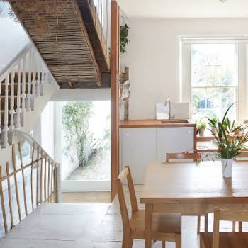
Reaching a consensus that an extension wasn’t necessary, it was decided to “scoop out” the much-maligned guest room and replace it with a glass-walled dining room, connecting the kitchen, dining room and den together without the need for separate entrances.
“We don’t tend to specify glass boxes as they have become a little ubiquitous,” Robert explains, “but I felt that the project called out for this particular treatment and so we installed glazed walls in the dining room and den.”

One of his subtle adaptations was to slightly rotate the family room (used even then as the boys’ den) so that a wider outdoor play space with direct access to it was created. The tiles running throughout the ground floor were then laid to run parallel with the outdoor tiles, thus creating a smooth transition between inside and out.
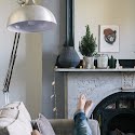
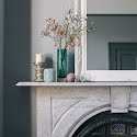
Whilst there is a deliberate stylistic distinction between the period part of the property and the re-imagined ground floor, consistent design themes resonate through the living areas of the house, played out primarily in the colour palette and use of materials.
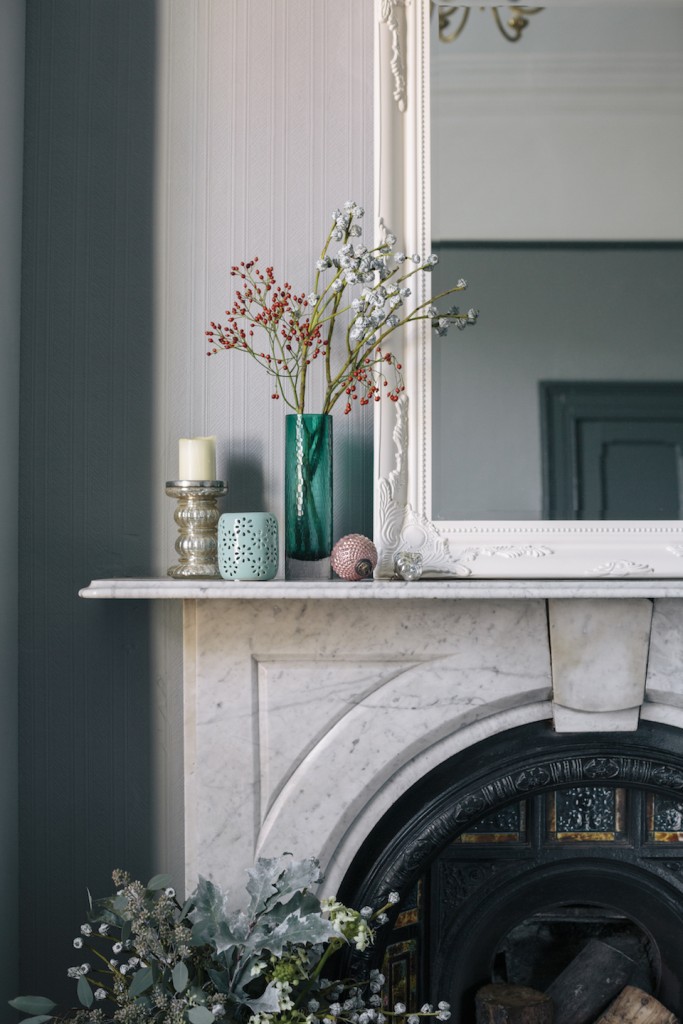
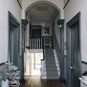
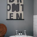
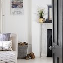
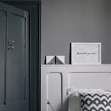
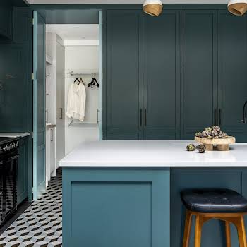
“The hallway was our beginning,” says Tonya. “We let light in with glass panels at the doorway and we developed our theme from there.” Ayshea says that having Tonya on-board gave them the confidence to choose what she describes as “quite masculine shades” in the hall, rather than painting everything white.
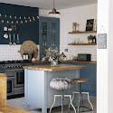
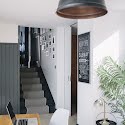
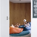
“We then continued with this colour palette down to the kitchen, dining room and den, so everything feels united,” says Ayshea. A warm wood theme is another unifying presence downstairs, linking the kitchen and dining room via a continuous oak surface, which morphs as it transitions from room to room and is echoed in the oak veneered panels of the den.

What was originally the dining room now has a new lease of life as the master bedroom. More clever work here links the bedroom to an ensuite bathroom and the den, via a new staircase and hidden doors concealed in the walls. “Ayshea tells me that everyone loves the doors,” says Robert. “What we’ve also achieved, however, is to create a second circular route through the house, which is both practical and interesting.”
Words: Tracy Biggam and photography: Doreen Kilfeather

