By Megan Burns
31st Dec 2024
31st Dec 2024
Interior designer Caroline Flannery takes an unusual project on for herself.
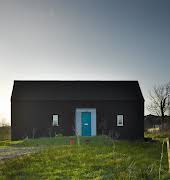
“It can be quite difficult to be your own client, but we figured it out eventually,” jokes interior designer Caroline Flannery. There’s no doubt she did, looking at her beautiful one-bed Clontarf home. She came across the building after searching as far as Wicklow and Meath. Although she had her heart set on a period property, this former artist’s studio struck her as the perfect blank canvas to work with.
“The architecture of the building is not a style which I usually like, however there was something about it that appealed,” Caroline explains. “The large expanses of glass, the form of the building and the private courtyard reminded me of a Spanish-style home, but the abundance of natural light was really what sold it to me.”

The studio was composed of an exhibition space on the ground level with a working area on the first floor – far from the layout of a normal home, so this was something that Caroline had to consider as part of her plans. “It was important to me that the house felt like a home and for this reason I very much anchored my layout within the design. For example, the dining area was defined by overhead lighting, the sofa was made bespoke to fit the space, the headboard is fixed to the wall and runs up to the ceiling: this all gives a sense of permanency, a lived-in look.”
She also divided the downstairs open-plan space with a wall, containing concealed storage as well as recessed shelves for books and artwork. “I designed a nifty laundry store for ironing boards and cleaning products which is concealed by bespoke panelled doors under the stairs,” Caroline explains. “I’m quite proud of that.”

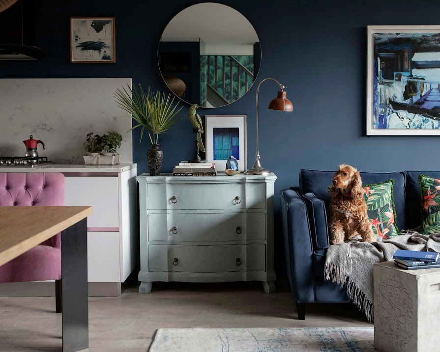
The living space is painted a deep blue; a move Caroline says many people would be afraid of. “I’m a huge fan of dark, moody colour palettes, which I feel can add a lot of warmth and interest to an otherwise bland space. People can be fearful of these colours, but with careful consideration to light they can actually make a space feel larger. Everybody who comes into my home comments on the colour and how warm it feels, even though blue is considered a cold colour.” Colourful furniture and accessories in the space are also used to make sure the colour does not overwhelm the space, and instead makes it feel vibrant.
Caroline made sure there were plenty of places to display the many objects and books she has collected over the years, which show her personality and bring life to the space. Additions such as the beautiful laser-cut light shade from Graypants, her bespoke sofa, and the Cole & Son tropical wallpaper add a luxurious feel. Caroline explains that when planning the kitchen, which was sourced from kitchenspace.ie, she needed it to be functional and streamlined, with plenty of storage: “I cook a lot, and like to have a vast array of ingredients to hand.”

It was also a priority to make sure that the dining table sat six people comfortably, without having to move it out from a wall, as she entertains frequently. Overall, Caroline wanted the space to function both as somewhere she could relax and snuggle up with her dogs, and would also feel lively and sociable when she had guests.
One of her favourite aspects of the completed project, Caroline says, is the way the outdoor space reads as part of the open-plan area. “No matter where you sit, you can see the sky and large plants. This was very intentional, and was achieved using mirrors and colour.” The careful consideration that went into this design means Caroline is confident it will stand the test of time. Although she plans to experiment with new paint colours and wallpaper for the space in the future, she sees her investment pieces sticking with her for many years to come.
This article was originally published in February 2022.


