How an interior stylist turned this period Cork apartment into a quietly luxurious home
Scandi-cool meets Irish country in this interior stylist's period apartment in Cork.
Ciara O’Halloran’s apartment is not luxurious in the traditional sense. It’s not scattered with expensive or plush furniture, but if you consider luxury to be the right balance between all elements, when it seems flawless, then she and her family are living in the lap of luxury.
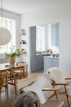
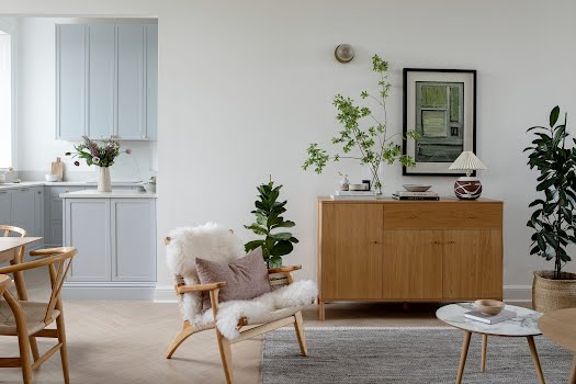
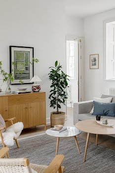
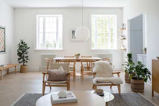
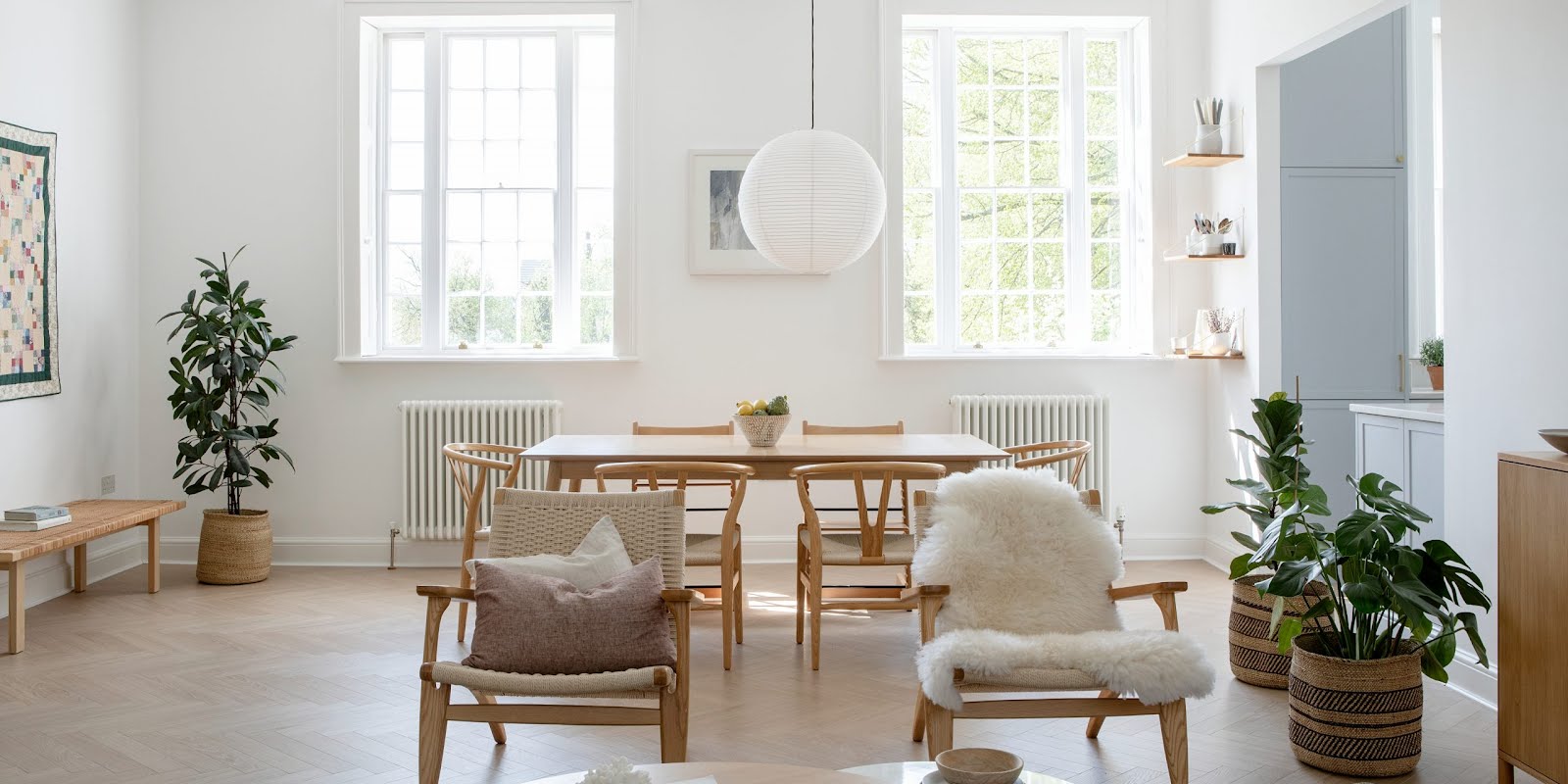
Stepping inside the stylist’s Scandi-inspired, light-filled home with views over mature woodland from the huge windows and you can’t help but let out a little sigh of relief. If it wasn’t for the Cork accents and the obvious period features – evidence of its former Victorian convent beginnings – you’d be forgiven for thinking you’re somewhere deep in the Scandinavian hinterland.

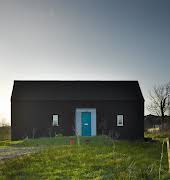
Back in 2010, Ciara and her husband had been living nearby, admiring the property from afar. It wasn’t until 2017, when developers brought it back to life, that she considered it as a possible family home. “I always loved the building and the grounds,” notes Ciara. “And, my mum went to school here, so it’s lovely to think her grandchildren are now running through her old classroom.”
At 1,300 square feet with high ceilings and pools of natural light, it feels more like a house than an apartment, but in terms of the design footprint they had to work small, maximising on the space they had by paring back and adding meaningful and considered choices such as the three-metre-high storage cabinets. “Living with less has been a great learning curve,” admits Ciara. “We’ve had to cull a lot, from clothes to toys, but the result is a more mindful interior. Everything here really belongs and we’re more conscious of looking after it as a result.”

Ciara knows her way around a stylish interior, mostly other people’s, in her work as an interior stylist for IMAGE Interiors; but when it came to her own home, it wasn’t as fluid. She can be more objective and work faster in a client’s home, she explains, based on what will work well on camera, and there’s no sentimental attachments as such.
Seeing her own home through the same eyes proved challenging. Her aim was to honour the architecture and natural bones of the building while creating a comfortable family home and reflecting her love of Nordic interiors and architecture.
“When we got the apartment, it was a refurbished shell, so I had carte blanche, which is great in one sense,” she explains. “I’ve seen some amazing houses over the years through my work as an interior stylist, so you’d think it would be easy for me,” she laughs. “Perhaps I had too many ideas because I definitely deliberated more over my choices.”
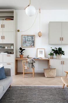
So much so that she enlisted the help of an interior design friend from Holland whose experience of Dutch apartment living was invaluable to Ciara as she navigated her own apartment dwelling design choices. “She was an amazing sounding board and resource, which helped us narrow the field. It was Holly’s idea, for example, to install the three-metre-high custom cabinetry, probably the biggest spend but also the best one.”
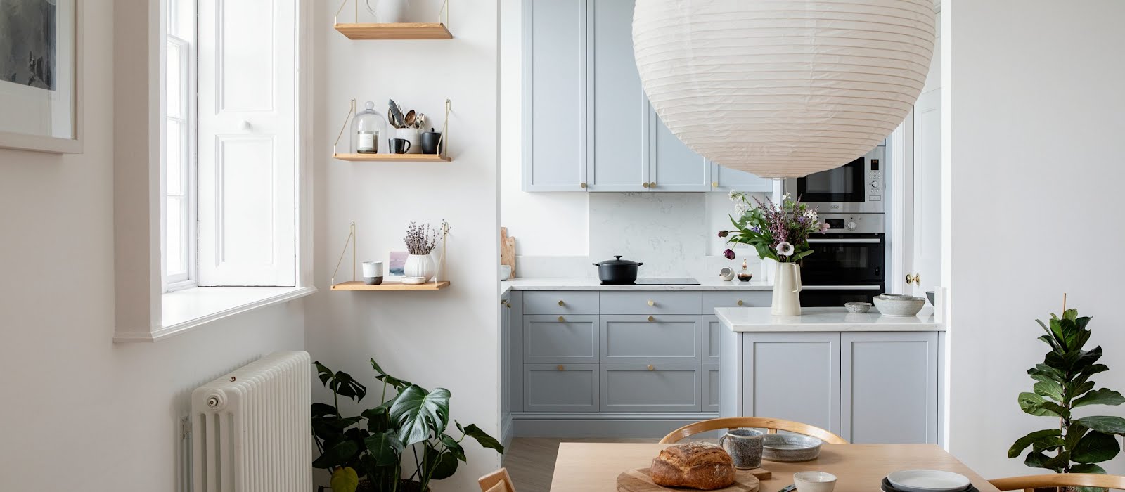
It also serves to create a “zone”, essential for open-plan living that needs to accommodate everyone’s needs. When everything is open plan, all the areas have to marry together and yet still have different functions. Ciara admits to worrying whether the cabinetry would dominate the space, but instead it achieves a refined functionality, a place for everything at the end of the day in the absence of an attic.

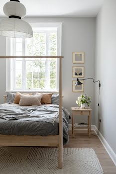
Throughout the home, there is a balance between strength and softness, between her barely there ethos and the fluidity of the open space, between the sharp lines of the interiors and earthy textures and neutral palettes, the delicacy of carefully arranged objets d’art and the simplicity of utility.
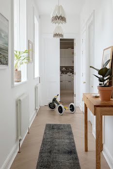
It might be pared back, but it certainly doesn’t feel stark or cold: it’s clean, thoughtful and unpretentious with a restrained palette and robust natural materials such as the beautiful ash hall table custom made by Irish furniture designer Colin Harris – a “real piece of nature” as you walk in the front door.
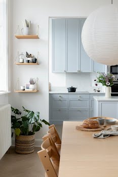
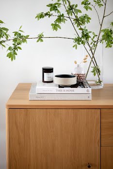
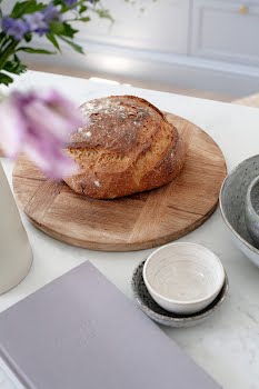
She’s not a pure minimalist – her love of texture is there in the beautiful collection of ceramics in the kitchen, the blousy floral arrangements and graphic plants peeking out from various corners, the rattan chairs strewn with wrung-linen furnishings and her love of art, adding playful touches to the otherwise calm walls. Finding the right art is an ongoing process. The apartment’s high ceilings lend a gallery-like feel to the place, making the process difficult, but she’s enjoying the research.
“I like collecting things that have a backstory,” she says. “One of my favourite pieces in the house is the little painting above the desk, which I brought back from a trip to Amsterdam. I love that it has a story and a memory behind it.” She also has a weakness for ceramics, which she collects wherever she goes.
“When you’re living in such a neutral minimal space, texture is important,” she muses. Apart from that, she’d like a third bedroom and some wardrobes. Right now, it’s a rail – the ultimate in minimal wardrobe design. “We’d like to get the wardrobes custom made, so that’s not in the budget right now, but we’re doing just fine with the rail,” she laughs. “It’s amazing what you have to live with when you’re forced to and how little you miss.”

There’s a resounding mindfulness to the space, reflective of Ciara’s approach to most things she does: a well-trained eye paired with a clean “Scandinavian” design language where simplicity and functionality reigns.
“As a stylist, I’m always assessing objects to see if they are adding value to an image and if they need to be there. The same view can be taken in our homes. I try to keep in mind the William Morris quote: ‘Have nothing in your home that you do not know to be useful, or believe to be beautiful.’”
Words: Orla Neligan
Photography: Ruth-Maria Murphy
This feature originally appeared in the Summer 2021 issue of IMAGE magazine.


