By Megan Burns
06th Aug 2020
06th Aug 2020
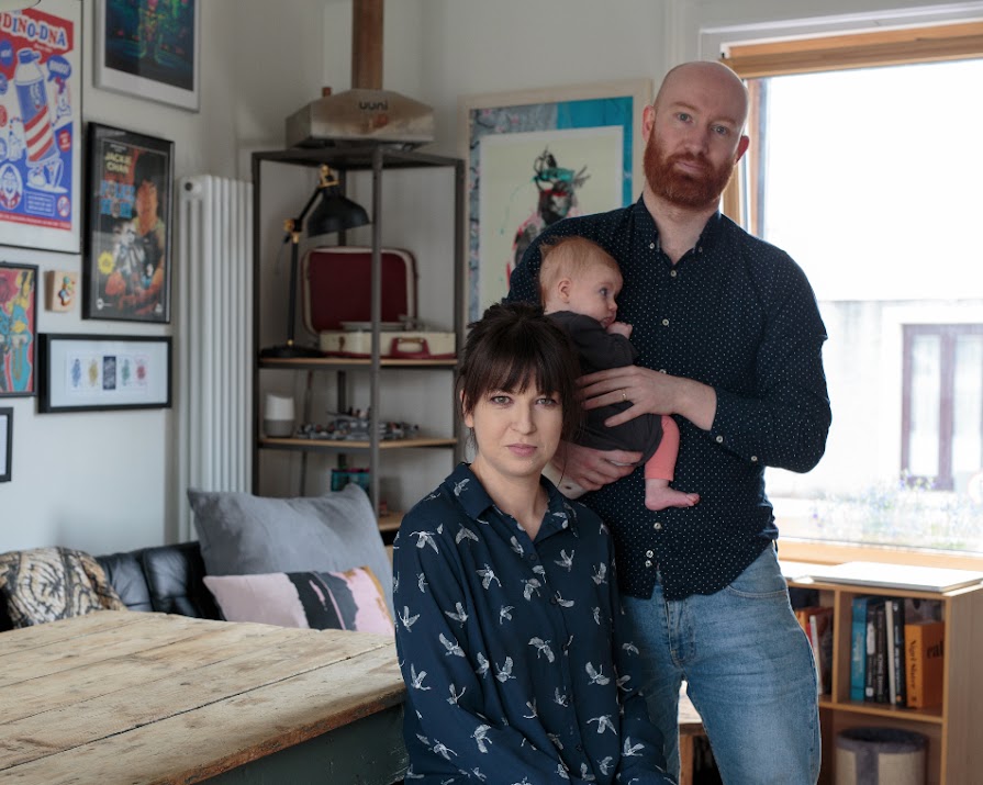
Architect Dualta Jones and fashion designer Francesca Griffin saw the potential in an old boiler repair shop, transforming it from commercial property to family home.
With housing at a premium, it makes sense that savvy home-buyers are thinking outside the box, investigating properties that others may pass over because they aren’t configured as a dwelling. Architect Dualta Jones and fashion designer Francesca Griffin were one such example of this, as their colourful home used to be a boiler repair shop.
When looking at homes, location was very important to Dualta and Francesca. Having both grown up around Phibsborough, they were keen to find somewhere in the area. They had both walked past what was to become their home countless times.
“It stood out as quite unique on the street because of the height difference and the large roller shutters,” Dualta explains.
“We made inquiries about its availability about four years ago when we started looking at homes and once we found out it was for sale at an affordable price we jumped at the chance.”

The couple admit they were “very lucky” that they didn’t require planning permission for change of use from commercial to residential, as they discovered it was already considered residential by the council, alerted to this fact when the issue was raised of overdue rates on the building during the sale. This saved them a considerable amount of time, as planning can be a notoriously slow process.
Open-plan kitchen
It did, however, require work to make it function well as a home. The age of the property meant it had to be completely rewired. Dualta and Francesca also reconfigured the space to give them an open-plan kitchen and living space on the bright first floor, while the main downstairs space is a studio for the couple to work in, leading through to a concealed bedroom and bathroom.

The exterior has two sliding perforated steel doors, which arose from the fact that the couple wanted to keep the opening from the original shop window, but needed a degree of privacy too. “The house is south facing so it felt like a crime to close that up,” Dualta explains.
Outdoor terrace
An outdoor terrace upstairs really helped the couple decide on the final layout. “Once the potential of the terrace became clear, the flow of the house came naturally to us,” Dualta explains, as having the kitchen and living space upstairs meant they would have access to the most light.

“We placed the bedroom at the back of the property shielding it from street noise,” he explains, “and the first room you enter is our studio which looks directly out onto the street, through the large shop window and perforated steel doors.
‘Good room’
“Francesca is a fashion designer and we are both very interested in making things, having a space which allowed us to do that was very important to us. We also wanted to flip the traditional idea of the ‘good room’ or ‘front room’ as a sterile space on its head. Our ‘good room’ is a representation of us, full of our interests and hobbies as well as our work.”
The size of the building meant that the couple had to think carefully about the best ways to use their space. At only 55 square metres, they felt that having fewer large rooms within a small footprint, rather than many small rooms would help to maximise the space.

Their bedroom is small, but Dualta explains that they decided that this was a worthwhile compromise, as “we spend a good portion of our time in the kitchen anyway” so it made sense to prioritise the open plan living space. They also have as much hidden storage in the house as possible. As the building has no rear access and has buildings on either side, their larger furniture items had to be lifted to the first floor by a crane.
One such item was their beautiful dining table, which Dualta explains had a dramatic journey before it even came to the crane. “The table came from my family home and nearly became the subject of a legal tussle on its sale, as the buyer had asked for it to be included, but I had always wanted it.”
Eventually the matter was settled, and the table is a real centrepiece of the open-plan space.

As a small space, the couple don’t have room for lots of furniture, but they’ve added real personality to it with their impressive gallery wall of artwork. “We both like minimal spaces but with the walls covered in artwork – it’s a sort of organised chaos,” Dualta explains.
“It may not look like it, but the artwork is generally in very specific spaces. You can look at rooms and see a big expanse of artwork, or you can look at small incidental moments where certain pieces are grouped together or isolated.”
The art is also from a whole host of places, a real picture of their life together: “a lot of it is from trips abroad or projects we have worked on. Others are from pop culture references that we are fans of and then some from artists we like or are friends with.”

Overall, the project was hugely successful, allowing the couple to create a space that feels truly representative of them in their perfect location. Their favourite space, they say, is the outdoor terrace off the living and dining space. “The balance of privacy and light with the perforated steel doors to the front of the house also worked out really well,” Dualta says.
For anyone undertaking a similar project, Dualta would definitely recommend positioning the living space upstairs. “You realise you spend so little time in the bedroom that it makes no sense allowing it to take up prime access to light. Also, consider two or three statement spaces.”
“For the size of house we have, our bathroom is relatively large. It makes the space feel grand in comparison. Also dedicating a large space to a specific function, which for us was the studio, gives the illusion of generous space.”
Featured photo: Francesca, Dualta and baby Lydia. All photos: Melanie Mullan.
Read more: This coastal Connemara cottage will make you want to move west
Read more: Downsizing lessons from this gorgeous Dublin mews
Read more: Design lessons we learned from this garage conversion


