By Lauren Heskin
30th Mar 2021
30th Mar 2021
Storage is the key concern in a small kitchen, but without foresight and some clever design ideas, it can quickly feel cluttered and cramped.
In a small space, you have to prioritise quality over quantity. Yes, a giant L-shaped couch might be your dream, but if you spend your life edging around it to get to the kitchen, then is it really worth it? Would a comfortable, well-made small sofa and footstool not better suit the room, while only slightly reducing your ability to stretch out?
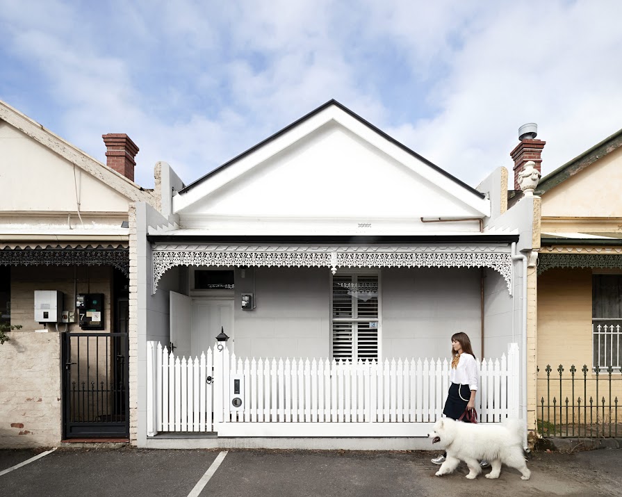
These were the questions asked by Whiting Architects and award-winning appliance brand Fisher & Paykel when they were brought in to design a kitchen for this tiny home in Melbourne, Australia.
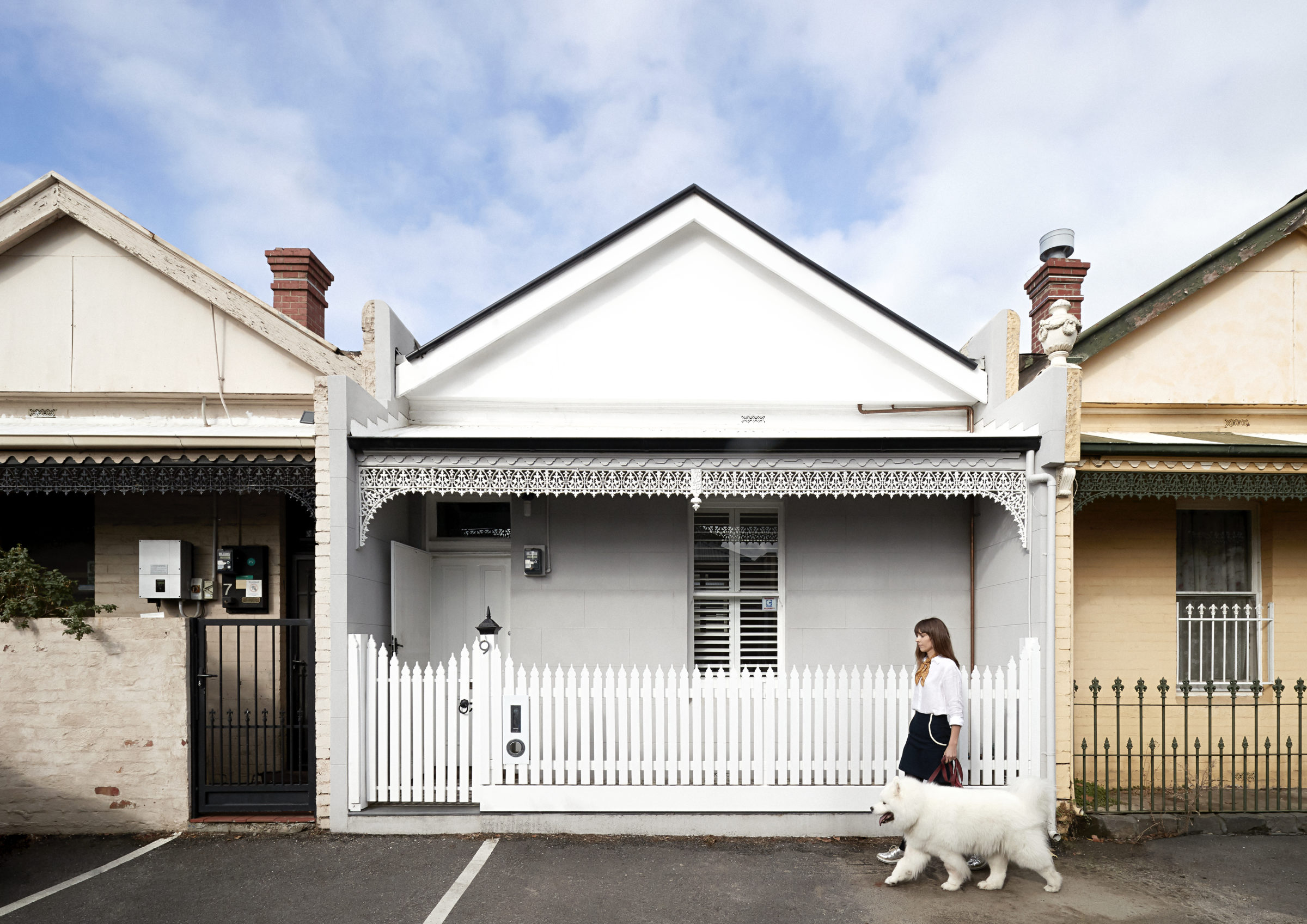
Wanting to balance functionality with form and space, the kitchen had to work both as a cooking and social room simultaneously. “The owners love to cook so they wanted high-quality, hard-working appliances. We wanted to play down the look of the kitchen. So the need for functional appliances that blended seamlessly into our design was paramount and Fisher & Paykel do this extremely well,” explains architect Steve Whiting.

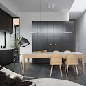
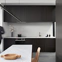
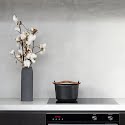
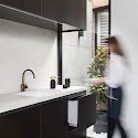
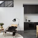
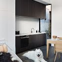
All the necessary elements for a kitchen were seamlessly integrated into sleek, minimalist cabinetry. Black and white units contrast to make a statement while still keeping the room feeling calm and uncluttered. A matte grey splashback is brought to the tiny courtyard window, blending and bleeding into the concrete exterior, making the space feel bigger as a result.

Even the smallest details have been considered here. The dark glass of the oven door is perfectly in line with cabinetry and even its distance from the pale grey countertops is the exact height of the cabinetry doors, making for one clean line running the length of the kitchen. A minute detail that pays dividends to the overall effect.
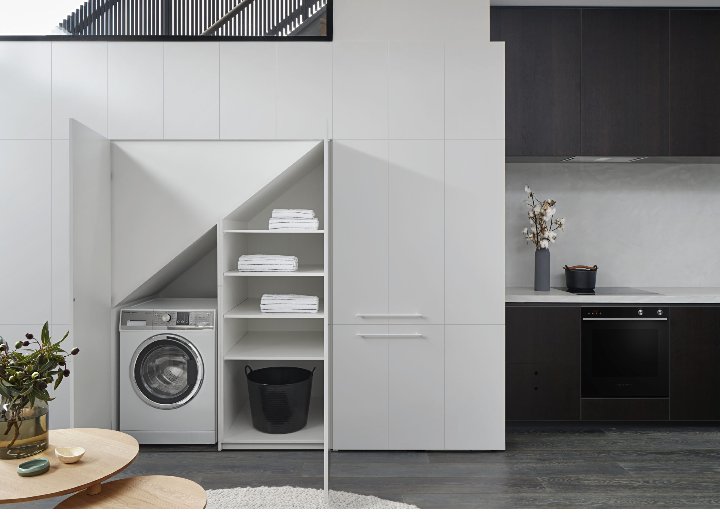
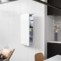
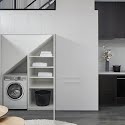
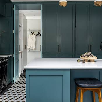
Needing to pack not just a kitchen but a utility into this room too, the space under the stairs has been dedicated to a tucked-away clothes area and integrated fridge, leaving the kitchen itself free for cooking and food storage. When you look at simply, it’s like an assembly line. You start at the fridge, move to countertop, then to the oven and the sink and finally to the dishwasher, also neatly integrated to the end of the units.
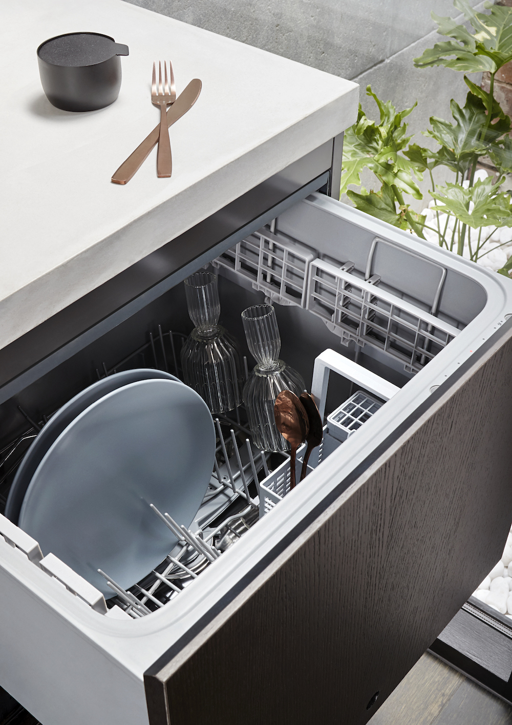
Incorporating the necessities with an awareness of how the kitchen will be used allowed the layout of the kitchen to inform the design, resulting in a flowing, monochrome space that feels ample and comfortable
Photographs by Shannon McGrath


