Interior designer Suzanne Garuda has created a fun, party vibe in this new Dublin 8 hotel
By Megan Burns
04th Mar 2024
04th Mar 2024
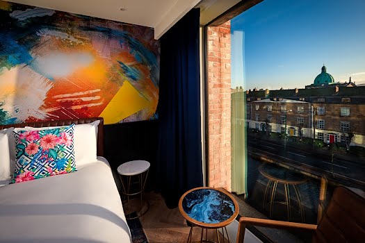
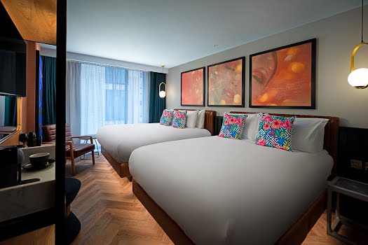
Working with Irish artists, as well as incorporating lots of colour and unique touches, the design ensures the NYX Dublin hotel stands out.
Having opened its doors at the Grand Canal at Portobello Harbour, NYX Dublin joins NYX hotels in London, Milan, Madrid and Munich. Known for their unique style, interior designer Suzanne Garuda of Garuda Design was tasked with creating a bespoke design for this new opening.
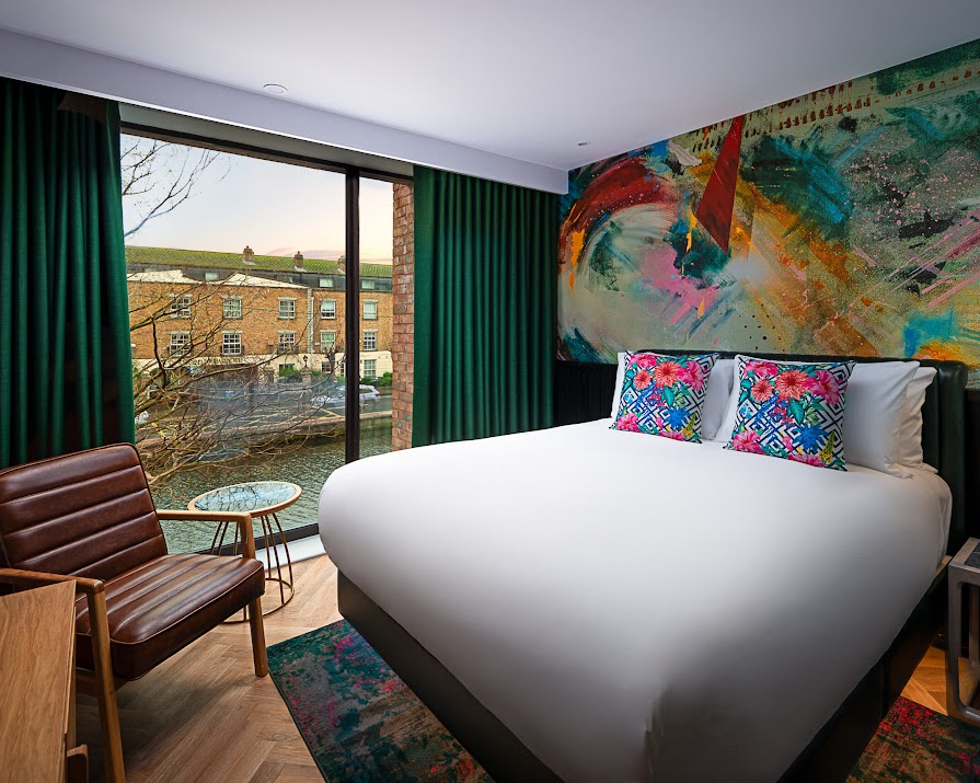
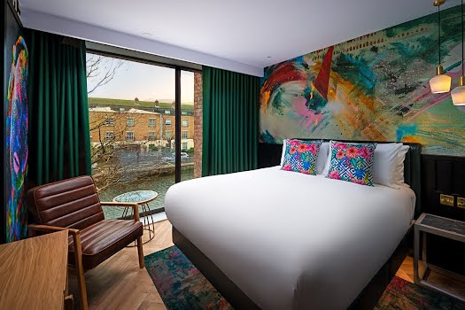
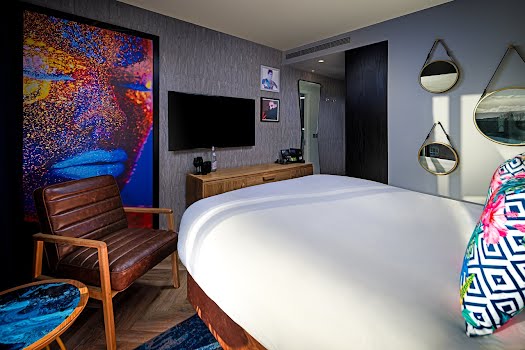
Suzanne was inspired, she explains, by the ethos of the hotel as a modern, exciting, cool and urban destination. “It appeals to those who appreciate contemporary, art, design and music,” she says. “We wanted to create an interior that was fun, exuberant, playful and an escape from the mundane and ordinary. A place where people could instantly be drawn in to the party and feel a sense of freedom.”

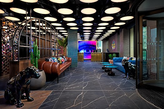
To achieve this, she explains, “We used a carefully balanced but dramatic palette of pattern, vivid colours and texture. Large LED art screens light up and constantly change the backdrop, dramatically taking you from day to night. The giant eye on the LED screen behind the reception watches all the action.”
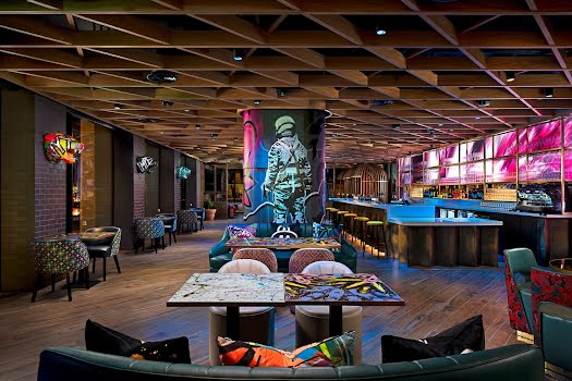
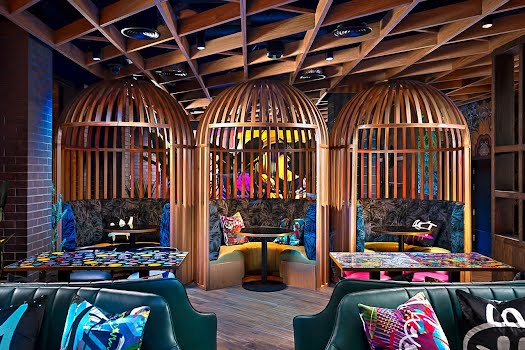
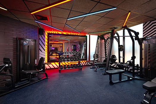
This mood is carried through from the biggest to the smallest details. “A sea of saucer like pendants greet you at the entrance, coloured neon artworks, jewel-coloured upholstery fabrics, mixed with acrylic printed table tops all sit within the riot of colour, pattern and changing imagery. Reflective 3D gold tiles, a sculptural brass bar and bold graphic wallpapers blend together to connect the spaces.”

The work of Irish artists including Shane Sutton has been incorporated into the design, which Suzanne says was important to the atmosphere. “From the outset it was important that NYX would be the destination for local artists to be represented and local DJs to perform and bring their music. The graffiti art of Shane Sutton on the columns and servery doors is all about the storytelling and art, the visuals and the music tell the stories.”
The design was bespoke to this hotel, which is illustrated through one of Suzanne’s favourite aspects of the finished space.

“The footprint of the building is quite small, especially on the ground floor which has quite a low ceiling so it was important to use the surface of the ceiling as a continuation of the visual backdrop. The saucer lights and the timber geometric ceiling add another dimension to the building that envelopes you from all sides of the building and heightens the experience. For me using all the surfaces walls, floors and ceilings may the experience more impactful and immersive.”
This article was originally published in January 2024.

