This art-inspired Dublin 8 extension is a masterclass in adding light and colour to a home
By Megan Burns
03rd Oct 2023
03rd Oct 2023
Seamlessly blending old and new together, this terraced Victorian house in Dublin 8 draws inspiration from a rather unexpected source.
Architect Rae Moore of Atelier Rae transformed this Victorian terraced home in Dublin 8 with clever design and unique details, taking her inspiration from contemporary art.
Extensions, although a common sight in homes across Dublin, can be notoriously tricky to get right, as they try to balance the flow and light of the existing house, while adding a new and functional space. There are many things that architects take into account when designing extensions, but contemporary art is not often one of them.
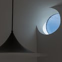
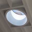
Perhaps it should be, though. Architect Rae Moore when designing this Dublin 8 extension was inspired by two modern artists, and the result feels refreshingly unique. She focused on Olafur Eliasson’s materialisation of light and exploration of its sensual qualities, as well as Donald Judd’s use of colour to magnify the effect of shapes and forms, and to play with depth and perception.
Advertisement

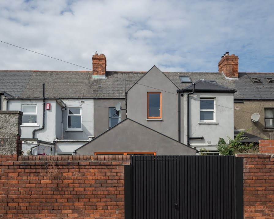
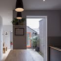
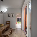
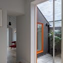
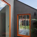
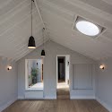
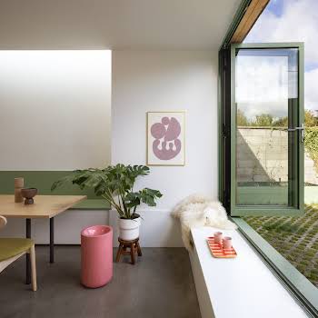
In the resulting extension, light streams in from unexpected places, shapes, and angles, creating a wonderful play of light and shadow. The colour palette too, with its tonal greys, natural wood and hit of orange from the window frames, feels fresh while never falling into the realm of cold, or boring.
In fact, with a modest budget and a simple selection of materials, Rae believes “The most luxurious material in this project is light itself. Each space is carefully formed to hold daylight and sky views, and great care and consideration was given to the size, shape and location of each window.”

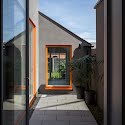
The windows and doors are a Danish alu-cad system, which is easy to order in almost any colour. Rae saw this as a great opportunity to add character. “The window colour is one of my favourite details in this project – we spent a lot of time researching colour tones and trends, but it wouldn’t have been possible without our fun, brave client too.”
The house itself, a two-up two-down Victorian terrace in Dublin 8, needed extra space and an injection of light. Rae explains, “A lean-to kitchen and bathroom had been added to the back of the house, leaving much of the original interior dark and dreary. Outside, a large workshed had gobbled up most of the garden. Both were poor quality, and a bit leaky.”
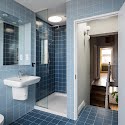
The clients wanted a new kitchen, living, dining and utility space on the ground floor, and new bathroom on the first floor. They also wanted the space to feel more connected to the garden.
Advertisement

While the approach with this kind of project is often to, as Rae puts it, “stick a big open plan box on the back of a house,” she explains that she tries to avoid this if at all possible. “This strategy rarely facilitates the delicate nuance of our daily domestic rituals. In this project, I made sure each ‘ritual’ is given is own space and atmosphere.” This creates many distinct spaces for different needs, rather than one large space trying to fit every function and mood.
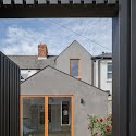
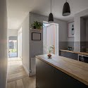
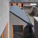
The resulting design is a series of pitched-roof volumes arranged around a courtyard that injects natural light into the surrounding spaces. On the ground floor, three rooms nestle together. Their doorways are all in line, creating a long view through the different spaces inside and out.
As the site was particularly narrow, the pitched roofs add a sense of space through their generous height, and as Rae explains, the lower side walls avoid overshadowing the neighbouring homes. “It’s good to be neighbourly, especially in a terrace.”

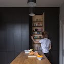
The black-stained plywood kitchen was also designed by Rae, and handmade by a local carpenter. This meant every detail is bespoke, and allowed the limited space to be maximised, including the clever pantry wall that is tucked into a neat sliver of space.
Advertisement
The outdoor space was not forgotten about either, and the house now has three distinct gardens: front, middle and back. “Each garden has its own character and function, much like the interior rooms,” Rae explains. “The middle garden is the most private, creating a city-centre sanctuary. In the mornings, sunshine pools through the courtyard and into the middle of the house – a perfect start to the day.”
Photography by Ste Murray.

