Interiors shopping: How to clash prints and patterns and make it work
By Lauren Heskin
07th Apr 2021
07th Apr 2021
Want to use clashing patterns in your interiors but unsure how to do it without inducing a headache? Here are our top tips to bring together strong prints that look cool and collected.
Spring arrives and suddenly nature is a riot of colours, textures and sounds. Bobbing yellow daffodils give way to statuesque tulips and confetti bombs of cherry blossoms, trees suddenly regrow their green cloaks and baby birds chirp loudly when they hear mom coming with lunch. It’s a gloriously messy, convoluted riot, and yet it works. It makes us all feel alive again, hope for a sunny summer and long days.
But trying to bring that clashing chaos into the home can be quite a different story. You can see it working across Instagram in a sun-drenched home that is not busy and yet restful (Anthropologie have built an interiors empire on it), but trying it yourself is daunting.
However, there are a few ways you can bring in a mix of patterns, colours and texture without your house resembling an untidy fabric shop.
The rules of pattern clashing
Work in threes
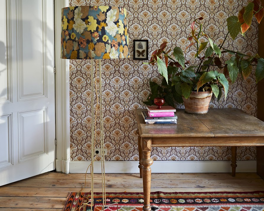
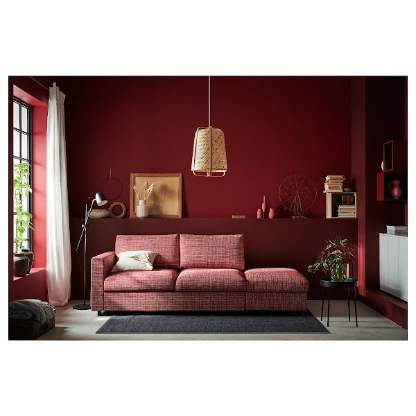
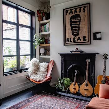
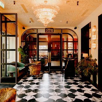
Try and group together your patterns and clashes into groups of three. This can be in through colour, theme, texture or era. For example, in the image below, we can group together the light shade, wallpaper and the potted plant, they all have a leafy theme, from the abstract design of the light shade, to ornate replicating pattern on the wallpaper and the real-life leaves. While the timber floor and two rugs both all have a shared fawn colour throughout.
Working in threes can help soften the stiffness of interiors while also create continuity. The idea is originally from the garden, with garden planting in irregular clumps of three to create more organic, natural-looking beds, which makes it the perfect rule to bring indoors in this design.
Advertisement

Use a colour wheel
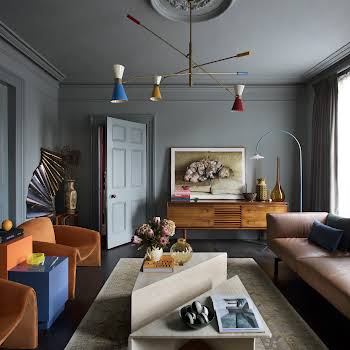
While you can and absolutely should be brave with your colour choice, use a colour wheel and combine complementary colours that mesh well together. This will help to unite your clashing fabrics while still being bold and brash.
Be aware of the daylight in the room
If you don’t already know, find out which way the room is facing. If it’s got lots of south-facing light, you can go for very bright colours like luminous yellows. If your room is north-facing, bright shades can suddenly look a little muddied so better to lean into it with earthy reds and deeper hues.
Use texture to your advantage
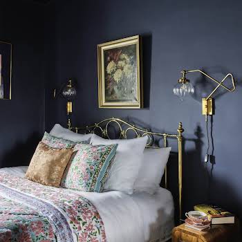
Lots of texture is your friend, especially when it comes to contrasting patterns. If you vary the textures of soft and smooth, weighted and light, it’ll give your interiors a sense of depth and longevity.
Advertisement
Remember to scale
Particularly when it comes to patterns, try not to mix too many prints of the same size. Combine a ditzy tiny pattern with a blowsy print or a structured geometric one. This variety will add depth and prevent you from getting a headache when you look at the combination.
The Basics
The Layers
The Finishing Touches


