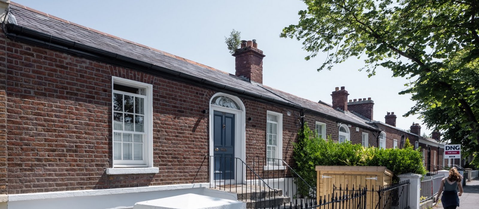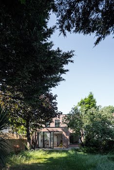
It may look small from the front, but this Dublin home has been opened up thanks to a clever extension
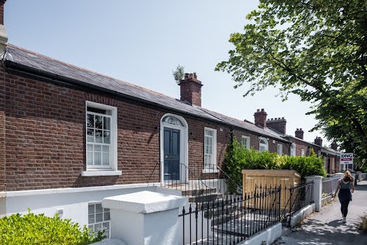
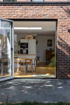
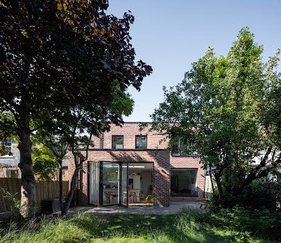
This seemingly small exterior conceals a bright and generous interior.
This Dublin home was in need of some improvements, and its owners got in touch with Ryan and Lamb Architects to help create a more inviting space.
Aileen Boylan, associate at Ryan and Lamb Architects and project architect and creative designer explains that some of the key issues with the existing house were confined to its garden level at the rear. “There were low ceiling heights, a lack of daylight, and a poor connection and access to the garden. As a result, the garden was not used as much as it should have been.”
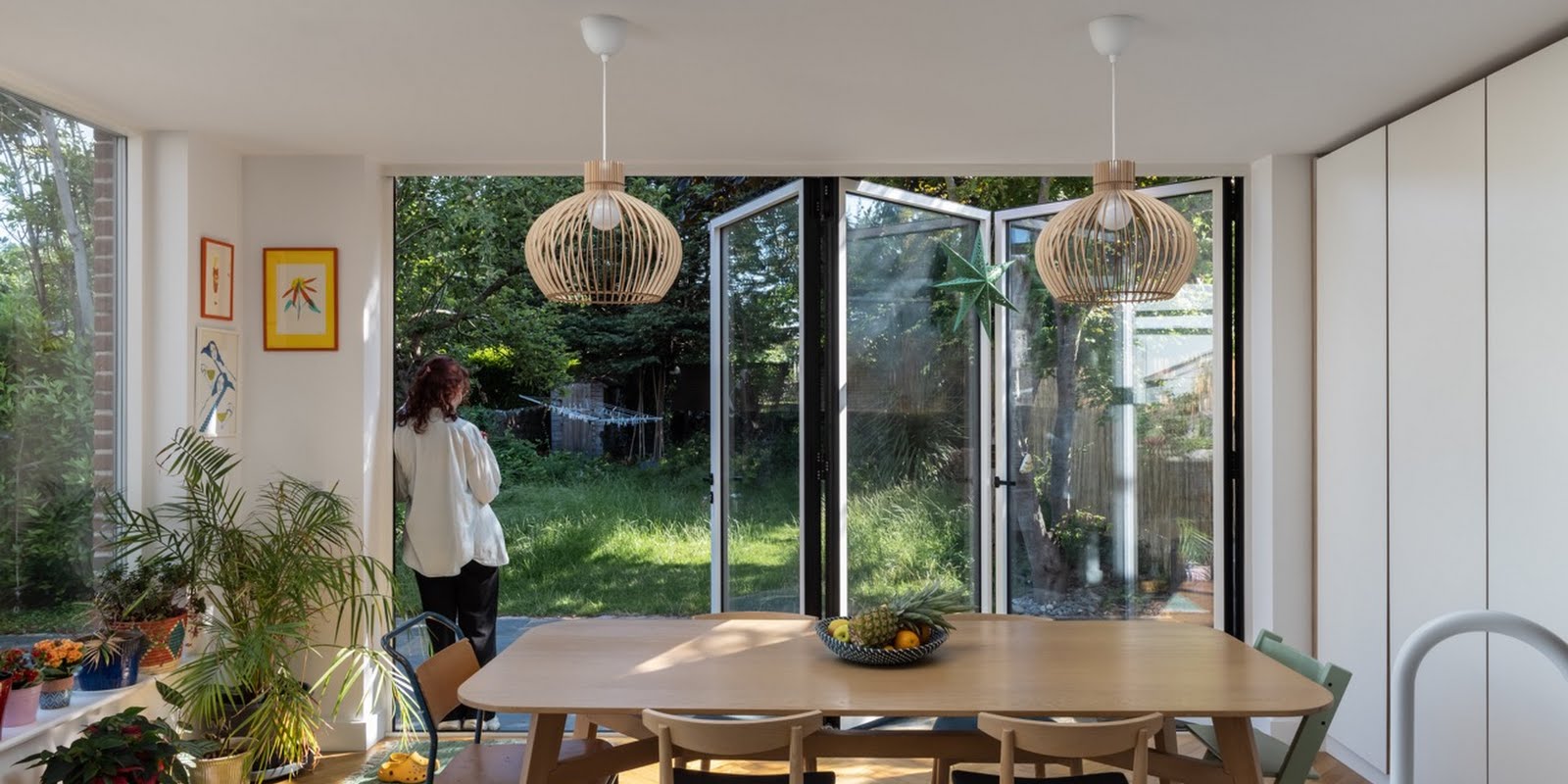
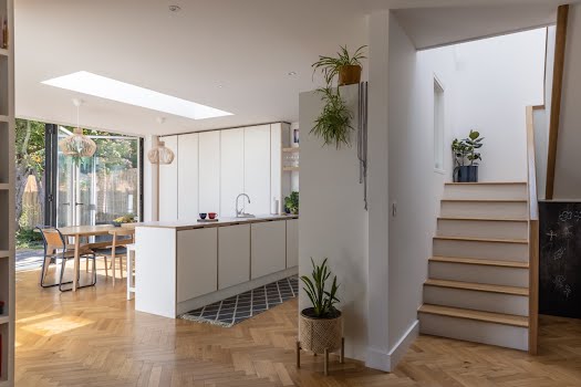
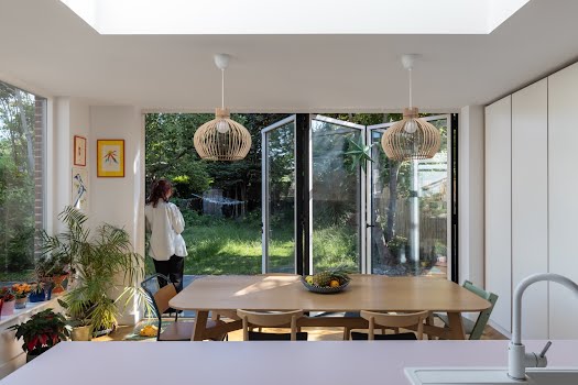
The homeowners wanted to create a brighter, more open plan design, whilst creating more of a connection to both the garden and the front of the house.
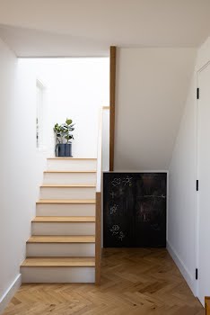
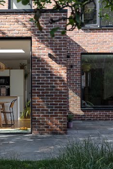
Aileen says, “The plans involved relocating the stairs, lowering the floor level at ground floor, and creating new openings to the rear of the existing house. We also constructed a two-storey extension to the rear with a bedroom, bathroom, kitchen, dining and sitting area, and everything was finished off with landscaping to the front and rear.”
She explains that the condition of the existing house was poor, which created its own set of challenges. Work was required to stabilise the structure, including underpinning existing walls.
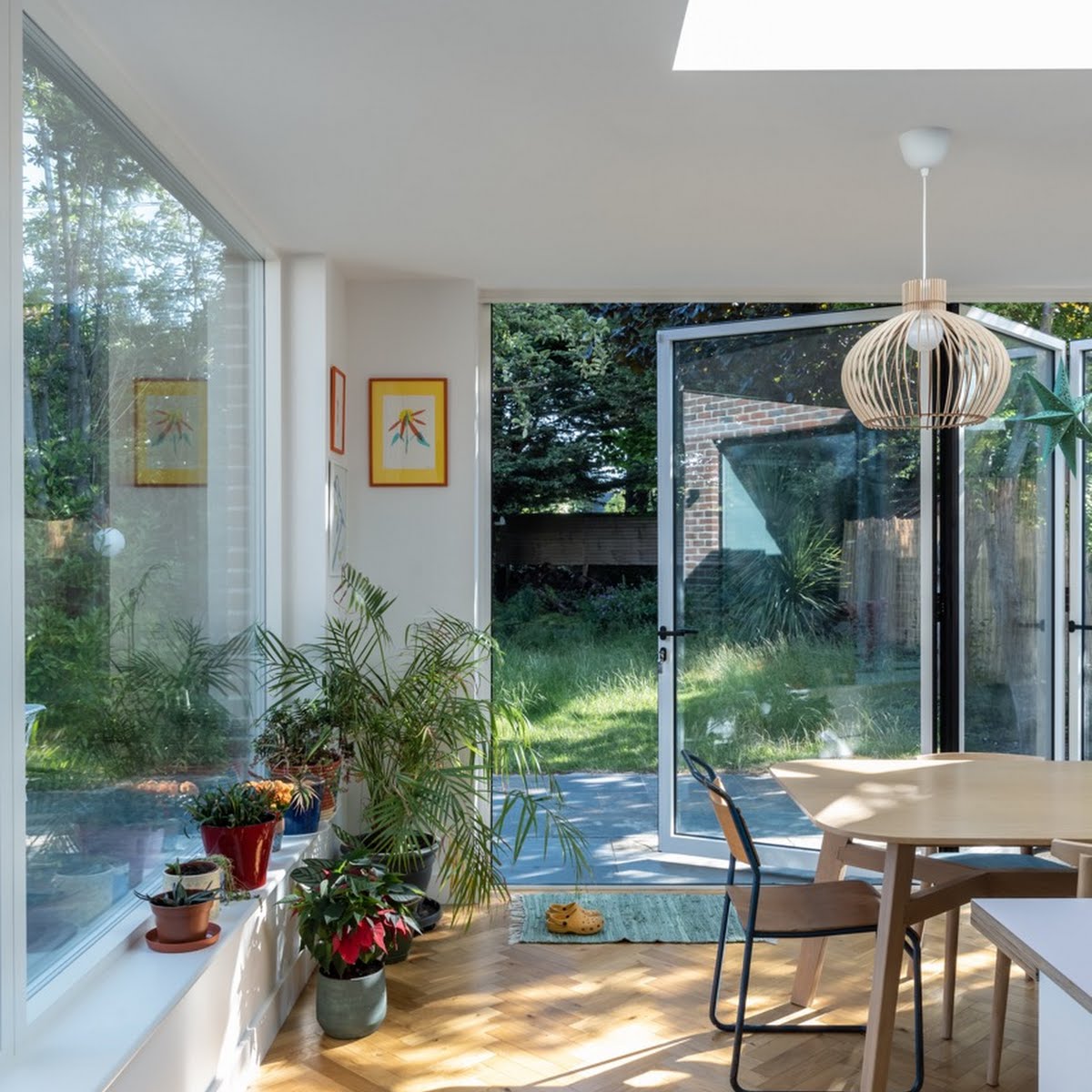
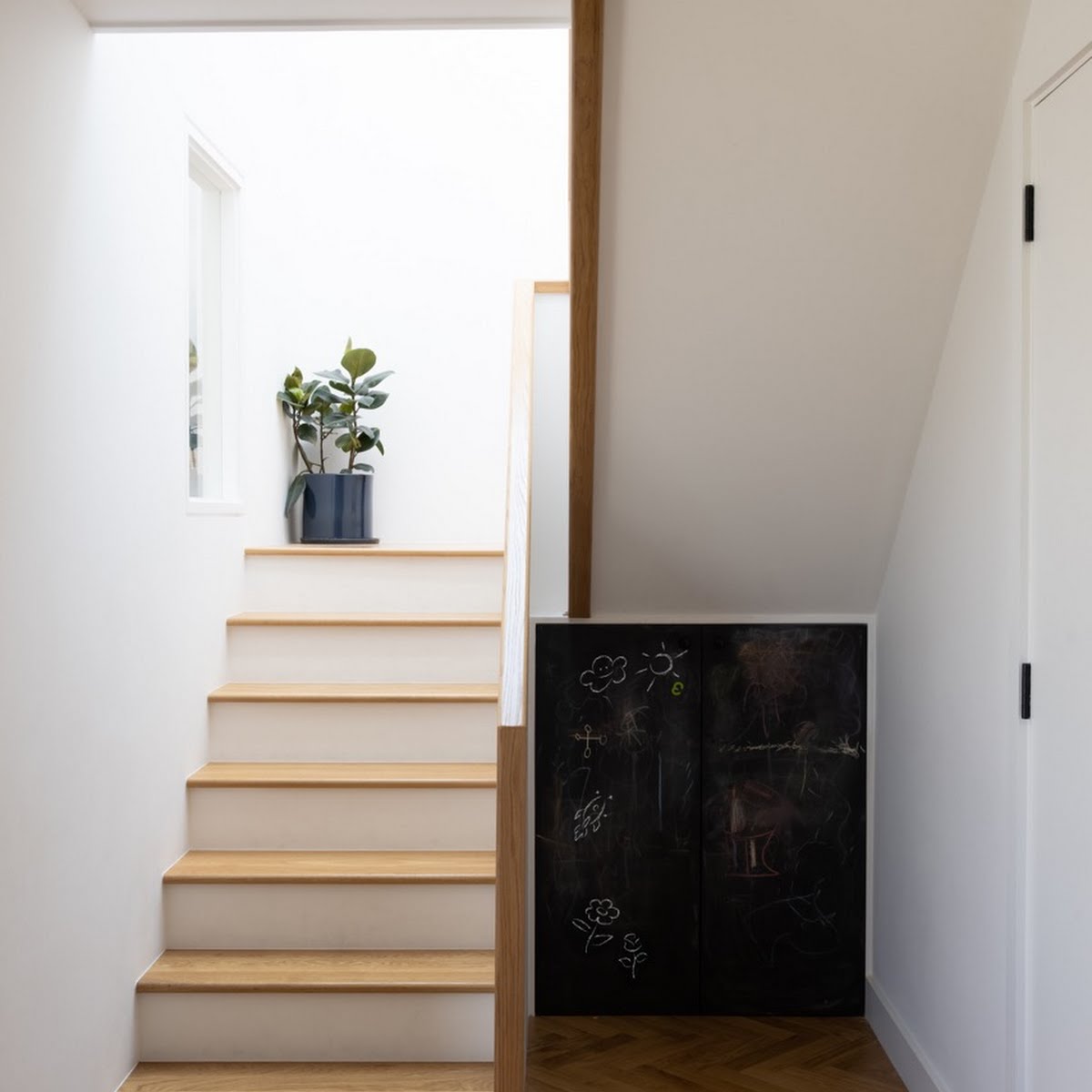
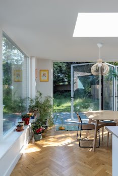
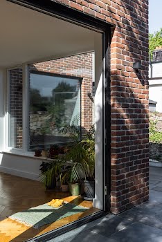
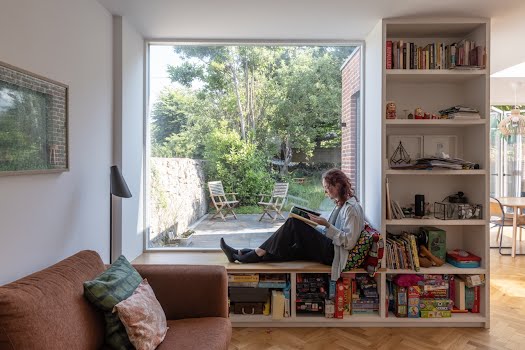
Now, the stairs lead down to a bright, generous space that’s full of light and makes the garden feel very much part of the house, thanks to bi-folding doors and picture windows.
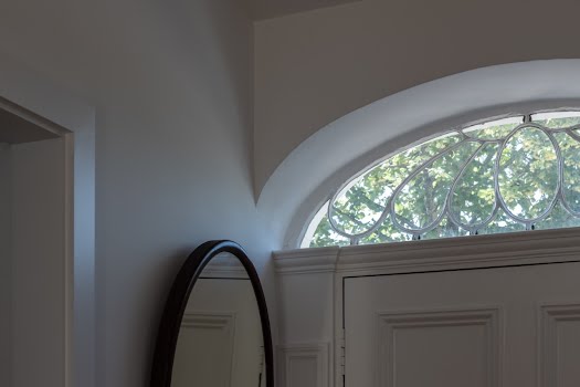
The design takes into account the original part of its house, and its period character. “The original house has been kept very much as it was,” Aileen says.
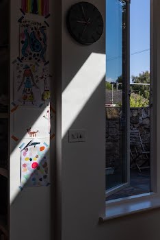
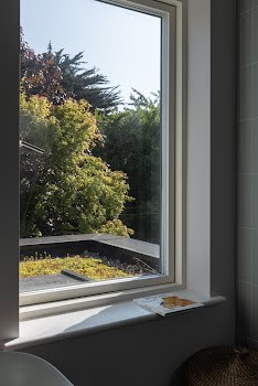
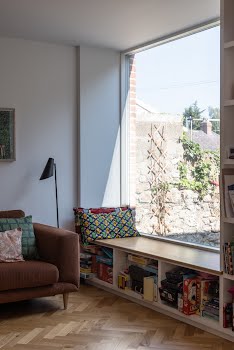
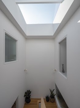
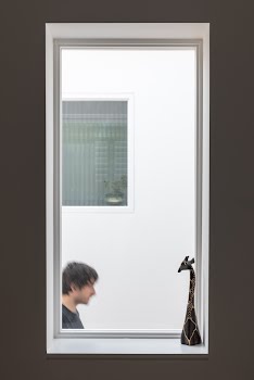
“New insertions are contemporary in execution but sympathetic to the original design. The new stairwell acts as the link between spaces where light floods into both the new and old parts of the house through carefully placed windows.”
A link is also created through the materials that were chosen.
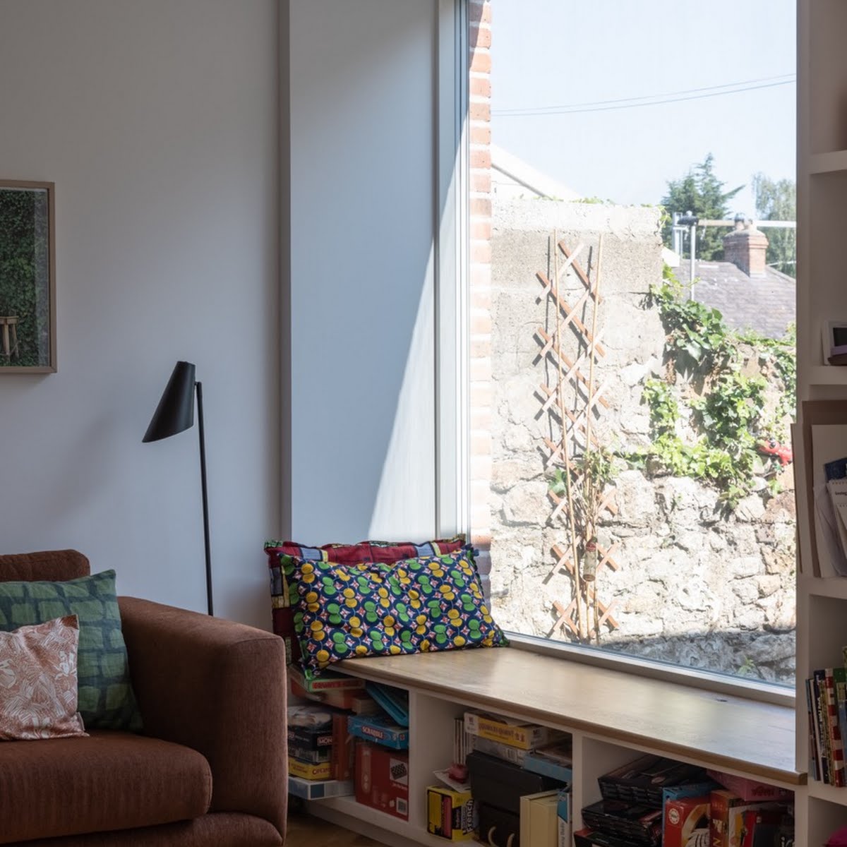
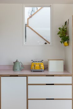
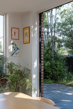
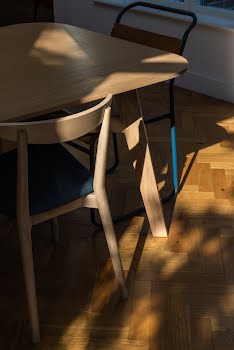
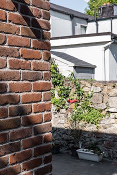
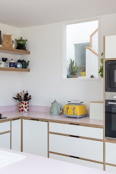
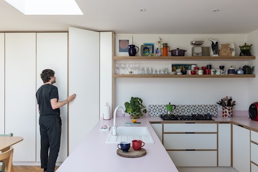
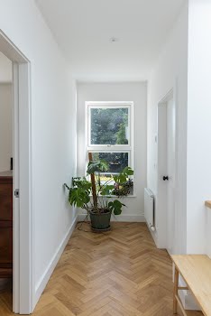
“Brick was used on the exterior of the extension as a nod to that used on the original front facade, which is complemented internally with herringbone timber floors and birch ply/formica joinery. Simple palettes of colour are used throughout to allow our clients artwork and furniture to sing.”

