Mid-century cool meets contemporary Irish design in this Dublin seaside home
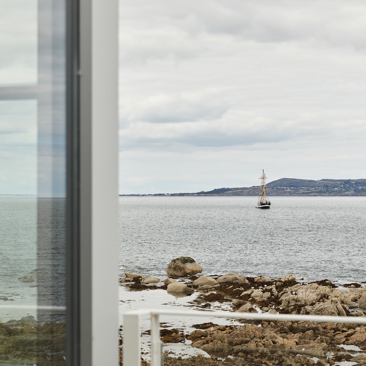
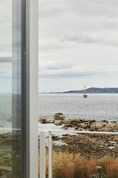
This seaside sanctuary gradually reveals its spectacular views of the Dublin coast – tucked away behind an inconspicuous exterior.
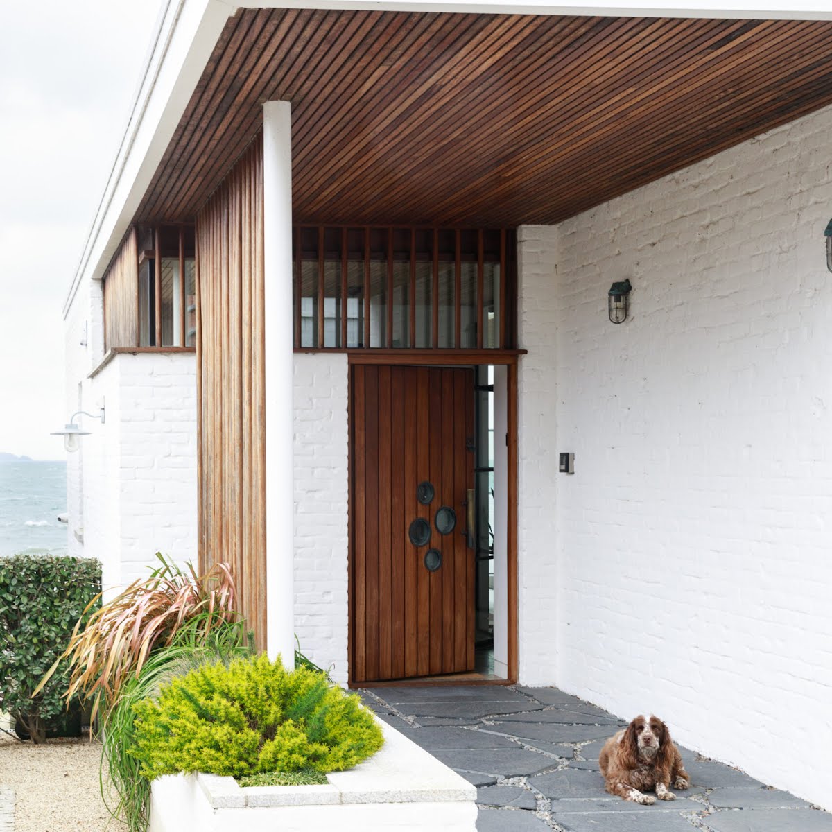
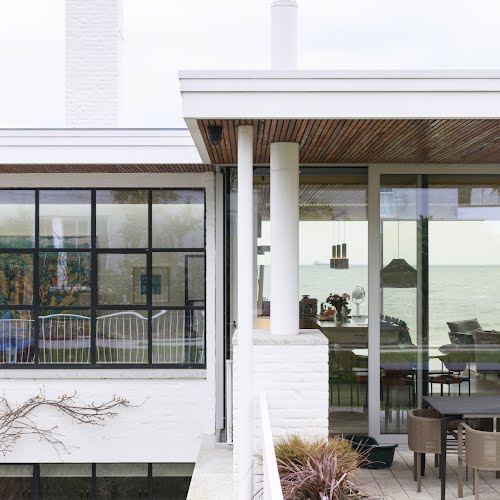
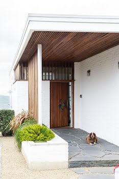
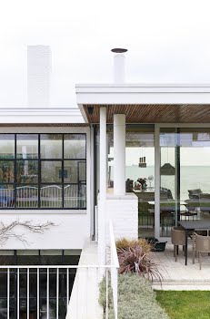
Imagine a trip to the Hamptons unwittingly diverted into a mid-century California cool home without the egotistical swagger. From the street, there is just a hint of this sleek building that unfolds effortlessly to the sea, tucked into a hillside on the Dublin coast, its soft limewash brick exterior a subtle nod to what lies beyond.
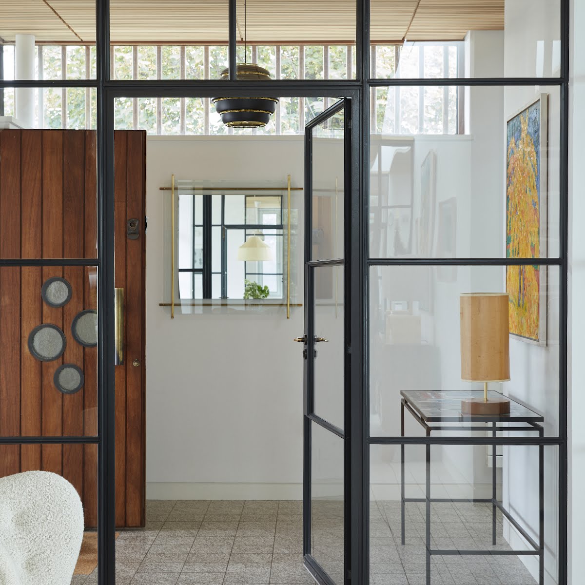
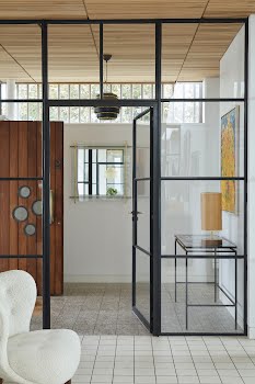
Even when you step inside the porch, you are deliberately drip-fed beautiful hints of what’s to come without revealing too much. It’s not until you walk through the gallery lobby and into the main living space that you meet the panorama of ocean from the glass façade – a clever design element intent on delivering design moments and sea views with every Tardis-like reveal.
“The sequence of space is probably my favourite aspect of the house,” says Mark Arigho who, together with the late John Meagher of de Blacam and Meagher Architects, designed the house before setting up his own firm, ALWA. “John was a great mentor of mine and a master of architecture. He considered everything, right down to the smallest detail. He always said a home should be somewhere that isn’t too regimented, where life takes over, and that’s always stuck with me.”
How this house reveals itself is testament to that. It’s not just one big gallery space and yet the abstraction of plans disappear over time: where you hang your coat, or rest your drink, where you sleep or make your coffee – the fluid flow of life takes over.
There is a formality to the design that harks to Eileen Gray’s E-1027 home in the south of France and Villa Mairea in Finland, designed by Alvar Aalto, both key influences for Mark: L-shaped, flat-roofed with floor-to-ceiling windows, both open and compact. But it’s tempered with an ethos that’s reminiscent of Californian style: luxurious but casual, expansive yet grounded in mid-century modern aesthetics while feeling very Irish, which also comes down to the subtle hand of interior designer Eoin Lyons of LyonsKelly Architecture + Design.
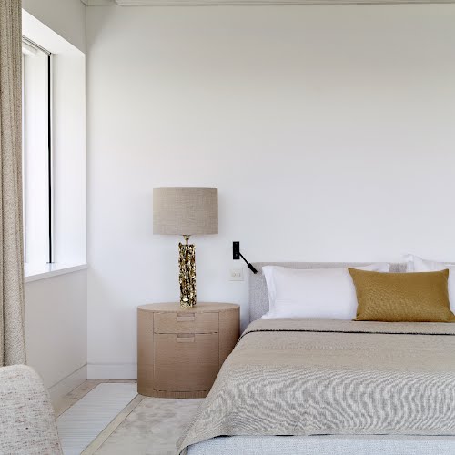
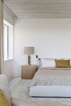
Where architects de Blacam and Meagher resisted over-manufacturing, Eoin ensured the interior complemented the natural feel. Furnishings are a masterclass in neutral tones and natural fibres layered over exposed materials. “Our aim was to enhance the sense of warmth and comfort achieved through the architecture by using casual but sophisticated furnishings,” explains Eoin.
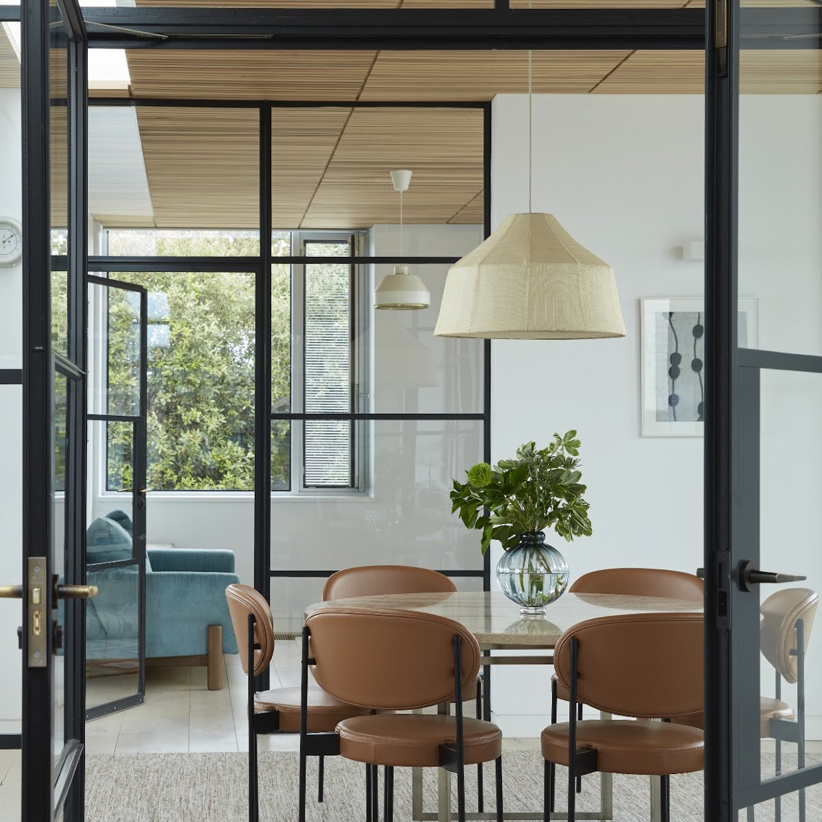
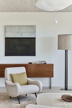
The design combines mid-20th-century antiques, new Irish design and contemporary furniture to give each room its own identity, while creating a visual flow through the house by linking colours and materials that reflect the sea and sky in each room. “I love the high and low together: things that are polished next to rough-hewn linens, for example, or the balance of big chunky pieces with more delicate ones.”
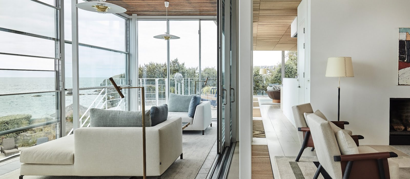
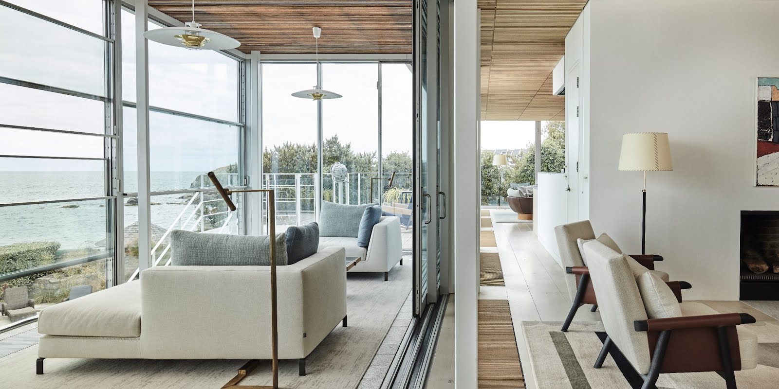
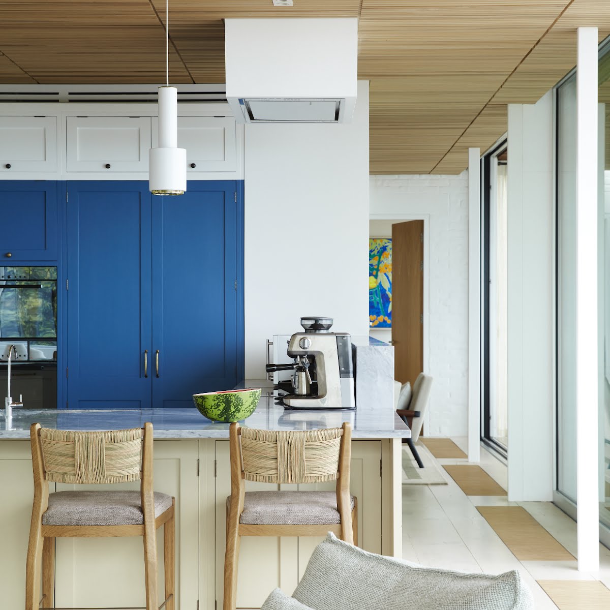
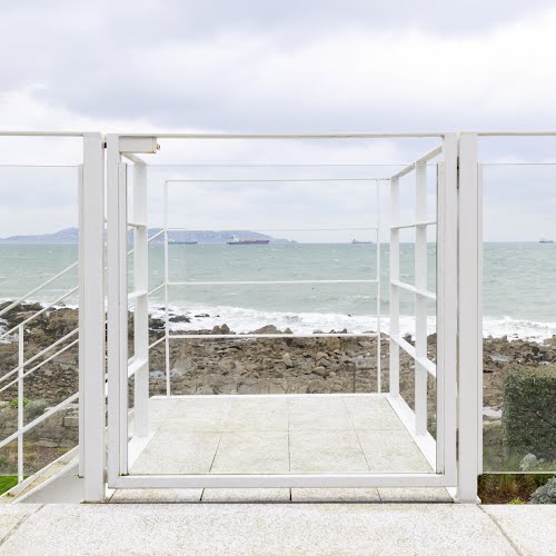
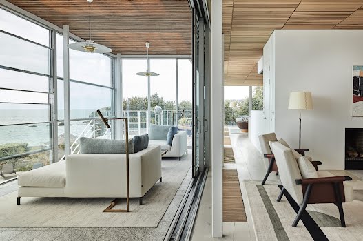
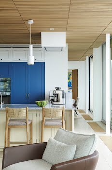
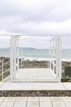
A pendant by Alvar Aalto hangs in the porch next to a 1950s Spanish table with a tiled top and a 1970s mirror. More pendants by Alvar Aalto hang in the sea room over two daybeds by B&B Italia on which to lie and take in the view. Nods to Eileen Gray are dotted throughout: a pink rug designed by Gray and produced by Ecart in the drawing room, blue and cream kitchen cabinets that mirror colours taken from her E-1027 villa along with an exterior balcony and steel staircase similar to that in Gray’s French villa garden. And there are local touches, too: a sea green and pale blue rug commissioned by Connemara Carpets in the family room and a sideboard by Fiona McDonald in the gallery space.
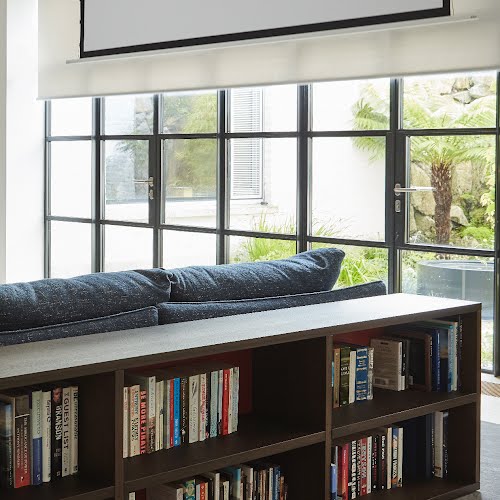
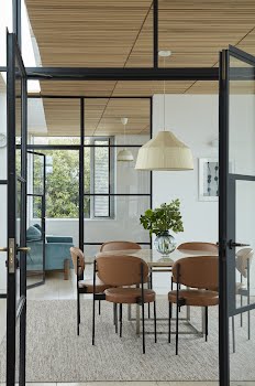
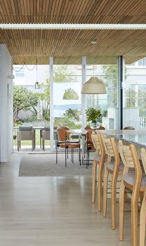
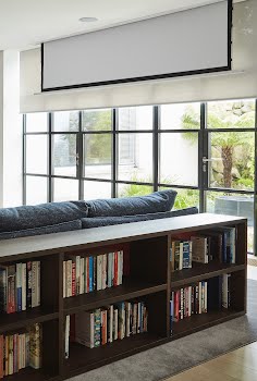
The result is a lighthearted space built of mid-century modern’s classic palette of materials with some softer twists and vintage finds: poplar slatted ceilings, a limewash brick façade, steel, glass, linens, marble, leather – a highly refined temple of contemporary interior delights with the layout firmly focused on the views with curved sofas and swivel chairs angled towards the ocean.
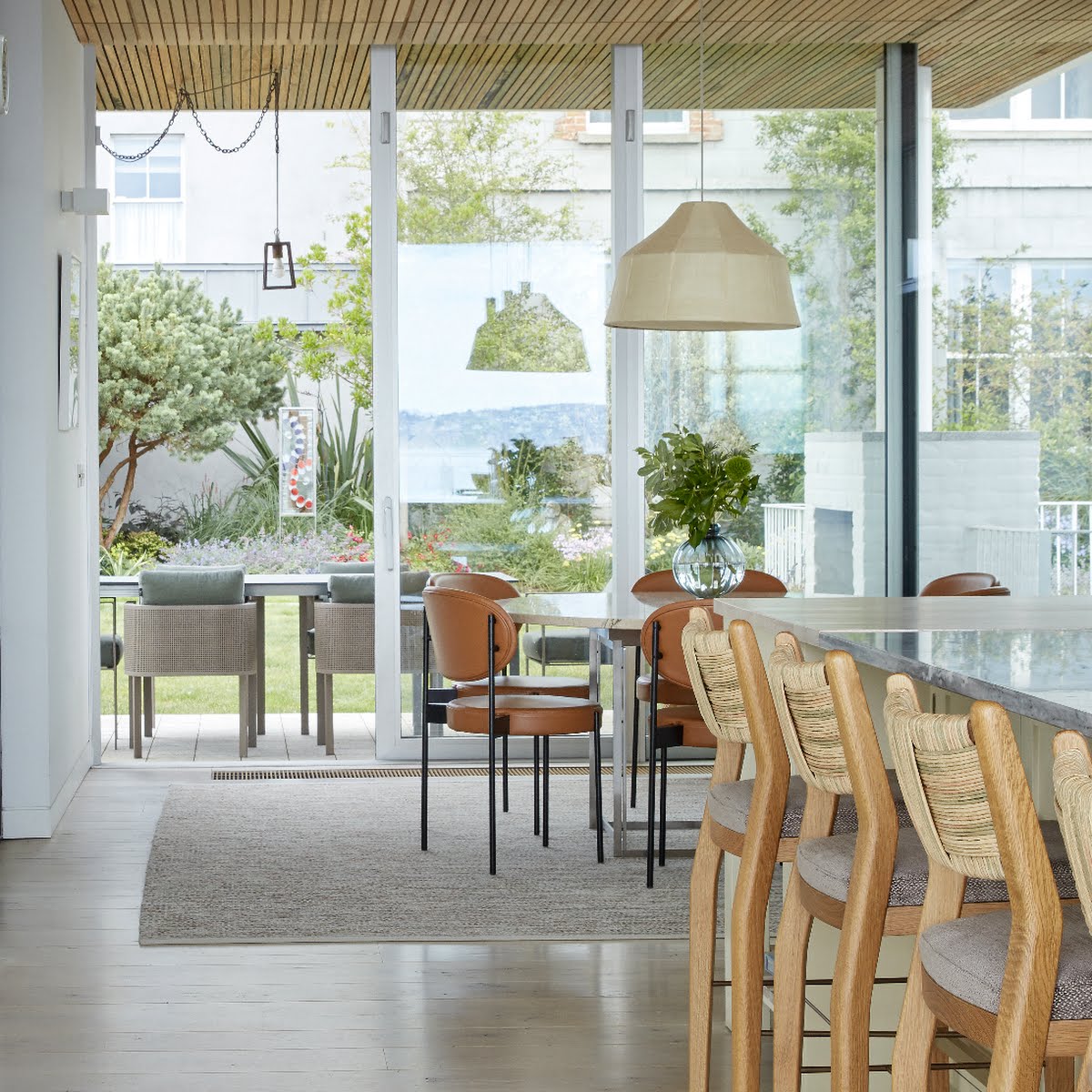
The liberal use of glass throughout the home seamlessly merges the interiors with the property’s seaside surround. That much glass may feel appropriate on the sunny west coast of America but runs the risk of being cold in the less-inviting Irish climate. “When you’ve that many windows, the internal performance of a house is fundamental. We used a high quality German glazing system and a lighter Portuguese system on top of that in the winter garden, which is out front, protecting the house from the sea,” explains Mark. So much natural light means wherever you are in the house, the scene and light is forever changing: turbulent one day, bucolic the next.
One of the most unique characteristics is the gentle cascade of the design from the street level to the lower garden overlooking the sea with subtle transitions in the way of canopies. “The first thing we did was to look to where the view was and where light came in,” says Mark.
It became quickly apparent that the bedrooms would go on the lower level with views to the sea, and the living space would work upstairs with the support of light, which they manipulated and played with through creating roof sails.
“John (Meagher) always brought things right back to basics. When we were contemplating the outside canopy, he was thinking about the client sitting there with friends at 4am and the dew falling on them; the canopy prevented that. At first, the client thought it would block the light, but you still get the direct sunlight with a roof over your head; it’s one of the aspects of the house they loved the most. John understood how people liked to live and addressed that. Thinking about a problem pragmatically without any far-fetched theories or concepts, which can often make a space uncomfortable, was John’s forte; I learned so much from him.”
Similarly careful consideration was given to the wooden ceiling to minimise the noise level in the home with timber batons placed 8mm apart to absorb sound. “He was always giving out about restaurant design in Dublin being too noisy,” laughs Mark, “and he’s right. Acoustics in design are really important and when you can marry that functionality with beauty, that’s the key.”
The sum of their symmetries and collected design amounts to an air of seaside sophistication, the quietly confident sort that doesn’t seek recognition and doesn’t pander to any real trends, where skilled design and hardworking palettes have produced a loosely-controlled nuance of casual spaces with plenty of mood and atmosphere.
Photography Mark Scott and Doreen Kilfeather
This feature originally appeared in the spring/summer 2023 issue of IMAGE Interiors. Have you thought about becoming a subscriber? Find out more, and sign up here.