Inspiration for tight spaces that marry style and practicality.
Often the smallest rooms in our homes, bathrooms are notoriously tricky spaces to design. Despite their modest footprint, they’re spaces that need to be extremely functional. Add on top that they often have poor natural light and you have a recipe for a room that can quickly leave you frustrated.
That’s why we’re taking inspiration from some stylish Irish homes who have tackled this problem to create functional bathrooms that feel in keeping with the home’s aesthetic. Here’s what we’ve learned.
Don’t’ be afraid of colour

The temptation in a small space can be to keep everything very neutral to make the room “look bigger”, but often the result is simply a cold, bland feel. Choosing coloured tiles, and even sanitaryware is a better solution than trying to crowd your bathroom with decorative accessories.
In this Belfast home, deep green tiles contrast with a baby pink sink to add impact space – sleek yet stylish.
Make a statement with texture
While other rooms in our home are easy to layer with different textures, a bathroom’s functionality means that hard, usually smooth surfaces are going to be dominant.
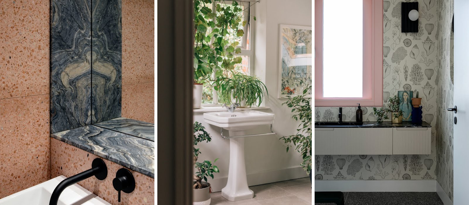
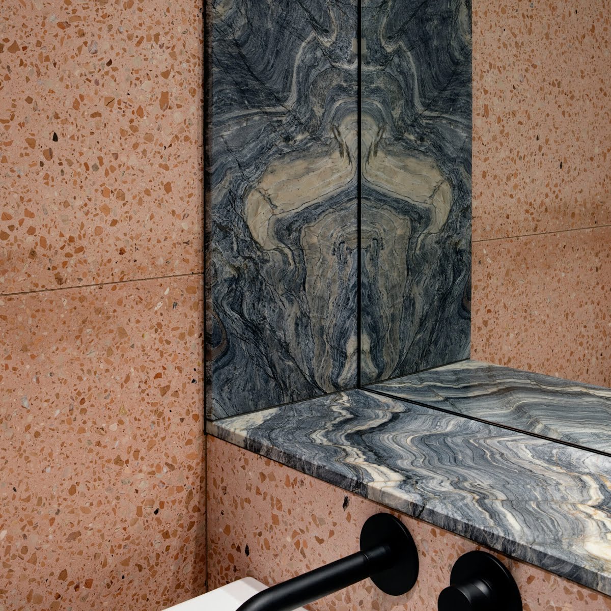
This Cork home takes those surfaces but turns them into something unexpected with bold texture that doesn’t compromise on their practicality. Pink terrazzo tiles meet the blue-grey swirls of stone for a striking effect. Bonus points for the mix-and-match colours.
Add life with plants

If you want to steer away from anything too bold in your bathroom, plants are a great way to add both colour and texture, as this Wicklow home proves.
Although this space has plenty of light, there are plenty of houseplants that will tolerate low light conditions, so there’s something to suit most bathrooms. Look out for humidity-loving plants too if your space has a shower, and they’ll be even happier.
Play with layout

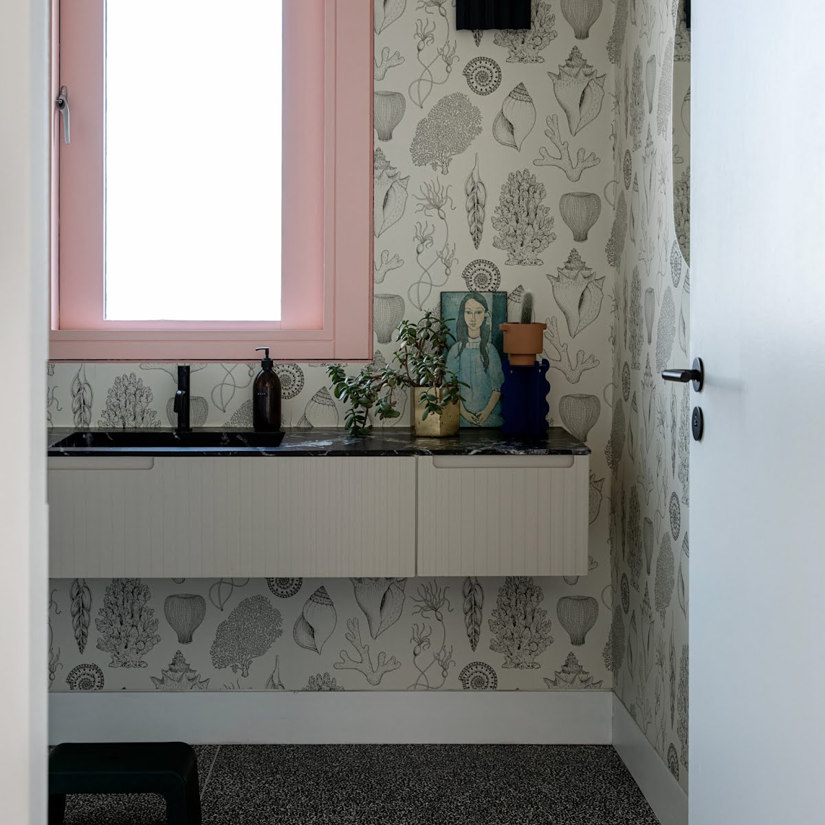
When space is tight, thinking outside the box can be valuable. Although we usually place a mirror over the sink, in this Galway bathroom it bounces more light around the room on the adjacent wall. A sink without a storage unit underneath also helps the space feel more open.
Floating units make everything feel more spacious
Keeping sink and storage units off the floor might not add much extra space in reality, but to our eye it makes the whole room seem bigger.
The continuous unit feels sleeker than two separate ones, also helping to make everything feel more open. The wallpaper, window colour and accessories help to add personality, turning it from a basic space into a memorable one.
Embrace the lack of light

If your bathroom doesn’t have a window, it’s never going to feel bright, so instead why not lean into this feature with deep, moody tones? This Dublin space is drenched in red, which has the added bonus of feeling warm and inviting.
Keep it simple

Paring your design back to only the essentials will make things feel serene. In this Dublin home, one simple, small storage unit minimises the amount of clutter, while still being small enough to feel unobtrusive.
These homes originally appeared in IMAGE Interiors. Have you thought about becoming a subscriber? Find out more, and sign up here, or pick up the Spring/Summer 2024 issue, on shelves now.


