The extension to this Georgian home beautifully blends old and new
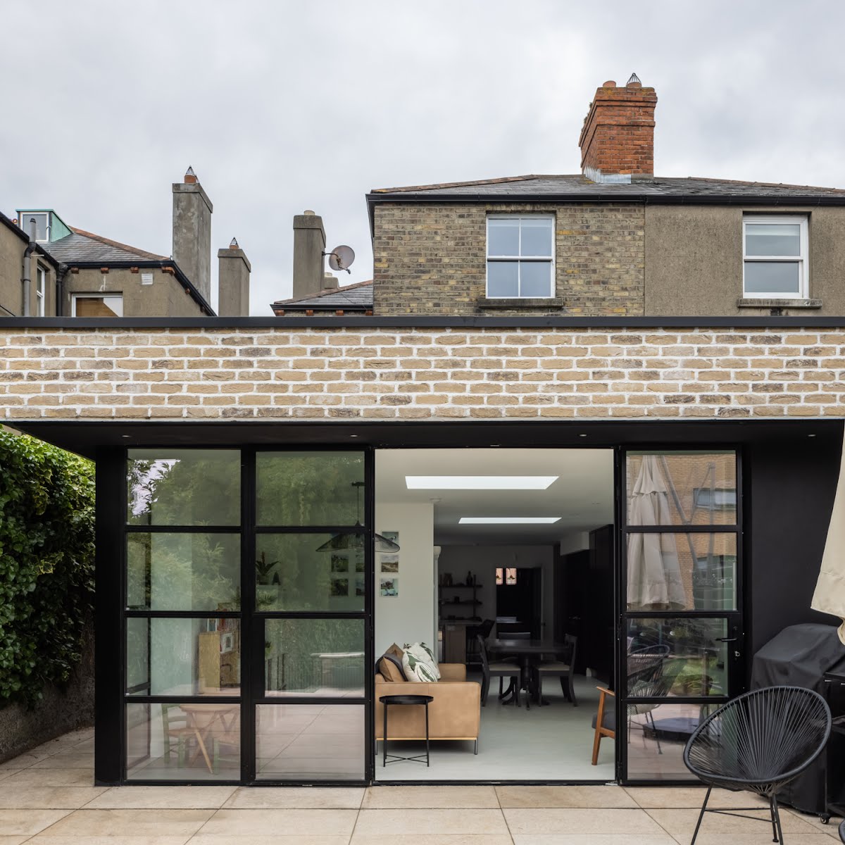
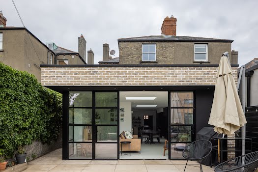
Ryan + Lamb Architects worked to preserve as many of the original features as possible, while creating extra space with a new extension.
This Georgian home was in need of renovation when its owners bought it, and they turned to Dublin-based Ryan + Lamb Architects. The building had many of its original features intact, but some were in need of repair.
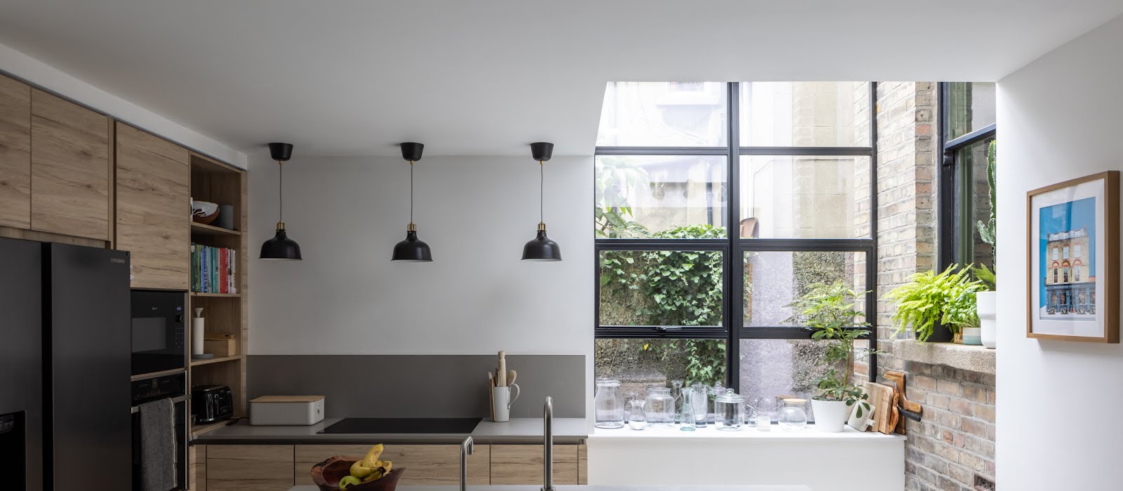
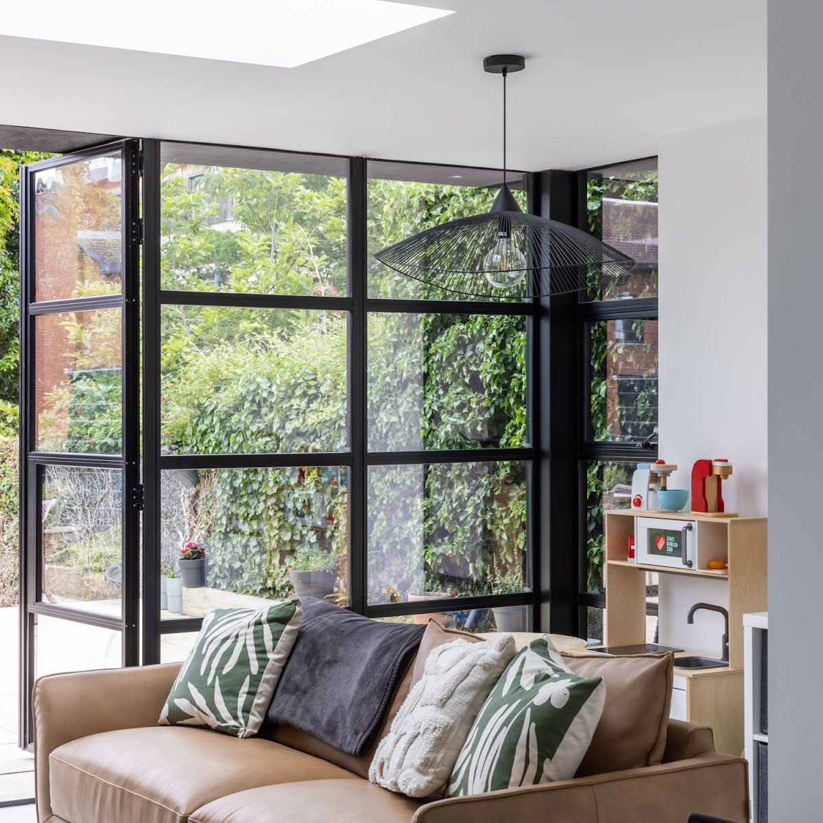
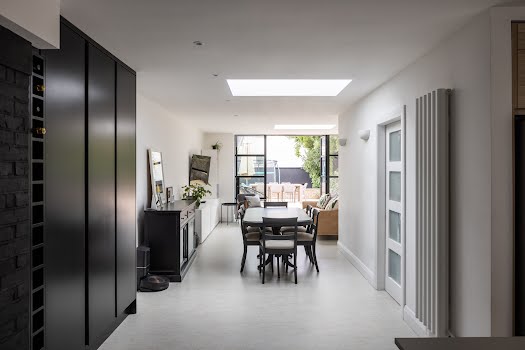
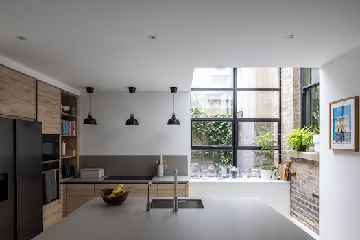
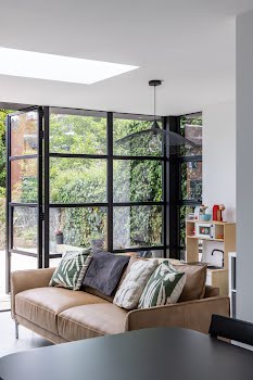
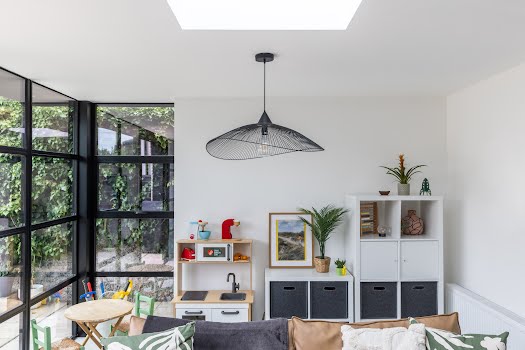
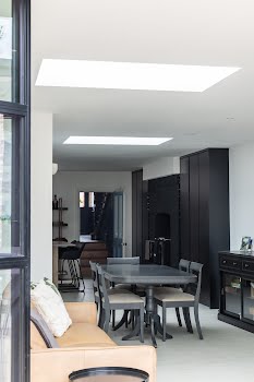
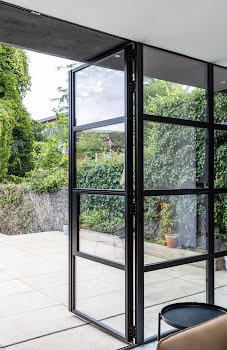
They wanted to preserve as much of the original home as possible, Anne Cook, architect and creative designer at Ryan + Lamb explains, but the one area that didn’t work was the lower level annex. “There was a pokey kitchen and dining area,” she says, “but they wanted a contemporary living space which connected with the garden.”
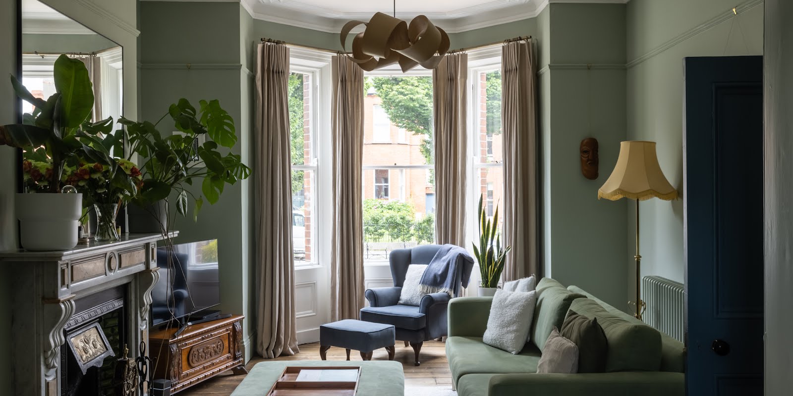
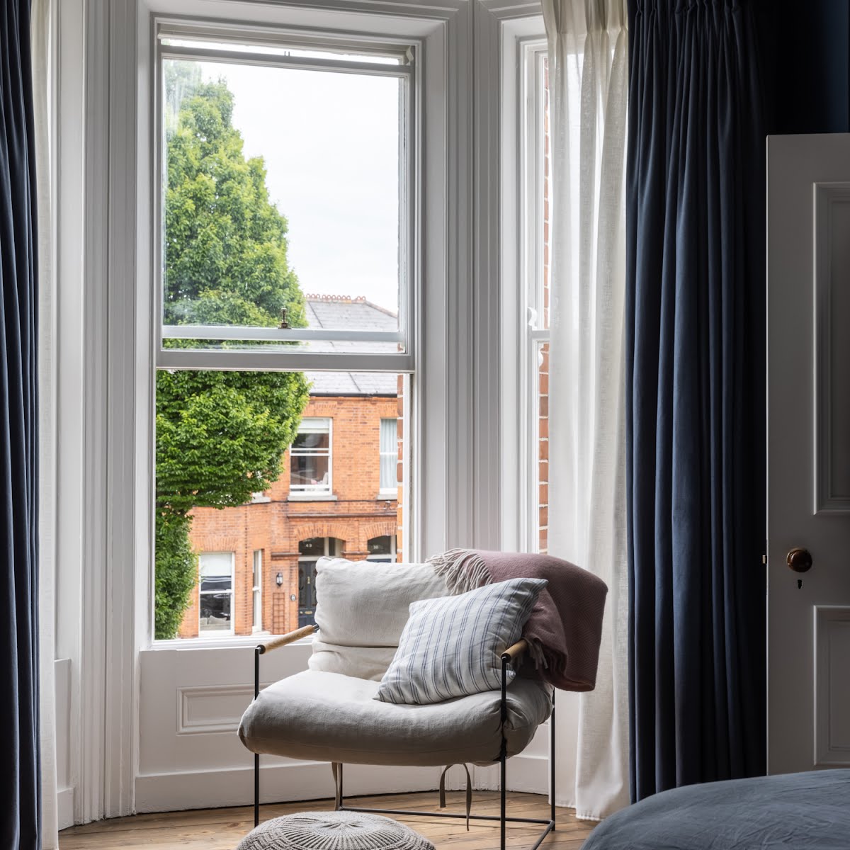
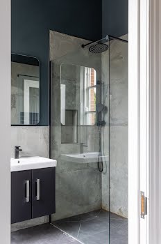
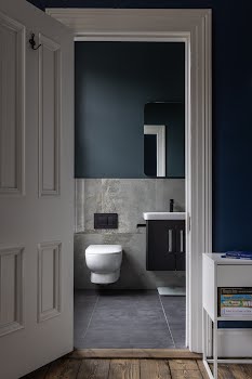
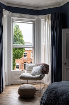
The firm’s design involved adding a contemporary extension and sensitively restoring the original fabric of the house including brickwork, plaster details, sash windows and timber joinery. They also converted a mid-level landing and box room into a walk-in wardrobe and en suite to create a master bedroom suite to the front of the house with a restored bay window.
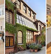
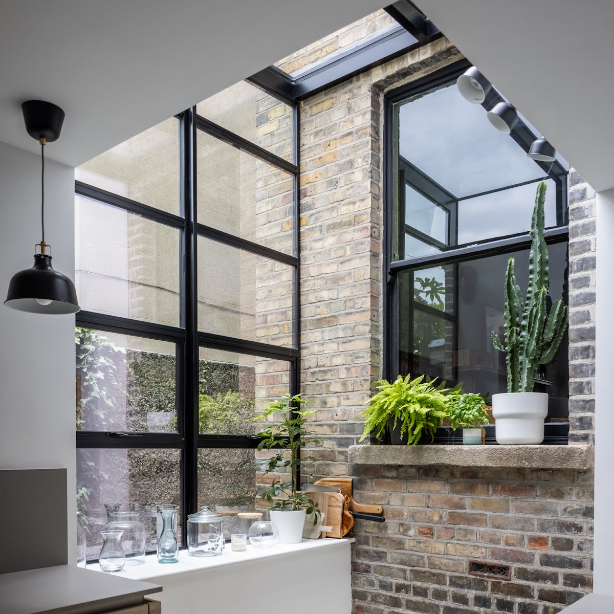
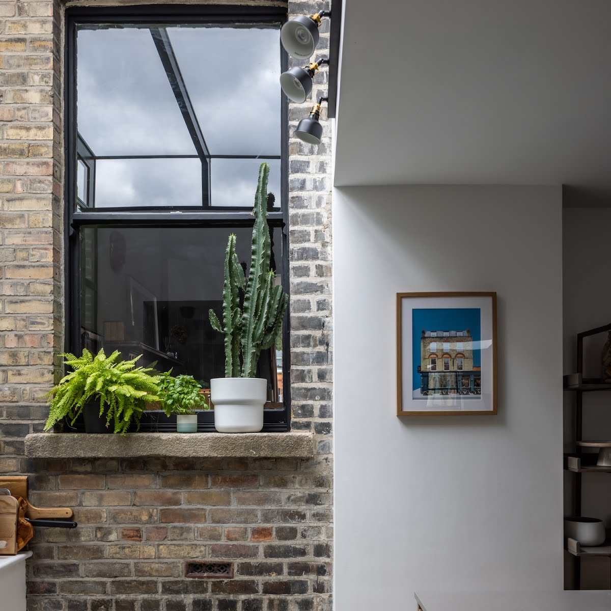
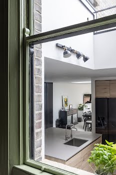
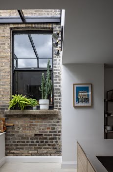
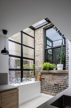
One of the key aspects of the project, Anne says, was sensitively integrating the old and new. “Our conservation experience meant the restoration wasn’t particularly difficult,” she explains, “but the connection and expression of old and new was the design challenge. We wanted to retain the beautiful Georgian window and brickwork to the rear of the house but we also needed that space for the extension.”
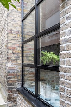
Their solution was an elegant glass light box which connected the extension to the house.
“It’s one of the nicest parts of the project. The interaction is simple – the old restored Georgian pasts are clearly visible and can be appreciated. The glass box allows the original elements to exist undisturbed but it also highlights their beauty.”
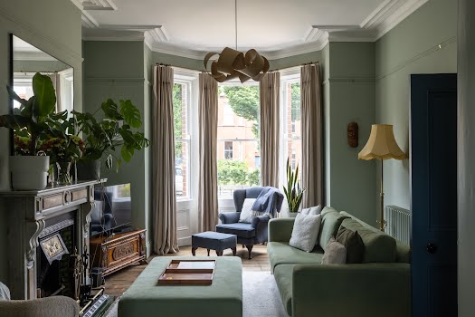
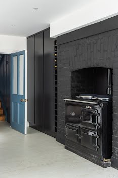
When it came to choosing colours and materials, it was all about bringing the period features to life in the existing house, while adding a contrasting contemporary edge in the extension.
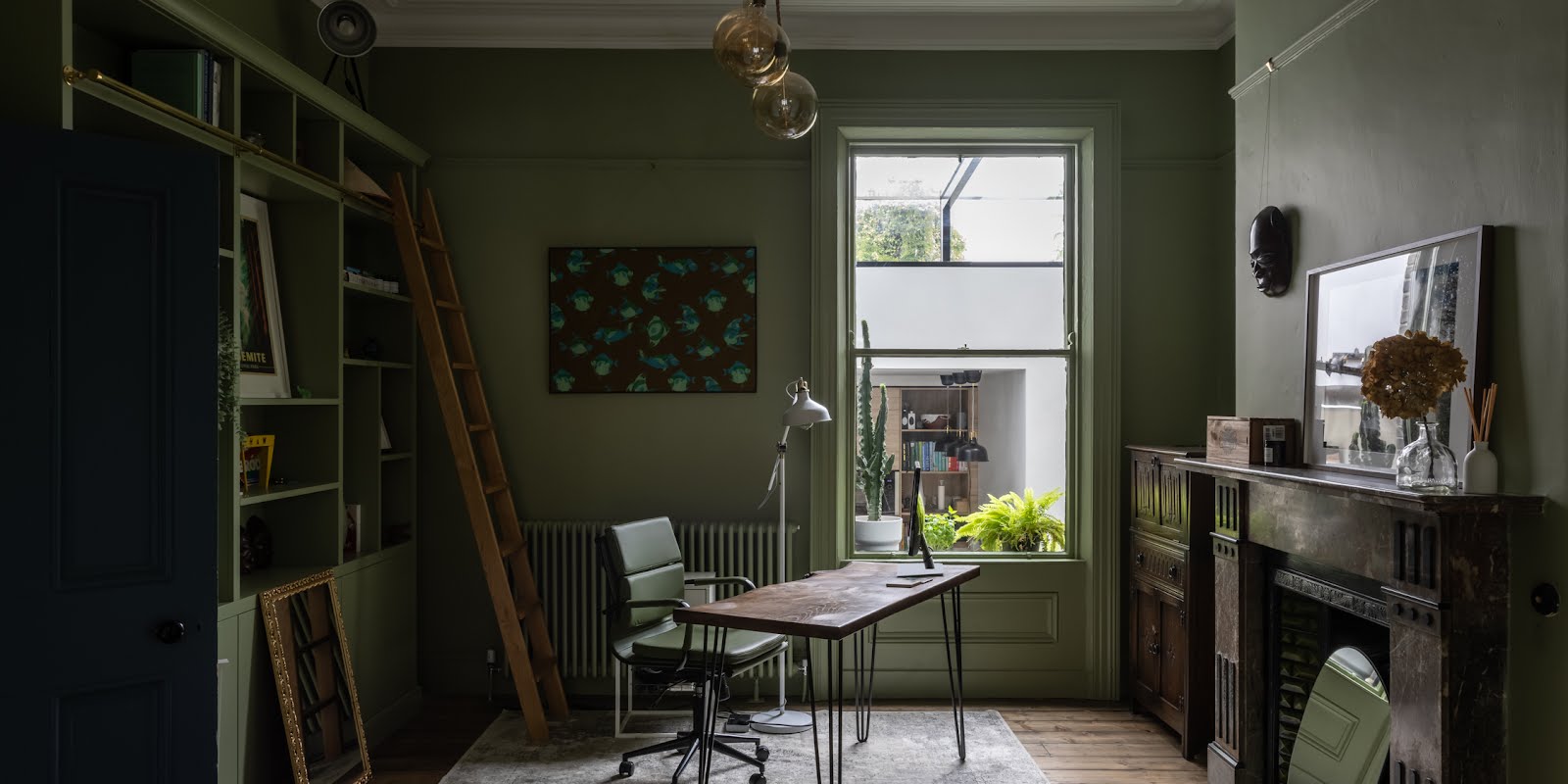
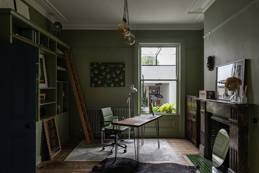
“Original timber joinery and plaster details were restored and painted to emphasise their beauty,” Anne explains. “Soft and dark colour palettes were used intermittently – the materials and palettes were influenced by the orientation, character and use of the rooms.
The main bedroom has a deep blue colour on the walls, echoed by the curtain fabric, while the curtain lining is white and speaks to the joinery.
The timber floors were sanded and stained so the timber brings a warmth to the room. “The overall effect is a homely space which celebrates the restored period detail,” Anne says.
In the library and home office a rich green was used, and combined with carefully selected furniture to give a period feel, whilst through the window the contemporary glass box provides a contrast.


