This 1930s Clontarf home has received an injection of brightness thanks to a thoughtful renovation
By Megan Burns
10th Nov 2023
10th Nov 2023
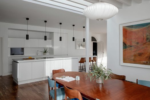
DMVF Architects have struck the perfect balance between open plan living, and maintaining distinct zones that work for a quiet night in just as well as a large gathering.
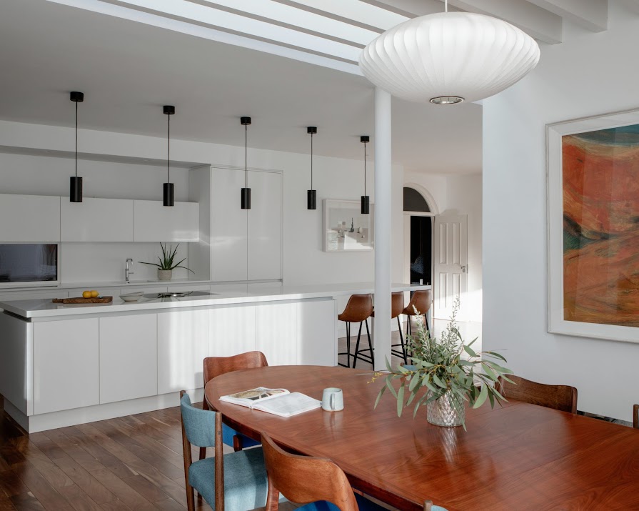
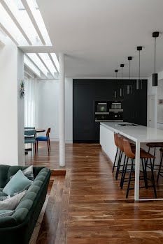
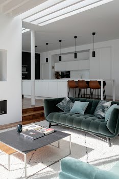
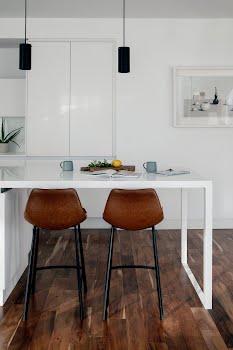
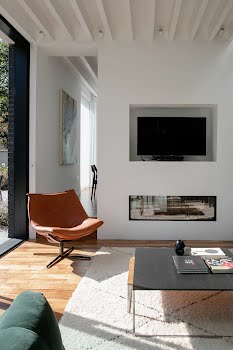
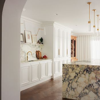
Perched at the breakfast bar in Síle and Ronan Kierans’ kitchen, it’s hard not to feel relaxed. Dappled and diffused light comes from the dining area, creating soft brightness. Floor-to-ceiling windows frame the sunken living room and provide a view of the garden, while inside the simple colour palette of the space is utterly calming to the eye.
It’s in many ways the polar opposite of the house when they first encountered it. Lacking light and any connection to the outside, it was made up of many small rooms, however, Síle and Ronan saw the space’s potential immediately.

The couple had been living in London but, planning to make the move home to Dublin, they began researching houses online. With Ronan hailing from Bray and Síle from Drumcondra, the couple were looking in between, landing on Clontarf and had narrowed it down to five houses. The plan was for Ronan to fly over and view them first. “I remember it so well,” Síle says, “Ronan called me and said that he’d seen the houses, and there was only one that I should come and see. So I booked flights and the minute we were in the house together we just knew this was our family home.”
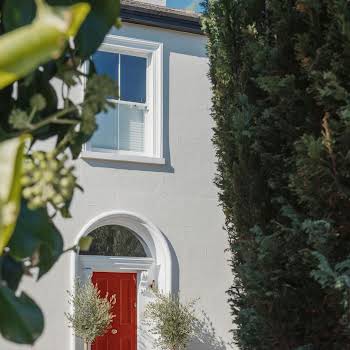
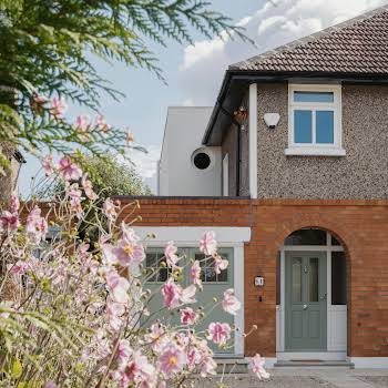
The house hadn’t been lived in for several years, and the couple wanted to renovate while keeping its distinctive features such as bay windows at the front. Having previously renovated a house together in London, and after admiring DMVF Architects’ work on a friend’s extension, they approached the practice with a clear idea of what they wanted, and project architects Colm Doyle and Amanda Bate set about planning how to transform the space.

“Everything about the house was dark and heavy,” Colm explains. “It was surrounded by a super garden, and yet there was almost no access to it.” They proposed maintaining the front rooms while moving the staircase to allow better flow through the house. They also reconfigured the upstairs to remedy a long corridor with many small rooms off it, converted the attic into a usable room, and opened up and extended the space at the back of the house.
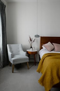
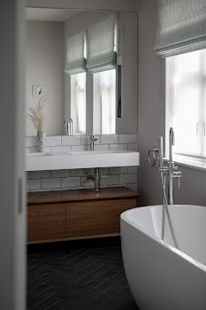
Upstairs, this created a much more balanced space, including a beautiful master bedroom with a walk-in wardrobe and en suite, while downstairs, concealed coat storage was cleverly incorporated into the hallway, and the old garage became a utility room. “It still appears as the garage doors outside,” Colm explains, “but inside it’s a wall with windows. We really prioritise useful spaces like this, we’re a bit storage obsessed.”

Overall, there was a real focus on incorporating light into the dark spaces. “We tried to get a spine of light through the house,” says Colm. “So when you look in through the front door, you can now see the whole way through to the kitchen and sitting room, and then a roof light crosses that in the opposite direction.” This roof light is key to the extension’s balanced brightness. Broken up by the exposed roof timbers, it creates a dappled rather than direct light from above that moves with the sun throughout the day.
Another key to the success of this space, Colm explains, is how it is sectioned off into different areas. “Open-plan spaces need to work when they’re full, which is usually when they’re at their best. But they also need to work when there’s just two people, maybe having a glass of wine or watching TV, and it’s important that they don’t feel empty or echoey. These spaces need to have a cosiness, too.”

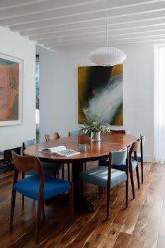
The space has three distinct zones, none completely closed off from any of the others, yet details such as the lower level of the sitting room, or the double-sided fireplace that sections off the dining space, ensure that there is also a sense of separation. Colm also points out that they made walls a priority.
“There’s a lot of glass box extensions that give you no wall space,” Colm points out. “Especially at night, pieces of art and personalising features are a helpful way of adding cosiness and life to these spaces, so we wanted big walls for large artworks.”

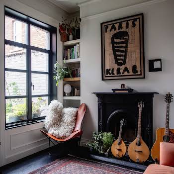
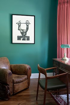
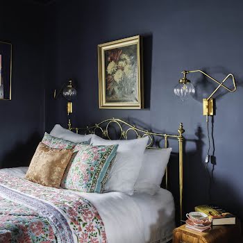
The couple worked with Julianne Kelly Interiors to complete their vision, especially in the original parts of the house. “Julianne pushed us out of our comfort zone in particular when choosing our paint colours, such as the bold green in the front living room,” Síle explains.
Now, the family spend most of their time in the new kitchen and living area. Ronan explains that, “We can play with the kids, entertain and relax all in one space.” From this considered approach to an existing space, a home has emerged that is perfectly poised to put on the many hats family life requires it to wear.
Photography: Ruth Maria Murphy
Assisted by: Shauna Lally
This feature originally appeared in the March/April 2020 issue of IMAGE Interiors & Living. Have you thought about becoming an IMAGE subscriber? Our Print & Digital subscribers receive all four issues of IMAGE Magazine and two issues of IMAGE Interiors directly to their door along with access to all premium content on IMAGE.ie and a gorgeous welcome gift worth €60 from The Handmade Soap Company. Visit here to find out more about our IMAGE subscription packages.


