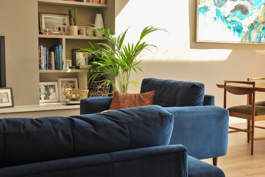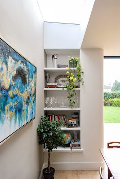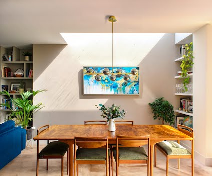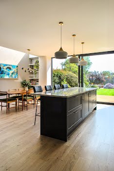
This 1930s Dublin home has been brought up to date, with a design inspired by its original details
Keeping all the charm of the house, and using its features as inspiration when designing an extension, David Flynn Architects beautifully combine old and new.
This Dublin home was built in the 1930s by master builders G&T Crampton, with a classic redbrick structure, and a layout typical of the period. When he first saw the home, David Flynn of David Flynn Architects explains, its main problems were a lack of connections between rooms, and a lack of light.
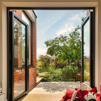
“To the rear, small windows and isolated rooms limited the flow of natural light, creating a dark, cramped atmosphere,” he explains. “The layout also hindered the connection between main living spaces, making the space feel disjointed and unsuitable for modern family living. Despite the large, South east facing garden, (which included its own 1938 beehive concrete bunker!), there was very little connection between the house and garden – with only a single glazed door allowing access between them.”
Its current owners wanted to address these issues, adding light and flexible, open-plan spaces to the home. “Retaining the original 1930s charm and features of the house such as the original fireplace and staircase, was important to the clients but they also wanted to incorporate modern amenities and energy-efficient features,” David says.
“The aim was to blend traditional and contemporary elements to enhance both functionality and aesthetic appeal. They also wanted to make the most of their large garden and create spaces that allowed them to appreciate it throughout the year.”
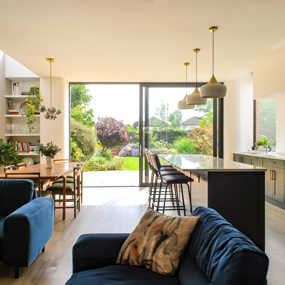
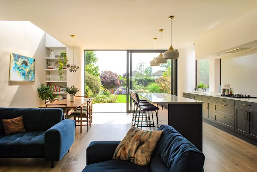
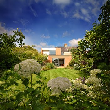
As a result, the design involved an extension into the long south-east facing rear garden. “Although the rear spaces were bright during the morning, we wanted to create spaces that were flooded with natural light all day long,” David explains.
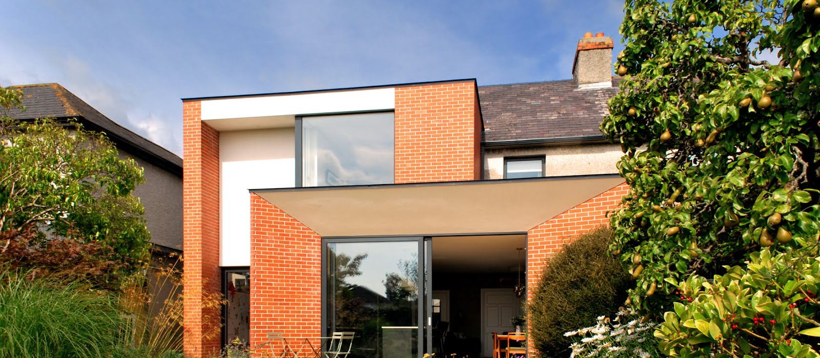
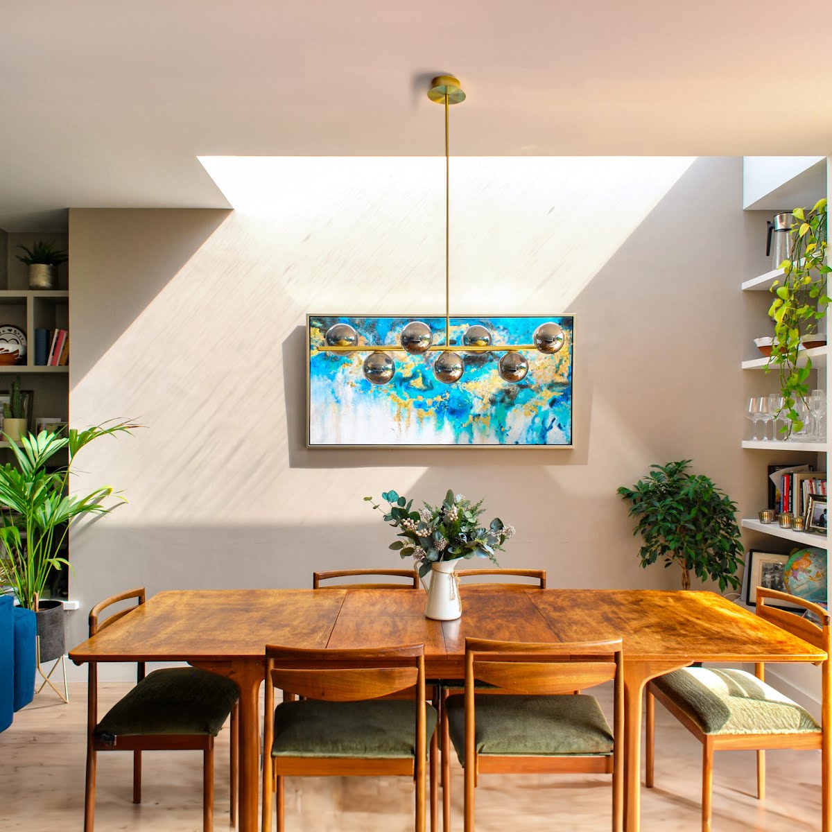
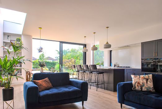
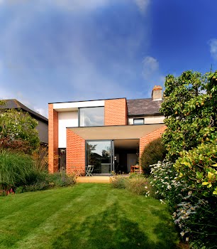
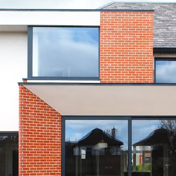
“The extension takes the form of two interlocking volumes with a stepped plan which incorporates the large kitchen living dining space at ground floor, and a generous master bedroom at first floor. This configuration reduced the overall bulk of the extension. Careful placement of windows and roof lights ensures the space is naturally lit from various sources year-round, creating a bright and inviting environment.”
Unlike some extensions which are of a completely different design language than the original building, here they took inspiration from the original features of the house, incorporating them into the design.
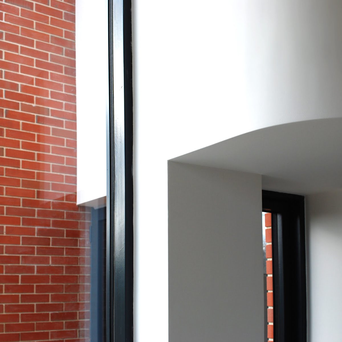
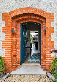
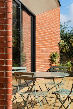
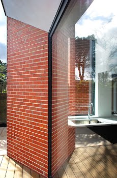
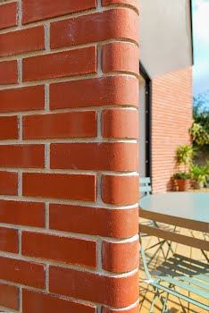
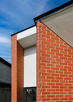
“The design of the rear extension drew inspiration from the front door and brick surround, a distinctive feature of the original house,” David says. “The stepped brick entrance creates a deep threshold between inside and outside, a concept we extended throughout the house. This led to the incorporation of deep splayed reveals and a double-height soffit at the rear, offering protection from the weather and allowing the internal spaces to extend onto the patio. The interlocking geometries of the rear elevation create a captivating play of light and shadow as the sun moves across the sky, much like the front hall door surround.”
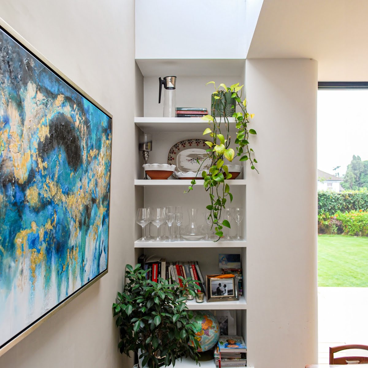
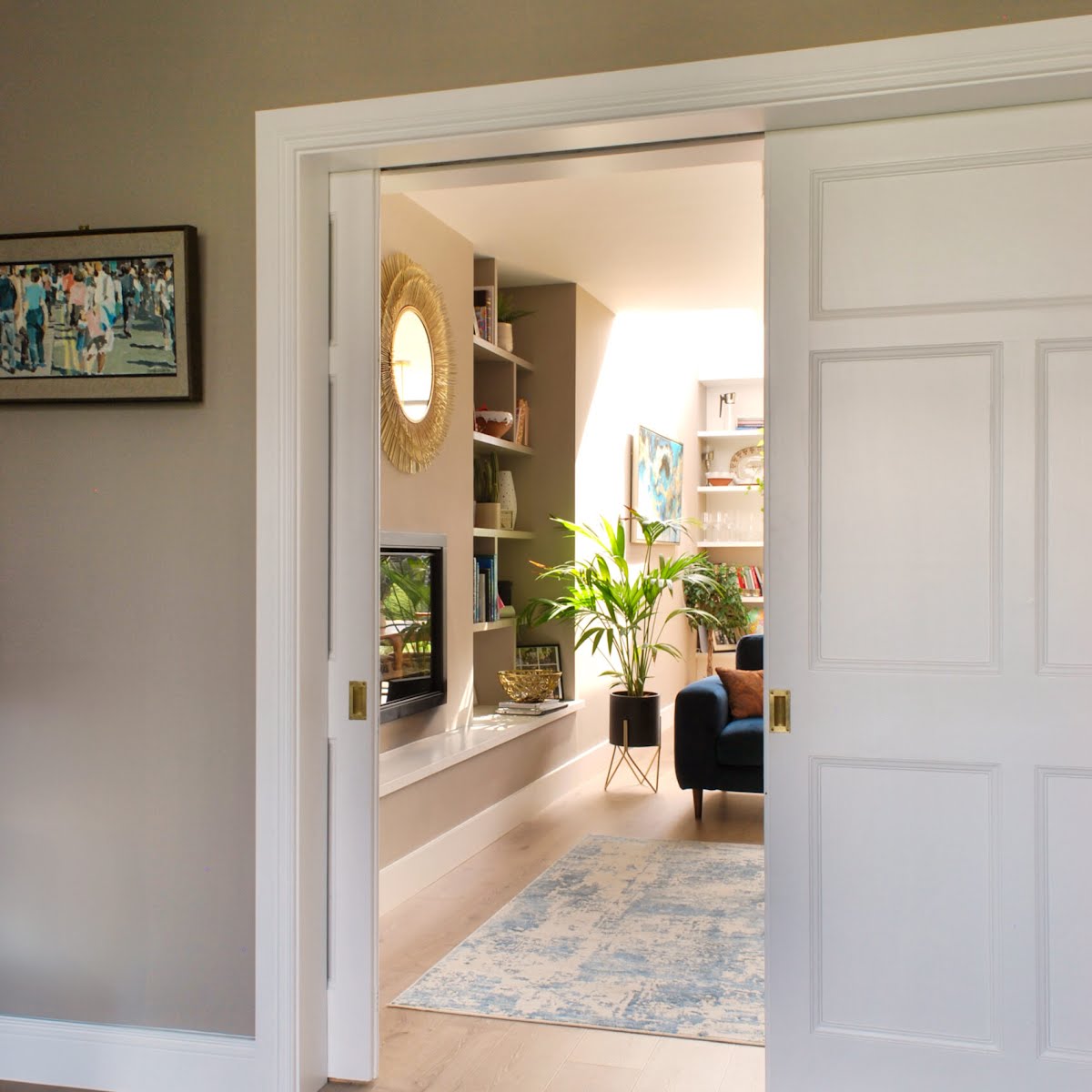
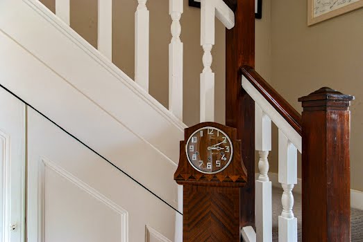
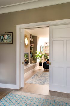
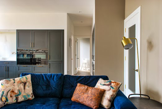
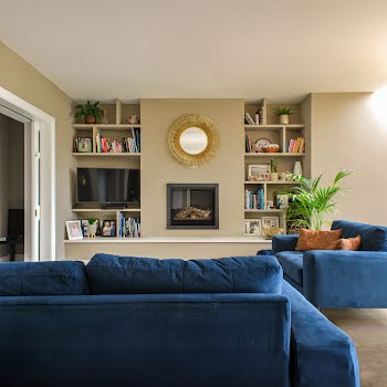
Care was also taken to preserve existing period features including doors, staircases, and fireplaces, while the front sitting room was refurbished as part of the project. “The original sliding doors connect traditional and modern spaces, offering flexibility to create either a large family area or a more intimate living room. The rear family space modernises the existing chimney breast with a new gas fire and built-in shelving.”
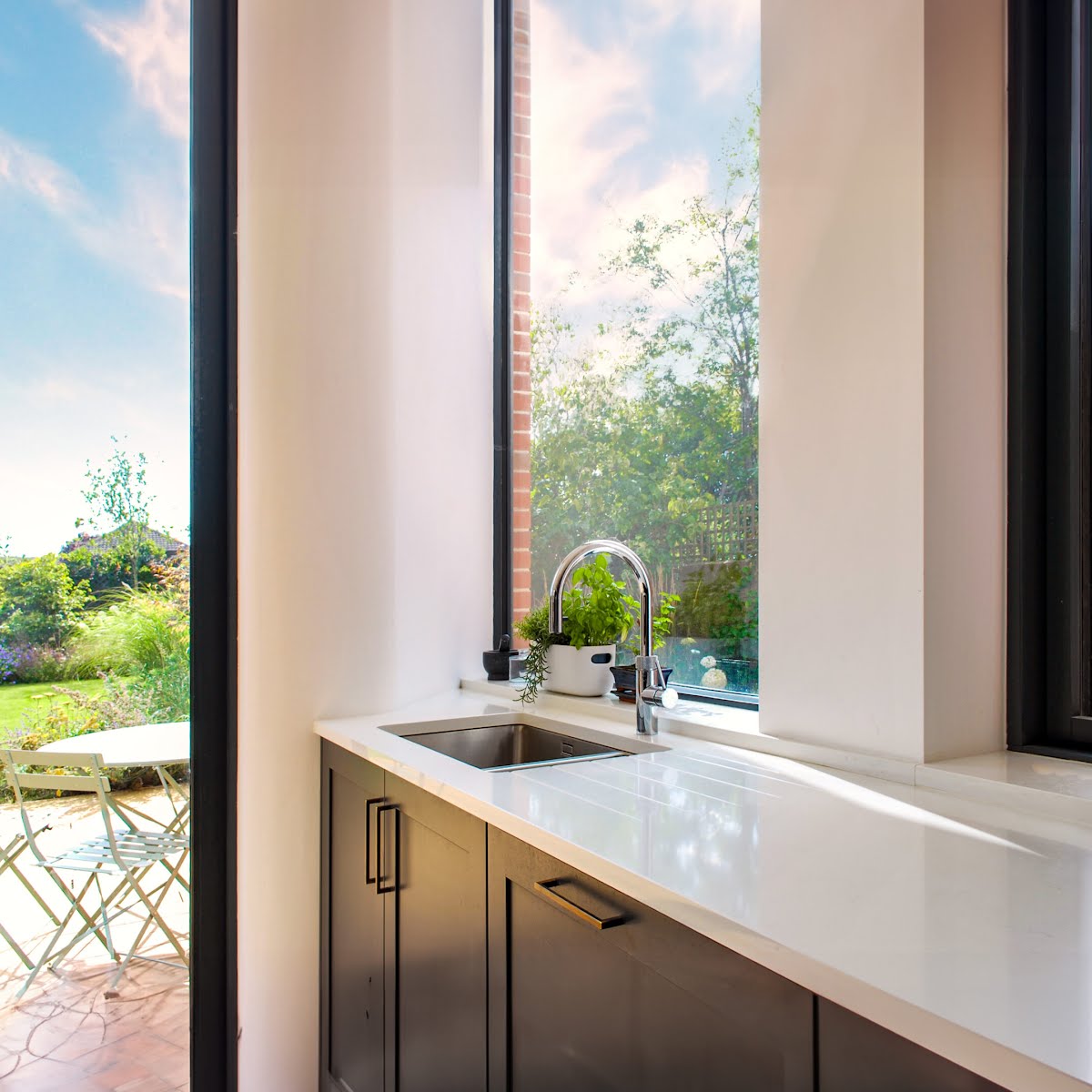
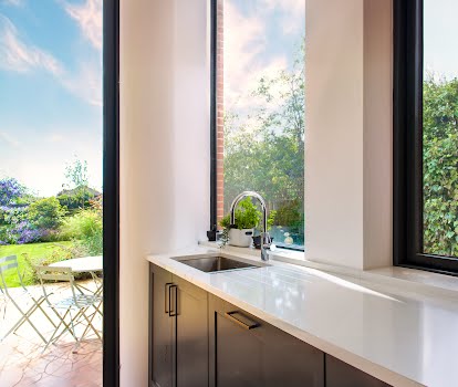
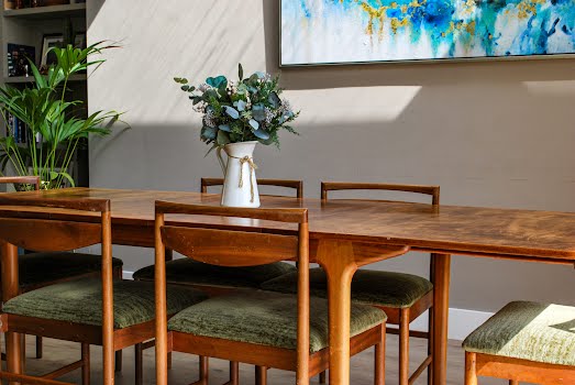
While the palette of red brick and white plaster externally references the original house, inside dark aluminium windows were chosen to frame the views of the garden. Natural materials including white plaster and timber floors also are calming on the eye, drawing your attention to the outdoors, making the most of the connections between these spaces.
It’s a design that allows old and new to sit harmoniously side by side, while the mature garden feels an important part of the interiors, providing calming views and abundant light.


