This 1930s Raheny home has been given a sleek refurb, extension and garden room
Highlights include a staircase designed around books, a waterfall window and a terrazzo kitchen island.
When Rachel Carmody of Rachel Carmody Design was approached by the owners of this 1930s Raheny home, they wanted to modernise it and create more space through an extension, without compromising the character of the original house.
“The clients wanted a home that was welcoming and filled with light and colour, a home with a balance of quiet spaces, as well as spaces to entertain and come together as a family,” she explains. “They also wanted to respect the architectural heritage of the building. We spent a lot of time getting to know the clients and developing a project brief with them, as well as researching the history of the property. We wanted to make a space that would allow the clients’ books, belongings, cats and loved ones feel comfortable together.”
When planning the extension, time was spent considering its relationship to the existing home. “With extensions we try as much as possible to take cues from the original building to inform the new extension part,” Rachel says, “so that the interlock feels harmonious.”
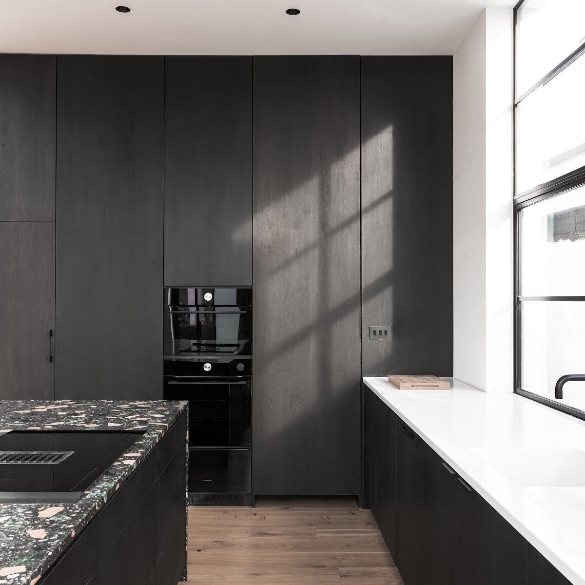
“The original modernist building was simple in its form and restrained in its palette. A smooth-rendered, white painted, flat roofed, simple volume structure with Crittall steel framed windows. The new extension carries through the smooth rendered, white painted materiality and flat roofs – to the rear we created a central waterfall window with large slim frame sliding doors to either side. We replaced the windows to the front of the building with crittall style windows.”
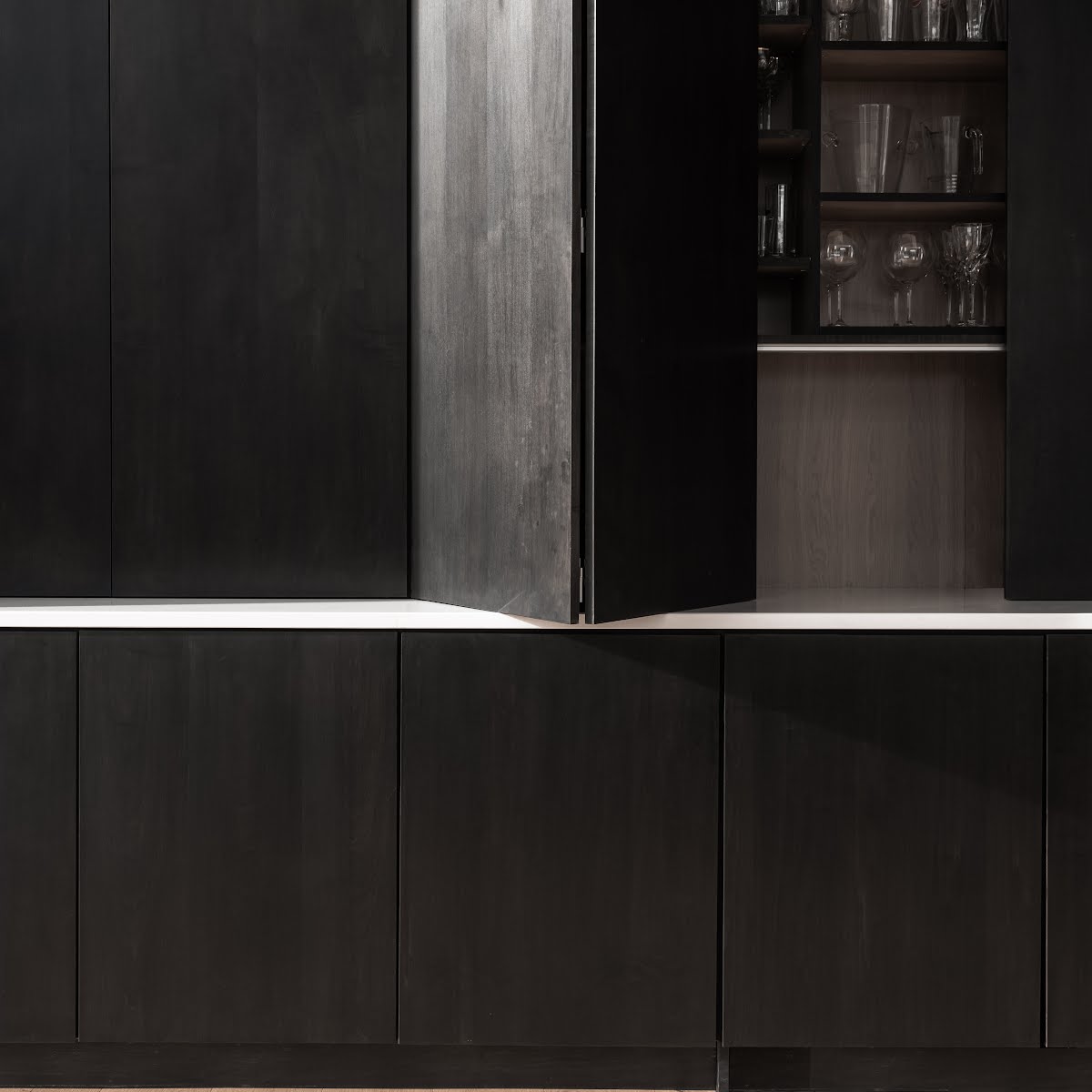
Outside, the material palette of the existing house is echoed in the extension – white painted render, black metal, and glass. “There are subtle differences in the detailing,” Rachel says, “but the coordinated palette allows the old and new building structures to interact harmoniously.”
Inside, at the heart of the kitchen is also a nod to the original house in the form of the terrazzo island. “There was a terrazzo porch in the original dwelling, so I thought we could reintroduce terrazzo as a focal point in the project through the kitchen island,” Rachel explains.
“We picked a terrazzo slab which had a black background to tie in with the kitchen, and was composed of four classical Italian marbles in hues of greens, yellows, reds and blues. We continued these colour tones in other moments of the project, with shades of green, yellow, red and blue used to stain the maple fitted furniture in each room. Each bathroom is fitted with a different shade of terrazzo tile. So there is a continuation of colour and materiality but in a restrained way. And while there is an abundance of colour choices in the project, each shade can be traced back to our kitchen island.”
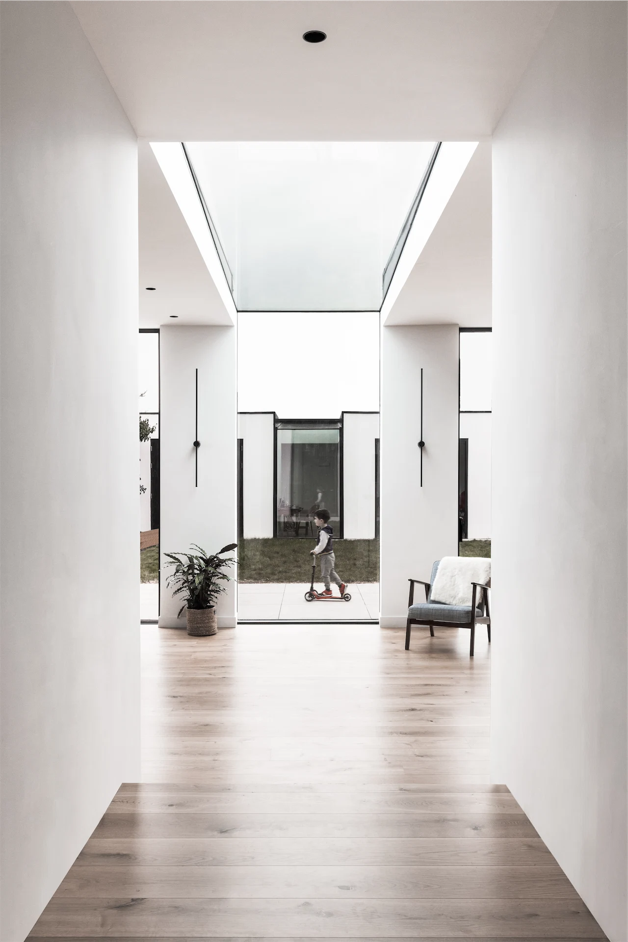
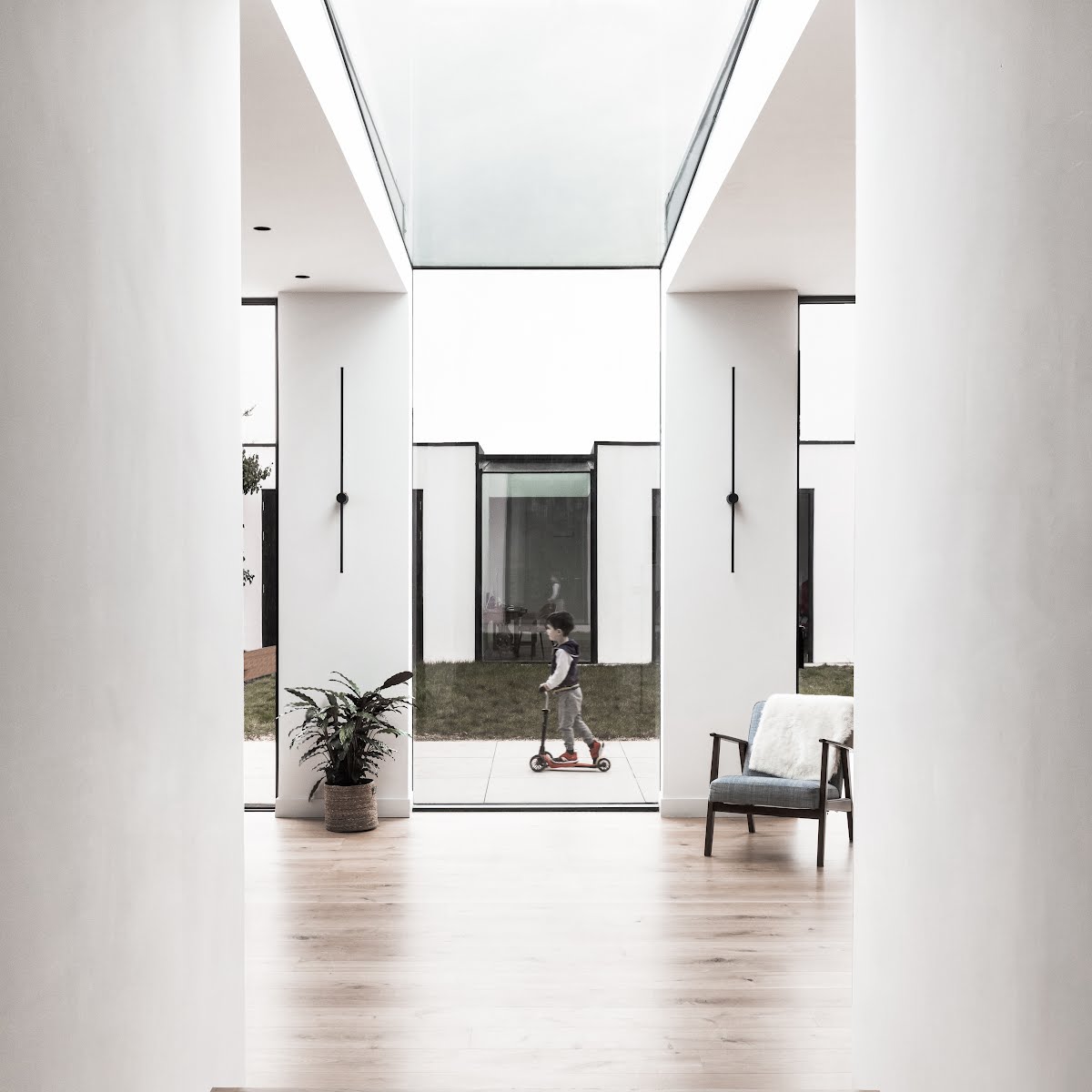
Light was another important consideration in this project. “We designed this home around light,” Rachel says. “The entrance hall is on axis with the waterfall window, so you are confronted with the garden view and the light beaming through as you enter through the front door.”
She explains how they strove to balance light throughout the house. “The front of the property faces north so we located the snug room and the music room along this elevation – these spaces are darker, more subdued and calming. In contrast, the south facing open plan kitchen, dining and living spaces are bathed in light. We located the kitchen along the eastern elevation and included a large window along that facade to bring in the morning light. I love to bring as much light as possible into kitchen spaces, but especially morning light.

“The circulation spaces are in the centre, and naturally darker spaces of the plan, so we punctured the main roof with rooflights over these spaces . The half landing is framed by a rooflight overhead as is the first floor landing space. The playroom is located off the open plan space, and in a naturally darker section of the plan, an open fin wall along the stairwell allows light to trickle into this space.”
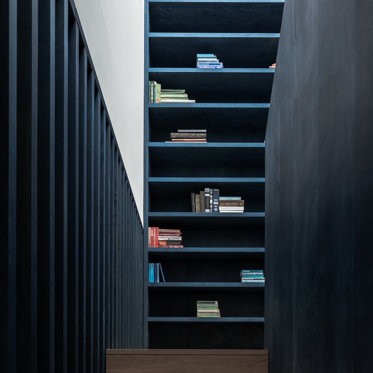
There were also some specific details that helped shape the design. “The clients, both academics, had a huge volume of books to house and we designed a new staircase around a large double height bookcase,” Rachel says. “I think relocating the stairs out of the central axis of the plan opened up a lot of design opportunities and allowed us to create a very simple, well-proportioned floor plan with a generosity of space.
The floors in the original building were also dropped to gain additional ceiling height, while stepping down to garden level in the extension gave a ceiling height of over three metres. “The sense of space gained through additional ceiling height is extraordinary, and I fight for it on every project,” Rachel says.
Photography: Ste Murray


Also Read