ngrxUiJVl2
When Rachel Carmody of Rachel Carmody Design was approached by the owners of this 1930s Raheny home, they wanted to modernise it and create more space through an extension, without compromising the character of the original house.
“The clients wanted a home that was welcoming and filled with light and colour, a home with a balance of quiet spaces, as well as spaces to entertain and come together as a family,” she explains. “They also wanted to respect the architectural heritage of the building. We spent a lot of time getting to know the clients and developing a project brief with them, as well as researching the history of the property. We wanted to make a space that would allow the clients’ books, belongings, cats and loved ones feel comfortable together.”
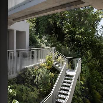
When planning the extension, time was spent considering its relationship to the existing home. “With extensions we try as much as possible to take cues from the original building to inform the new extension part,” Rachel says, “so that the interlock feels harmonious.”
“The original modernist building was simple in its form and restrained in its palette. A smooth-rendered, white painted, flat roofed, simple volume structure with Crittall steel framed windows. The new extension carries through the smooth rendered, white painted materiality and flat roofs – to the rear we created a central waterfall window with large slim frame sliding doors to either side. We replaced the windows to the front of the building with crittall style windows.”
Light was another important consideration in this project. “We designed this home around light,” Rachel says. “The entrance hall is on axis with the waterfall window, so you are confronted with the garden view and the light beaming through as you enter through the front door.”
She explains how they strove to balance light throughout the house. “The front of the property faces north so we located the snug room and the music room along this elevation – these spaces are darker, more subdued and calming. In contrast, the south facing open plan kitchen, dining and living spaces are bathed in light. We located the kitchen along the eastern elevation and included a large window along that facade to bring in the morning light. I love to bring as much light as possible into kitchen spaces, but especially morning light.