This 1940s Dublin bungalow was extended without losing its original character
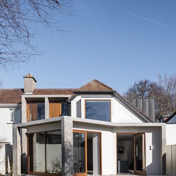
A 1940s red-brick, this Churchtown bungalow was sensitively extended by Ryan W. Kennihan Architects, making the most of its original features.
Like clothes, some houses are of the here and now, complete with the accoutrements of the latest trends, while others are as timeless as a well-tailored suit. This 1940s red-brick bungalow in the south Dublin suburb of Churchtown is more of the latter.
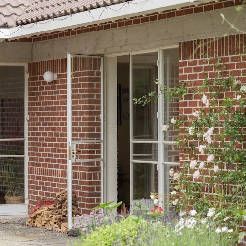
It was even still wearing its original steel windows, as rare as hen’s teeth, when a young couple found it for themselves and their two small children. All it needed was a little alteration to expand and adapt to modern living.
Meeting Ryan Kennihan, Principal Architect of Ryan W. Kennihan Architects, in his crisp shirt, suit and tie, one instantly realises why he would be drawn to a house of this era and how to sensitively extend it.
Don’t let his American accent deceive you as he understands Irish vernacular architecture more than most. Explaining the ethos of his practice, he says: “We arrive at an architectural language, which comes straight out of what we find.”
The client’s brief was to retain the original features of the house while making use of the large garden. As avid gardeners, the couple were attracted to the size of the garden originally laid out in an era when people were encouraged to grow their own vegetables.
The square, two-bedroom house, although in a semi-derelict state inside, was bursting with character. Not having changed since it was built, it provided a wealth of references for the extension at the rear.
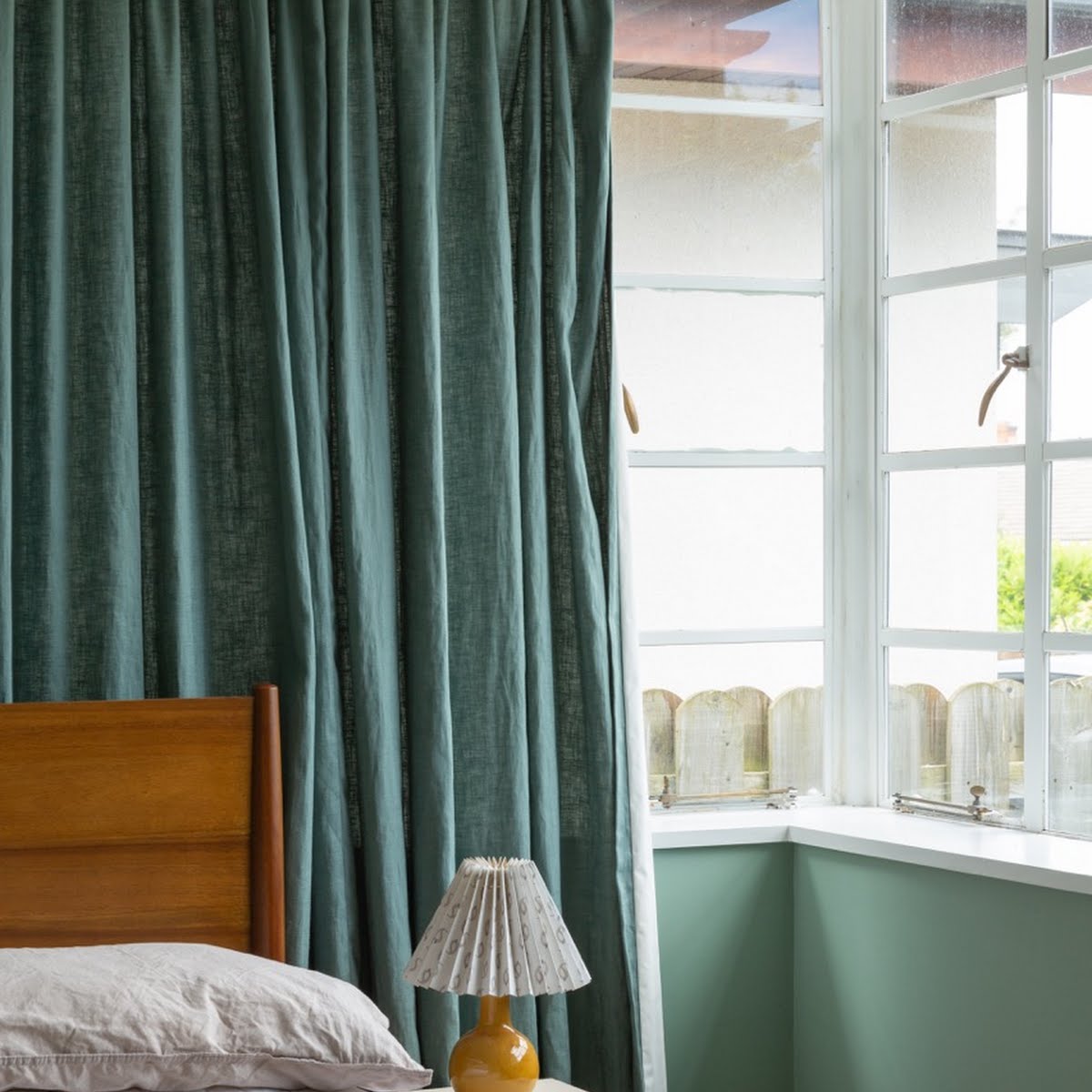
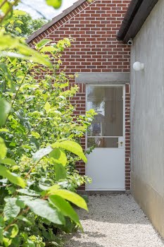
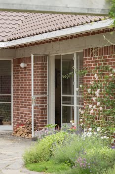
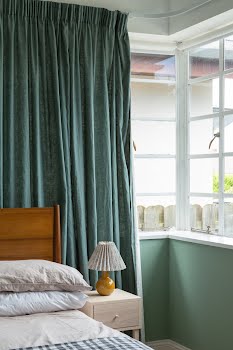
All the front façade needed was some minor repointing of the brickwork, repair to original roof tiles and conversion of the single-glazed Crittall steel windows to double-glazing, which was worth the extra expense as they felt they were integral to the original appearance.
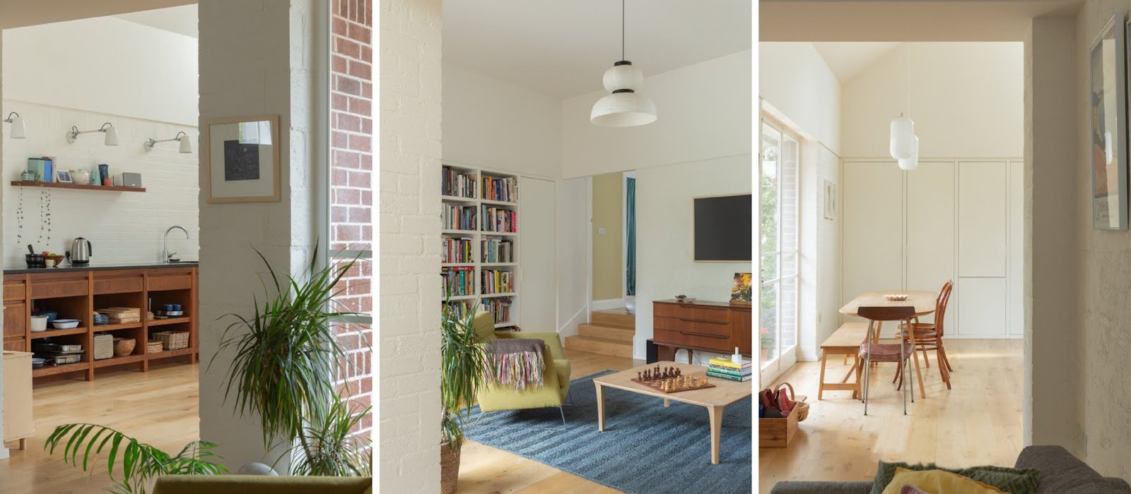
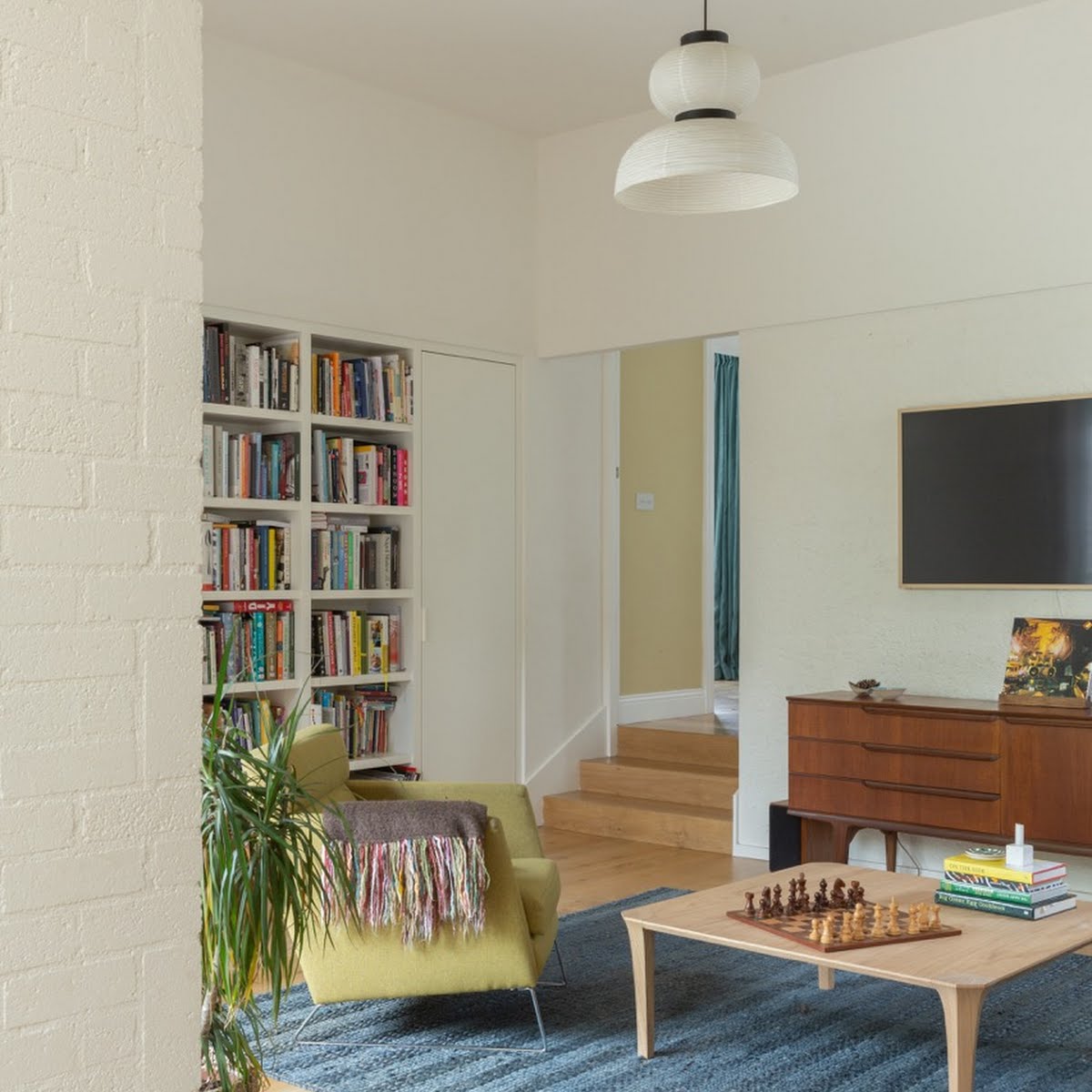
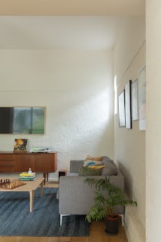
Through the front door there’s a narrow corridor with the children’s bedroom and master bedroom to the left, while the right is full of light from the refurbished steel windows. The original floor was suspended and raised high off the ground. This was dropped across the back of the house to increase the ceiling height in the living/kitchen area and snug, so as you descend three steps you move from a slightly compressed feeling to a generosity of space that is quite dramatic.
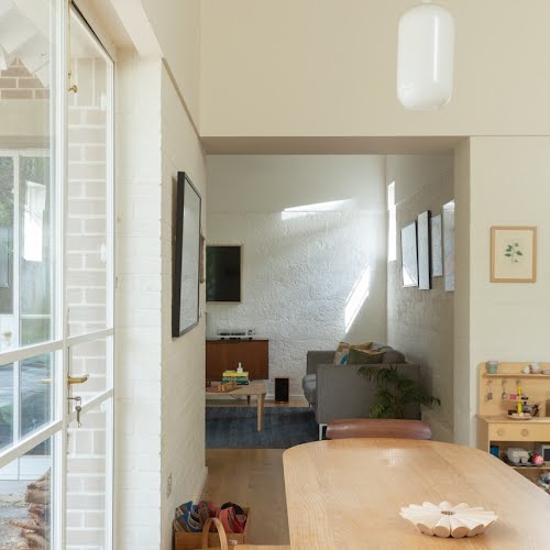
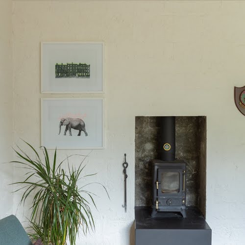
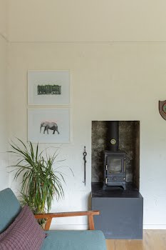
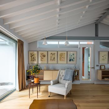
Big pivot doors at a couple of locations create the feeling of an open, fluid house, even as they separate the sleeping quarters at the front of the house from the living/kitchen area, which is in turn separated from a cosy snug with a wood-burning stove.
The interior can be open-plan or partitioned, according to the owners’ needs. Again, in the principle of working with what you find, the window of the original bathroom was left in the snug to bring in light. At the back of the house, the original steel windows were matched with contemporary ones that repeat the horizontal bars.
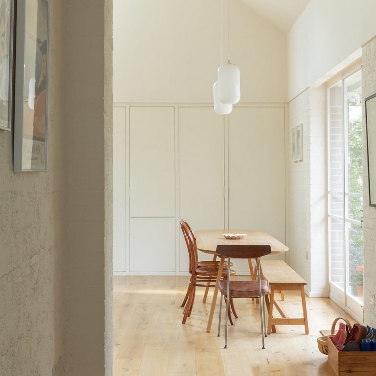
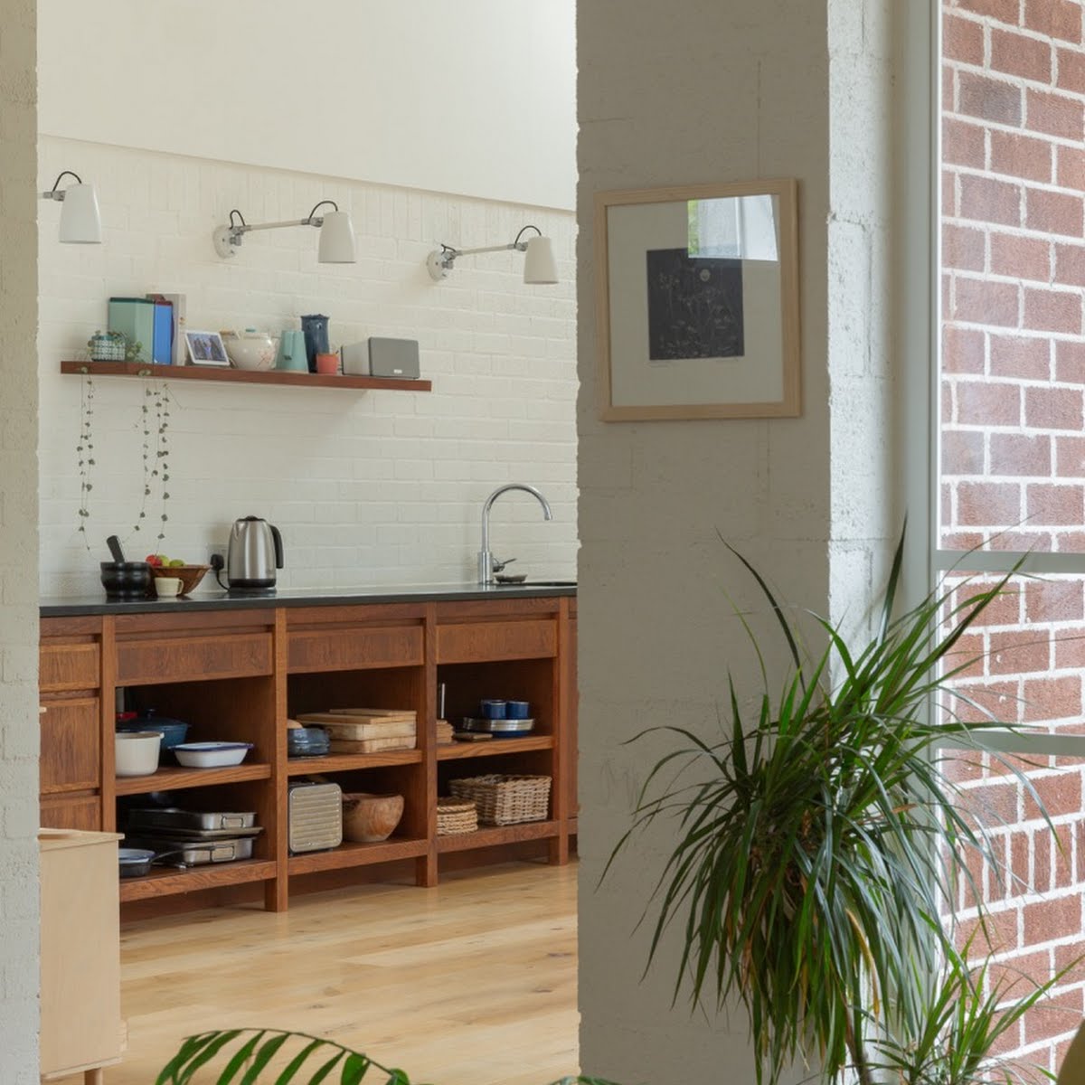
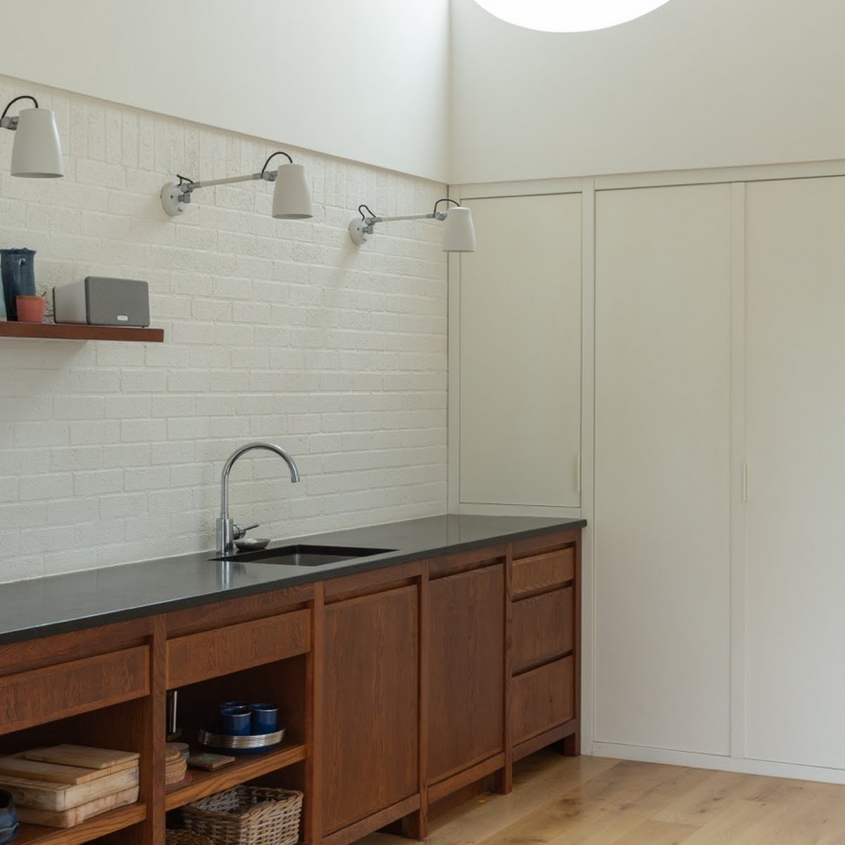
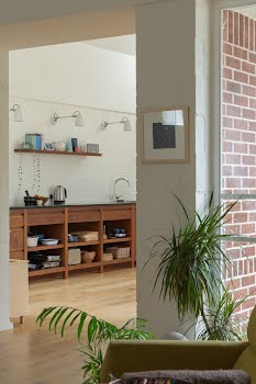
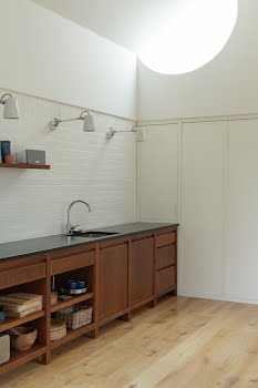
Through the living room, into the kitchen extension, a high ceiling follows the roof profile. The kitchen contains a semi-circular roof light that captures the light, changing with the time of day and seasons of the year. Not only does it create a beautiful natural orb during the day but also a light show from the moonlight.
Ryan creates a dialogue between old and new parts of the house: “I was interested in this idea of where we could reveal the original character of the house and that’s done externally through the brickwork. Internally, we stripped off the plasterwork in the snug and we found old block wall. We patched it up and painted it to a datum line, which ties the living room to the capping line in the kitchen, and you get this nice differentiation between the very textural, rough lower surface and then this crisp roof space above that.”
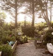
Off the kitchen is the family study, which, although it predates the pandemic, became especially vital during lockdown. It was important to the clients to connect the house to its south-west facing garden. Sometimes long gardens can be unyielding, reduced to an expanse of lawn. Ryan’s answer here was to extend the compression and expansion of the interior into a courtyard that catches the evening sun but also forms a threshold to the garden.
The extension is connected to the courtyard by the soldier course of the back wall and a concrete beam to create a framed view to draw your eye out beyond the brick and entice you into the garden.
Many extensions fail to sympathise with the earlier parts of the house. Here, the redbrick walls and the pitch of the hipped roof extend the form and materials of the older house, while the courtyard and garden extend its spatial rhythm.
Design such as this can make a house feel timeless, or at least show the continued relevance and adaptability of its historical features.


