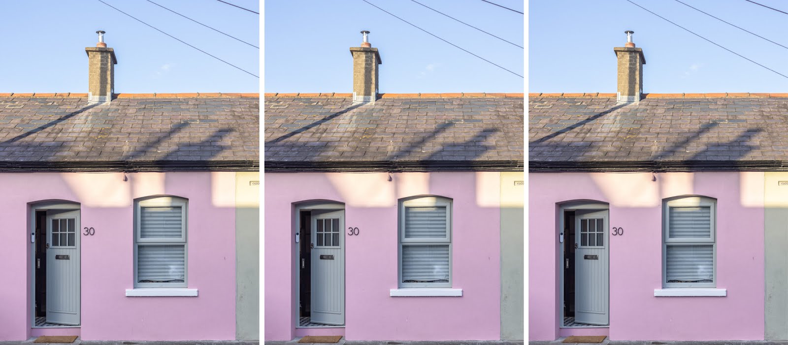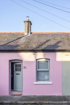
This adorable Stoneybatter cottage has been reconfigured to create extra space and filled with colour
A total renovation and stylish finishes have turned this cottage into a warm, welcoming space.
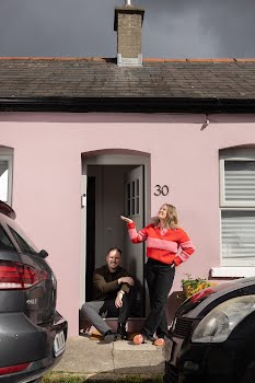
The owners of this home, Luke and Olwyn, knew it would require a lot of work, with dark spaces, dated details and a floorplan that didn’t work at all for how they wanted to live.
Emma Delaney, senior interior designer at April and the Bear explains that the couple first approached her during the summer of 2023.
“They had undergone the tricky process of purchasing their first home in a place that they hold dear to their heart; a quaint, artisanal cottage located in Stoneybatter, Co Dublin. The property required a full renovation and having just been successful in receiving the Vacant Property Grant, we worked with our clients on establishing an entirely new design concept for their dream home in a location that was special to them.”
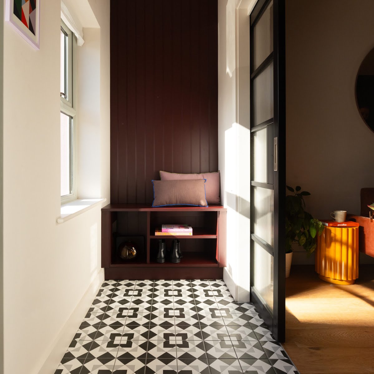
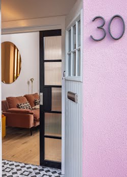
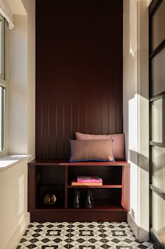
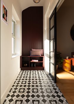
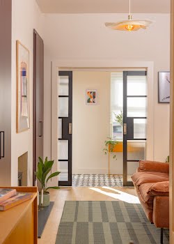
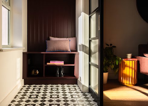
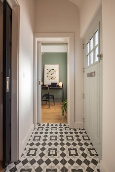
A key part of the design was reconfiguring the floorplan, to ensure it flowed well and worked for day-to-day living. A hallway was added to create privacy from the front of the house.
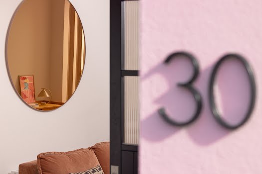
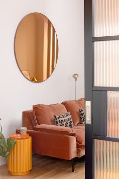
“The tall bespoke wall panelling we designed draws your eye up, emphasising the beautiful, original high ceilings,” Emma explains. “This unit also features a bespoke bench and open shelving beneath for stowing away their shoes. Space saving pocket doors recess into the walls – the reeded glass panels creates the perfect balance of privacy while ensuring light travels through.”
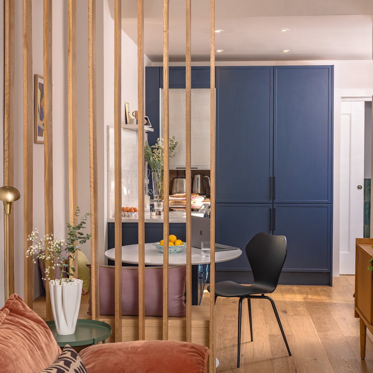
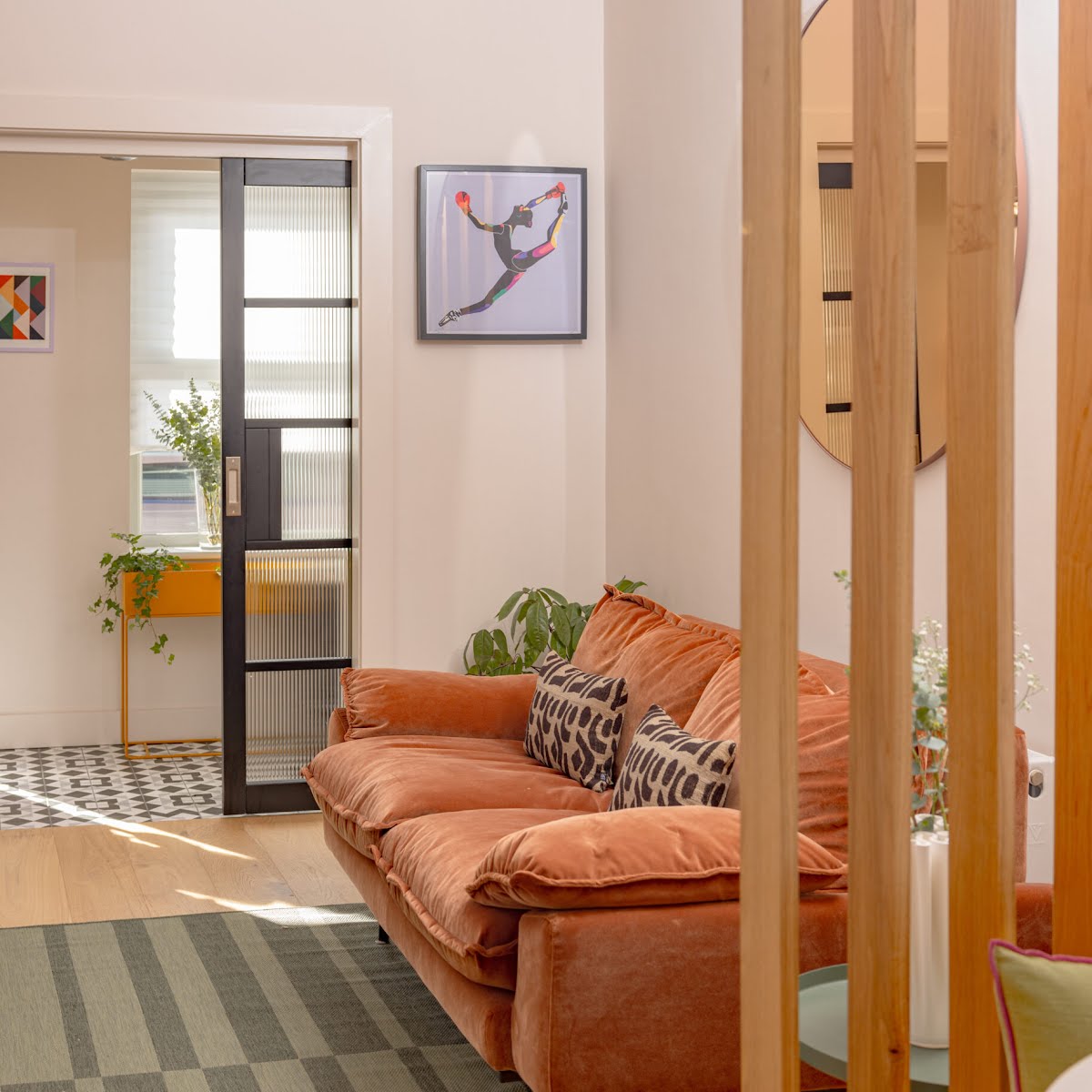
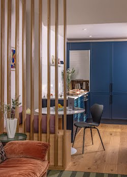
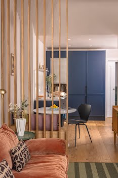
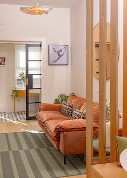
Olwyn and Luke love cooking, and wanted a space where they could cook while chatting to guests. “Once two separate rooms, we suggested connecting the kitchen and living area, creating an open plan layout,” Emma says. “We proposed and designed the addition of a bespoke slatted, oak room divider which frames the dining area nicely and acts as a subtle separation between the dining area and the living area.”
The divider helps to break up the space, while allowing natural light through, whilst also including a bench seat and storage for cookbooks.
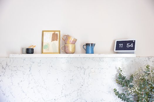
Units in the kitchen were kept to the lower level, with an open shelf above helping it to feel more open.
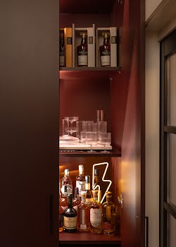
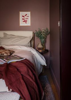
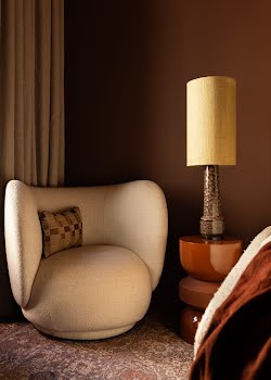
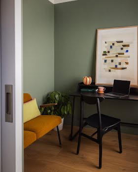
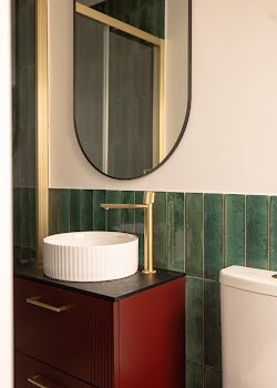
Throughout this home, colour is used to define spaces and create different moods, while varied materials add texture and depth.
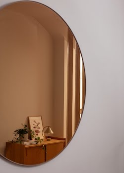
“Overall, we introduced colour to help define and break up each space of the home – the contrast in colours sparks intrigue when travelling through the home. A variation of considered materials (oak, braided rattan) help create more textural depth throughout each space of the home.”
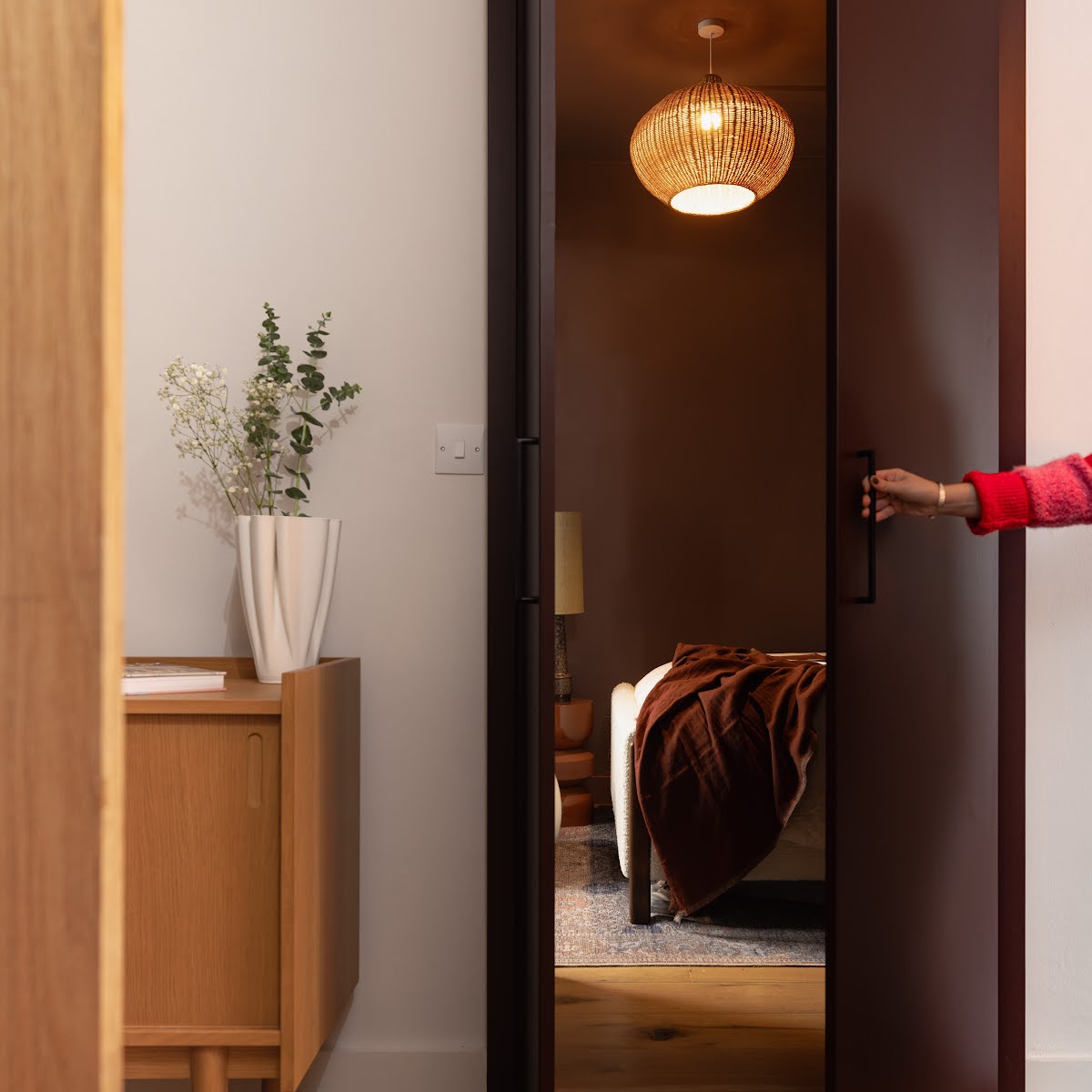
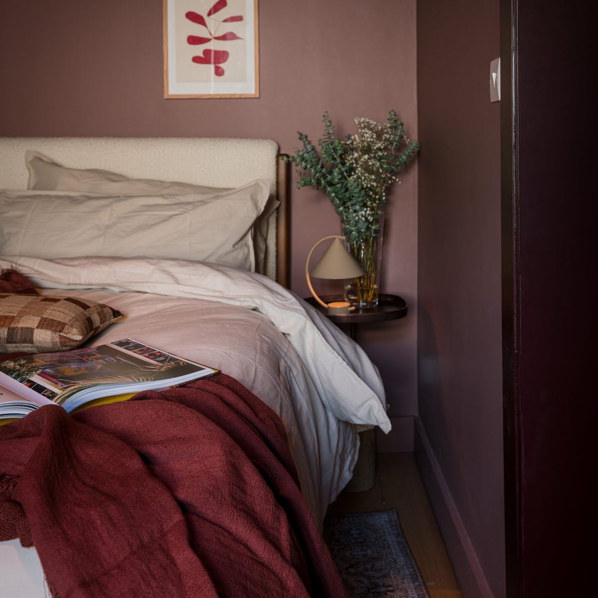
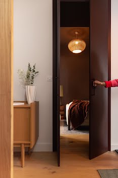
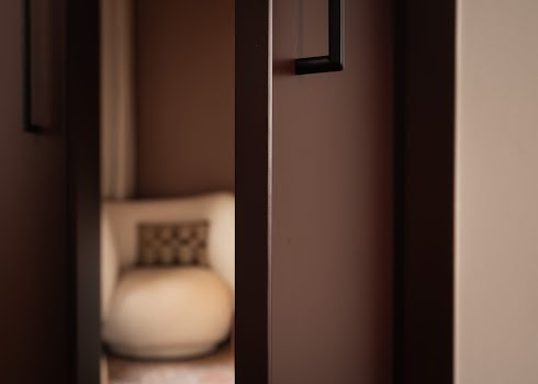
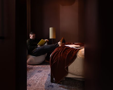
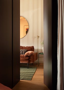
One of Emma’s favourite aspects of this design is the secret door to the main bedroom. “We changed locations of door swings of the original floorplan and incorporated the concept of a secret door to which leads to their main bedroom. The idea of this was to create more novelty to the space, while also giving our client the opportunity of having a more sizable wardrobe space where the original door was to the main bedroom. It offers all visitors a pleasant surprise when they open it to find the doors lead to another room!”
Photography: Ruth Calder-Potts


