This apartment proves that small spaces can feel both spacious and stylish
A renovation by Studio VM Design has created a space that’s full of considered design and luxurious finishes.
Working with small spaces can be more challenging, but this project by Studio VM Design shows what can be achieved in a limited space. Victor Meus, founder and creative director explains that the property was unusual, and started off in a very different form than it is now.
“The property was originally a 3 bed two-story apartment with an unconventional layout,” Victor explains. “The first floor included a compact kitchen, which was located where the master bathroom now sits, alongside a spacious but disconnected living area and a single bathroom. The arrangement felt fragmented, with the kitchen tucked away and isolated from the main social spaces, creating a disjointed flow. On the upper floor, there were two bedrooms and an additional bathroom, but despite the ample square footage, the layout was inefficient and didn’t fully capitalise on the available space.”
The project involved totally changing this layout. “The client wanted to reimagine the property as two independent flats, each with a clear identity and sense of openness. This vision also led to the ambitious addition of a new third floor, transforming the upper flat into a bright, expansive space with high ceilings and open-plan living. This new layout not only optimised the flow and function of each area but also brought in an abundance of natural light, making the upper flat feel spacious and unique – a rare space in central London.”
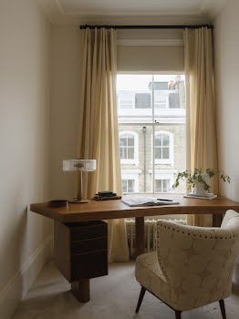
The clients wanted the spaces to feel inviting, contemporary, and full of character, and were drawn to a mid-century modern influence, Victor explains. “The first flat was designed as a one-bedroom apartment with an open-plan kitchen and living area, offering seamless flow and comfort. The second flat features two bedrooms, an office space, and the newly added third floor, which includes a spacious living area with high ceilings and ample natural light. Our goal was to create a home that felt bright, relaxed, and effortlessly stylish, where each element contributed to a sophisticated yet comfortable environment.”
A key element of the design was to maximise natural light and flow in the spaces, while bespoke elements were added to introduce personality.
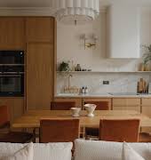
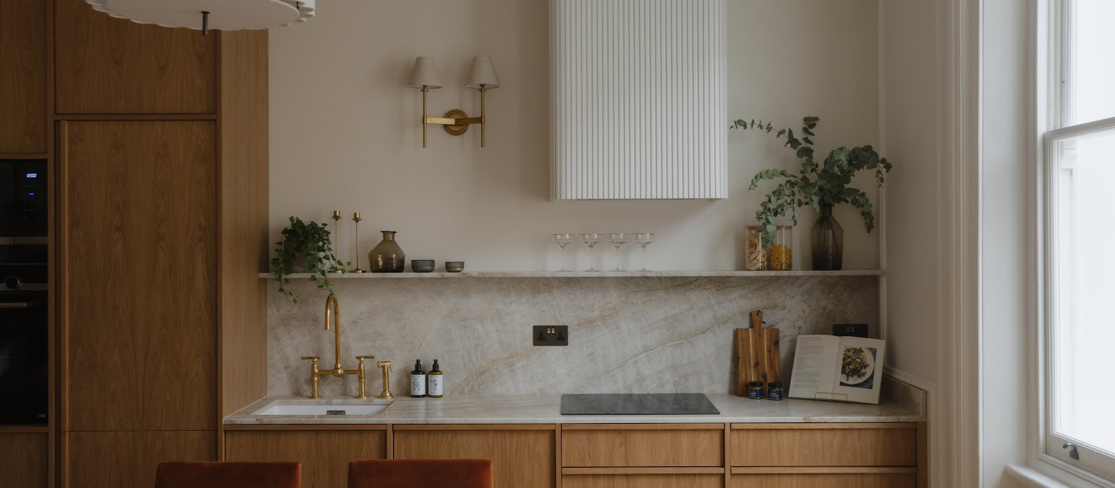
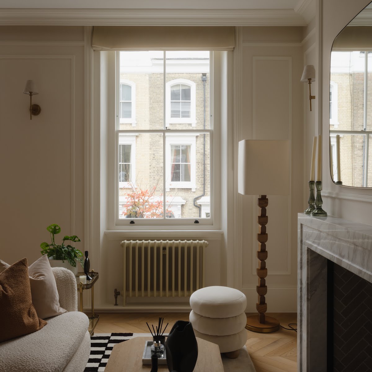
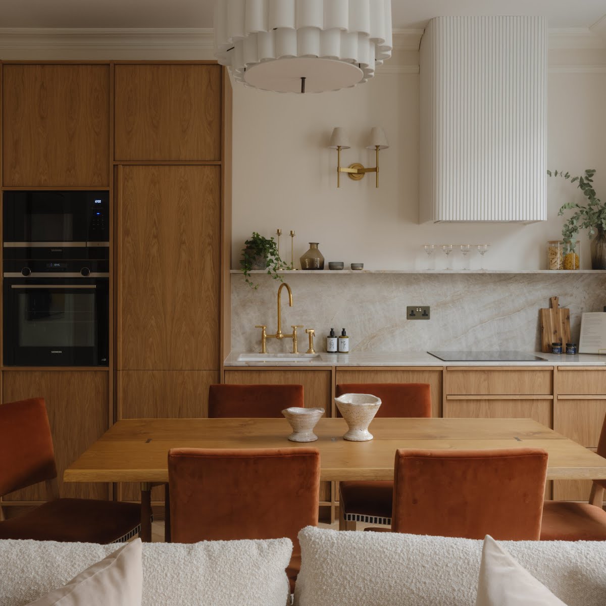
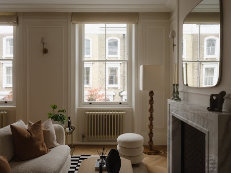
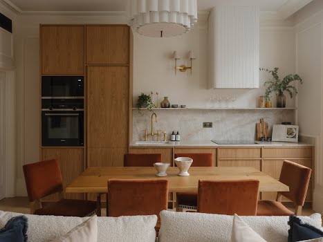
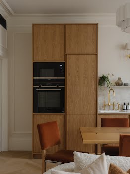
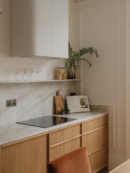
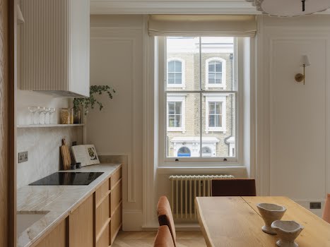
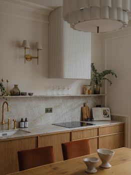
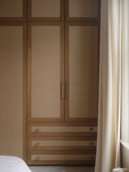
“In the first flat,” Victor explains, “we opted for an open-plan layout to create a sense of spaciousness and connection between the kitchen, living, and dining areas. A minimalist wooden kitchen with subtle grain patterns brings warmth without overpowering the space, while wall panelling adds depth and texture. To give a touch of elegance and surprise, we introduced wardrobe doors with wallpaper, an element that elevates the room’s atmosphere while adding a bespoke feel.”
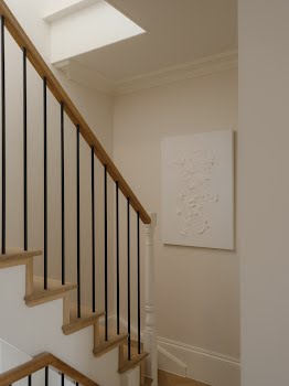
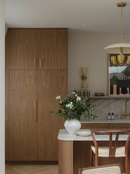
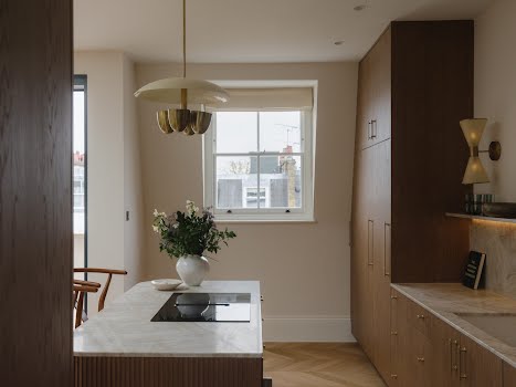
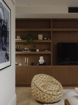
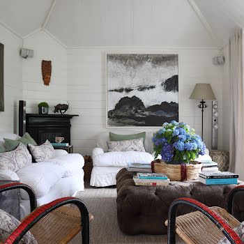
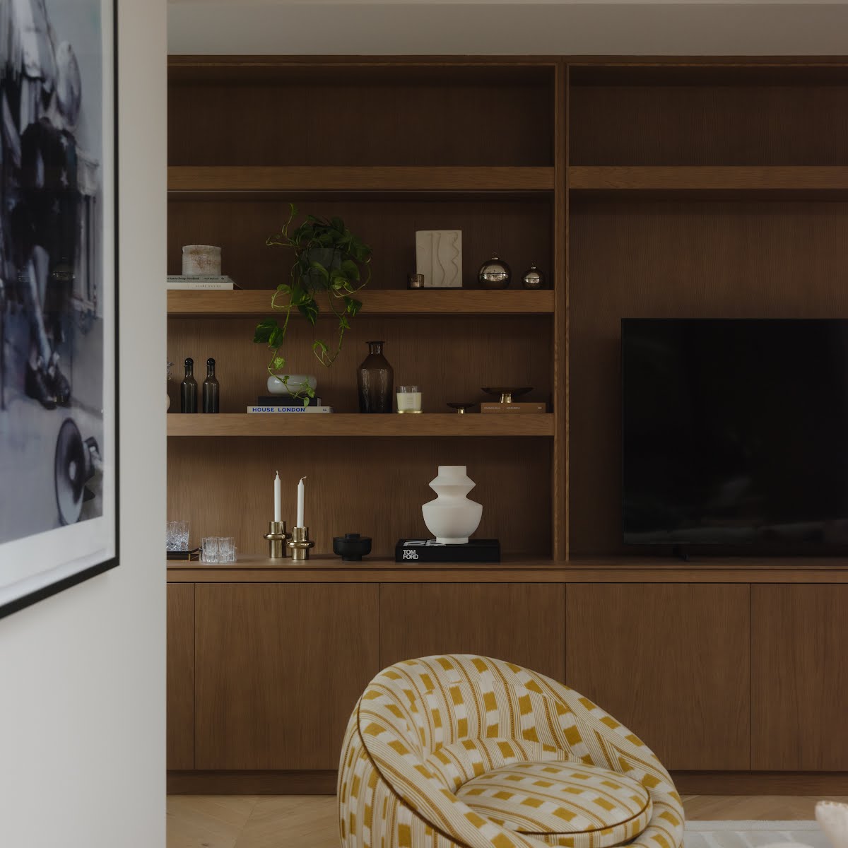
The second flat has a more obvious midcentury modern influence. “Here, the kitchen features a fluted island—a statement piece that balances sophistication and functionality, inviting social gatherings or family time around the island. A custom TV cabinet adds a streamlined aesthetic and serves as a focal point in the living area. Moving upward to the newly created third floor, this space became the crowning feature: high ceilings, a grand skylight, and an open-plan layout create a vibrant, airy room flooded with natural light.”
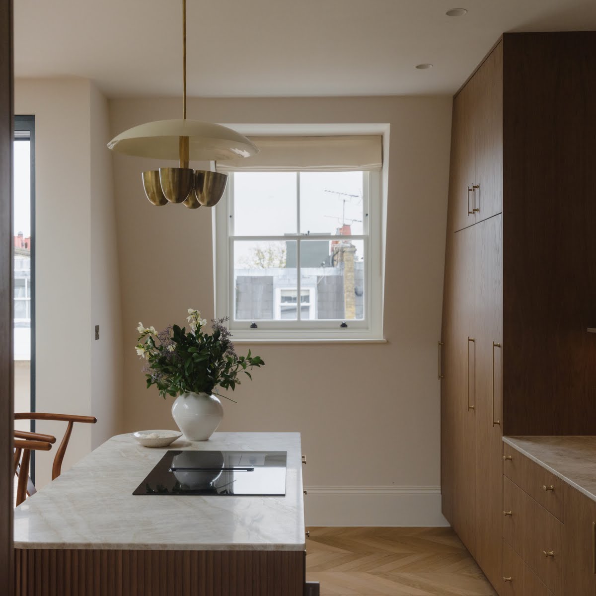
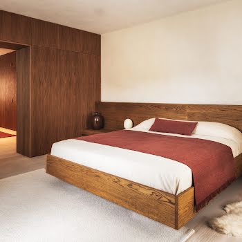
When it came to choosing materials and finishes, Victor explains that the light and character of each space was carefully considered. “On the first floor, where natural light is more limited, we embraced a lighter palette of warm neutrals and oak to create an airy, welcoming atmosphere. As we moved upward to the third floor, where sunlight is most abundant, we intentionally introduced darker oak tones and a moodier palette. This deliberate contrast enhances the abundance of natural light, creating a cosy yet luminous environment that feels perfectly balanced for the space.”
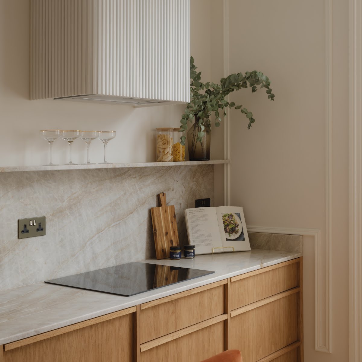
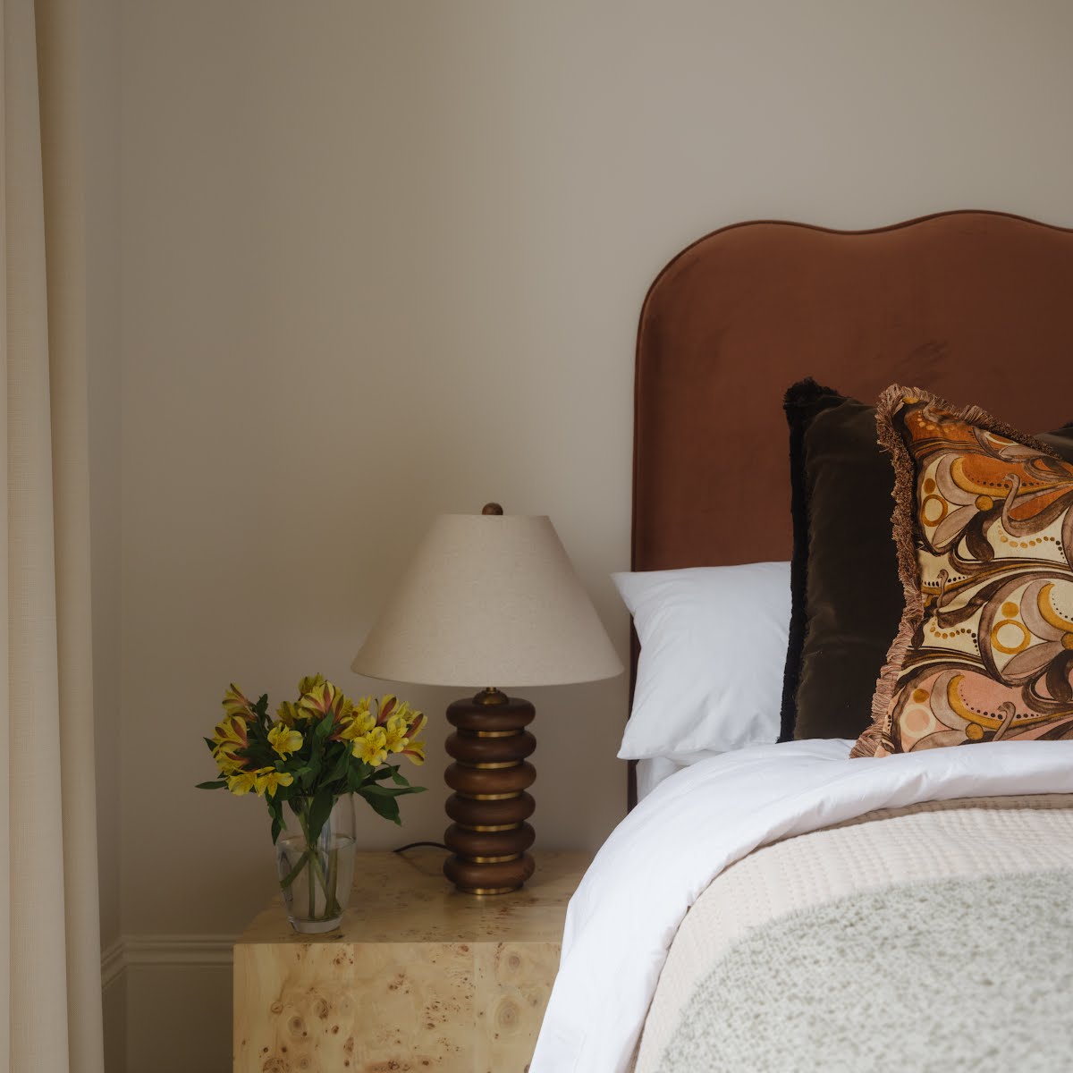
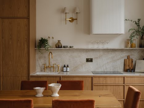
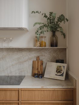
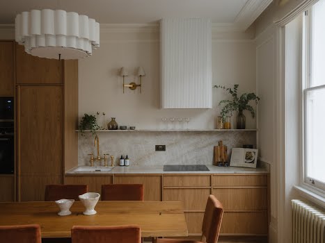
The first apartment has a neutral palette, comprising light fabrics such as boucles and linens with rust and warm velvets. “The bespoke kitchen features clean lines, light oak cabinetry, the countertops are crafted from Taj Mahal quartzite, which brings in a smart natural veining, offering both elegance and practicality. For the extractor fan cover, we wanted some fun as it would be exposed, but at the same time we needed to keep it minimalist, so we crafted with fluted panelling painted with a lighter colour than the walls to give it a better contrast, adding a playful yet sophisticated element to the kitchen. To enhance the open-plan living and kitchen area, we incorporated large wall panelling to subtly elevate the room’s ambiance.”
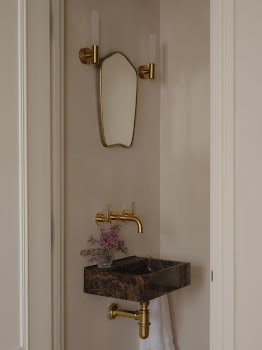
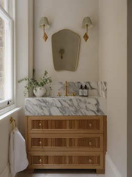
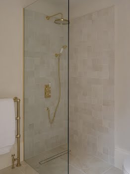
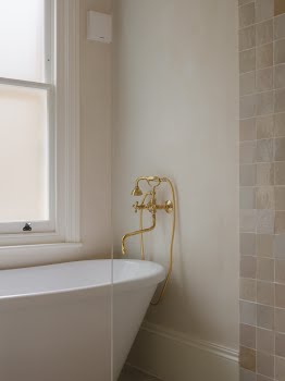
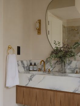
In the bathroom, textured effect paint and handcrafted Moroccan zellige tiles give a soft, organic feel. Custom-designed cabinets with Arrabescato marble vanities and unlacquered brass fixtures feel chic yet timeless.
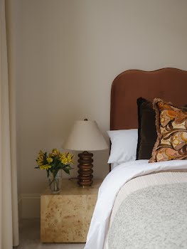
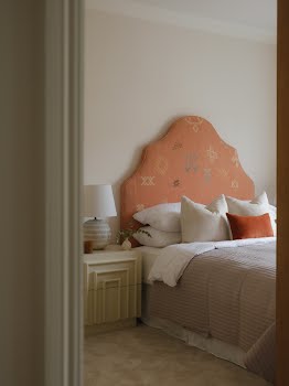
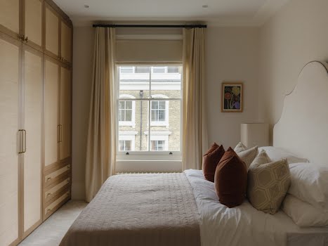
Moving into the second apartment, the mood is similar but with its own distinct character. The second flat carries a similar aesthetic but with distinct variations. “We continued with light, airy tones, adding warmth through oak accents and wallpapered wardrobes for continuity and playfulness,” Victor says.
“On the newly built third floor, we chose to use slightly darker oak for the joinery which complements the abundance of natural light, giving the space a cosy yet open feel. This kitchen also was designed to a more minimalist look so it would not compete too much with the large TV cabinet built in the room facing it. The kitchen includes a fluted island with brass handles, and a stunning pendant sourced from India blending mid-century influences with modern refinement.”
Photography: Richard Oxford


