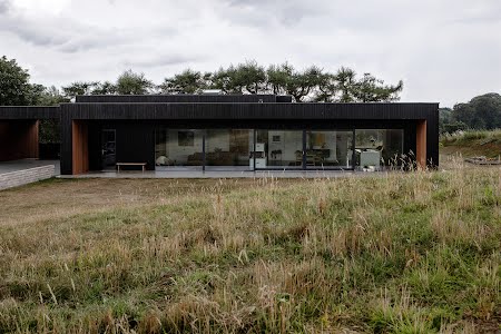
Low-slung and edgy, Tara Thallon and Curt Wigham’s contemporary family home sits neatly into the Antrim landscape, a line of dramatic trees piercing the sky behind it. All clean lines and natural textures, it shifts persona in the changing light, sometimes feeling Japanese, sometimes Scandinavian. And then there’s that pervading mid century modern sensibility, paying more than a passing nod to America’s great design movement.
But there is nothing derivative about this striking new build. Original and bespoke, the considered design was over two years in the making. “We bought the site six years ago,” Tara explains, noting that, on the day we speak, it is the first anniversary of when they moved in. Surrounded by fields, yet 10 minutes from Belfast city centre, the home offers a countryside idyll without the stress of a big commute. Tara co-owns interior design store Boünd in Belfast city while Curt owns a chain of cafés around greater Belfast. With three boys under 12, it is a busy, joyful and hard-working house.
The front of the house is dominated by five large Internorm windows, 13 metres in height, of which two slide fully open. The polished concrete floor continues outside, forming a terrace that’s neatly protected by the eaves, and connecting the garden and sitting room in one seamless flow. “That was probably one of our biggest and most expensive decisions. When you open those huge panels in summer, the inside and outside become one with the kids running about. It’s really lovely,” she enthuses.
The exterior is clad in dark larch, blackened using the Japanese method of shou sugi ban. Developed in the 18th century as a way to treat wood and weatherproof it, the technique involves charring the wood’s surface to render it a deep charcoal-black. Fire-treated by hand by Sasha Stewart of Toasted in Co Down, the artisan individually “toasts” each piece of timber to a custom shade.
“It becomes antibacterial and fire retardant, and is a really good natural form of cladding for your house,” Tara explains. “Initially, we were going to do a concrete exterior, but we made a last-minute decision on the shou sugi ban because we felt [concrete] might look a bit like an office block. It was a really good decision to go with the wood, because it blends in with the natural surroundings.”
The kitchen needed to feel modern without dominating the open-plan space. Slats of wood were incorporated, referencing the external cladding, while creating a feature that’s also found in the living room. “We wanted to incorporate wood. It has a mid-century modern feel but also references our love of modern design. We wanted to keep it really simple and understated, so it almost becomes part of the furniture.” With the oven hidden behind a pocket door, the units are designed to look more like a wall than a kitchen. “We didn’t want it to feel like a kitchen when it wasn’t being used as one.”

This feature originally appeared in the Autumn/Winter 2021 issue of IMAGE Interiors.
