This Blackrock bungalow proves that you can create more space without extending
Previously made up of small, disconnected spaces, this home was opened up to make the most of its existing footprint, without the need for a new addition.
When faced with a home that feels dark and cramped, many of us would think that an extension is the solution. And while they can be a great addition to a home, they’re also expensive and require significant work, so if a solution can be found within the home’s existing footprint, it’s a great option.
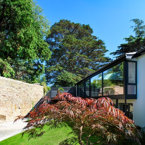
This was the case with this Blackrock bungalow, which David Flynn Architects were approached to improve. David Flynn explains that while from the front it seemed like a standard bungalow, at the rear a semi-basement level added an interesting dimension, creating a raised patio from the ground floor level that overlooks the garden.
“Despite its charming garden and its southern orientation, the interior felt dark and uninviting,” he says. “The existing windows were small, and the layout did not facilitate an easy flow between the rooms or to the outdoor spaces. The lack of cohesion between the interior and the exterior, and poor thermal performance were the primary issues we aimed to address.”
This did not involve extending, allowing them to keep the unique design of the existing home. “The house seemed to be the right size,” David says, “and it was agreed that the clients didn’t need more space, just better space.”
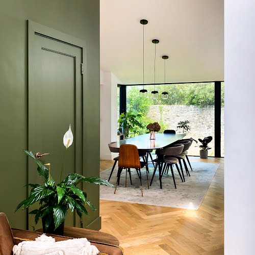
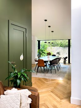
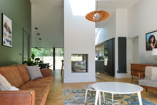
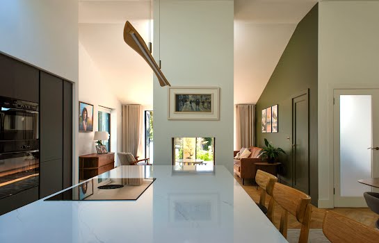
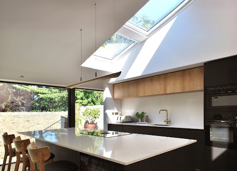
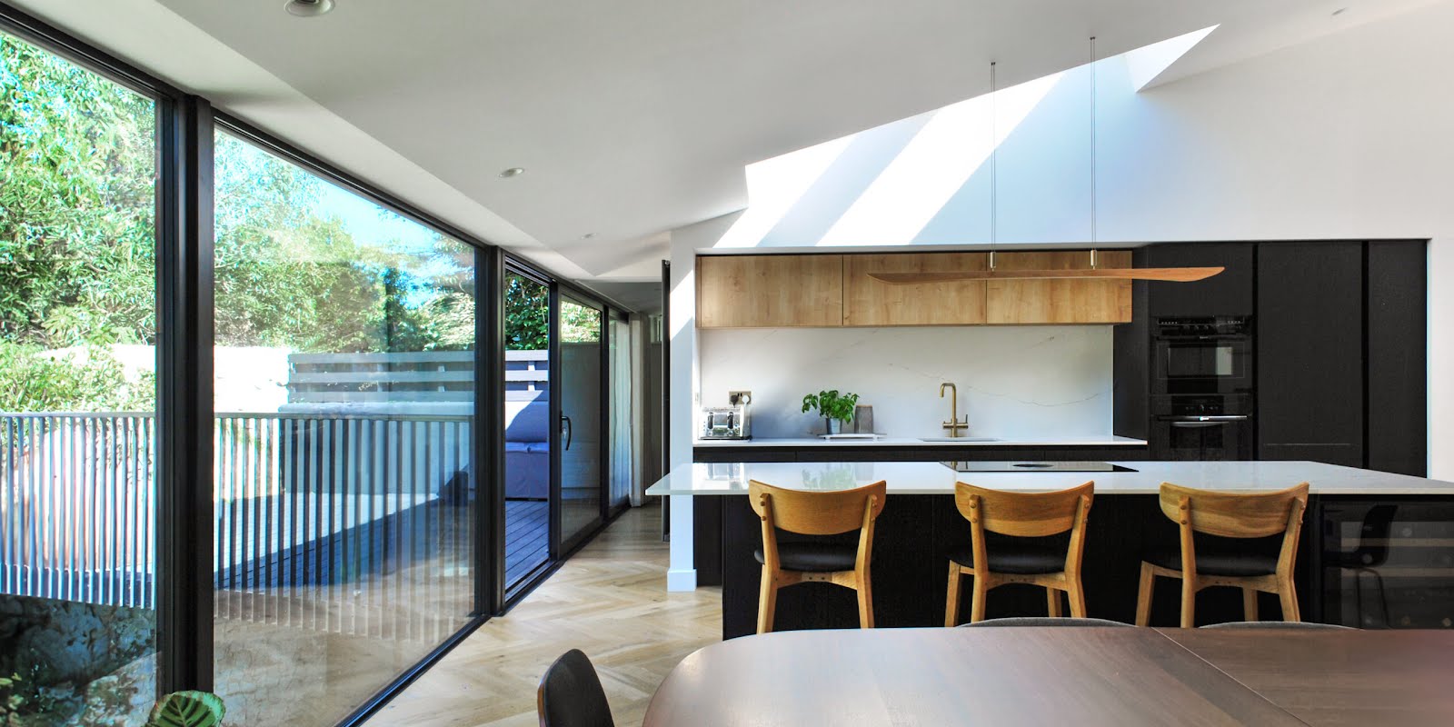
This involved reconfiguring the layout to create an open-plan design. Walls were removed, roof lights and glazed doors allow light to flow in, and sliding doors were installed between rooms to create flexible spaces.
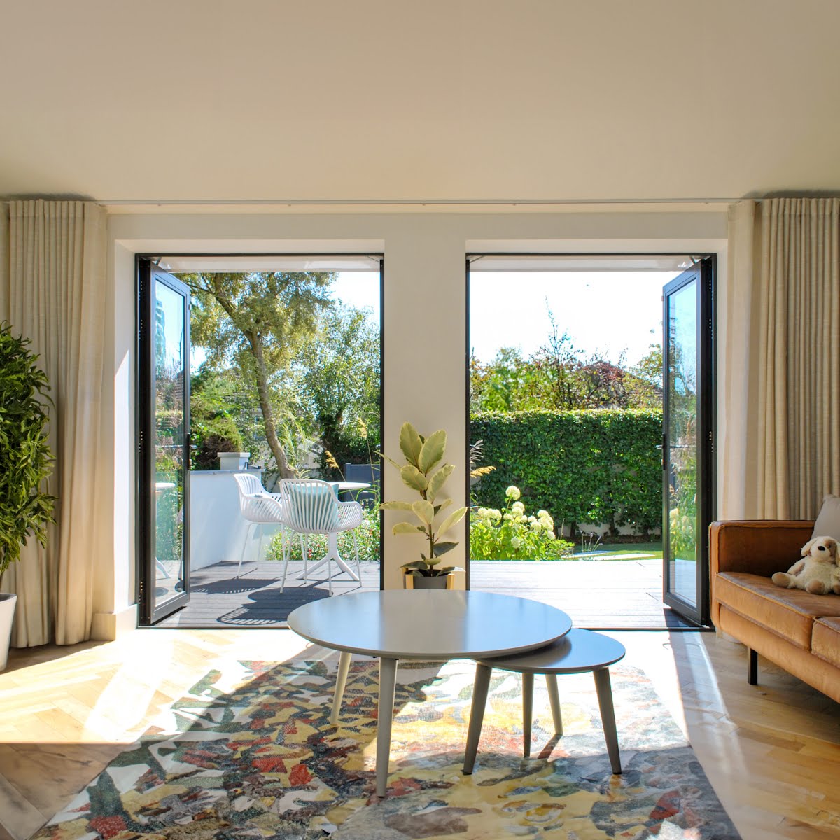
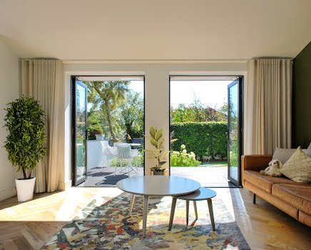
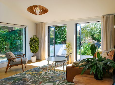
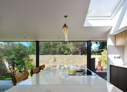
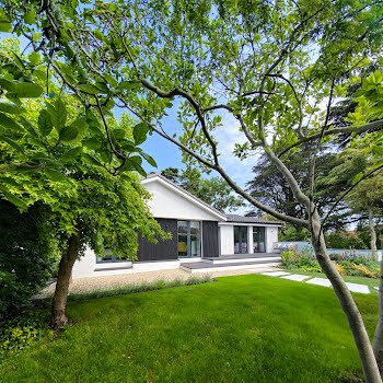
“The front garden was almost completely separate from the house, accessed only through a single door,” David points out. “We installed two sets of glazed double doors to the front giving direct access to the sunny garden for the first time. This, combined with the new large glazed sliders across the rear elevation means the living spaces can open up completely and create a view from front to rear garden. This is one of our favourite aspects of the design as it really feels like you’re surrounded by nature, almost like being in a tree house.”
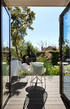
David was pleased that the design allowed them to not only preserve the home’s features, but improve how they are used. “The raised patio over the private garden was a wonderful aspect of the house, but was only accessed through a series of doors along a corridor, with no direct access from the main living spaces. We knew our design had to focus on improving this connection.”
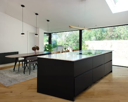
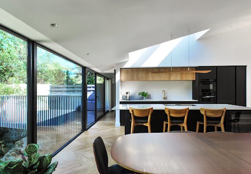
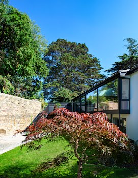
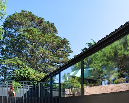
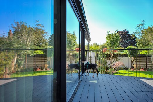
This was done thanks to a large glazed screen, which extends along the full length of the open plan kitchen, living, and dining space, adding light and connecting the indoors and outdoors. “The aluminium doors slide away allowing the living spaces to spill out onto the extended and refurbished patio, making it easier to use on a day to day basis.”
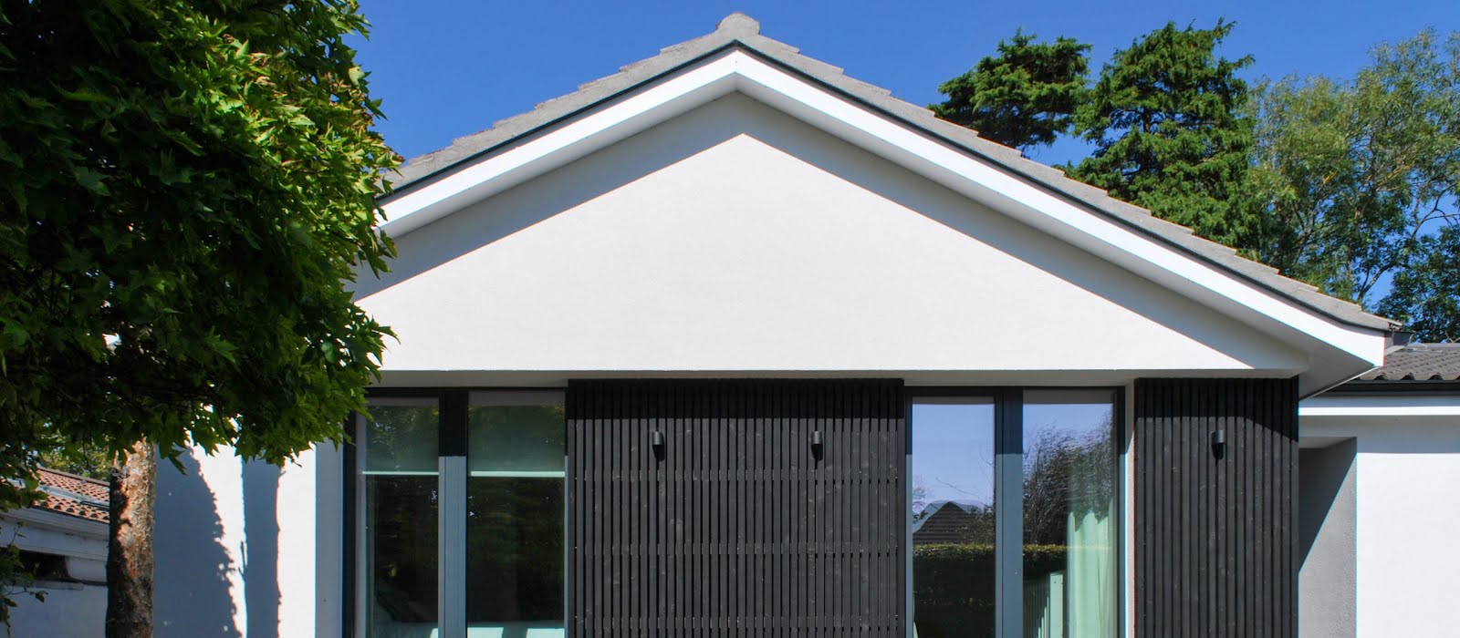
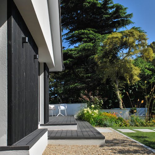
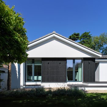
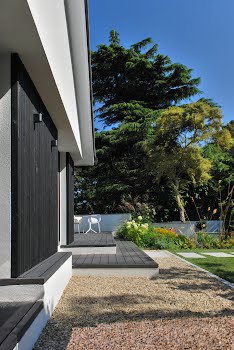
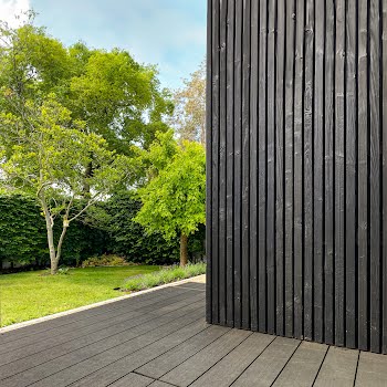
To address the home’s poor BER rating, external insulation was added, which also gave the opportunity to modernise the home’s appearance from the outside. “A contemporary combination of white render and black charred timber cladding was selected,” David explains. “The concept was to design a monochrome structure nestled amidst lush greenery, evoking a serene, Japanese-inspired aesthetic. By recessing and projecting sections of the front façade, we created small seating areas and covered porches that play with light and shadow, adding visual interest.”
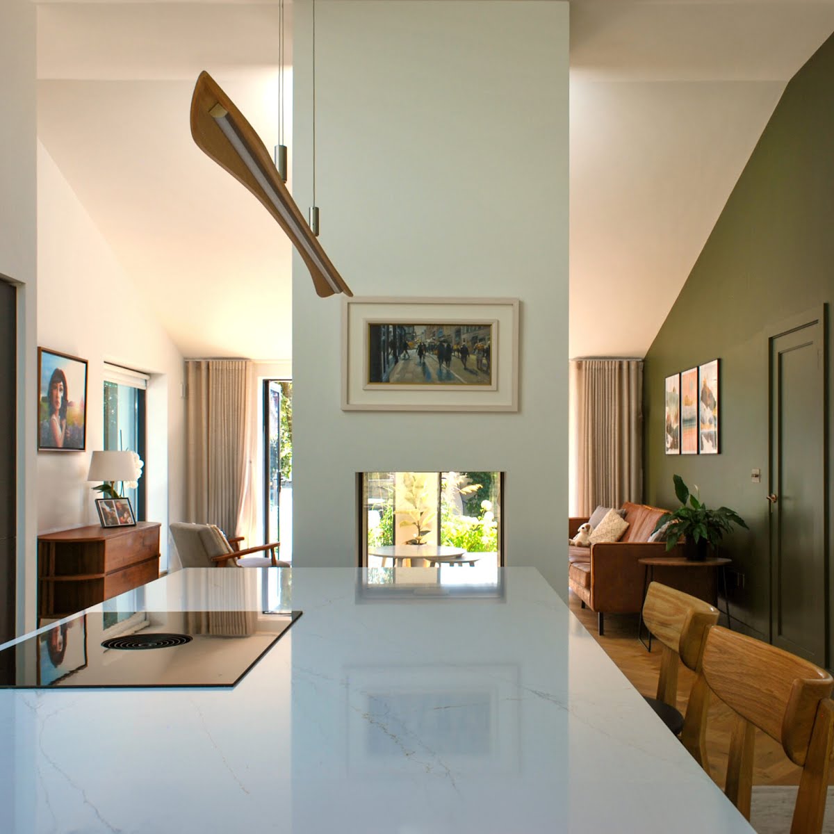
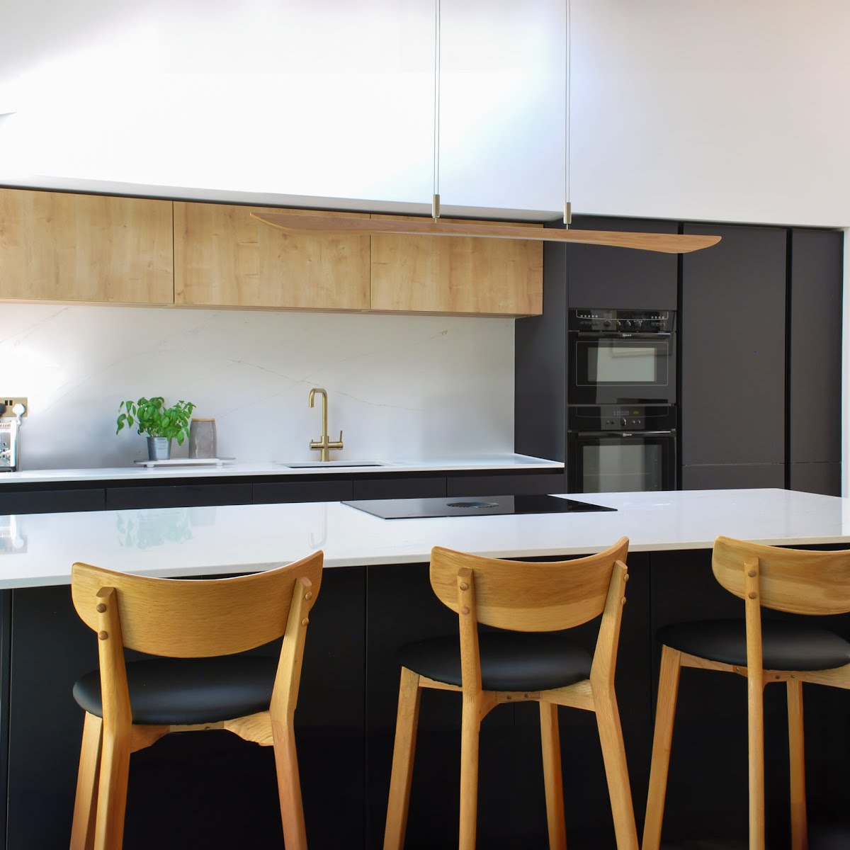
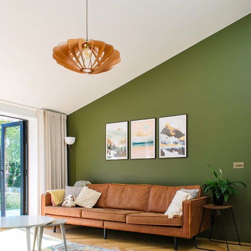
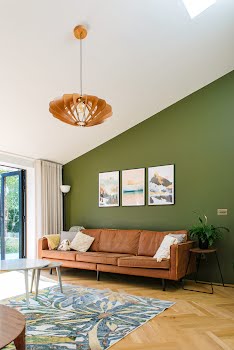
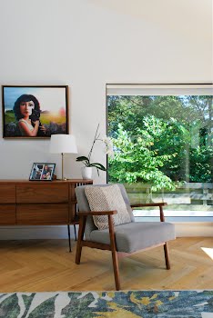
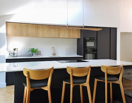
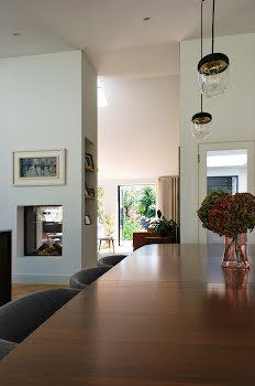
Internally, warm tones and neutral colours were chosen creating a calm, welcoming feeling, while dark kitchen units add a touch of contrast. The original flat ceilings were also raised to follow the profile of the roof, providing the chance to create a tall feature fireplace and chimney.
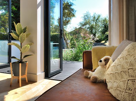
Overall, it’s a hugely successful project, showing how relatively simple changes can transform a space. “The finished spaces are filled with natural light, creating a bright and airy atmosphere,” David says. “With wide views of the garden on both sides of the main living spaces, you feel like you’re in a covered garden room that just spills outside when you open the doors. The rest of the house maintains this strong connection to the outdoors, with refurbished bedrooms opening directly onto the front patio, ensuring a continuous link to the garden and the natural environment.”


