This Clontarf home has been transformed with a spacious extension full of delicately dappled light
The design by Architectural Farm turned a 1950s home with many small rooms into a series of calm, connected spaces.
This Dublin semi-d suffered from many of the same problems that afflict so many Irish homes. Built in an era where people lived differently than we do now, its layout felt all wrong for modern family life.
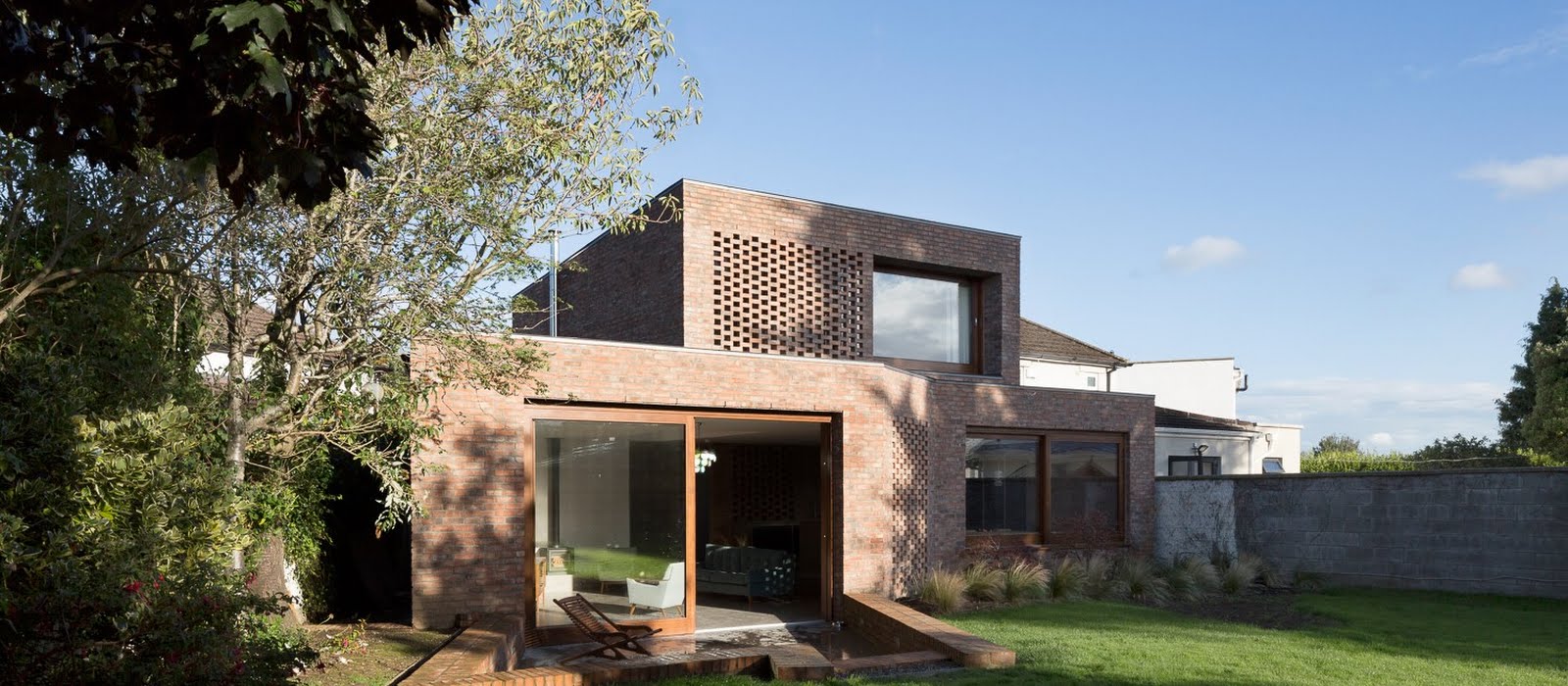
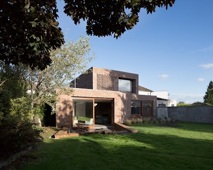
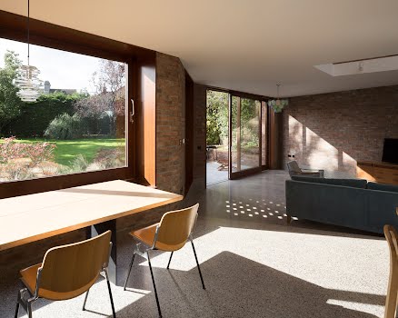
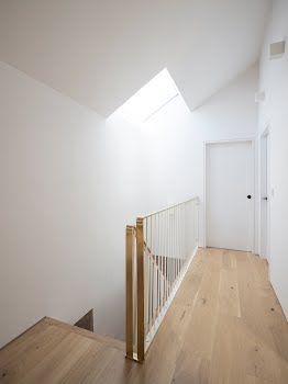
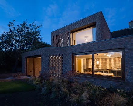
Shane Cotter of Architectural Farm explains how the practice re-envisaged this home by creating a continuous twisting brick ribbon wrapping around and supporting the original structure. A new open-plan kitchen, dining and a sunken living area were created on the ground floor, as well as a new master bedroom and en suite on the first floor.

One of the main issues with the house, he explains, was work that had been done to the home by previous owners. “There were a series of extensions that had been added over time, which resulted in quite a large footprint, but this was made up of a series of small, pokey spaces. None of the living spaces really connected with the large, wedge-shaped garden to the rear.”
The homeowners weren’t too prescriptive about the overall design, simply asking for a generous kitchen and living space and an extra bedroom. “How that was achieved and how that felt was very much left open and teased out in our discussion with them during the design development.”

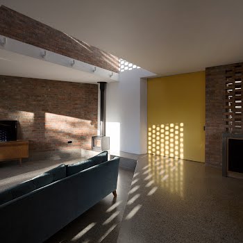
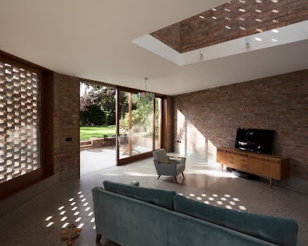
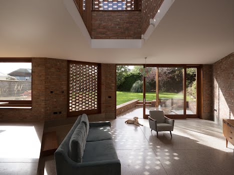
Given this creative freedom, the practice came up with a design that first removed the existing extensions, retaining most of the original rooms. The main aspect of the new extension is a large double-height space with perforated brick screens, drawing dappled daylight deep into the heart of the house.

Shane explains that because work done to the house over the years had removed any clear character or features from the period it was built, “it freed our hand to be bold with the new interventions”.

They were interested in how the new extension could interact with the large, wedge-shaped rear garden, especially the afternoon light it received.
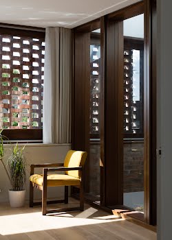
The brick structure not only adds warmth, but its perforated sections create dappled light, softening harsh sunlight, with effects that change throughout the year, while the brick also adds privacy to these largely glazed spaces.

Shane explains that the brick also “guides and orientates you as the house slowly reveals itself, from a glimpse of the first floor screen on approaching the house and, once passing through the deep brick threshold to the intimacy of the entrance hall, another perforated brick screen delays your journey to the main living space.”

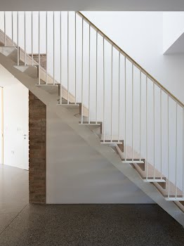
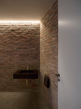
Overall, they kept the palette of materials pared-back: concrete, brick and timber. With such simplicity, attention to detail becomes paramount. “There was a huge amount of time invested by ourselves, the client, the builder and subcontractors in considering and refining the junctions of all these materials, which we think really paid off in the end in creating a calm space,” Shane says.
The result is a serene space that feels substantial, almost protective of its inhabitants. “There is a quietness and calm to the main space which is really lovely,” Shane says, “which I’m not sure we could have achieved without the attention to detail by everyone involved.”
Photography: Aisling McCoy

