This Dublin bungalow was transformed to create a bright space, while keeping its character
Ryan+Lamb Architects gave this 1950s-style home a complete renovation to create a new layout, increase the ceiling height and improve its energy efficiency.
A Dublin home that was built around the 1960s, this bungalow had been largely untouched since then, and its owners contacted Ryan+Lamb Architects to bring it into the 21st century.
However, as Laura Ayuso Nieto, associate & BIM manager at Ryan+Lamb Architects explains, they did not want to lose the character of the original building.
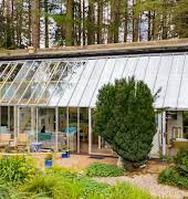
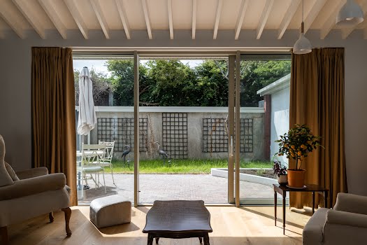
“The detached, low lying bungalow, designed in an American suburban 1950s style had features and an aesthetic that we and our client wanted to retain,” she says. “These included deep roof overhangs, large expanses of glass capturing views of the expansive landscaping and distant hills.”
The main problems the renovation needed to address were the lack of insulation, low energy performance and poorly defined spaces. Laura explains that, “circulation took up a large percentage of the floor area and resulted in living spaces that did not make the most of the site and its orientation.”
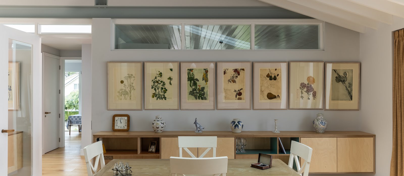
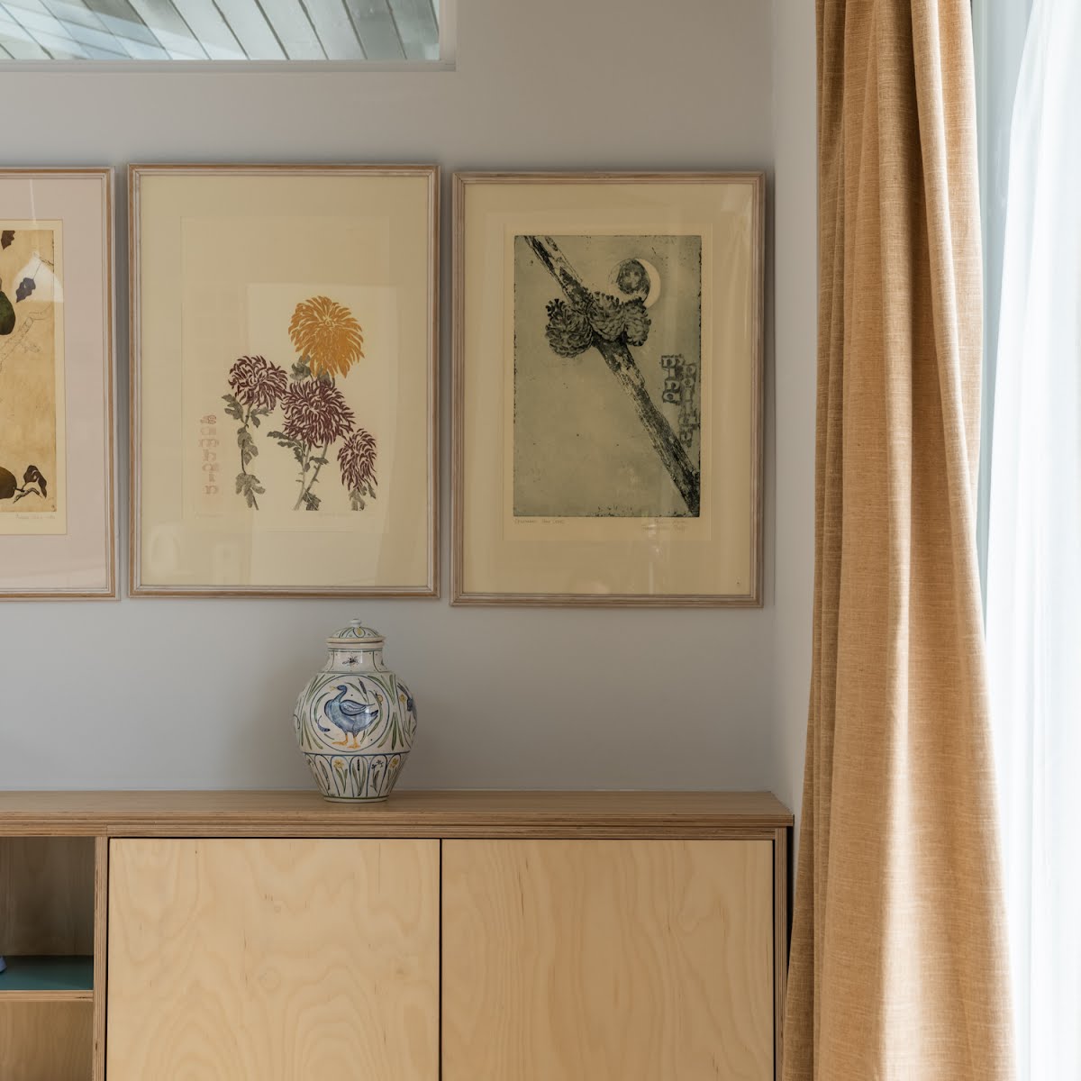
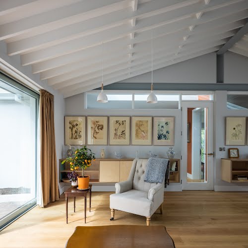
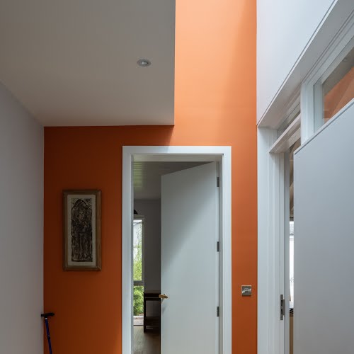
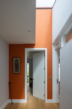
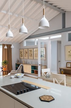
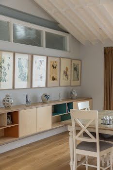
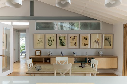
Some of the key things the owners asked for in the design were lots of wall space for artwork, increased ceiling heights where possible, more open spaces but counterbalanced with some cosier spaces for reading, better planned and more spacious bathrooms and spaces that connected with the gardens and the changing light as the day passed on.
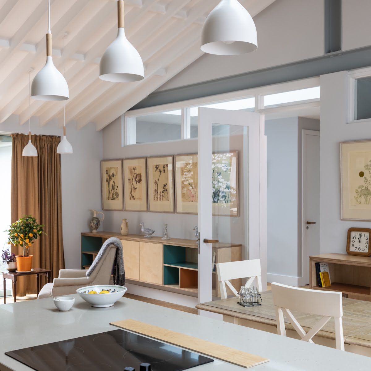
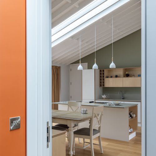
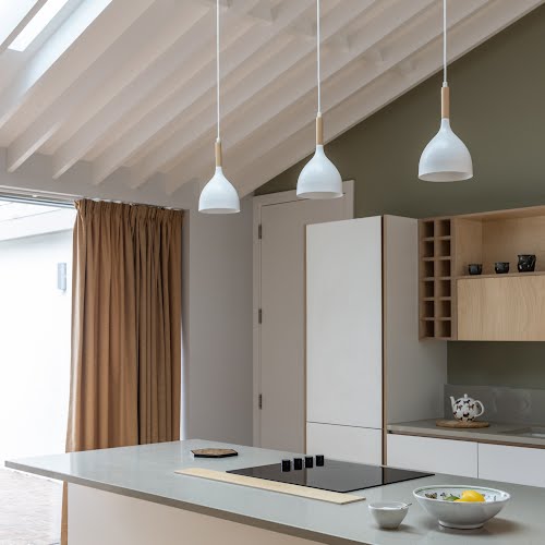
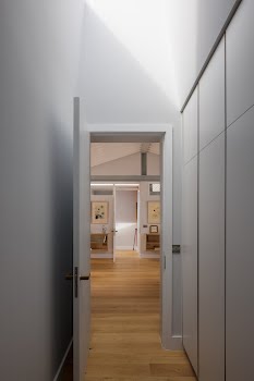
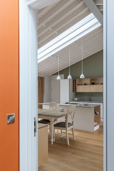
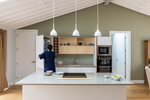
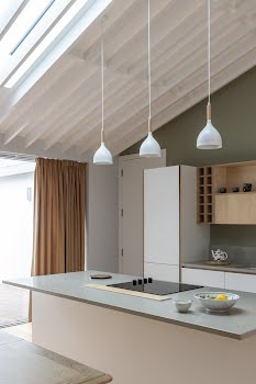
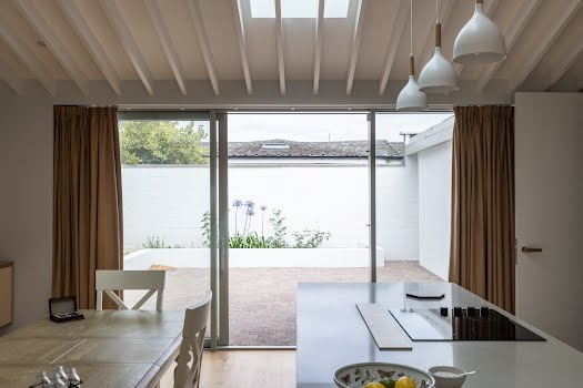
Taking all this into consideration, Ryan+Lamb Architects designed a large open plan kitchen, dining and living space in the centre of the house that had an increased ceiling height. This space separates the other entrance and living spaces to one side with bedrooms on the other.
To the rear of the house, there was an existing secondary living space which was retained to cater for a live-in carer. A main aspect of the design was to reorient the house to the north west/ south east axis of the site, so that the central space made the most of the changing daylight throughout the day and connected with the garden.
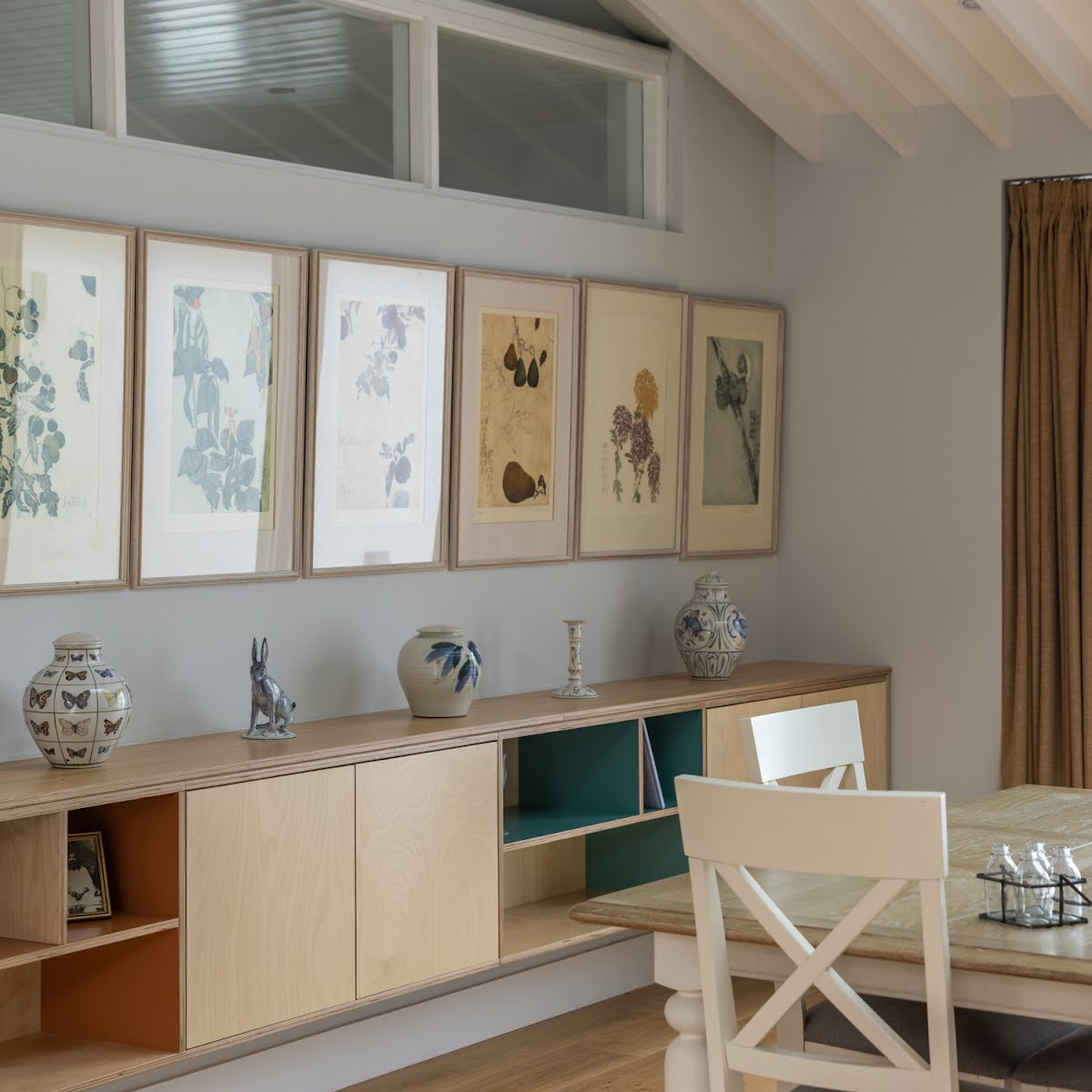
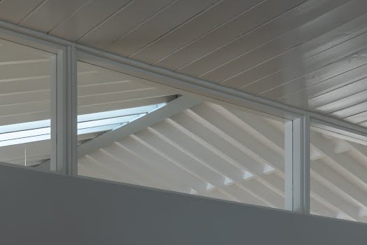
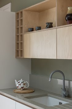
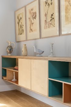
As a nod to the original house, Laura explains, “We introduced bespoke joinery pieces into the design that have nuanced references to 1950s American interiors. Some of the wall hung units have pastel coloured Formica lining which is a nod to joinery of the time. Ceilings are both timber lined and open joisted which again, reference houses of this period.”
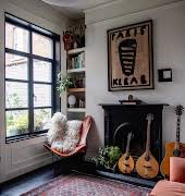
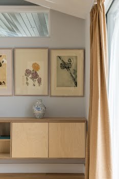
Because the owners wanted to highlight their extensive art collection, the walls were kept to muted tones, and simple, hardwearing materials were used throughout, such as oak flooring porcelain tiles, and bespoke joinery made with birch veneer plywood.
The result is a wonderfully serene space, full of light. “It’s calming, and a place people want to stay in,” Laura says. “It is warm, comfortable, light and airy. It connects with nature and gardens and beautifully captures views of the hills.”


