This Dublin café is the perfect inspiration for colourful kitchen spaces
From pops of colour to bespoke storage, it’s full of great ideas.
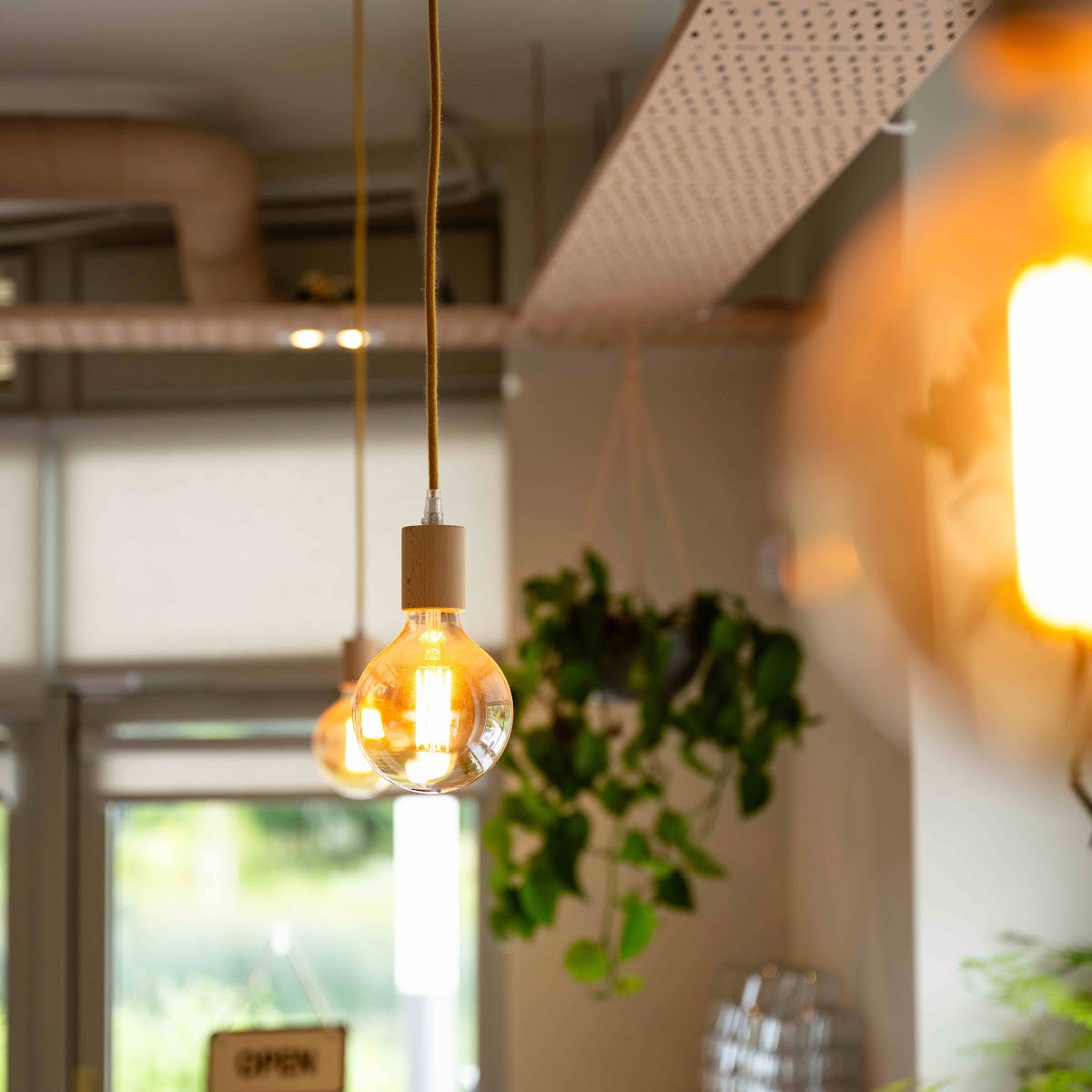
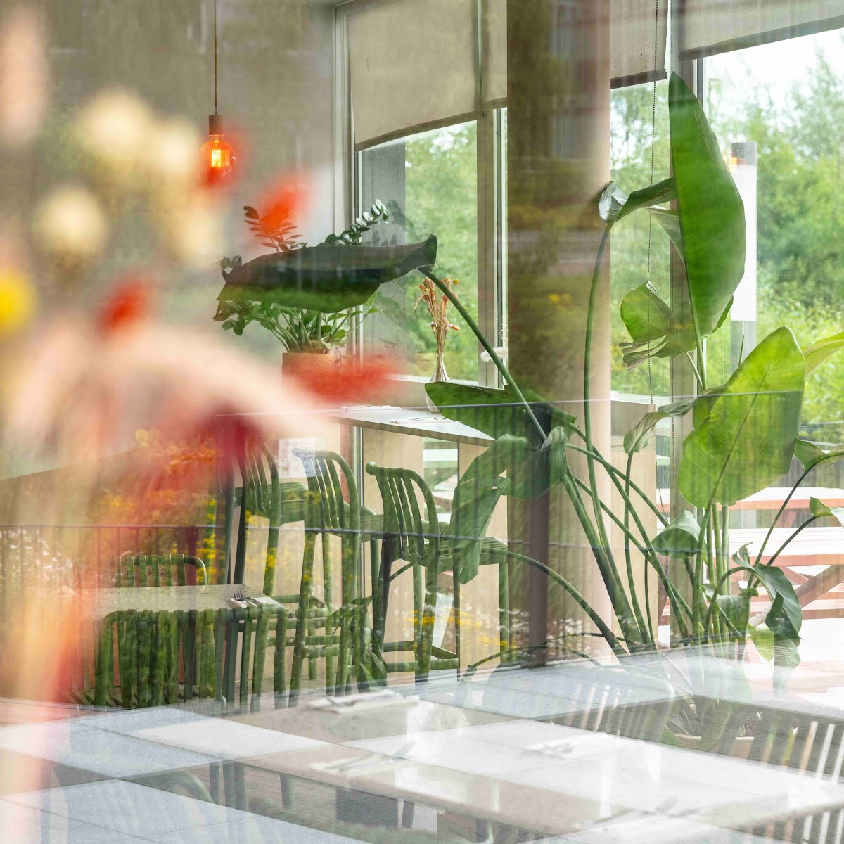
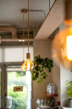
We all love looking at beautiful homes for interiors inspiration, but sometimes it can come from more unexpected places too. Such is the case in this Dublin café, where a design by Lisa Hayes of Fabric Design has refreshed this space with plenty of touches we could see translating to a home kitchen.
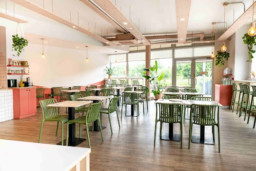
“The space was reimagined for Rustic Honey Food, a contemporary bakery known for its freshly made, homemade goods,” Lisa explains. “Previously occupied under different ownership, the existing café was outdated and in need of a complete transformation. The objective was to create a vibrant and inviting space that perfectly reflected the owners’ vision.”
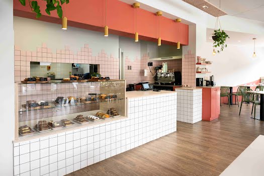
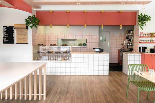
Sustainability was also an important consideration in this design, making use of existing features in the space. “The original café counter was refreshed with simple white square tiles for a more contemporary look,” Lisa says, “and a glass display was added to showcase the bakery’s array of cakes. Existing features were given a new lease on life with fresh paint, enhancing the overall look of the space.”
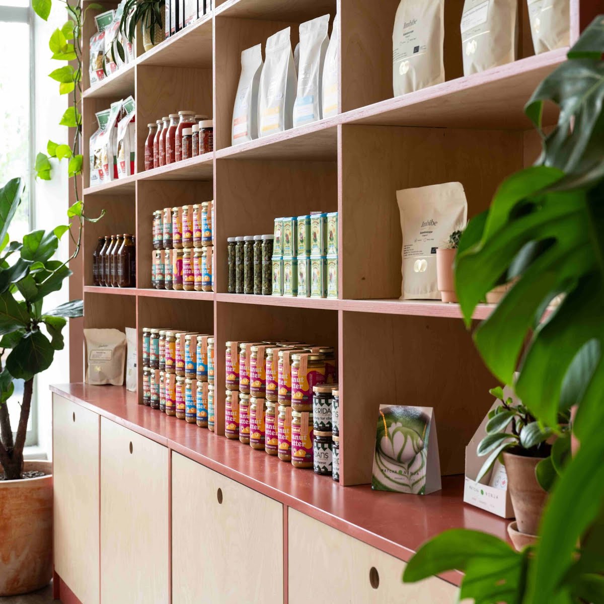
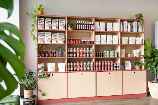
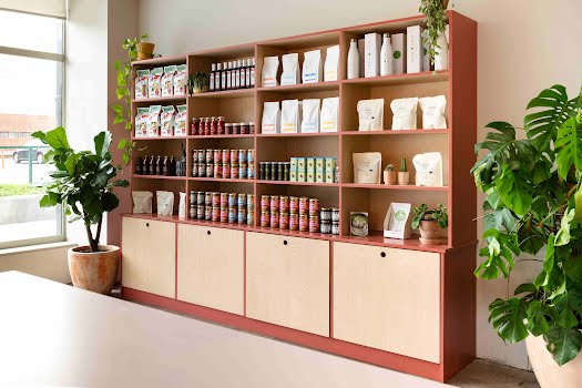
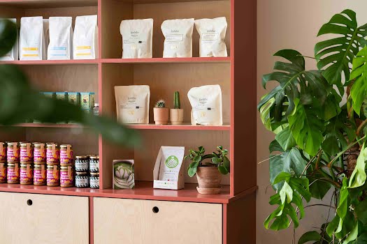
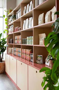
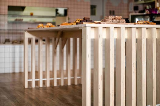
Key to the success of this space is its bespoke joinery, allowing it not only to function exactly as it was needed, but also meant its design could fit in perfectly with the colourful, fun mood of the space.
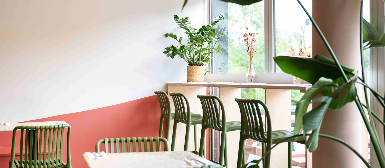
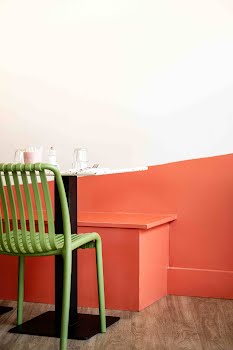
“The retail unit, display table, coffee dock, and custom high tables to optimise seating capacity and enhance space efficiency are all bespoke. Birch ply material was chosen for its warmth and durability, and we added in a pop of colour around the edges to make these features stand out,” Lisa says.
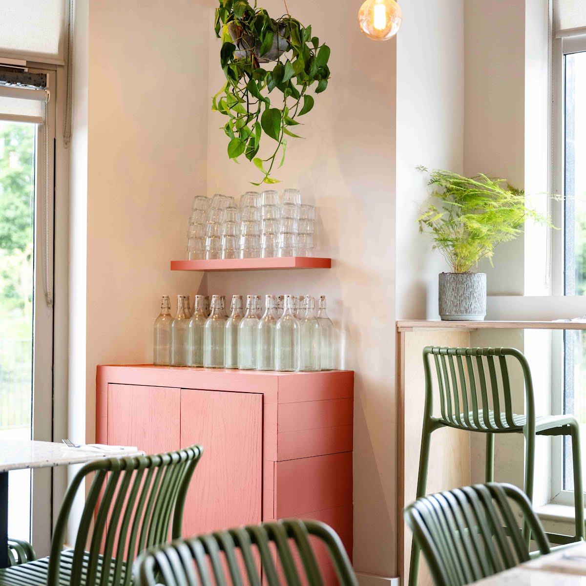
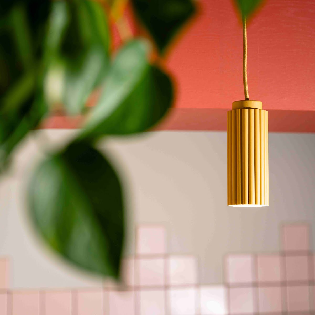
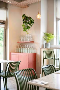
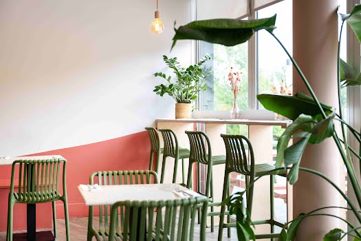
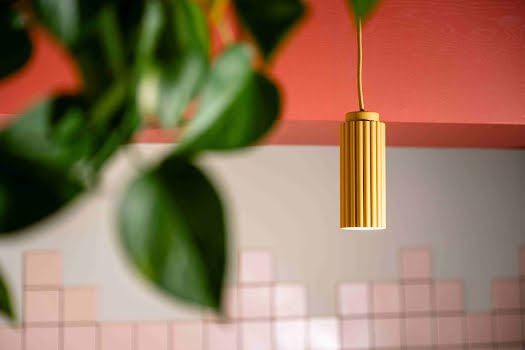
Colour was another important aspect of this design. “The transformation of the café was guided by a carefully curated selection of materials and a thoughtfully designed colour palette, drawing inspiration from the brand’s existing identity,” Lisa explains. “We aimed for a clean and bright aesthetic throughout, with birch plywood joinery adding natural warmth and soft pale pinks complemented by accents of green and mustard. A curved terracotta wall graphic became a key focal point, and an irregular tile pattern on the backdrop introduced a playful and unexpected touch to the counter area.”
The result is a cohesive, functional space that feels welcoming. “Strong teamwork and collaborations with David Shannon from The Architects and Brendan Kavanagh Furniture were instrumental in bringing this project to life,” Lisa says. “Their expertise ensured the project was completed smoothly and successfully within a tight six-week turnaround.”
It’s a project that not only proves that you can transform existing features for a cost-effective way to update your own space, but that relatively simple materials can have a real impact. “With smart material reuse and thoughtful planning, the whole space is totally transformed,” Lisa explains, “while the clean and contemporary aesthetic perfectly captures the client’s ethos.”
Photography: Johnny Mallin

