This Dublin home used to be a shop: here’s how it was transformed into a contemporary home
A former shop gets a modern makeover resulting in a pared-back contemporary home with a beautifully simple charm.
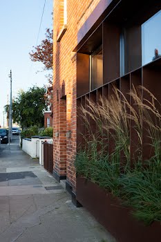
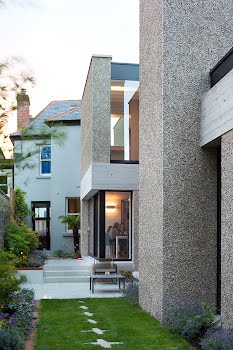
I’m standing outside what used to be a vintage clothes shop in a quiet Dublin village. It looks familiar – I’m pretty sure I bought a pair of shoes here once – but now the window is framed with steel and soft grasses.
“Not a day goes by without someone putting their face to the window and having a good look in,” laughs homeowner Katie Cremin, who together with her husband William bought the shop and adjoining red-brick house to convert into a family home in 2015.
Katie and William had lived next door for years, William’s mother had run the shop and so they were familiar with the property. “We had our eye on the place,” she admits. “We used to stand in the window of our old house and dream about owning that huge garden one day. When it came up for sale, we didn’t have a clue what we would do to it; we just knew we wanted it.”

With the help of Grace Keeley and Michael Pike of GKMP Architects, the couple set about gutting and rebuilding the house. Apart from the two bedrooms at the front and the ‘shop’ (now the front living room), the rest of the space was redesigned. They had one clear wish: an informal and welcoming fluid space with abundant light that would accommodate the whole family.
“We wanted somewhere where we could all live together in a communal space but that also offered privacy. We were conscious that the kids are getting older and may want their own bedrooms and space so the house had to serve that purpose, but also be open-plan.”
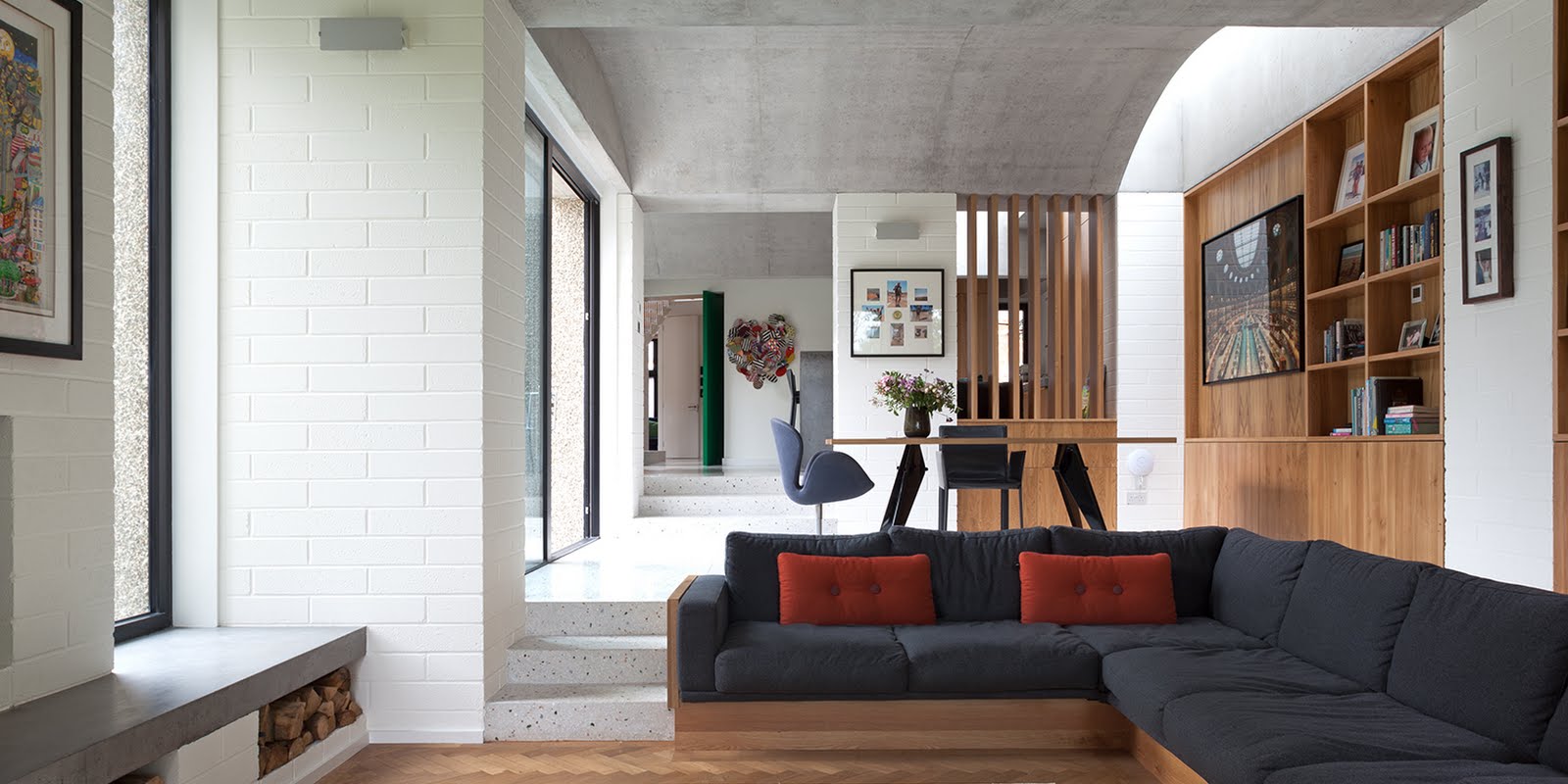
Writing a wish list of rooms and requisite storage that could cater for everyone is no mean feat. The final result is a multi-level living space that unfolds like the Tardis. Shelves are sparse, free of knick-knacks and fussy arrangements.

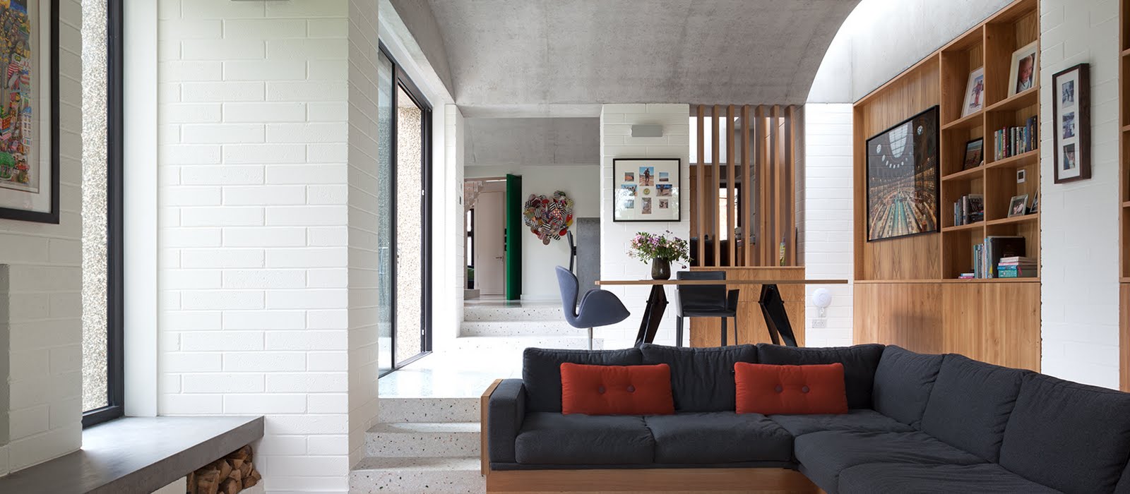
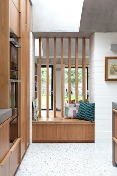
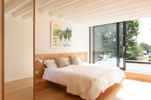
Spaces are functional yet relaxed, with much of the interior clad in oak-panelling and set against clean white brick; it’s deliberately clutter-free, stylistically rooted in a mix of Denmark and Japan’s rustic-yet-minimalist vernacular.
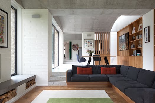
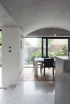
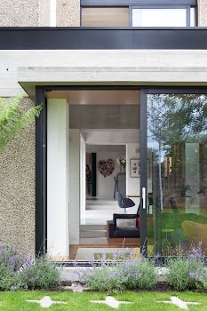
It sits on the threshold between laid-back comfort and modern formality, as told in the big-impact design ideas and organic materials: concrete vaulted ceilings and countertops, wood panelling and floor-to-ceiling windows.

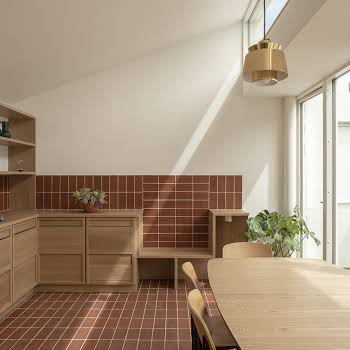
GKMP’s premise was to give identity and intimacy to the distinct spaces of the kitchen, dining room and living room while maintaining open-plan living.
The house was opened so that wherever the owners sit – whether in the kitchen or living room – they can see through to another space and not feel like they’re living in a box.
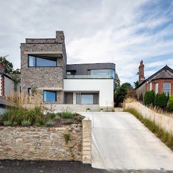
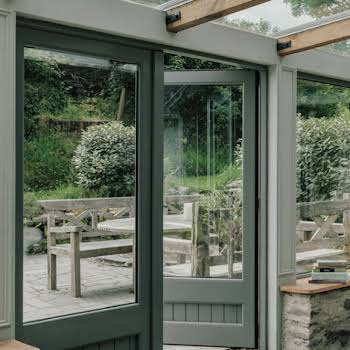
At the front of the house their main objective was to retain the memory of the shop by keeping the large shopfront opening but filter the light and privacy. “Getting the façade right was definitely one of the more challenging aspects,” notes Katie.
They toyed with the idea of opaque glass but then settled on the Corten steel frame and the grasses, which soften the somewhat industrial facade. “It’s taken quite some time to get right – we’re on our third round of blinds – but I think we’re nearly there.”
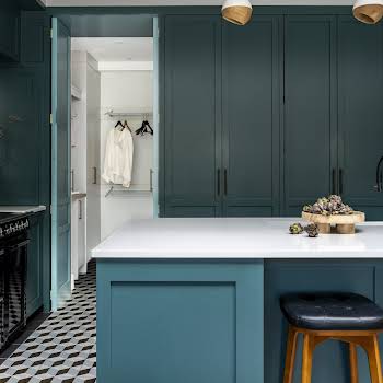
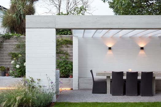
It was Katie’s idea to keep the kitchen in the centre of the house making the most of the living space and orientation to the rear, and connecting the garden to the living area. “I didn’t want a trophy kitchen,” says Katie. “One of those kitchens that nobody leaves because there’s nowhere else to go. I had this idea of the kitchen being the core of the house and everything evolving from it.”
When GKMP came on board Katie and William invited them to “push the boundaries” allowing them creative freedom with the space. The result was a series of concrete vaulted ceilings that stretch from the kitchen to the back of the house.

“There were moments when I thought it was going to look like the M50 or the inside of the Port Tunnel: there was a lot of concrete,” laughs Katie, “but we trusted Grace and Michael to do something incredible. The vaulted ceilings are probably our favourite feature in the house along with the sunken living room.”
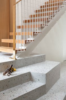
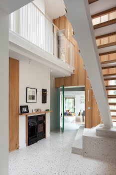
GKMP also resolved the issue of what had been a “pokey” hallway, installing a double height stairwell framed by an oak-panelled wall that stretches the full height and acts as a visual spine to the home.
The beautiful brass-rail staircase leads down to the terrazzo marble floor that sweeps through the house. The repetition of the oak panelling and marble, from the kitchen to the stairwell and upstairs rooms, connects the spaces.

“It’s easy living,” Katie says, in response to what surprised her most about the house. “We’re only here since June but it feels like we’ve been here a lot longer. In summer it felt like we were on our holidays, all the doors were open, the sun was beaming in. In winter, it’s cosy and warm. I said to William the other day that I wouldn’t want a holiday home, I’d miss here too much.”
Photography: Alice Clancy
This feature originally appeared in the January/February 2018 issue of IMAGE Interiors & Living.


