By Lauren Heskin
17th Mar 2024
17th Mar 2024
This home in Dublin's city centre proves that with a bit of clever design, even a small space can be spacious and functional.
In a bid to create a comfortable, multifunctional home in a poorly insulated 63-square metre terrace in The Liberties, material was the focal point for architect Declan Scullion. “Part of the strategy was not to clutter, so we tried to be inventive and cost-effective through a limited number of trades and using materials in multiple ways,” he explains.

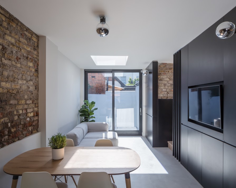
With room for two bedrooms upstairs, Declan admits the biggest challenge was creating a generous and comfortable ground floor that included all the main living spaces in what was essentially one room. Unable to extend without eating into an already-minute outdoor space, they opted to raise the ceiling height of an existing extension at the back, creating a view that looked above the back wall and poured light into the ground floor through a new roof light.

To create a cohesive space, Declan focused on four materials; concrete, white plaster, black Valchromat engineered wood and existing brickwork to create an open-plan ground floor that includes a kitchen, dining area, living space and bathroom. Wanting to incorporate the original brick was both a way to draw on what little historical material had been left in the property and a budgeting technique. “It gave the room so much more character and texture, and it was ‘free’ in that it was already there,” says Declan.

Considerable time was devoted to storage, collaborating with the client in testing layouts and negotiating space. With a sunny, south-facing rear, now maximised through the raised roof and skylight, and a noisy urban street to the front, they opted to put the kitchen by the door, creating a sound and privacy buffer for the rest of the room. A wall of handleless units surrounding the TV make the most of the under-stair space, while a hidden door leads to a compact bathroom.

Having an indoor area for two bikes by the front door was important for the client and this dictated much of the kitchen design. “It radically affected how much space we needed in the entrance area,” says Declan, but the result is a discreet and secure bike area that doubles as a breakfast bar and doesn’t require daily spins through the living space.

Using a simple palette of materials allows this small space to breathe and, as Declan puts it, “provides a tactile and robust backdrop for life that reveals traces of its past.”
Photography by Ste Murray.
This article was originally published in April 2021.


