By Lauren Heskin
23rd Aug 2020
23rd Aug 2020
How do you create an opulent, luxurious home that also works as a functional, comfortable space for a busy family? This was the task set to Louise Rankin and Lauren Martin of North Design when owner Catarina Martins asked for their help in the renovation of her Dublin home.
Catarina had already done much of the major construction work before teaming up with North Design, gutting the entire property. As a protected property, she had focused on restoring what she could as well as updating the kitchen and adding some simple panelling in the hallway.

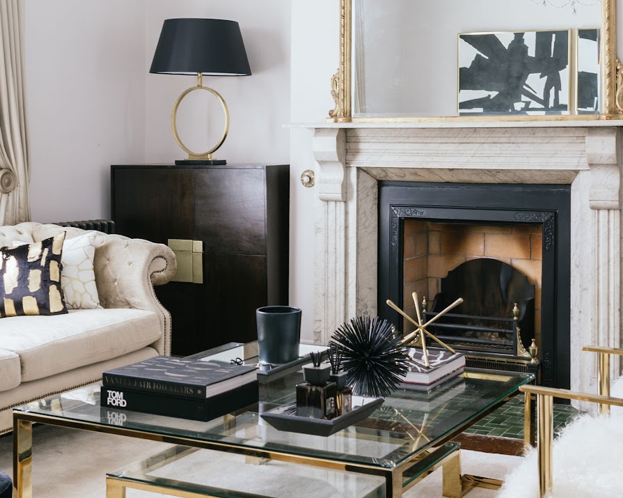
Once she was ready to begin the interior design, Catarina had a vision of what she wanted but wasn’t sure how to execute it. Painting the walls a pale white-grey, she wanted a neutral palette that allowed the period features to sing. “But she wanted a space that reflected modern-day living with contemporary touches so it didn’t feel too stuffy,” explains Lauren. Catarina also wanted “the added glamour of opulent gold detail and silver elements,” so the North Design duo got to work.

“We wanted a space that would reflect her style and glamour,” says Lauren. Keeping the family living element in mind, they selected large, comfortable pieces of furniture in calm hues. “Then we layered rich timbers, marbles, brass and glass items on top, working in the likes of the contemporary brass chairs, lamps and artwork to keep the balance between old and new.”
This balance was something the duo kept in mind throughout the build, merging the “youthful” pieces of the new extension with the period spaces of the front. “Layering is key,” notes Lauren. “The use of soft furnishings with different materials and textures brings that comfort that you need in a home. The same applies to using timbers to add warmth and accessorising a space with personal touches.”

“The ‘snug’ space features the period-style panelling on the walls but then is very much filled with modern furniture, like the cowhide rug, Hermes throw, geometric side table,” explains Louise. “We feel it’s a responsibility to these structures that you keep the harmony between the old and new and be mindful of over-saturating the space with too many modern forms.”

On these larger forms, they then introduced brass accents to really amp up the space. “Brass would have been a common feature in grander period homes so we wanted to use this antique style,” explains Louise, while also giving it a modern edge through, clean designs like the picture frames and drawing room coffee table, as well as contemporary textiles like Irish textile designer Aoife Mullane’s metallic cushions. “We knew the client would really appreciate the femininity and little bit of richness they would bring,” says Lauren.

When it came to artwork, Catarina didn’t have any of her own so Lauren and Louise commissioned Dublin-based artist Maureen McDonnell of Stone Step Gallery to create some bespoke pieces. “The ceilings were high and the rooms grand so we wanted art that was proportionate to the space and modern in style to offset the period features,” says Lauren. “This really helped with making the house feel personal.”

After six months of work, Lauren, Louise and Catarina and her family are thrilled with the results. Now the house flows effortlessly between old and new, denoted through subtle texture and material changes while comfort remains key. So do the duo have a favourite corner? “The living room definitely has a wow-factor when you walk in, you feel almost like you should sit instantly, have a glass of champagne and talk with your girlfriends,” laughs Lauren. For Louise, it’s the study. “The beautiful Theodore Alexander antique desk, Bert Frank lights and gallery wall above the mid-century style sideboard from Swoon – we’d take working there every day.”

Using a calm palette, lots of subtle texture and reflective brass elements in both antique and modern pieces, North Design has certainly created a luxurious home you’d be happy to hole up in.
PHOTOGRAPHY PJ Rankin

