This Portobello home has been injected with light, flow, and zingy colour
A reconfiguration and renovation by InSpace has transformed this house into a space that marries fun and function.
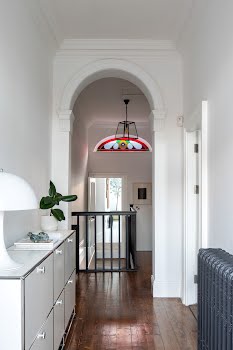
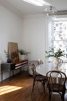
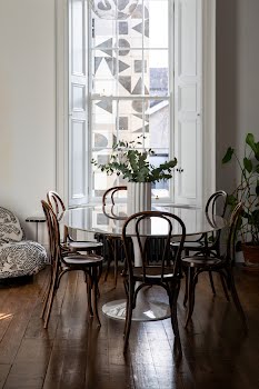
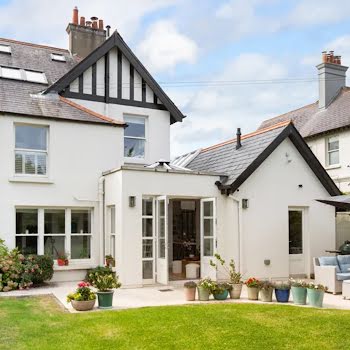
When the current owners first bought this Portobello home, it had been split up into two flats, with a large extension on the back which obstructed the view from the dining room and lower bedroom. They worked to make it back into one home, reinstating the staircase, removing a bathroom, and restoring some of the original features including sash windows and coving.
After this initial work was done, they got in touch with Emily Cunnane, creative director of InSpace to help with the project. “The layout was a huge issue with lots of small rooms and wasted space, and the clients really wanted to have a much more usable home in terms of spatial planning,” Emily explains.
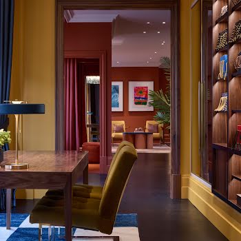
“They also wanted me as a designer to bring a more contemporary, vibrant spin to their style which would be more classic. They had always wanted to experiment with colour – they are big fans of yellows and greens – but were unsure of how to marry this with a more formal period home like this.
“The same question was also asked of how to make the newer nineties extension work with the original Victorian home, and they hoped that a designer could help them to contrast and combine those two styles.”
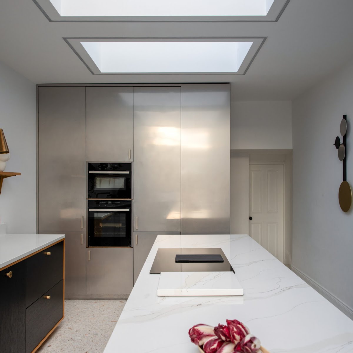
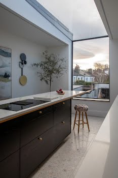
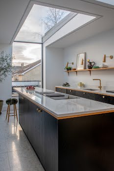
The layout was a key aspect of this design, and needed to be reconfigured to work for this family of four. “We broke down what had been several rooms on the first floor into one large kitchen space and added an ‘up and over’ rooflight to flood the room with light, as well as steer the city view outside,” Emaily says.
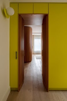
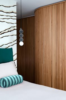
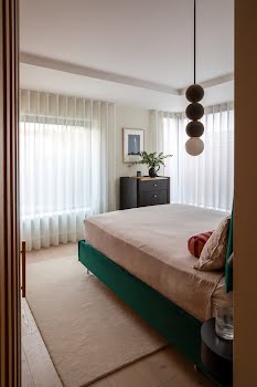
Downstairs, the extension was turned into a large bedroom suite for the couple, hidden through a secret door from the new utility room, while on the original side, an existing bedroom was split up to create a family bathroom and guest WC.
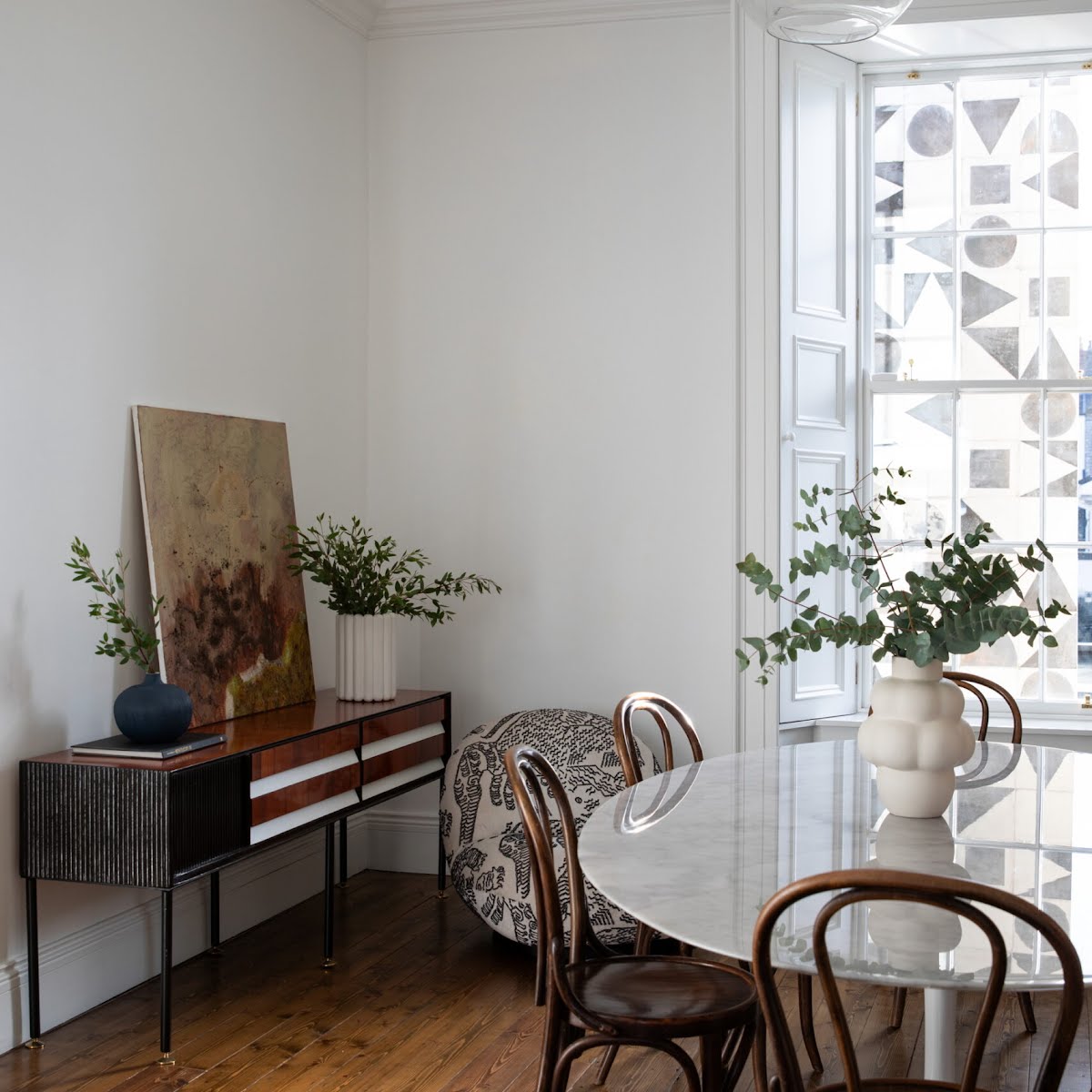
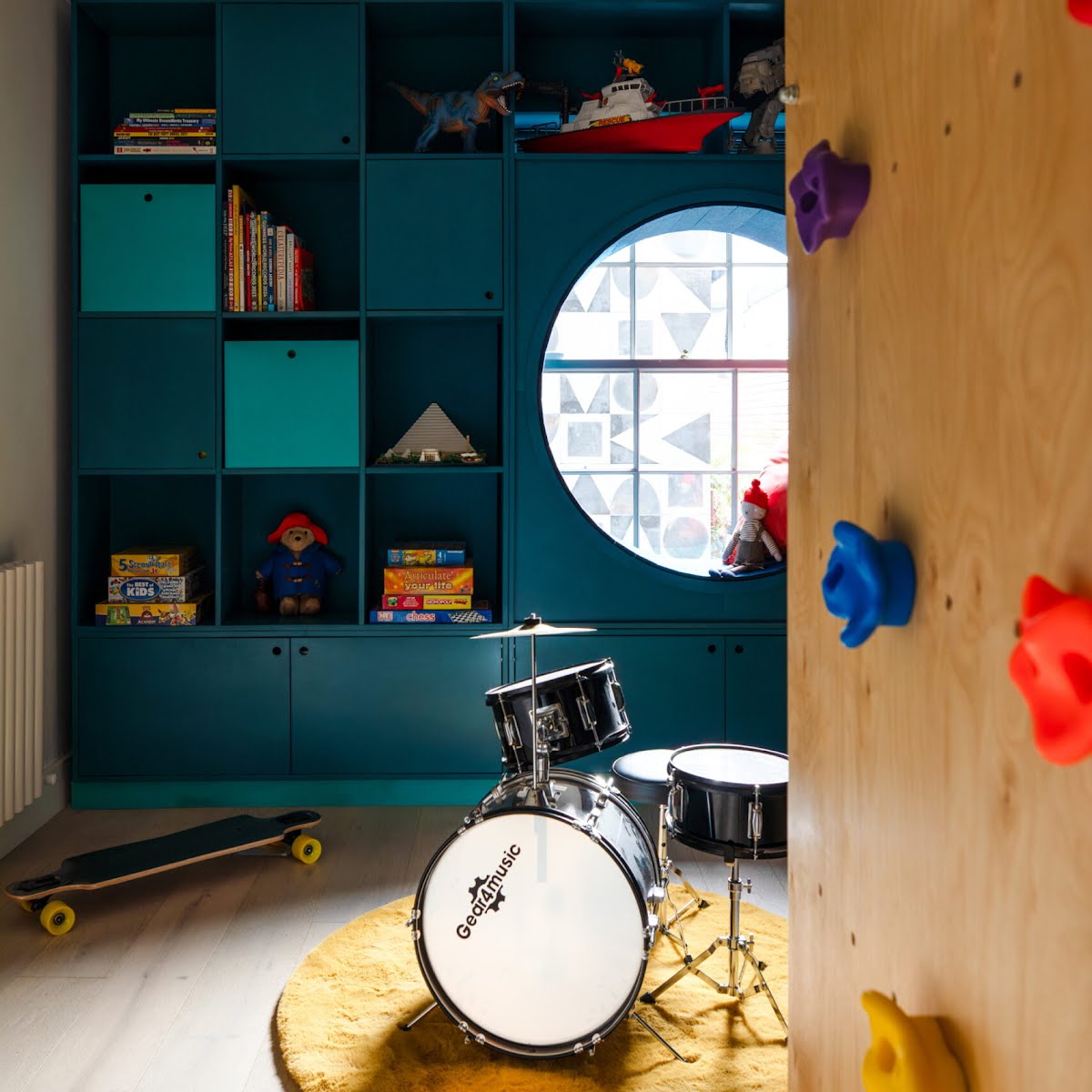
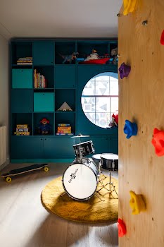
“One of the biggest problems aesthetically was having the wall of the extension jut out in front of the windows in the dining room and downstairs bedroom,” Emily explains. “We clad that wall in tile, and built a reading nook in the child’s bedroom in order to lean into what became a feature of the house.”
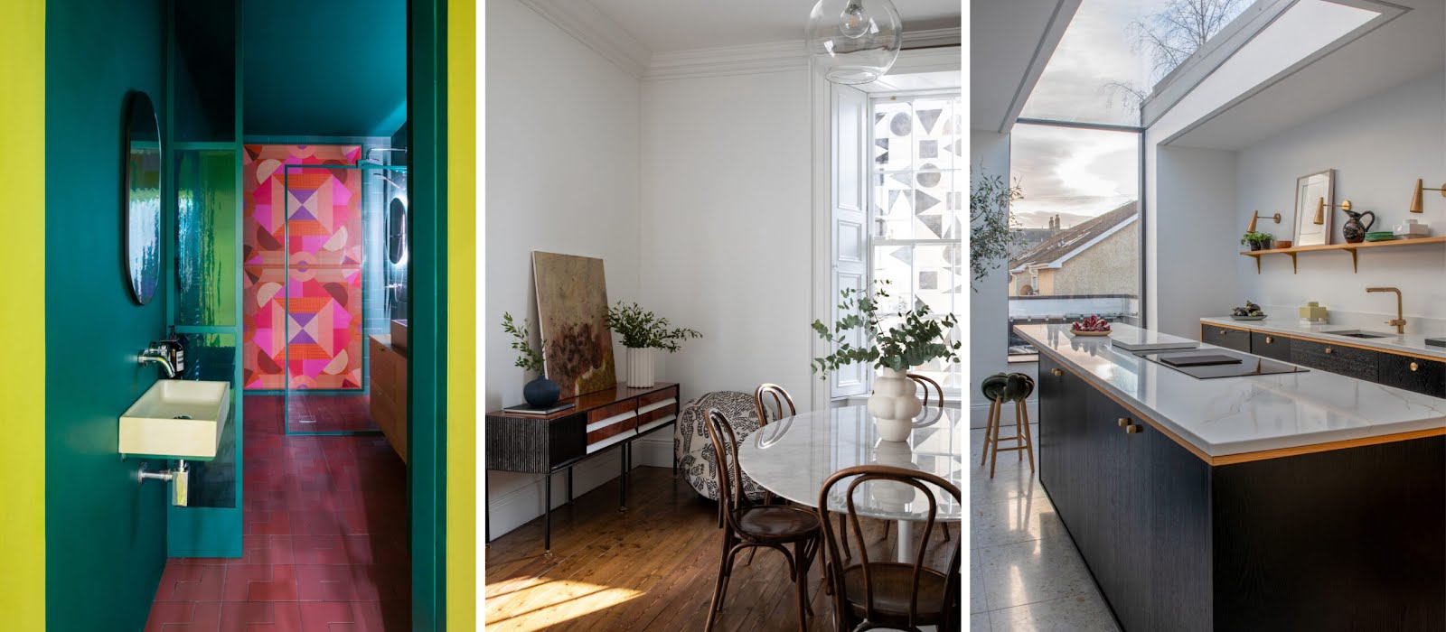
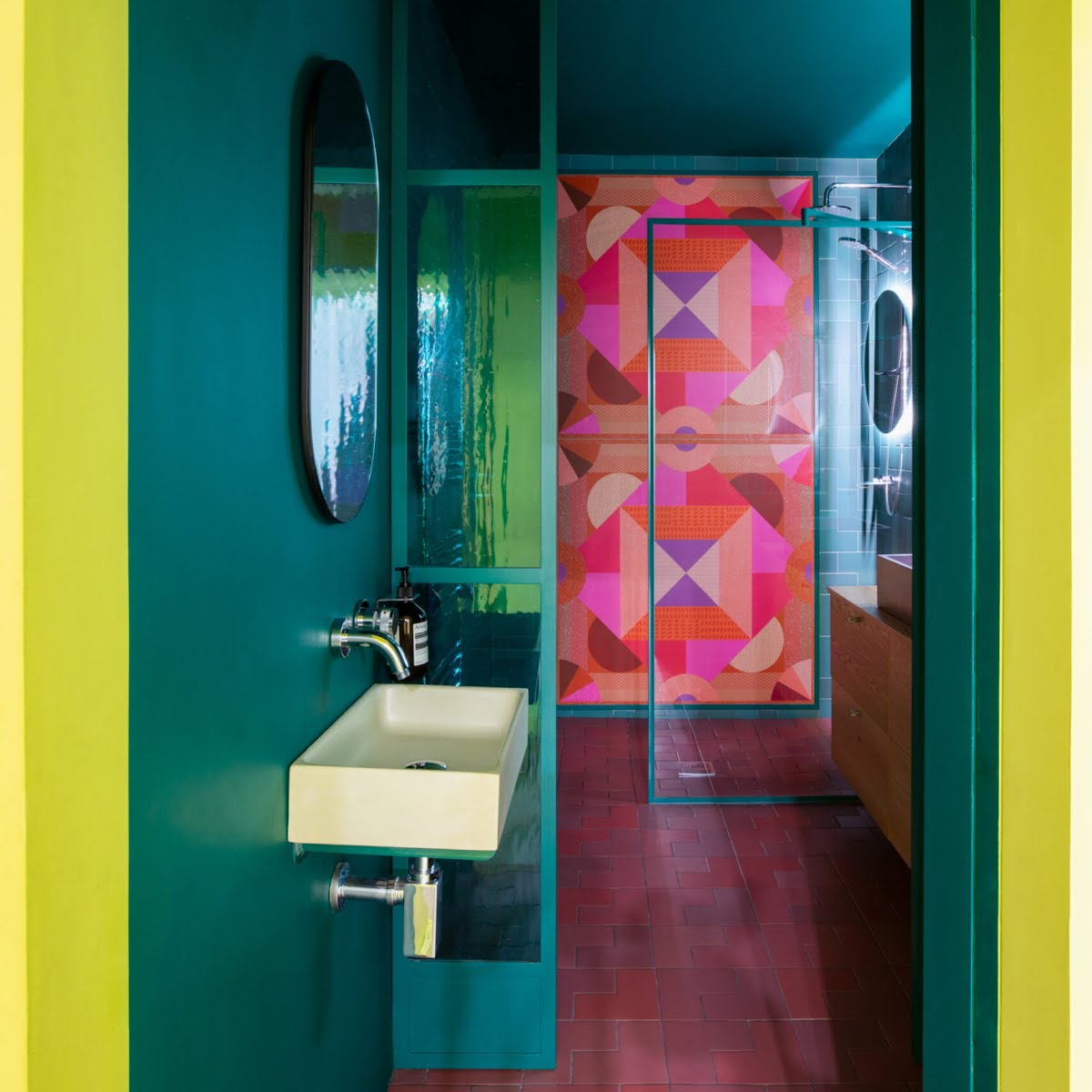
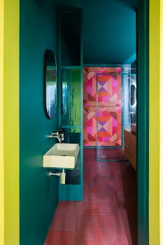
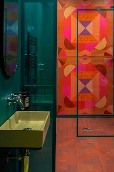
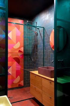
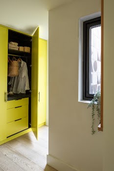
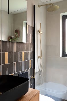
The question of how to treat the old and new parts of the house was solved largely through using different colour palettes. While most of the house is painted in an off-white, zesty, vibrant shades are introduced in parts of the extension. “We used Goblin by Little Green in the family bathroom to contrast with the amazing 41Zero42 tiles, and Green Eggs & Ham by Dulux in the vestibule into this room, as well as the large utility area.” The metal dividing screens in the bathroom were made by InSpace with vintage stained glass from Rathmines Glass.
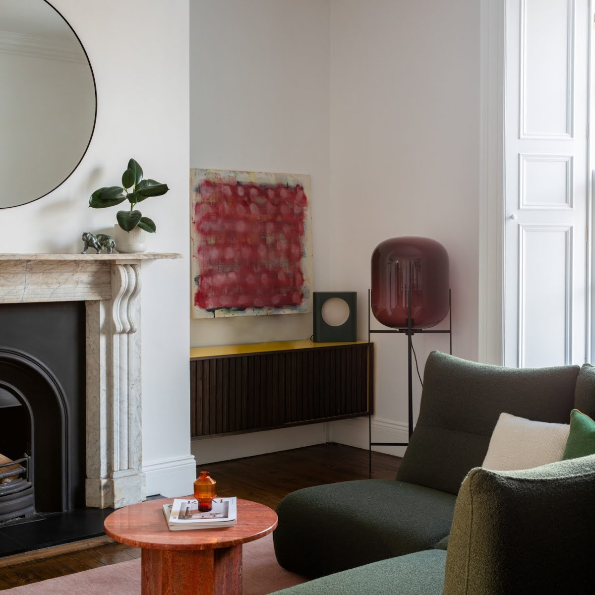
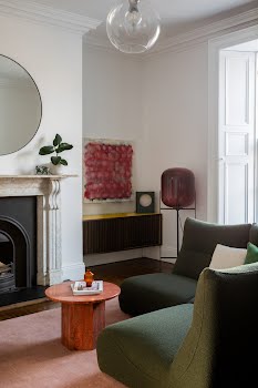
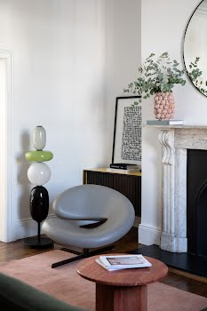
Finishing touches were carefully chosen to reflect the clients’ personality. In the living room, a Temps Calme sofa from Roche Bobois sits alongside a Gubi Travertine coffee table and a Massimo Copenhagen rug, both sourced from Lost Weekend.
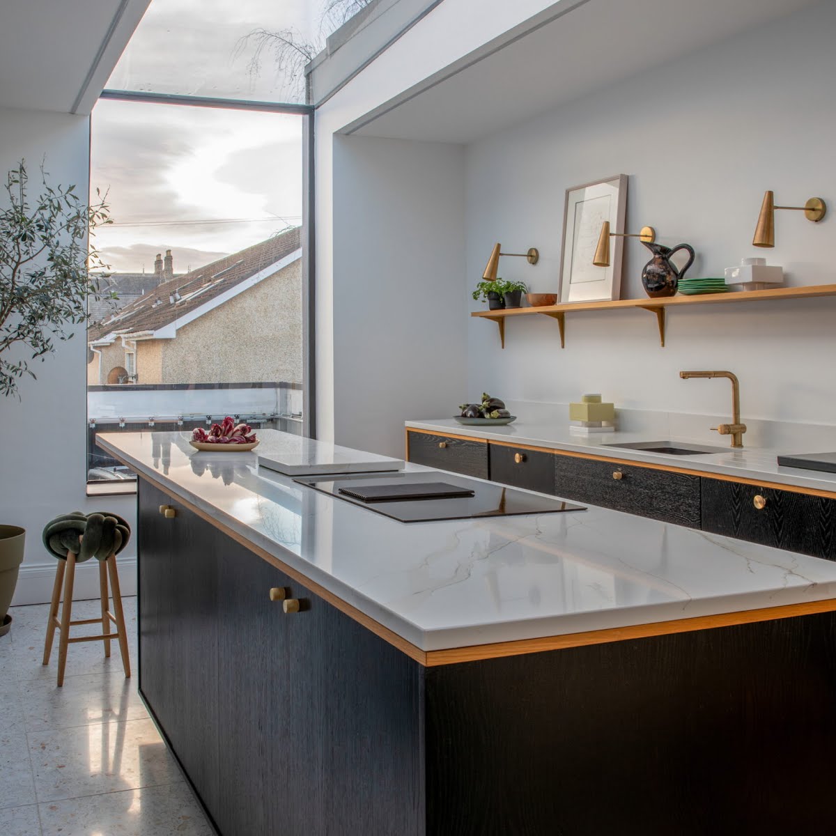
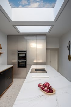
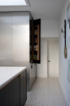
The kitchen is oak, with different stains used to create multiple shades. The terrazzo tiles are from TileStyle, and the wall lights are from Please Wait To Be Seated. The stainless steel “cube” hides a utility unit, larder, and fridge/freezer, keeping the rest of the space very minimalist, while the reflective surface bounces light from the skylight around the room.
The result is a home that marries the classic and the contemporary, where touches of fun are to be found at every turn.
Photography: Ruth Maria Murphy


