This Róisín Lafferty-designed restaurant in Ballsbridge is an ode to childhood
By Lauren Heskin
21st Oct 2020
21st Oct 2020
It was a basic, double-height empty shell in Ballsbridge, but Róisín Lafferty allowed her imagination to run wild for a new era of restaurant Cinnamon.
“The brief was to transform it into a dual-function restaurant and takeaway with mezzanine kitchen and to create a space dripping with playfulness and humour, combining multiple functionalities and experiences in a small and compact unit,” explained KLD‘s Róisín Lafferty of the new 185-square-metre Cinnamon restaurant in Ballsbridge.
But the space didn’t exactly look child-friendly or childlike. Concrete walls, high ceilings, a glass front and exposed wirings and ducts, it leaned much more towards an industrial aesthetic than a cuddly one. “This space could have quickly become a shell of a unit framing bits of furniture,” admits Róisín, and so they decided to make everything bespoke, from the furniture to the light fittings, to ensure it all worked with the brief.
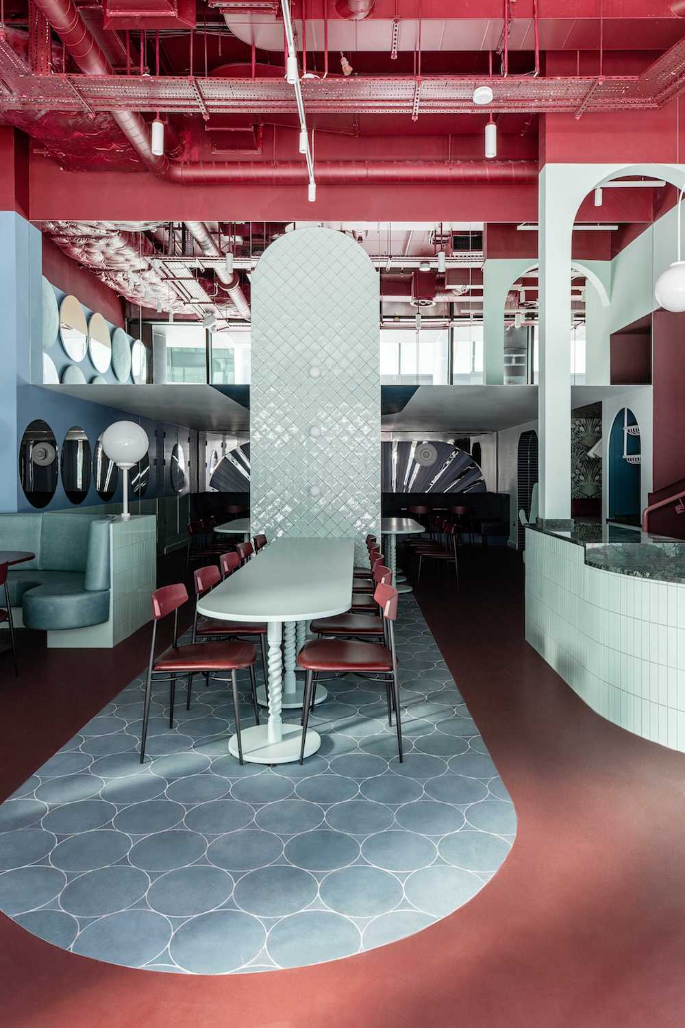
From the offset, KLD took a playful approach to the design. “There are so many beautiful hospitality designs all over the city but we wanted to create something that looked totally different,” says Roisin. Rather than take inspiration from a place or interior, they decided to look to the work of Róisín’s all-time creative hero, 1960s Danish designer Verner Panton, as well as Cinnamon’s first restaurant in Ranelagh.
Panton’s work is known for his bold block colours, futuristic designs and work in plastics, while the dusty pink interiors and sweet pastries of the Ranelagh outpost informed the colour palette. “We saw this as the next step in the Cinnamon story, the older sister if you like and an opportunity to bring the space to the next level,” she says and they wanted the space to feel light-hearted and childlike, a visual treat.

However, achieving that is no easy feat. Needing to find a balance between building regulations, budgets, service requirements, functionality and the design concept meant that the space had to work as a restaurant and be somewhere you’d comfortably sit and enjoy, not just to look at. “All of the necessary elements have to work to maximise the overall business viability, especially when it comes to hospitality, capacity etc; it’s almost like a slow forming jigsaw that needs to be worked and reworked.”
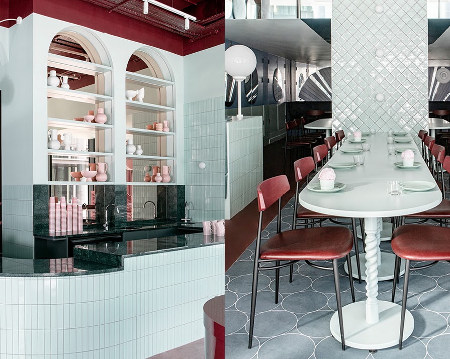
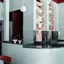
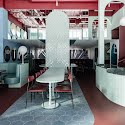
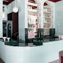
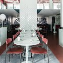
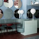
Deciding to leave the kitchen on the mezzanine level, the front of the space is left open to soak up the double-height ceiling. An ice cream-cloured bar at the front services coffee and takeout while cosier nooks to the rear cater to the dining portion.
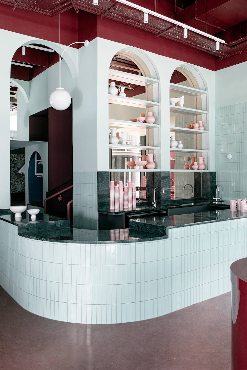
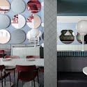
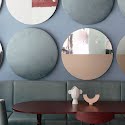
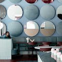
Blending the maroon hue of the Cinnamon logo with the pale pinks of the first two restaurants into a deep rose, they complemented it with a palette of pastels. Using simple shapes like circles and arches on an oversized scale gave the space a dramatic wonderland feel. As Róisín puts it, “This is a space for all ages to enjoy, appealing to your inner child, but with sophistication to it”. KLD outsized all of the accessories, from giant lollipop light fixtures to a double-height wall of a dozen circular mirrors, to create a dreamlike, whimsical feel, while the huge swathes of block colour ground them in a solid reality.
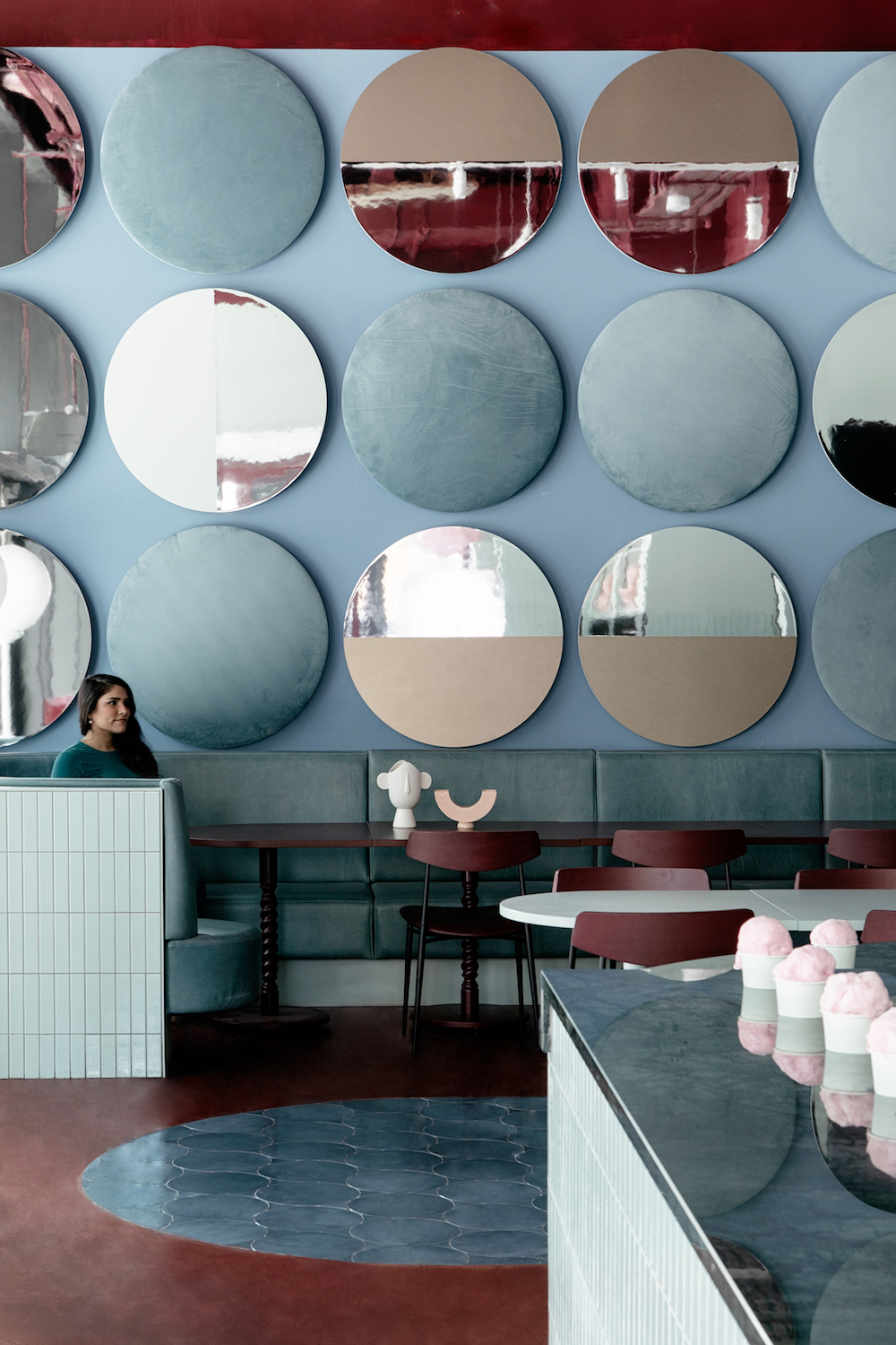
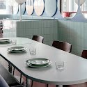
However, through all the complexities of combining structural, functional and fantastical elements, they made the people using the space the centre of the design. “This is a very family-friendly brand so we wanted people to feel comfortable touching and feeling things within the space,” explains Róisín of their selection of tiles and upholstery. “The design encourages that interaction, avoiding being too precious or formal, all materials are hard-wearing and durable whilst being sweet and bright to look at.”
“We wanted to create a series of desirable and light-hearted dining environment that fully encompassed the visitor and made them want to come back,” says Róisín.
Mission accomplished.
Photography by Ruth Maria Murphy
Read more: Inside a modern Wicklow tree house built for family life
Read more: An interior designer’s advice on making dark interiors work
Read more: Inside the studio of Galway artist Finbar McHugh


