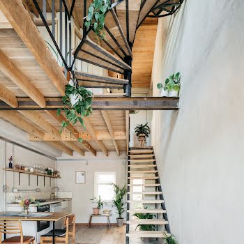
This seaside Dublin home makes the most of its unique shape
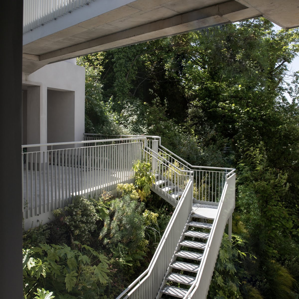
In a busy seaside town in Dublin, this unique round house surveys the Irish coastline below.
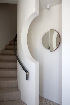
Towers may conjure up images of times past: lookouts come to mind, or the crowning glory of ancient castles. But rarely do we expect the clean lines and sleek luxury of this round, tall family home. Tasked with creating a serene mood in this tricky, curved layout was Carol Crimmins, lead interior designer at Nordic Elements.
While Carol was brought on board to help with the interiors, renovations initially began on the building around a decade ago. “It was an existing water tower – it had obviously been there for quite a while,” Carol recalls. “About ten years ago, an architect became involved to convert it to a residential building. Our clients bought it mid-project directly from the developer. It came as a sort of half-completed project.”
The client, a young couple with two small children, had been living outside of Dublin in a grand period property. “They had done a full renovation on that a number of years ago, so it was kind of ‘been there, done that’. What they wanted now was something that felt very contemporary, very clean,” says Carol.
The new owners had a very specific brief, but they also had quite specific restrictions too. “Because they bought it from the contractor, the contract they signed meant they were restricted in who they could use to work on the project. That was all signed and sealed, there was no movement on that.” Naturally, that posed its own set of complications to add to the already unusual building.
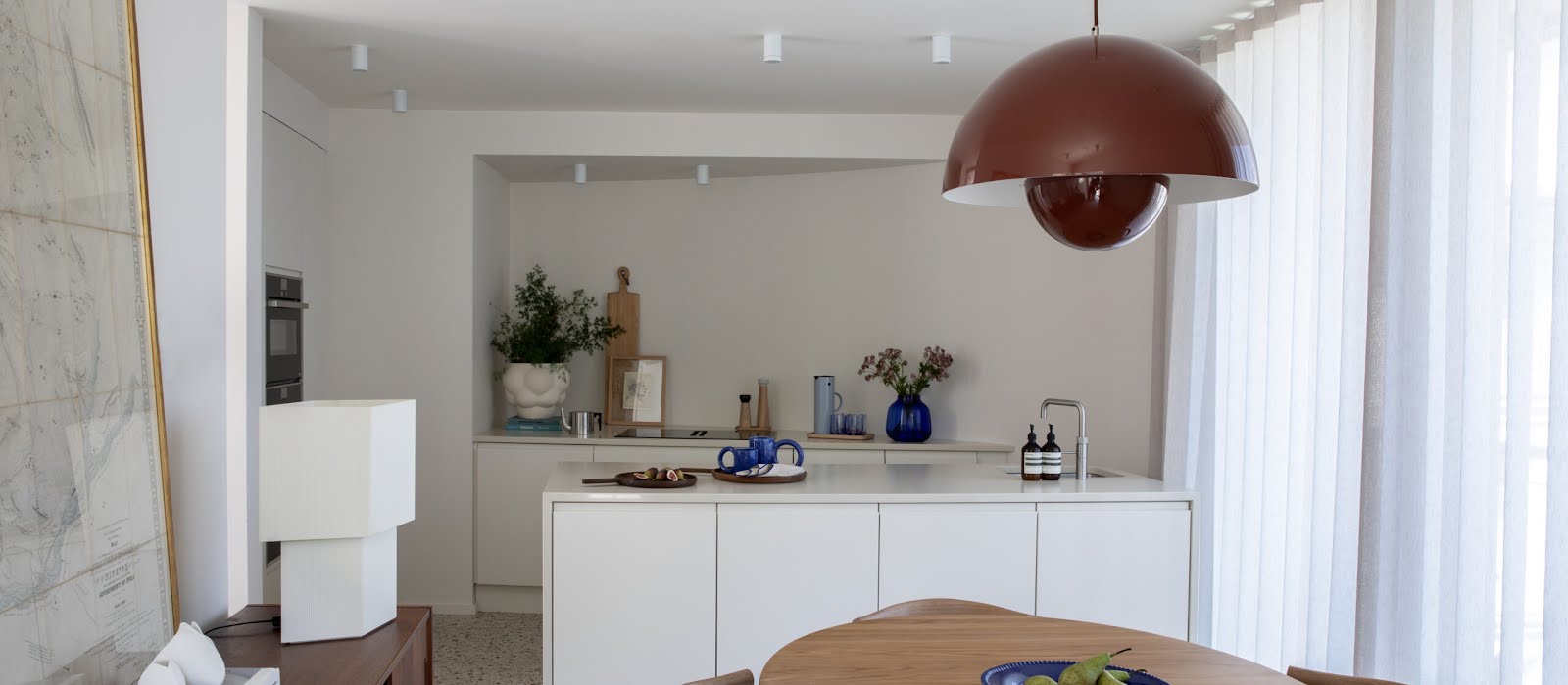
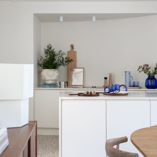
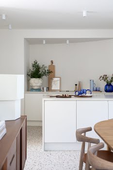
For example, the kitchen had already been designed and the plumbing was done by the time Carol’s expertise was enlisted. Neither she nor the client let such limitations phase them, though. “We made some slight changes for better functionality. I helped them choose the finishes so that it would work with the rest of the scheme I had in mind. It all came together really well given the fact that it was almost done. I got there just in time to stick my oar in,” Carol laughs.
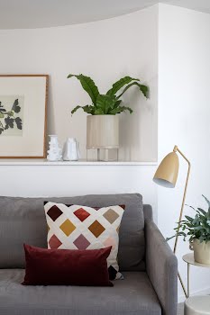
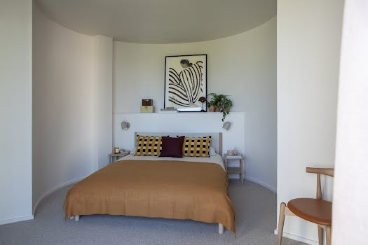
Carol’s adroitness was instrumental when it came to making decisions on things from colour palette to texture and flooring too. “They wanted a very restrained, muted palate. That was challenging in itself because at Nordic Elements, we love colour. We don’t use grey or greige.” Good storage was also key in creating a practical environment conducive to family life.
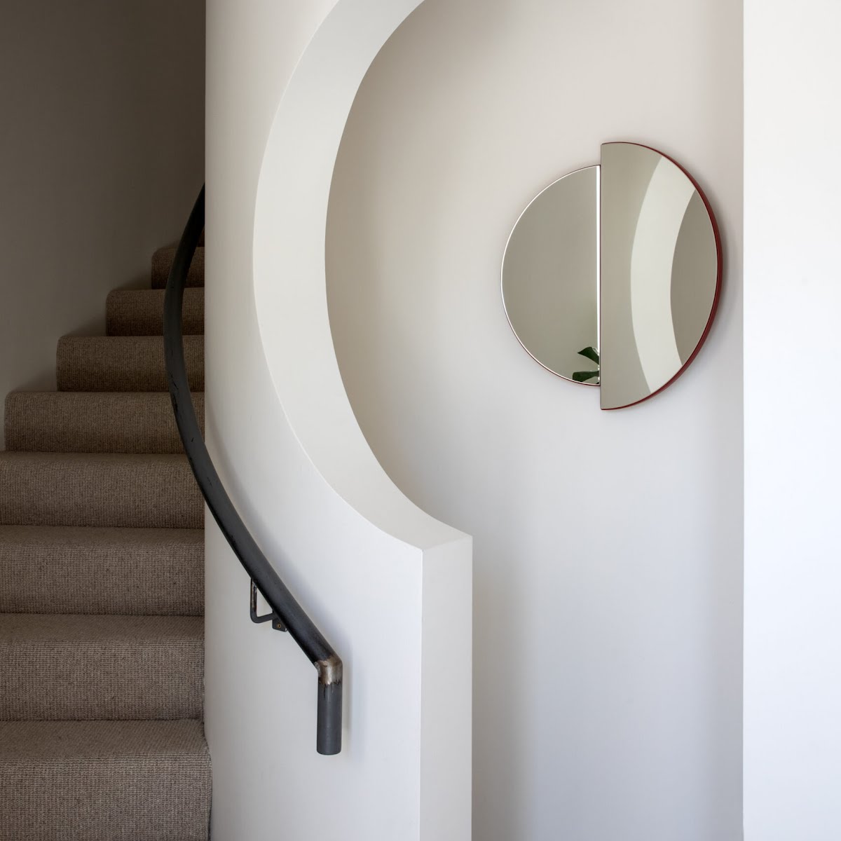
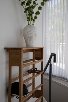
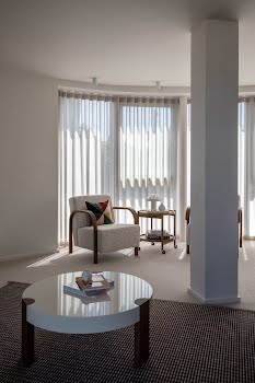
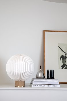
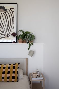
When it came to furniture, all of the pieces are from Nordic Elements. Carol’s expertise when it came to furnishing such a tricky space was instrumental in the project. “The shape of the building really informed my approach,” she says. “There isn’t a straight wall in the house so everything was custom-made to fit the space. It was about making it look streamlined and ensuring everything felt seamless. The client didn’t want any clutter or unnecessary detail.”
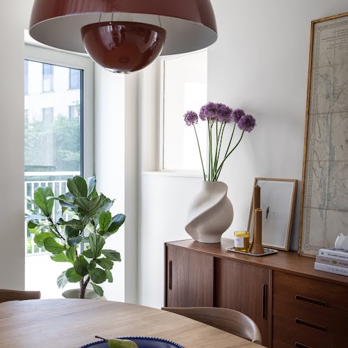
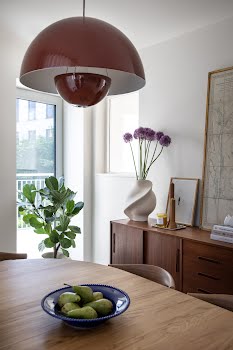
“They only brought two pieces with them from their previous home – the first is a beautiful mid-century sideboard, which we used in the dining area. That worked beautifully with all the contemporary furniture pieces that we chose. The other is a stunning Persian rug. The rooms are quite small – you expect them to be bigger for the footprint of the building – so they weren’t sure if they’d be able to use it. I suggested they have it cleaned, and we used it in the children’s room. We worked with the colours in the rug for some of the fringe pieces, and it came together nicely.”
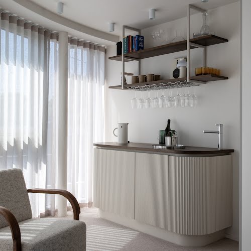
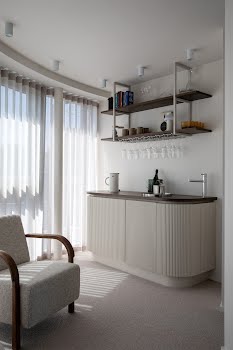
For Carol, the bar is one of the standout features. “Normally, when people mention ‘bar’ to me, that brings me out in a rash! You can have pretty awful home bars,” she jokes. Here, the focus was on creating an elegant, free-standing piece of furniture. “We work with an amazing joiner called Shane Duffley, and together we managed to get a dishwasher, a sink, sockets for a kettle, as well as storage for drinks and glasses into a very small space. It’s all concealed quite nicely.”
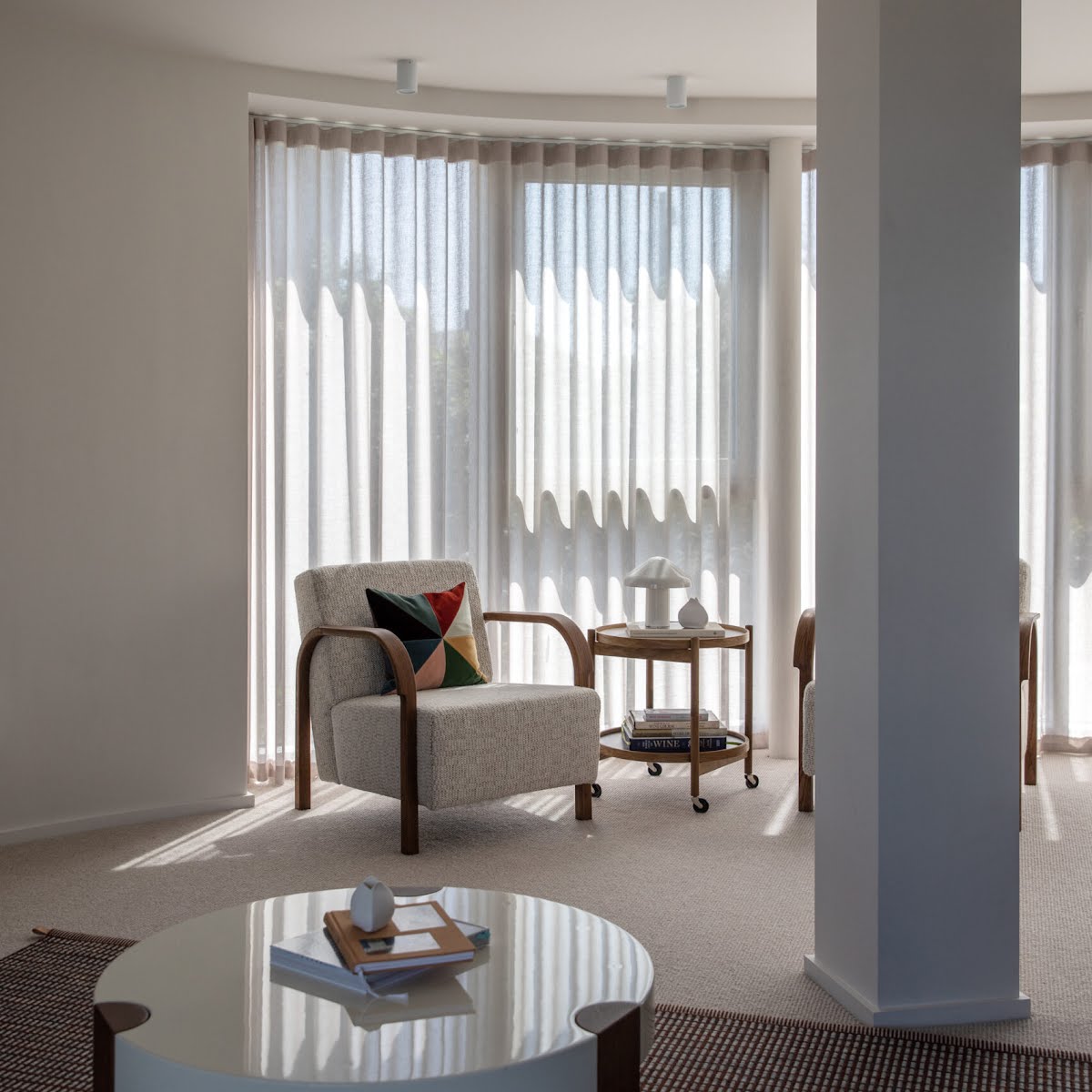
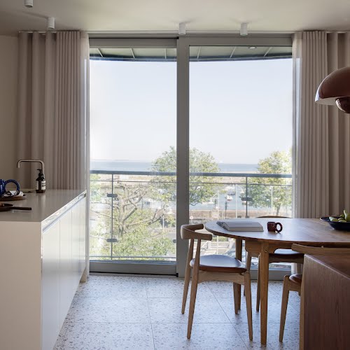
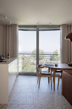
Balancing seclusion and light was another focal point of the design. Floor-to-ceiling windows ensure the space is bright and airy, while carefully chosen window dressings keep prying eyes out.
“There’s a guest WC on the first floor and it’s hysterical because it’s facing the bus stop! Everyone naturally turns to look at the house because it’s such a unique building. The client wanted to achieve privacy without losing all that lovely, natural light and the views of the harbour.” Finding a fabric that suited the building and aesthetic was harder than anticipated, but the effort was worth it for the dreamy, ethereal feel the dancing sunlight creates through the gauze-like blinds.
The focus on minimalism was also appealing to Carol, a lover of all aspects of Scandinavian design herself, who notes that the client wanted something “completely new and different” to their first home. “Very often, people struggle to be that extreme in changing their interiors – especially when it’s a space that they’re going to be living in – but the client was adamant and really clear in their brief.” The result is a unique home that feels neat and contemporary – round towers aren’t just for fairytale princesses, it seems.
Photography: Ruth Maria Murphy


