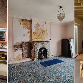
This Stillorgan semi-d was transformed into a luxurious oasis by a travel-loving couple
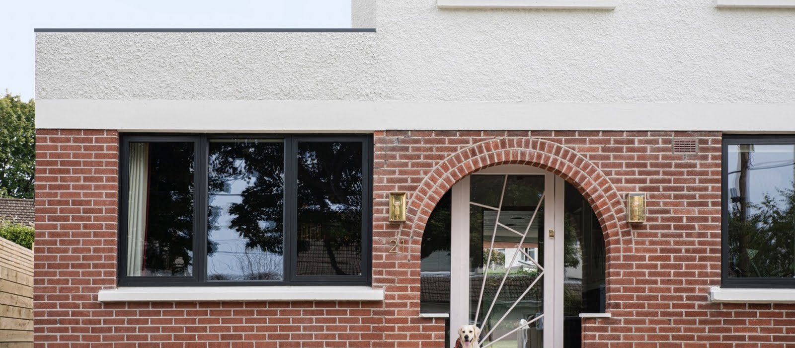
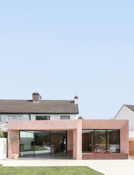
Inspired by their globe-trotting getaways, an intrepid young couple transformed this 1950s semi-d in Stillorgan, Co Dublin, into a terracotta-hued, sun-soaked retreat.
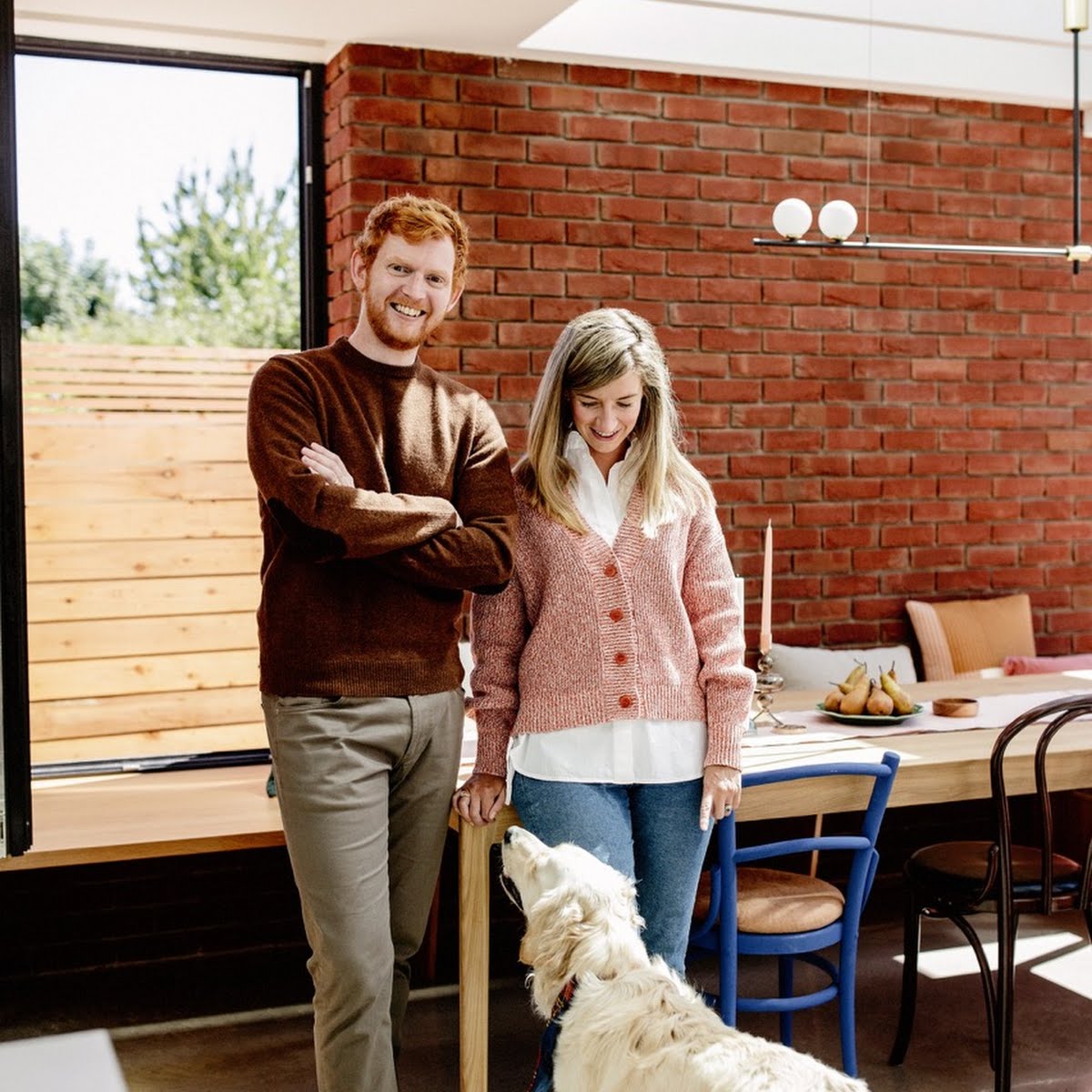
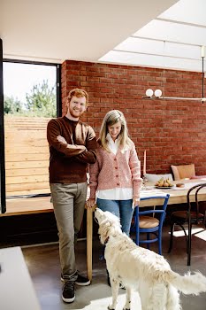
While brides and grooms are advised to relax as much as possible on the eve of their wedding, that isn’t quite how things materialised for Richie Hannify and Ciara McMahon.
The day before their nuptials dovetailed with the final snagging of their extension project. And with 40 wedding guests due to attend a reception in their newly renovated home the next day, it was all hands on deck.
“We had every single tradesperson here,” recalls Richie. “Plumbers, painters, electricians hanging pendant lights over the island… At one point there were 16 people in the living area.”
Meanwhile, a pagoda tent was being erected in the garden. “I remember the wedding planner saying, ‘I don’t know how you’re doing this, you must have nerves of steel,’” remembers Ciara. “I very much don’t have nerves of steel – Richie does – so I don’t know how we did it.”
Ciara might not think of herself as brave but, like her now-husband, she’s more than willing to take risks and follow the design road less travelled.
When the couple, who met while training to become solicitors, began looking for a property in 2019, they wanted something they could put their own stamp on; a project where they could flex some creative muscle.
A 1950s semi-d in Stillorgan, Co Dublin ticked all their boxes and by the time Courtney McDonnell Studio came on board, they had a pretty clear idea of what they wanted.
An L-shaped extension with alcoves and a dining nook, a strong connection to the garden and lots of light were among their non-negotiables. Equally, they wanted to push the envelope and try something new.
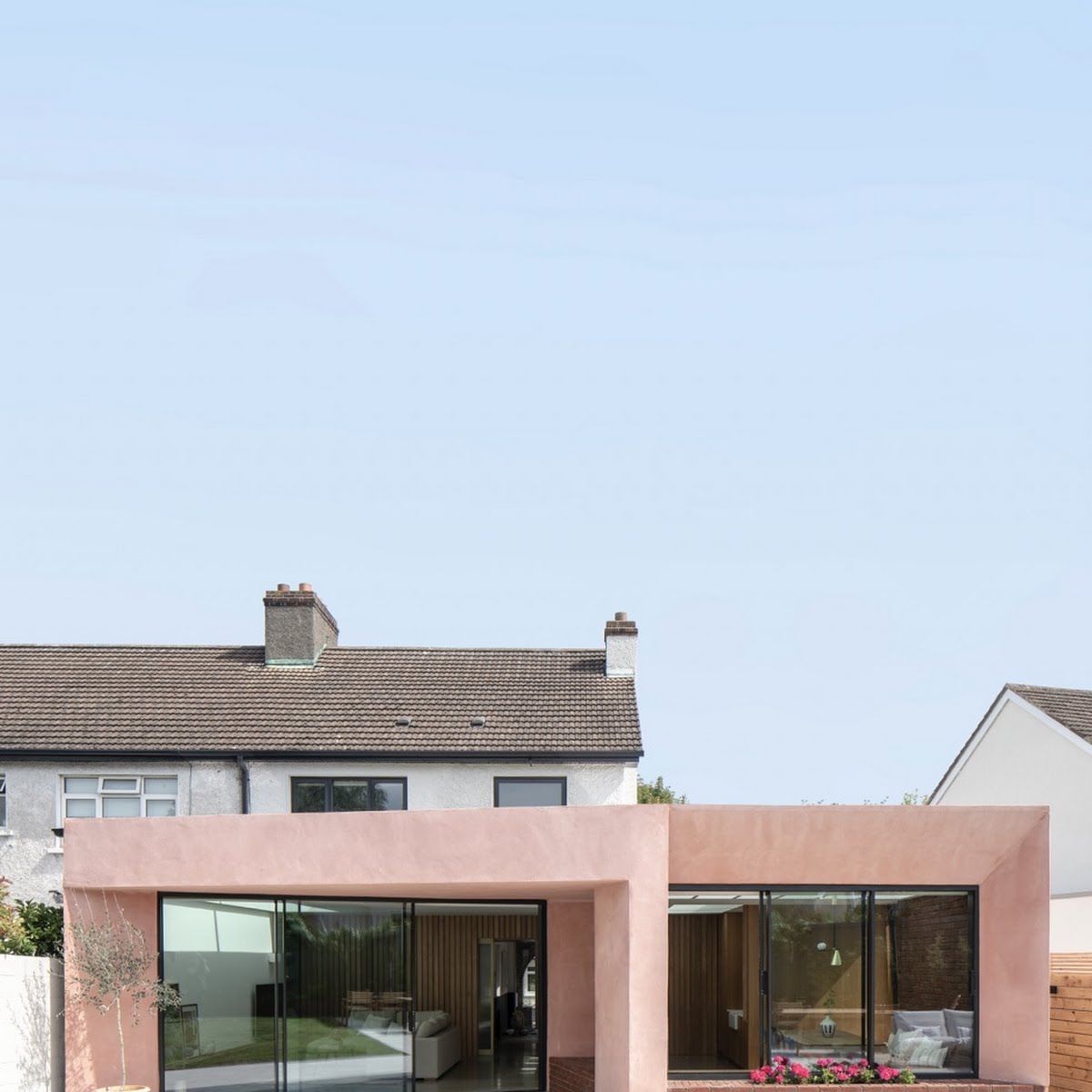
“We said to Courtney, ‘This house cannot look like every other home. We don’t want a rectangle on the back of our semi-detached house,’” Richie recalls.
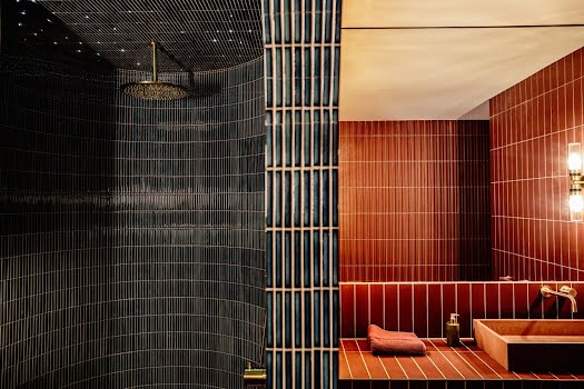
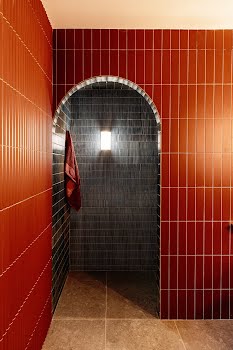
The other items on their wish list were rather more adventurous. Richie wanted an office-cum-cinema room where he could display his collection of Marvel comics and figurines. And then there was his dream shower. On the couple’s first holiday together in 2013, they stayed in the Heure Bleue Palais in Essaouira, Morocco, where they were upgraded to a room with a generous, mosaic-tiled, walk-in shower with an arched doorway. “I remember thinking, I have to have a shower like this in my house one day,” he says.
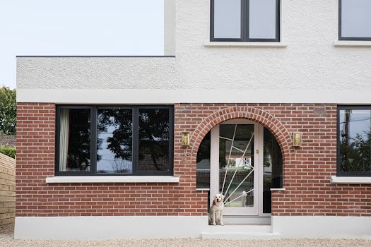
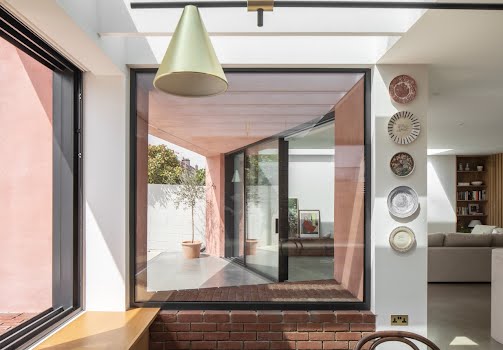
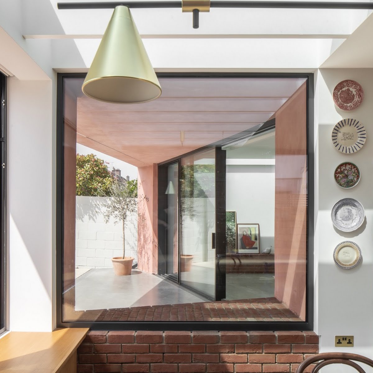
Along with the shower, the couple’s moodboard featured a photograph of a pink door which, unbeknownst to them, would influence the overall aesthetic of their home. “Courtney very much took the idea of the door and went a bit wild with it,” says Ciara, who was as excited as Richie when the architect suggested an external finish coloured with pink pigment.
The initial idea was to use pink concrete that would be mixed and poured on site. When they discovered it was way beyond their budget, they went back to the drawing board to research clever alternatives. Exploring projects in Spain and Morocco, Courtney discovered a pigmented render finish which is often used to create a concrete-like effect. After months of trial and error, they agreed on a mix that provided light and shade, along with the all-important texture. It’s highly durable, weather-resistant and cost effective when compared to a concrete exterior, which, says Richie, would have cost three-and-a-half times as much.
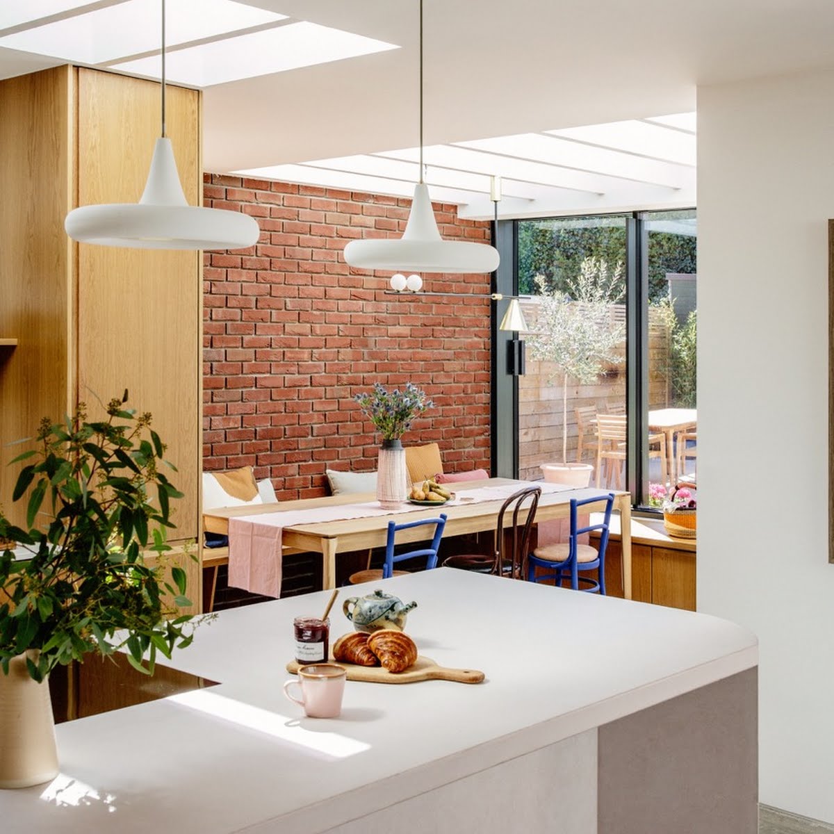
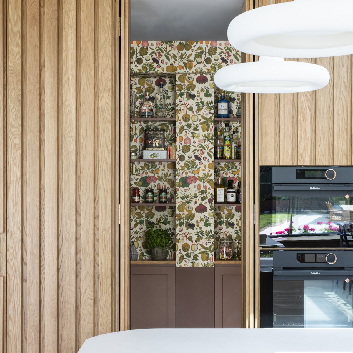
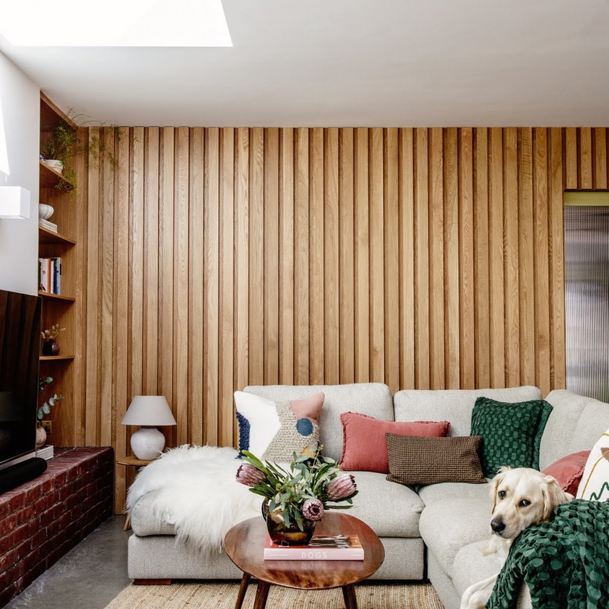
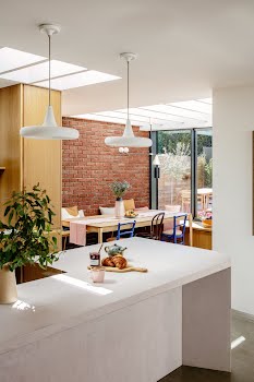
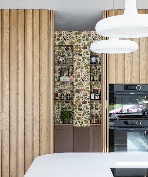
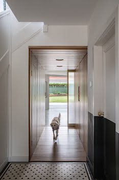
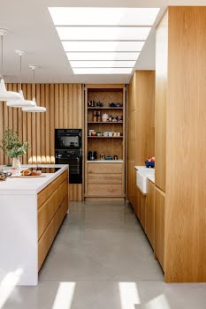
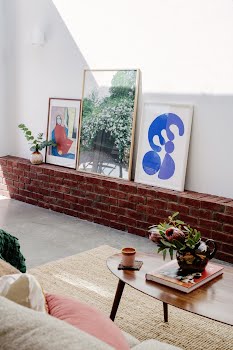
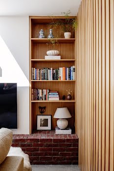
The style of the home’s exterior continues inside where exposed brickwork and polished concrete floors create a flow between outside and in. Solid oak panels line the walls of the passageway between the original house and the extension, enhancing the acoustics and adding a sense of intimacy.
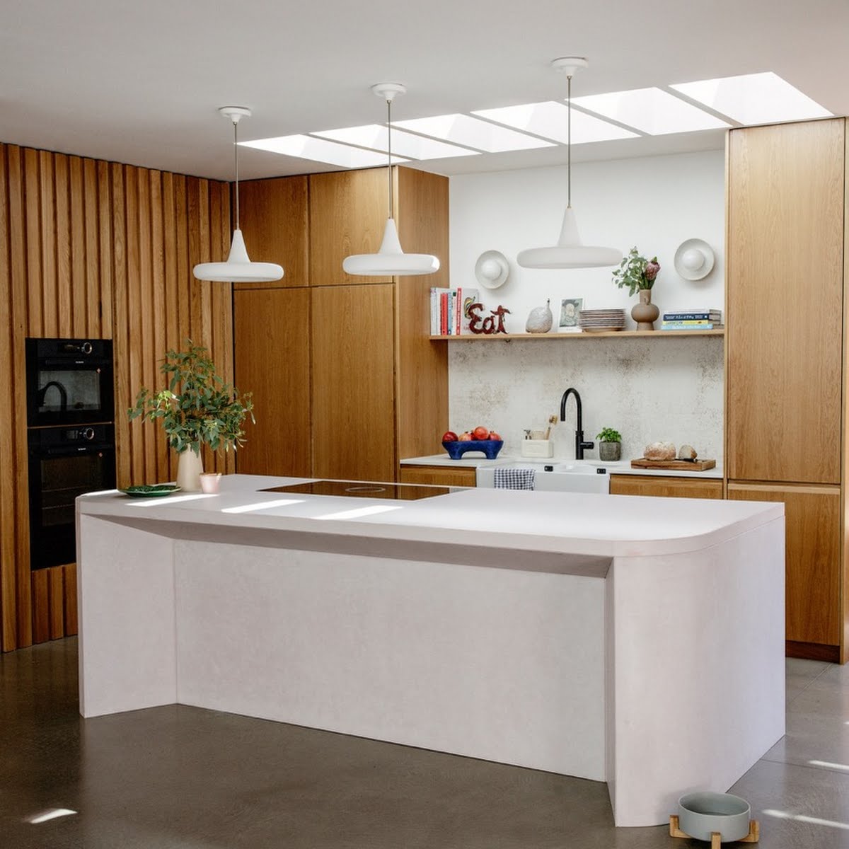
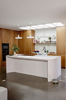
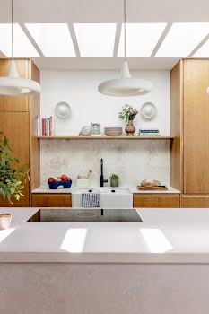
The pièce de résistance is the sculptural concrete island by Concrete Design Studios, which arrived in seven different parts and took 20 hours to assemble. “Nobody else would take on the project, but they have a maths-engineer expert on their team who worked on the angles,” Richie explains.
“They were incredibly dedicated and proud of their work,” adds Ciara, who says they haven’t decided whether or not to add kitchen stools in case they “take away from [the island’s] impact”.
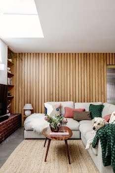
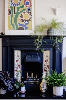
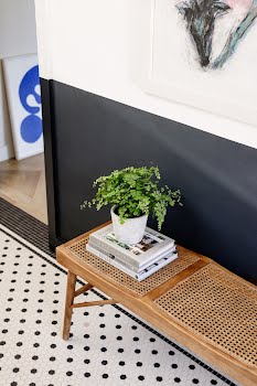
When Richie and Ciara were designing their home, they wanted the shapes and finishes to appear “monolithic”. Yet what’s interesting about this space is that it also feels warm and welcoming. Mid-century furniture finds and Scandinavian minimalism blend with joyous pops of colour.
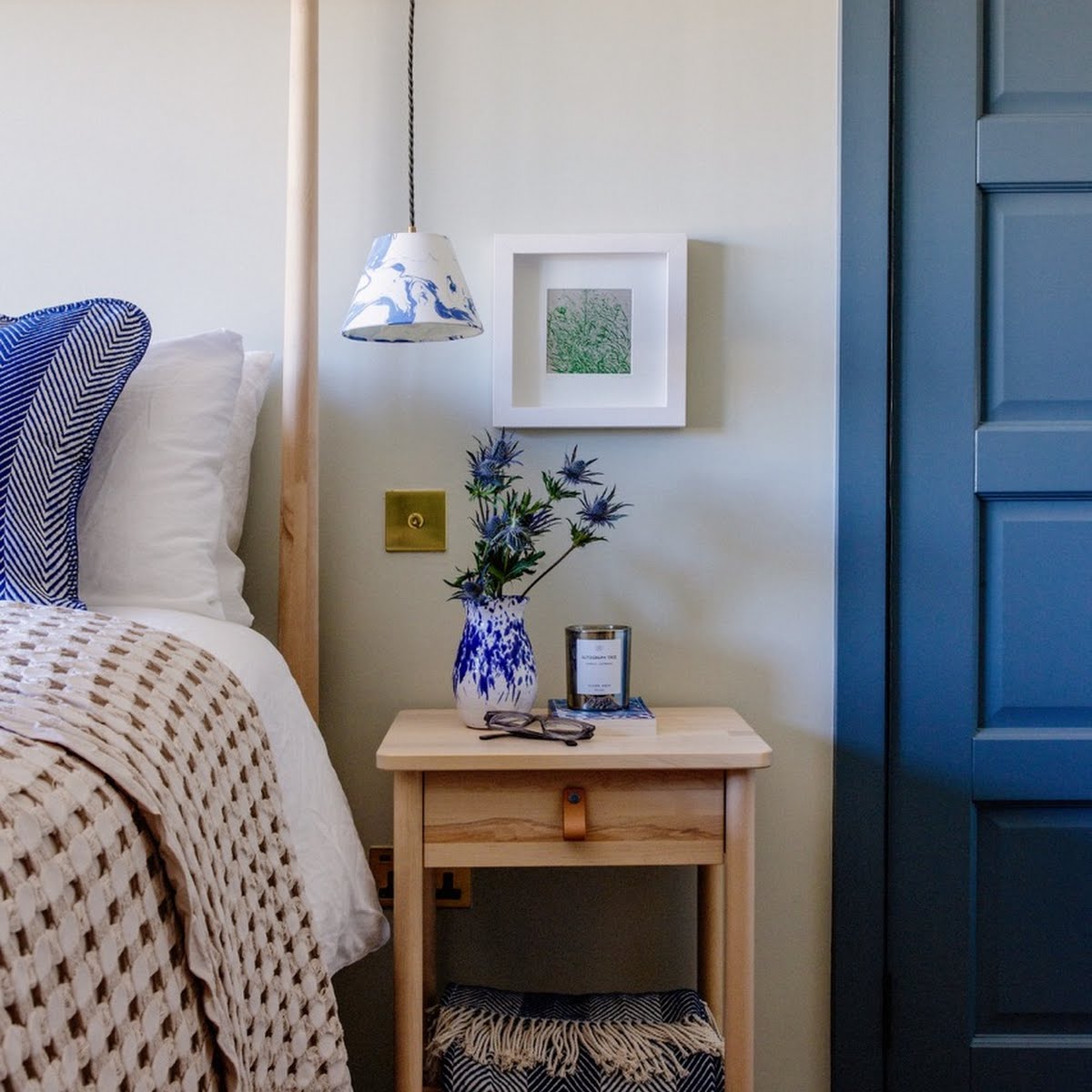
Harder materials are softened with tactile textures like sheepskin, bouclé and linen. “I’ve noticed with people who come into the house, they don’t even realise they’re doing it but they are always running their hands over something,” says Richie.
Inside and out, the home is full of warmth, visual interest and elements of surprise. “It’s working incredibly well for us,” says Ciara. “And I suppose that’s one of the benefits of designing a house in exactly the way that you want it to work, and in the way that you want to live.”

