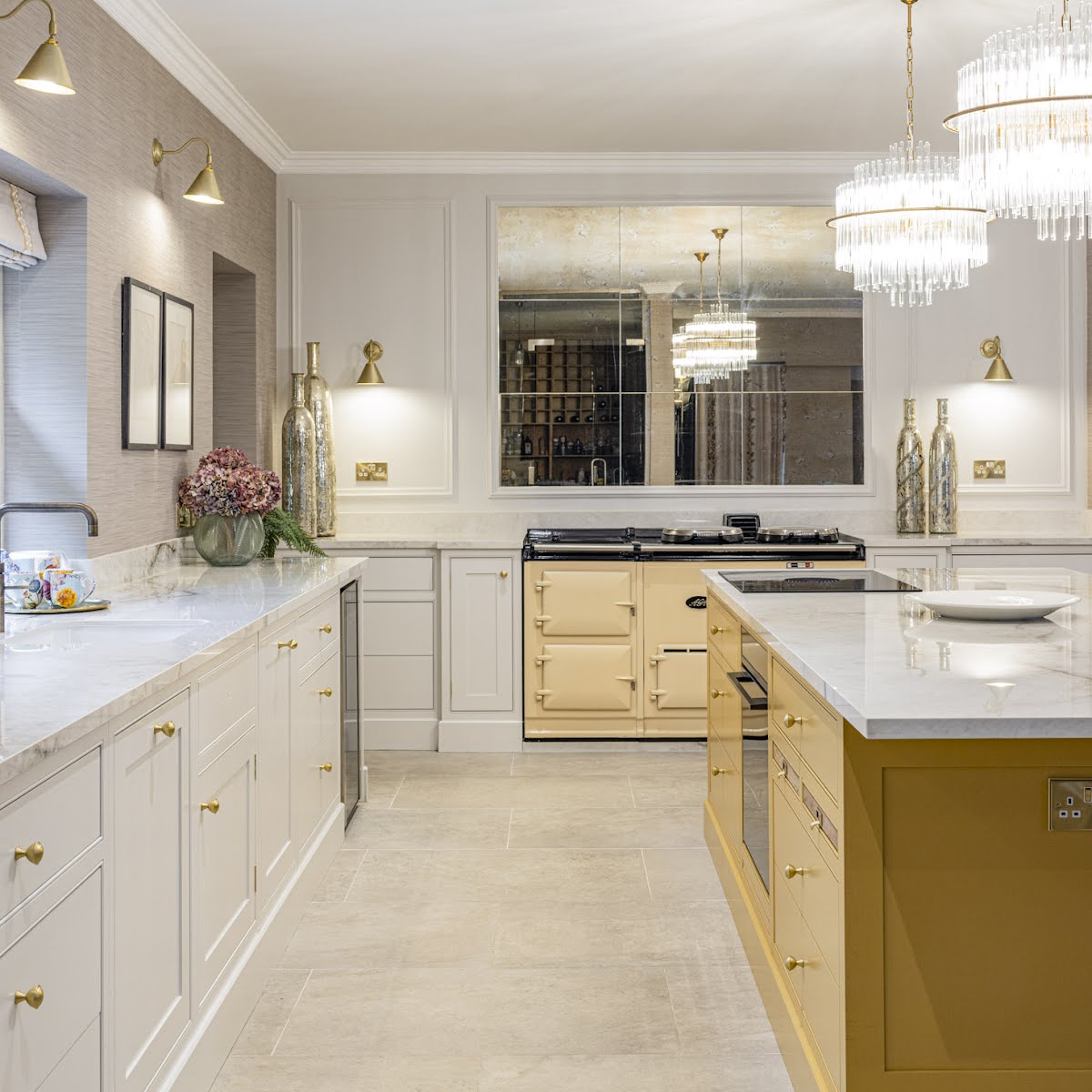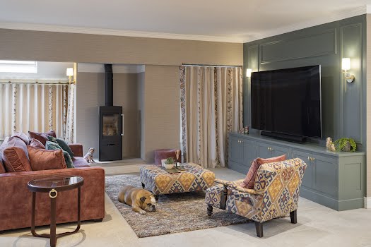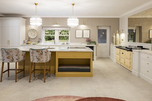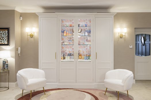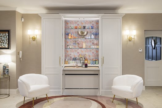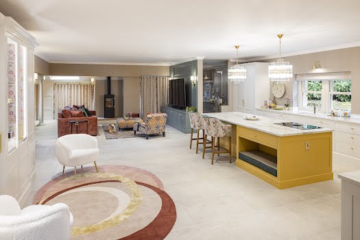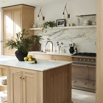
The space was transformed with a layout change, while built-in joinery adds both character and storage.
The owner of this Wicklow home was originally planning to give their home a bit of a spruce-up, and had contacted Rhatigan & Hick about replacing their kitchen island. However, as co-founder Ed Rhatigan explains, these plans soon became larger.
“Collette Ward Interiors were involved from the start, and when myself and Collette were in the house for our first client meeting, we soon realised that a quick fix wasn’t really going to make much of a difference. It took a few site meetings to really work out how to approach the design, but the great thing was, because we were both working together, there was a much better continuity throughout the whole house. Doors were blocked up, some of the old stone walls were covered over with wall panelling, and new floor finishes were introduced.”
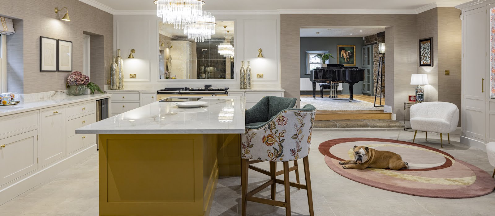
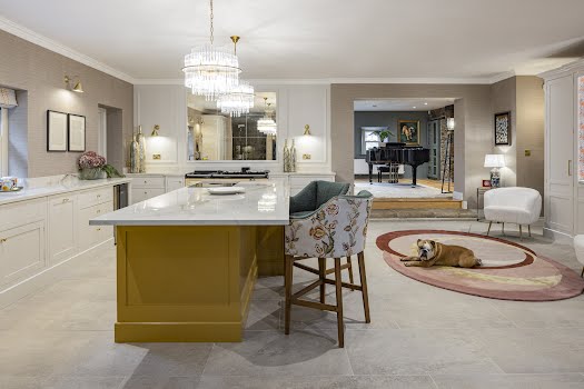
In the kitchen, the existing island unit was very large and square, sitting awkwardly within the space. Dark worktops and wooden cabinets also made the space feel dark. “All in all, the room felt a bit claustrophobic,” Ed says. “And even though the kitchen was big, it had really poor, hard-to-access storage.”
As the client spends most of their time in this space, they wanted it to feel bright and open – a cosy space in the evening whilst being enjoyable to be in during the day. “The house is on an equestrian farm, so the finishes had to be robust with all the dogs, cats, and riders coming and going,” Ed adds.
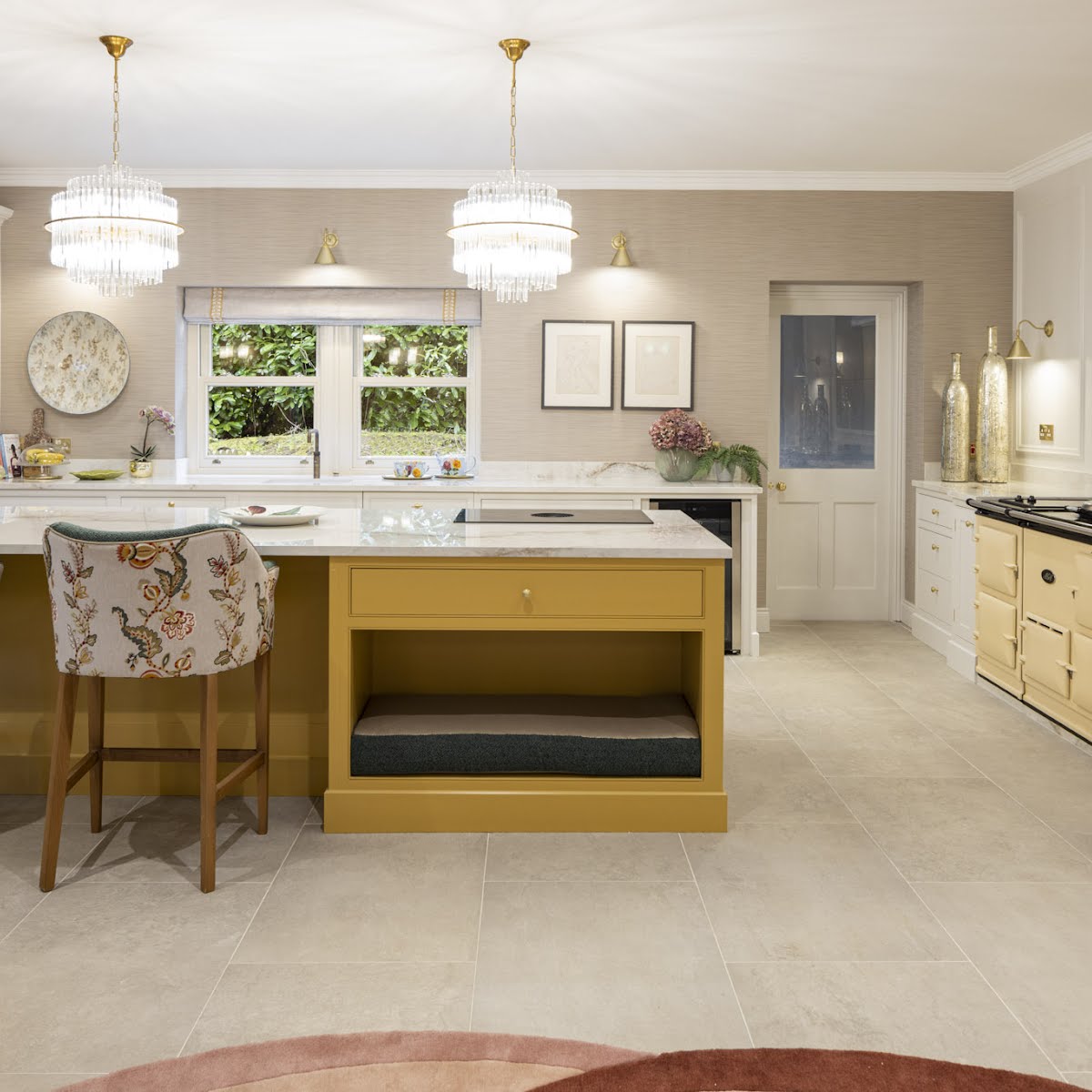
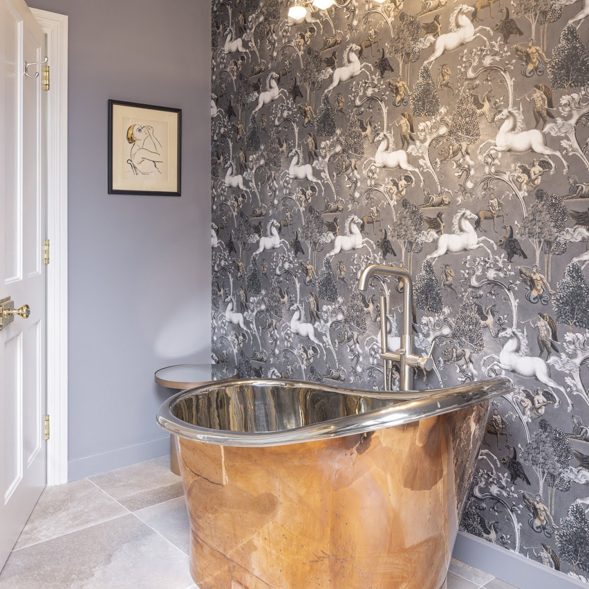
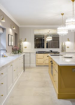
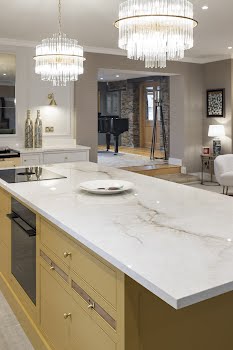
The new kitchen design has transformed the space, a real focal point for the house. A mustard-coloured island is a wonderful statement piece, while a cocktail cabinet with ornate wallpaper inside is a gorgeous feature.
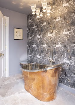
“Collette has a wonderful way of adding colour and character,” Ed says. “It’s all about fun and longevity with the finishes and materials with Collette Ward. Everything looks good but stands up to the heavy traffic that this kind of home has to deal with. The kitchen worktops are mind-blowingly beautiful, but because we used marble-effect porcelain from GraniteTops.ie, they are pretty much bombproof. The extra pops of colour from the wall paper was cool, but cleverly used in places where they are seen, but outside of the high-traffic spaces.”
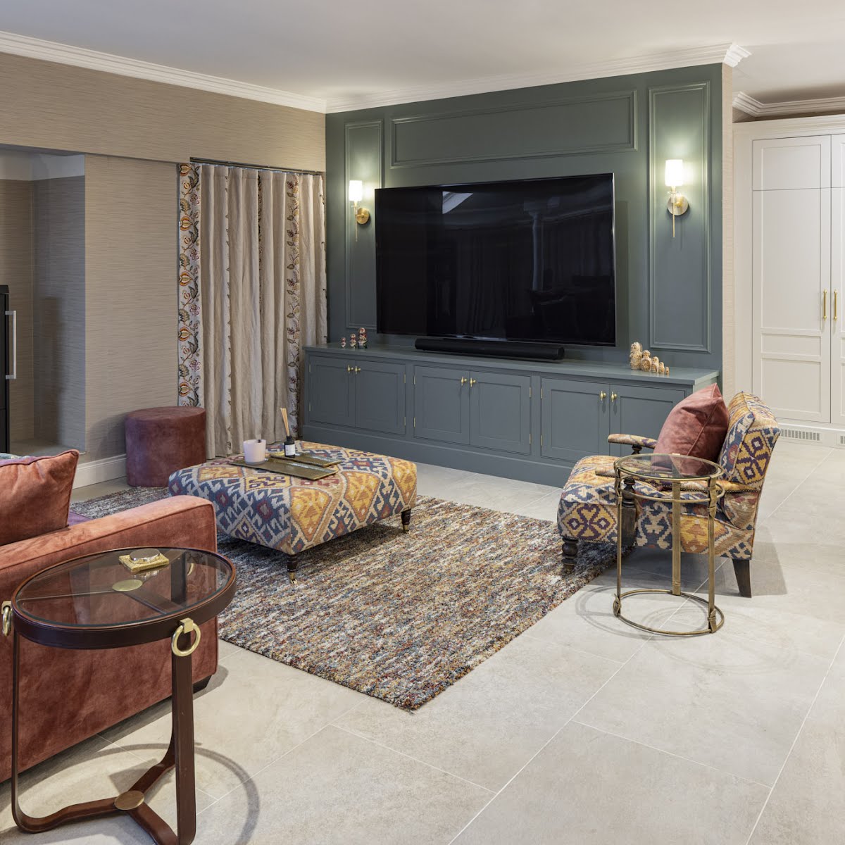
Another successful element, Ed explains was the new built-in cabinetry for the TV. “The TV is enormous and looked totally out of place before, but the client loved it and wanted to keep it for watching equestrian and other sporting events. I think by redesigning the cabinetry and panelling and then painting everything there dark, it helps absorb the bulk of the TV.”
The finished space feels completely different. “There’s a beautiful warmth and fresh atmosphere now and also a very tactile feel,” Ed says. “The fabrics on the furniture are luxurious, yet practical.”
Photography: Brian MacLochlainn


